Roll Back Malaria Partnership. Brand Guidelines
|
|
|
- Cecil Bailey
- 6 years ago
- Views:
Transcription


1 Roll Back Malaria Partnership Brand Guidelines
2 How to use these guidelines Our identity is not just a logo. It is a design scheme composed of a number of core elements that come together to create a distinctive look and feel that makes the RBM brand instantly recognisable. This document outlines the basic guidelines and principles that must be understood and adhered to. There is also a templates & resources, where you can download the various RBM logos, Lock-ups and templates.
3 About RBM The Roll Back Malaria Partnership (RBM) is the global framework for coordinated action against malaria. Founded in 1998 by UNICEF, WHO, UNDP and the World Bank and strengthened by the expertise, resources and commitment of more than 500 partner organizations, RBM is a public-private partnership that facilitates the incubation of new ideas, lends support to innovative approaches, promotes high-level political commitment and keeps malaria high on the global agenda by enabling, harmonizing and amplifying partner-driven advocacy initiatives. RBM secures policy guidance and financial and technical support for control efforts in countries and monitors progress towards universal goals. The RBM Secretariat is hosted at WHO in Geneva, Switzerland. For more information about what we do, visit us at:
4 Contents 01/ Our Logo 05 Introduction 06 RBM Primary Logo 07 Logo Construction 08 Exclusion Zone & Minimum Size 09 RBM Logo Translations 12 RBM Secondary Logo 13 RBM Alternative Logos 14 Using the WHO wording 15 Primary Colours 16 Incorrect Usage 02/ Our Brand 17 Introduction 18 How to use the brand 19 Portrait Layouts 23 Landscape Layouts 27 Tall & Thin Layouts 30 Using the RBM Social Media Device 31 Using the Arrow Graphic 32 Colours 33 Typography 35 Photography 36 Layout Examples 03/ P&I Series 39 Introduction 40 Front Cover 41 Layout Examples 04/ Partners' & Non-Partners' materials 42 Introduction 43 Using the RBM logo on Partners' materials 45 Using the RBM logo on Non-Partners' materials 46 Using Partners' logos on RBM materials 05/ downloads & Resources 47 Introduction 48 Stationery & Press Release 49 Power Point Presentation 50 RBM Logos 51 RBM Logo Translations 52 RBM Portrait Lock-ups 53 RBM Landscape Lock-ups 54 RBM Tall & Thin Lock-ups 55 RBM Arrow Graphic & Social Media Device 56 RBM Sticker Device 57 Glossary 58 Contact
5 01/ Our Logo The logo is the most visible element of our identity a universal signature across all Roll Back Malaria Partnership communications. Because the logo is such a recognisable and highly visible brand asset, it is vital that it is always applied consistently wherever it appears.
6 01/ RBM Primary Logo RBM Primary Logo / Our Logo / Contents / Wherever possible our primary logo, shown here should be used. This includes the word PARTNERSHIP within the logo. Occasionally it may not be possible to use the primary logo because of lack of space, for example on small merchandise items. In these cases the secondary logo can be used see page 12 for more details. 01/ International Logo Colour Where possible the RBM logo should always appear in the RBM Blue and Black. At no time should the logo appear in grey or a tint of the blue. Ideally, the logo should always appear on a white background to ensure legibility and clarity. 02/ Black (Single Colour) Logo On a rare occasion when a single colour logo may be needed, there is a Black only logo. This is ideal for good reproduction on photocopiers and fax machines.
7 01/ Logo Construction Logo Construction / Our Logo / Contents / 07 01/ Logotype 02/ Arrows Graphic The RBM logo consists of two core elements which are fixed in size and proportion the arrows graphic and the Roll Back Malaria Partnership logotype. The RBM logo is a unique piece of artwork, it should never be recreated or altered, which could cause inconsistencies that dilute the impact of the brand s power. 01/ Logotype The logotype should always be used with the arrows graphic, it has been specifically designed to work together with the graphic so it should never be used on its own. 02/ Arrows Graphic This fits alongside the logotype and under these circumstances must never be rotated, flipped or made bigger, and should always appear in the RBM primary colours. Under certain circumstances, the arrow graphic can be used as a separate element to enhance a layout. See page 34 for more details.
8 01/ Exclusion Zone & Minimum Size Exclusion Zone & Minimum Size / Our Logo / Contents / mm mm 8 mm To protect the clarity and visual integrity of the logo, it has an exclusion zone. It must always appear legibly on a white background. 01/ Exclusion Zone To preserve the logo s integrity, always maintain a minimum exclusion zone around the logo. This is to protect the RBM logo. The size of this zone is determined by the height of the P in 'Partnership'. This is a minimum recommended exclusion zone area more space will always aid visibility. 02/ Minimum Size Primary logo When the logo is reproduced too small, it is no longer legible and its impact is diminished. The primary logo should never be less than 30 mm wide. 03/ Minimum Size Secondary logo This logo should never be less than 15 mm wide. 04/ Small Logo This logo should be used if you need to use it smaller than 15 mm wide, this is ideal for use online. Always try the primary or secondary logo, before resrting to this version.
9 01/ RBM Logo Translations RBM Logo Translations / Our Logo / Contents / We have a range of RBM logos which have been translated in to other languages. These logos have been specially designed with the translated text. Please contact the RBM Secretariat for more information on other language versions. 01/ French Logo 02/ Spanish Logo 03/ Portuguese Logo
10 01/ RBM Logo Translations RBM Logo Translations / Our Logo / Contents / We have a range of RBM logos which have been translated in to other languages. These logos have been specially designed with the translated text. Please contact the RBM Secretariat for more information on other language versions. 04/ Chinese (Traditional) Logo 05/ Chinese (Simplified) Logo 06/ Arabic Logo
11 01/ RBM Logo Translations RBM Logo Translations / Our Logo / Contents / We have a range of RBM logos which have been translated in to other languages. These logos have been specially designed with the translated text. Please contact the RBM Secretariat for more information on other language versions. 07/ Japanese Logo 08/ Indonesian Logo
12 01/ RBM secondary Logo RBM Secondary Logo / Our Logo / Contents / If you have any issues getting our primary logo to fit into a layout, especially on small documents, then use our secondary logo which doesn't have the 'Partnership' wordmark. Only use this logo after gaining approval form the RBM Secretariat. 01/ Secondary Logo Always try the primary logo first, but if this does not fit or has to be made really small to fit, then consider using this version instead. All the other rules for colour variations of the logo, exclusion zone and minimum size apply (see page 8). 02/ Black (Single Colour) Logo On a rare occasion when a single colour logo may be needed, there is a Black only logo. This is ideal for good reproduction on photocopiers and fax machines.
13 01/ RBM Alternative Logos RBM Alternative Logos / Our Logo / Contents / Wherever possible our primary RBM Partnership logo should be used, but under certain circumstances these two secondary logos can be considered. 01/ Alternative Small Logo Always try the primary logo first, but if you need it to be really small to fit, then consider using this version instead. All the other rules for colour variations of the logo, exclusion zone and minimum size apply (see page 8). 02/ Whiteout Logo On a rare occasion when the logo needs to be used on a dark coloured background, use the whiteout version. Always try and use the full colour RBM logo where possible, but if the whiteout logo is needed, only use it on one of the RBM colours. See page 33 for more information on the RBM colour palette.

14 01/ Using the WHO wording Using the WHO wording / Our Logo / Contents / 14 The RBM Partnership Secretariat is hosted by the World Health Organization The RBM Partnership Secretariat is hosted by the World Health Organization When using the RBM Partnership logo on printed material, then the WHO wording should be added below the logo. 01/ Using the WHO wording The WHO wording should be positioned below the logo, and where possible set over three lines as above. If space is an issue this wording can be set over two or even one line. This wording should always be positioned out side the logo exlusion zone (see page 8). It should be set in the RBM primary font Avenier 55 roman. Please contact the RBM Secretariat for more information on using this wording.
15 01/ Primary Colours Primary Colours / Our Logo / Contents / Pantone: Process Blue C Process: C100 K10 RGB: Web HEX: #0093D2 Black Process: K100 RGB: Web HEX: # The colour palette for RBM when consistently applied in combination with photography, graphics and fonts helps to define, communicate and reinforce our brand. 01/ Primary Colour Palette RBM s primary colours are Blue and Black. It is important that these colours are positioned at the heart of its identity. Used in combination, they are strong brand signifies and are fundamental to the brand identity.

16 01/ Incorrect Usage Incorrect Usage / Our Logo / Contents / In association with ROLL BACK MALARIA To maintain a strong, distinctive brand it is important to use the logo in a consistent way. Always select the correct logo for an application from our templates library and do not alter it in any way. Here are some examples of what shouldn't be done. 01/ Fonts Do not substitute fonts or reset the logotype. 02/ Colour Do not change the logo colours. The logo must always be in blue and black. 03/ Exclusion Zone Do not encroach on the minimum clear space. 04/ Orientation Do not rotate the logo. 05/ Relationship of Elements Do not adapt or change the layout or positioning of the logotype and arrow graphic. 06/ Effects Do not add embellishments like drop-shadows, embossing etc. to the logo.
17 02/ Our Brand A strong visual identity is one of the most valuable assets an organisation owns. To make it truly powerful it needs to be applied consistently so anyone dealing with the Roll Back Malaria Partnership knows who we are and what we stand for. Everyone has a part to play in doing this and bringing our brand to life.
18 02/ How to use the brand How to use the brand / Our Brand / Contents / 18 01/ Visual Area 02/ Brand Lockup The RBM visual identity consists of strong images, bold colours and a clean logo lock-up area. This consistent balance across all layouts and elements creates the distinctive RBM look and feel. 01/ Visual Area The greater part of all the layouts is used for positioning images, titles and text, this section is always bold, eye catching and colourful. The flexible grid used in this area allows for a variety of designs, which can be adapted to suite the content. See page 21 for more information on using the grid. 02/ Brand Lock-up The RBM logo is used in a brand lock-up bar which is included on all materials. This lock-up bar includes the logo and strap line, along with any partners' logos. By always keeping this white bar consistent on all materials it creates an easily recognisable and uniform area to balance the flexible visual are above. See page 19 for more information regarding lock-ups.
19 02/ Portrait Layouts Using the Brand Lock-up Portrait Layouts / Our Brand / Contents / 19 This is the RBM lock-up for Portrait layouts, and this should be used on all of RBM s publications and printed materials, to keep all materials looking consistent. The lock-up consists of the RBM logo and strapline, which work together as a group. This lock-up should always sit on a white background and always be positioned at the bottom of the document. On a Portrait layout, the lock-up should always be 1/3 of the document height. The version shown here is the standard lock-up, and should be the first option when creating layouts. There are further lock-up variants for Landscape (see page 20) and Tall Thin layouts (see page 24). Please note never set up the lock-up yourself, these are available to download, see page 47 for more information.
20 02/ Portrait Layouts Using the Brand Lock-up Including Partners' logos Portrait Layouts / Our Brand / Contents / It is often the case that partners' logos will need to be included onto RBM materials. In this instance there is a specific RBM brand lock-up available. 01/ RBM & Partners' Logos Lock-up The partner logos are added along the bottom of the lock-up, a thin black key line is used to separate these from the RBM logo above. Thin black key lines are also used to separate each of the partner logos, which should always appear in single colour black. The size of the RBM logo and strap line should not be reduced, instead the partners' logos need to be added onto the bottom, and they should not be too large so not to overpower the RBM logo. 02/ RBM & Partners' Logos Lock-up (Primary & Secondary) If further secondary partner logos need to be included, they should be positioned below the primary partners' logos. Again these secondary logos will need to be one colour black and smaller than the primary partner logos.


21 02/ Portrait Layouts Using the Grid Portrait Layouts / Our Brand / Contents / Various layouts (grids) can be used within the visual area, so that it can be adapted to accommodate content. This flexibility allows layouts to keep a diverse and individual feel, and yet still be consistent with the RBM brand. 01/ 3x3 Grid This is the standard layout which has 9 individual squares and is ideal for layouts which only use photographs. Another good option for this grid is to remove the top 3 photos and use a colour here instead, then use this space to position a title. 02/ 6x6 Grid This grid has 36 squares, so allows for a lot more flexibility, shown above is a layout where the centre of the grid is used for a large title and text over a bold background colour. The images are then placed around the edges. Always remember to keep an even balance between the amount of images that are used and the space for titles and text.

22 02/ Portrait Layouts Using the Grid Portrait Layouts / Our Brand / Contents / Here are a few more examples of how adaptable the grid structure can be, depending on content. 03/ 3 row grid This example shows how the grid can be split into 3 strips. This usage is ideal if there are wide landscape images which will not fit into a square format. 04/ Flexibility of the grid The grid is very versatile. Different sized boxes can be used to hold the photos as long as they always fit within the grid structure. If a report cover is being created for example, a mixture of photos and text can be used to get a message across. The text box can be any size as long as it sits within the grid area.

23 02/ landscape Layouts Using the Brand Lock-up Landscape Layouts / Our Brand / Contents / 23 This is the RBM lock-up for Landscape layouts. This is ideal for use on press advertising. As with the other lock-ups, this should be used on all RBM materials. The lock-up consists of the RBM logo, which is aligned to the right and strapline on the left. These elements are designed to work together as a group. This lock-up should always sit on a white background and always be positioned at the bottom of the document. On a Landscape layout, the height of the lock-up should always be 1/4 of the document height. The version shown here is the standard lock-up, and should be the first option when creating layouts, and is especially useful for adverts. Landscape layouts may often be different widths, always align the logo to the right and the strapline to the left and the space between can vary.


24 02/ landscape Layouts Using the brand lock-up Including Partners' logos Landscape Layouts / Our Brand / Contents / It is often the case that partners' logos will need to be included onto our RBM materials. In this instance there is a specific RBM Brand lock-up available. 01/ RBM & Partners' Logos Lock-up The partner logos are added under the strapline and website with a thin black key line being used to separate them. Thin black key lines are also used to separate each of the partner logos, which should always appear in single colour black. The size of the RBM logo and strapline should not be reduced, instead the partner logos need to be added onto the bottom, and they should not be so large as to overpower the RBM logo. 02/ RBM & Partners' Logos Lock-up (Primary & Secondary) If further secondary partner logos need to be included, they should be positioned below the primary partners' logos. 03/ RBM Alternative Lock-up In some cases there may not be enough space to fit all the partners' logos onto the layout, especially when designing a small advert. In these cases the logos can be removed and replaced by the simple line of copy as above.


25 02/ landscape Layouts Using the grid Landscape Layouts / Our Brand / Contents / 25 Various layouts (grids) can be used within the visual area, so that it can be adapted to accommodate content. This flexibility allows layouts to keep a diverse and individual feel, and yet still be consistent with the RBM brand. 4x2 Grid This is the standard layout which has 8 individual squares and is ideal for layouts which only use photographs. Another good option for this grid is to use half the visual area (4 squares) as a colour here instead of photos and use this space for text.


26 02/ landscape Layouts Using the grid Landscape Layouts / Our Brand / Contents / 26 Here are a few more examples of how adaptable the grid structure can be, depending on content. 8x4 Grid This grid has 32 squares, so allows for a lot more flexibility, shown above is a layout where the left half of the grid is used for a large title and text over a bold background colour. The images are then placed in the square on the right. An even balance should be kept between the amount of images that are used and the space for titles and text. Flexibility of the grid The grid is very versatile. Different size boxes can be used to hold the photos as long as they always fit within the grid structure. If an advert is being created for example, a mixture of photos and text can be used to get a message across. The text box can be any size as long as it sits within the grid area.
27 02/ tall & Thin Layouts Using the brand Lock-up Tall & Thin Layouts / Our Brand / Contents / 27 This is the RBM lock-up for Tall Thin layouts. This is ideal for use on large format banners. As with the other lock-ups, this should be used on all RBM materials. The lock-up consists of the RBM logo, which is aligned above the strapline. These elements are designed to work together as a group. This lock-up should always sit on a white background and can be positioned at the top or bottom of a document. On a Tall Thin layout, the height of the lock-up should always be 1/4 of the document height. The version shown here is the standard lock-up, and should be the first option when creating layouts. The main use of this lock-up is for large format banners and in these situations it can be positioned at the top of the layout, as this aids visibility. On all other printed materials, like a DL leaflet, the lock-up should be positioned at the bottom as with the landscape and portrait lock-ups.
28 02/ tall & Thin Layouts Using the brand lock-up (partners) Tall & Thin Layouts / Our Brand / Contents / It is often the case that partners' logos will need to be included onto our RBM materials. In this instance there is a specific RBM Brand lock-up available. 01/ RBM & Partners' Logos Lock-up The partner logos are added under the strapline and website with a thin black key line being used to separate them. Thin black key lines are also used to separate each of the partner logos, which should always appear in single colour black. The size of the RBM logo and strapline should not be reduced, instead the partner logos need to be added onto the bottom, and they should not be so large as not to overpower the RBM logo. 02/ RBM & Partners' Logos Lock-up (Primary & Secondary) If further secondary partner logos need to be included, they should be positioned below the primary partners' logos. Again these secondary logos will need to be one colour black and smaller than the primary partner logos.
 can be used within the visual area, so that it can be adapted to accommodate content.")


29 02/ tall & Thin Layouts Using the grid Tall & Thin Layouts / Our Brand / Contents / Various layouts (grids) can be used within the visual area, so that it can be adapted to accommodate content. This flexibility allows layouts to keep a diverse and individual feel, and yet still be consistent with the RBM brand. 01/ 2x3 Grid This is the standard layout which has 6 individual squares and is ideal for layouts which only use photographs. Another good option for this grid is to remove the top 2 photos and use a colour here instead, then use this space to position a title. 02/ 3 row grid This example shows how the grid can be split into 3 strips. This usage is ideal if there are wide landscape images which will not fit into a square format. 03/ Single Image Here is a single image which has been used instead of the square format. This is an ideal use of the grid if a single bold image is to be featured.


30 02/ Using the Social Media Device Social Media Device / Our Brand / Contents / Follow us on: Follow us on: RBM's Social Media channels should be included wherever possible. This is good help keep people up-to-date with RBM news and events. 01/ Positioned on the Back Page The ideal position for the Social Media device is on the back of a document, next to the address or website. An example of this is shown here where it is positioned on the back page of a leaflet. 02/ Positioned within the Lock-up With an advert or a poster the social media device will need to be positioned inside the lock-up as shown above. Only use the social media device in the lock-up if there are no partner logos, as there will not be enough space to include both. On some occasions, if free space is an issue just use the social media icons without the text.


31 02/ Using the Arrow Graphic Arrow Graphic / Our Brand / Contents / The arrows graphic can be used as a separate element to enchance layouts. This graphic should never be used instead of the RBM logo and brand lock-up, but in conjunction with it. The arrow graphic can either be used as a tint of white over a coloured background, or as a tint of the RBM Blue over a white background. 01/ Arrow Graphic on a colour background In this example of a report cover, the arrows graphic has been used as a 40% tint of white on the RBM Blue. This can be a good alternative background if there are no images available to use for a specific document or report. The arrow graphic should be tinted back by at least 50% to create a subtle look. This same style could also be used with any other of the RBM Secondary Colour Palette (see page 32 for more information on the secondary colours). 02/ Arrow Graphic on a blue background In the second example, this poster has a lot more text, so a very subtle tinted blue arrow graphic has been used as a background. When using the graphic on a white background, it must be the RBM blue colour tinted back to at least 20%, so it is very subtle, like a water mark. The blue arrow graphic should under no circumstances be positioned behind the logo or brand lock-up.
32 02/ Colours Colours / Our Brand / Contents / 32 Pantone: Process Blue C Process: C100 K10 RGB: Web HEX: #0093D2 Pantone: 520 Process: C70 M90 Y15 RGB: Web HEX: # Pantone: 2747 Process: C100 M90 K20 RGB: Web HEX: # Pantone: 7469 Process: C100 M50 Y30 K20 RGB: Web HEX: # Black Process: K100 RGB: Web HEX: # Pantone: 248 Process: C45 M95 RGB: Web HEX: # Pantone: 646 Process: C70 M40 Y20 RGB: Web HEX: #336E99 Pantone: 5473 Process: C100 M40 Y40 K30 RGB: Web HEX: #005F The colour palette for RBM when consistently applied in combination with photography, graphics and fonts helps to define, communicate and reinforce the RBM brand. 01/ Primary Colour Palette RBM s primary colours are Blue and Black. It is important that these colours are positioned at the heart of its identity. Used in combination, they are strong brand signifies and are fundamental to the brand identity. 02/ Secondary Colours The secondary colours have been developed to work alongside the RBM Blue and Black. These can be used to add colour into layouts and adverts. They should never replace the RBM blue, but be used to work alongside it. It is not advisable to use more than one of the secondary colours per page or advert. See page 36 for examples of RBM materials.
33 02/ Typography Primary Fonts Typography / Our Brand / Contents / ABCDEFGHIJKLMNOPQRSTUVWXYZ abcdefghijklmnopqrstuvwxyz (!? $@%&/;:) Avenir 45 Book ABCDEFGHIJKLMNOPQRSTUVWXYZ abcdefghijklmnopqrstuvwxyz (!? $@%&/;:) Univers 45 Light ABCDEFGHIJKLMNOPQRSTUVWXYZ abcdefghijklmnopqrstuvwxyz (!? $@%&/;:) Avenir 65 Medium ABCDEFGHIJKLMNOPQRSTUVWXYZ abcdefghijklmnopqrstuvwxyz (!? $@%&/;:) Univers 55 Roman The two main fonts, which are used throughout all RBM materials are above. The fonts are an integral part of the brand, never use any other fonts otherwise this will weaken the brand. 01/ Body Copy font Avenir 45 Book is our primary body copy font and should be used on all publications. Other weights of Avenir, like 65 Medium or 45 Book Oblique (or italic) can be used to highlight text or for sub titles and quotes. 02/ Title Font Univers 45 Light should be used for large headings on all documents and the slightly bolder Univers 55 Roman can be used to highlight specific words. See page 36 for examples of font usage in the layout examples section of these guidelines.
34 02/ Typography Secondary Fonts Typography / Our Brand / Contents / ABCDEFGHIJKLMNOPQRSTUVWXYZ abcdefghijklmnopqrstuvwxyz (!? $@%& +=*/;:) Childs Play Age Eight ABCDEFGHIJKLMNOPQRSTUVWXYZ abcdefghijklmnopqrstuvwxyz (!? $@%& +=*/;:) Univers 57 Condensed 05 ABCDEFGHIJKLMNOPQRSTUVWXYZ abcdefghijklmnopqrstuvwxyz (!?$@%& +=*/;:) Cracked Regular ABCDEFGHIJKLMNOPQRSTUVWXYZ abcdefghijklmnopqrstuvwxyz (!? $@%&/;:) Arial Regular There may be circumstances where different fonts are required. Above are a couple of other possible fonts that can be used on RBM materials. But always try and work firstly with the two Primary fonts. 03/ Special Fonts Under certain circumstances, special fonts can be introduced into title or quotes to enhance a specific message. Above is a hand written font which can be used for a child's quote, and also a bold distressed font which can be used to create a feel of deprivation or distress. Using specialised fonts should be used sparingly and mainly on adverts and posters. On all normal documents the Primary fonts should be used. 04/ Lock-up Font Univers 57 Condensed is the font used for the text on the lock-ups, and this can also be used as a title font on documents. 05/ Alternative (Online / Digital usage) With regards to online and digital media, use Arial as an alternative font, Univers or Avenir is not available as a standard font on all computers. Also use it on all internal documents such as word files or power point displays. But do not use Arial on any printed materials.


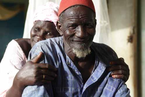
35 02/ Photography Photography / Our Brand / Contents / RBM uses a bold and striking style of photography which has a positive and energetic feel. The photographs are cropped in close and are specifically focused on the person or subject matter. 01/ Family Life The images should be people-based and should also be energetic and have a sense of optimism about them. They should be cropped so that you are only focusing on the person and not the whole scene. We want to try and show a variety of people from around the world and of all ages this will give the viewer a sense of just how many people are affected by the disease worldwide. 02/ Young People & Community Life Using images of young people is eye-catching and powerful. The shots need to be natural and capture a moment in time. The most powerful images are the ones that are positive and vibrant. 03/ Research & Action It is important to show a range of shots illustrating the research and action side of RBM s work. These images are encouraging and demonstrate hope and progress.


36 02/ layouts Adverts Layouts / Our Brand / Contents / Above are several examples of RBM adverts. Often with small adverts the space can be limited, as above often it is an option to use the landscape lock-up even on the portrait layouts. This should only ever be considered on adverts where there is limited space. 01/ Portrait Column Advert This advert is a small column advert, which uses one large image, child's quote is set in a hand written font to enchance the message. The social media icons are used at the bottom in a Landscape lock-up layout, which has been adapted because of the small size of the advert. 02/ Full Page Advert This advert uses the standard Landscape lock-up, with the social media icons included. The title of this advert has been positioned over the photograph. 03/ Half Page Advert This layout uses a standard RBM look with a range of small images positioned alongside the coloured text area. This advert also includes several partner logos on the landscape lock-up.


37 02/ layouts Publications / Reports Layouts / Our Brand / Contents / This is a typical example of an RBM publication. The cover uses the standard Portrait lock-up, while the visual area includes a mix of photographs and a coloured area which contains the report title. 01/ Cover This cover uses the standard Portrait lock-up, with the document title appearing in the colour bar at the top. The title is white-out text on the dark blue, which is one of RBM secondary colours. 02/ Internal Spread On the spread, the title font is Univers Regular with all body copy set in Avenir. The images have been positioned into the same square format grids to follow the brand style of the cover.
38 02/ layout Stationery and Press Releases Layouts / Our Brand / Contents / Above are examples of the RBM Stationery, including Letterhead, Compliment Slip and Business Card and press release. 01/ Stationery Both the letterhead and compliments slip use a clean layout with th RBM logo positioned in the top left corner, with plenty of white space around it. The back of the business card uses the same arrow Graphic effect, except it has a bold and strong blue background to create a contrast with the white front. 02/ Press Release The press release has a similar simple and clean feel, but on this images and a top bar have been introduced to give it a little more impact.
39 03/ P&I Series The P&I Series reports are different from all the other RBM publications, so different rules apply! Instead of using a grid, we want to make the layouts more dynamic and free, so this is where the collage theme comes into it.

40 03/ Front Cover Structure Front Cover / P&I Series / Contents / 40 02/ Visual Area 01/ Brand Lock-up 03/ Partner Logos The P&I Series Reports are different from all the other RBM publications, so they have a different look and feel. 01/ Brand Lock-up The P&I Series Reports are different from the other RBM publications but they still need to have a brand lock-up so that there is some consistency between all the publications. The lock-up must never be altered. 02/ Visual Area A single image should be used and can be placed on a coloured background along with the arrow graphic. The title can sit on the image, so that it is interacting with the subject matter. 03/ Partner Logos The partner logos should sit along the bottom of the cover and should all be white. They should not be so large as to overpower the RBM logo. Thin white key lines are also used to separate each of the partner logos.


.")
41 03/ Layout Examples Layout Examples / P&I Series / Contents / 41 Here are a few examples of how various report covers can look different, simply by using coloured backgrounds and images. On all three cover examples, the RBM Brand lock-up is in the same position. It must always be at the top of the document and must remain the same height. The visual area is more flexible, and can be altered. The background colour can change as long as you use the colours from the Secondary Colour Palette (see page 32). The title of the report can be moved around and can sit on the photo. It is advisable to have the text in white as most of the background colours are quite dark.
42 04/ Using the RBM logo on Partners' / Non-Partners' materials This section will show how the RBM logo should be applied to partners' publications, without disappearing on the page.


43 04/ How to use the RBM Logo How to use the RBM Logo / Partners' & Non-Partners' materials / Contents / FULL PRESCRIPTION BETTER MALARIA TREATMENT FOR MORE PEOPLE, MSF S EXPERIENCE September 2008 MEMBER OF THE In association with We want the RBM brand to have a consistent look and feel on all materials even when we are not producing them. This is why we have come up with three styles in which the RBM logo can be used in every circumstance you can think of. 01/ RBM Partner Materials Here is an example of how to apply the RBM Sticker Device onto Partner Materials. 02/ Non-Partner Materials Here is an example of how to use the RBM logo alongside other non-partner logos. The logos need to be visually balanced, with neither being more prominent than the other. 03/ RBM Materials Here is an example of how to use the RBM Partner lock-up on RBM materials. The Partner logos should always sit underneath the RBM logo at the bottom of the page.


44 04/ using the RBM logo on Partners' materials Partners' Materials / Partners' & Non-Partners' materials / Contents / MEMBER OF THE MEMBER OF THE 01 MEMBER OF THE The RBM Sticker Device should be used if a partner wishes to use the RBM logo as an endorsement on its own initiative. For example, if an RBM Partner produces a corporate brochure and would like to include the RBM logo to show that it is part of the Partnership, then the RBM Sticker should be used. 01/ RBM Sticker Device The RBM Sticker Device has been created so that it stands out from all the other partners' logos which come under the RBM Partnership umbrella. It is flexible as it can sit anywhere on the page which makes it easy to use without breaking any of the guidelines. 02/ Layout Examples Above are a couple of examples of how to apply the RBM Sticker Device onto Partner Materials. It can be placed anywhere on the layout and must not be altered in any way.

45 04/ Using the RBM logo on Non-Partners' materials Non-Partners' Materials / Partners' & Non-Partners' materials / Contents / 45 FULL PRESCRIPTION BETTER MALARIA TREATMENT FOR MORE PEOPLE, MSF S EXPERIENCE September 2008 In association with When the RBM logo is used with other global health partnerships of major institutions, then the logos must be used on equal footings. The RBM-logo should always be the same size as the non-partner logo and the exclusion zone should always be adhered to. Here are a couple of examples of how to use the RBM logo alongside other non-partner logos on an equal footing. The logos are visually balanced, with neither being more prominent than the other. Always remember a non-partner logo should never be placed inside the RBM logo exclusion zone. Try to maintain sufficient space between them. The RBM logo should always appear in Blue and Black. See Our Logo section for more details.
 lock-up with the Partner logos should always be used if possible. The RBM logo should always be stronger and larger and wherever possible placed above the partner logos.")

46 04/ using Partners' logos on RBM materials RBM Materials / Partners' & Non-Partners' materials / Contents / When using Partner logos on any RBM materials, the RBM (Portrait / Landscape / Tall Thin) lock-up with the Partner logos should always be used if possible. The RBM logo should always be stronger and larger and wherever possible placed above the partner logos. 01/ Primary Lockup Here are a couple of examples of how to use the RBM Partner lock-up on RBM materials. Always remember to put the Lock-up at the bottom of the document and make sure that the RBM logo is more prominent than the Partner logos. See Our Brand section for more details. 02/ Alternative Lockup If the Partners' logos require more prominence, then they can be placed above the RBM logo and below the strapline as the above version illustrates. But remember to always keep the RBM Logo larger than any partners' logos.
47 05/ downloads & Resources Within this section, are all the various files for you to download along with other resources such as explanations of file formats and file types. All the RBM logos and lock-ups have been saved into packages of files, which include various formats and colour ranges. There are also templates for Stationery and Powerpoint.
 French (Genva address) English")

48 05/ Stationery & Press Release Stationery & Press Release / Downloads & Resources / Contents / 48 01/ Stationery There are three versions of the stationery templates are available for download: English (Geneva Address) French (Genva address) English (New York office) Word templates for each of the Letter heads are also included in these downloadable files. Download English Download French Download New York 02/ Press Release This is available as either a Word template or as a high resolution pdfs. Download


49 05/ Power point Powerpoint / Downloads & Resources / Contents / 49 01/ Power Point This contains two slide templates, one for the cover slide and the second for all the internal pages. Download
50 05/ RBM LogoS RBM Logo / Downloads & Resources / Contents / 50 01/ Primary logo Download 02/ Secondary logo Download 03/ Alternative logo Download 04/ Primary logo Whitout version Download The RBM Partnership Secretariat is hosted by the World Health Organization 05/ Primary logo Including the WHO wording Download
51 05/ RBM Logo Translations RBM Logo Translations / Downloads & Resources / Contents / 51 01/ French Logo 02/ Spanish Logo 03/ Portuguese Logo 04/ Indonesian Logo Download Download Download Download 05/ Japanese Logo 06/ Chinese (Traditional) Logo 07/ Chinese (Simplified) Logo 08/ Arabic Logo Download Download Download Download


52 05/ RBM Portrait LoCK-UPS RBM Portrait LOCK-UPS / Downloads & Resources / Contents / Download PACKAGE 01/ RBM Lock-up 02/ RBM & Partners Lock-up 03/ RBM & Partners Lock-up (Primary & Secondary)
 04/ RBM Alternative")
53 05/ RBM LANDSCAPE LoCK-UPS RBM LANDSCAPE LOCK-UPS / Downloads & Resources / Contents / Download PACKAGE 04 01/ RBM Lock -up 02/ RBM & Partners Lock-up 03/ RBM & Partners Lock-up (Primary & Secondary) 04/ RBM Alternative Lock-up


54 05/ RBM Tall & Thin LoCK-UPS RBM Tall & Thin LoCK-UPS / Downloads & Resources / Contents / Download PACKAGE 01/ RBM Lock -up 02/ RBM & Partners Lock-up 03/ RBM & Partners Lock-up (Primary & Secondary)
55 05/ RBM ARROW GRAPHIC & Social Media Device ARROW GRAPHIC / Downloads & Resources / Contents / 55 Follow us on: Follow us on: 02/ Arrows Graphic 02/ Social Media Device This is available in both oif the above formats, either can be used depending on the space available. Download Download
56 05/ RBM Sticker Device RBM Sticker Device / Downloads & Resources / Contents / 56 MEMBER OF THE 01/ RBM Sticker Device Download
57 05/ GLOSSARY GLOSSARY / Downloads & Resources / Contents / 57 Each of the logo and lock-up packages contain a range of files and different colour formats. Below is a brief and simple explanation of what these files are and where they are best used. Available logo & Lock-up formats: Available colour formats:.eps (Illustrator) Illustrator eps files are ideal for use on any printed material, as they can be scaled as large or small as you require without losing quality. These files are idea for use on like brochures, leaflets, and any large format elements like flags and banners and are the preferred choice for designers or printers. You will probably not be able to open these file types on your PC, but any printer or designer will..pdf (Adobe Acrobat) Pdf files are similar to Illustrator files, they also a good format to send to designers and printers. They can also be scaled to any size without loss of quality, and these can be opened and used on your pc..jpg /.tiff These are perfect for use in your own powerpoint and word templates, but do not send.jpgs or.tiff to designers or printers, they will always prefer an Illustrator.eps or.pdf file..png These can also be used in your own powerpoint and word templates. They have a transparent background, so can be placed over colours or photos without showing a white box. But they are only for digital use, never use them to print from as the quality will not be high enough CMYK (four colour process) This is the primary colour range and can be used on most printed material, such as brochures, reports and newsletters. If you are unsure about what colour format to use, then use CMYK. Spot colour (Pantone / special colours) This is for two colour print runs, when you only need to use the RBM corporate blue and black. It is ideal for stationery, signage, t-shirts. RGB (websafe RGB or hexadecimal colours) This is used for electronic & online media only, such as websites, powerpoint presentation & newsletters. Never use an RGB logo on a print project as the colour will reproduce incorrectly. Black (Single colour) The black (single colour) logo is only to be used when you are restricted to a single colour print, or if you need good reproduction on a fax or photocopier.
58 Roll Back Malaria Partnership Secretariat hosted by WHO 20 Avenue Appia, 1211 Geneva 27, Switzerland Tel: Fax: Follow us on:
Brand Guidelines January 2016
 Brand Guidelines January 2016 Contents Brand Assets Logos Lock Up Brand Properties Brand Assets 04 Grow Wild, Kew & The Big Lottery Logos Lock Up 11 Brand Property: Scattered Seeds 22 Grow Wild Logo 05
Brand Guidelines 12 December 2014
 Brand Guidelines 12 December 2014 Our brand Introduction A distinctive new approach to the transport infrastructure of Edinburgh deserves a bold new look. A whole new brand platform has been developed
Using the logo. About the logo. Elements. The seal. The logotype. Third party logo use
 Style guide 218 Using the logo About the logo Jimmy is at the heart of everything we do as a charity and this is reflected by his name being at the foundation of our actions. The various elements of the
Australian Dragon Boat Federation Corporate Style Guide. Australian Dragon Boat Federation Style Guide
 Australian Dragon Boat Federation Corporate Style Guide Australian Dragon Boat Federation Style Guide 1 Contents Introduction 3 Objective 4 NATIONAL LOGO 5 Australian Dragon Boat Federation Logo 6 Australian
The ExCeL logo. ExCeL London brand guidelines V2
 10 The ExCeL logo 11 ExCeL logo ExCeL London and The ADNEC GROUP tab have been given more space to breathe, they are now separate elements that work together. This gives the structure of the organisation
IDENTITY GUIDELINES AND GRAPHIC STANDARDS MANUAL SPRING 2017
 IDENTITY GUIDELINES AND GRAPHIC STANDARDS MANUAL SPRING 2017 THE IMPORTANCE OF GRAPHIC STANDARDS The United Mail logo is our unique graphic signature. It is one of the most visible aspects of the company
CONTENTS S1 : CORPORATE MARQUE S2 : CORPORATE TYPEFACE S3 : STATIONERY S4 : COVER DESIGNS S5 : APPLICATIONS
 CONTENTS S1 : CORPORATE MARQUE PRIME MARQUE 4 CORPORATE COLOURS 6 PRIME MARQUE DIMENSIONS 8 EXCLUSION ZONE 10 PRIME MARQUE VARIANTS 12 PROMOTIONAL VARIANTS 14 NON PERMITTED VARIANTS 16 S2 : CORPORATE TYPEFACE
UNIVERSITY OF MANITOBA VISUAL IDENTITY GUIDE. May 24, 2013
 UNIVERSITY OF MANITOBA VISUAL IDENTITY GUIDE May 24, 2013 TABLE OF CONTENTS Signature 5 Colour 25 Typography 28 Photography 31 Bringing it all together: The University of Manitoba brand 35 Templates 53
This guide should be read by anyone involved in creating communications for One You.
 This guide should be read by anyone involved in creating communications for One You. It explains the thinking behind our look and how easy it is to execute. Please take the time to read the following pages.
Introduction. Page 1. Welcome to the signage guidelines for St John Ambulance premises, updated as of September 2012.
 Signage guidelines Introduction Welcome to the signage guidelines for St John Ambulance premises, updated as of September 2012. These guidelines provide a signage standard for all St John Ambulance buildings,
105 BRAND GUIDELINES Ensuring people aren t in the dark about their power cut.
 105 BRAND GUIDELINES Ensuring people aren t in the dark about their power cut. Contents 2 3 Brand strategy 7 Brand elements 17 Applying the elements 32 Partners best practice 4 Brand objectives 8 Logo
Brand Guidelines v1.0
 Brand Guidelines 2019 v1.0 Overview Ticketek is New Zealand's gateway to the live entertainment experience. Using innovative technology, we ve become New Zealand's leading platform for connecting millions
Brand identity toolkit
 Our visual identity Brand identity toolkit Typography Photography Lyon Display Medium ABCDEFGHIJKLMNOPQRSTUVWXYZ abcdefghijklmnopqrstuvwxyz 0123456789 Akkurat Regular ABCDEFGHIJKLMNOPQRSTUVWXYZ abcdefghijklmnopqrstuvwxyz
UNITED WAY BRANDMARK. Brandmark Usage. The most fundamental visual element of a brand identity is its brandmark.
 OUR BRANDMARK 13 UNITED WAY BRANDMARK Brandmark Usage The most fundamental visual element of a brand identity is its brandmark. The evolution of our brandmark is most dramatic in its configuration. The
OUR MASTER BRANDMARK BRANDMARK USAGE LIVE UNITED TAGLINE PRIMARY BRANDMARK OUR PURPOSE WHAT IT MEANS TO JOIN
 OUR MASTER BRANDMARK PRIMARY BRANDMARK The most fundamental visual element of a brand identity is its brandmark. The evolution of our brandmark is most dramatic in its configuration. The United Way symbol
MITCHELL COLLEGE MITCHELL COLLEGE VISUAL STANDARDS. Visual Identity Standards
 1 MITCHELL COLLEGE Visual Identity Standards 2 TABLE OF CONTENTS PURPOSE, BACKGROUND, ELEMENTS...4 3 HOW TO USE THE MITCHELL COLLEGE LOGO...5 SIZE and SPACING...6 MITCHELL COLLEGE COLOR USAGE...7 OFFICIAL
BRAND STYLE GUIDE External 07/ 2011
 BRAND STYLE GUIDE External 07/ 2011 TABLE OF CONTENTS understanding the brand 01 What is a brand? 01 Why are guidelines needed? 01 Who should use these guidelines? 01 How should they be used? 01 Brand
Brand Identity & Design Standards
 Brand Identity & Design Standards Copyright 2014 by the Tahoe Truckee Community Foundation All rights reserved Originally developed for use by the Tahoe Truckee Community Foundation December 2014 Information
Special Olympics Delaware Logo Guidelines
 Special Olympics Logo Guidelines Introduction - Special Olympics Brand Identity Guidelines Our brand is our reputation, a reputation shared by all of the programs within Special Olympics. This reputation
CONTENTS. Introduction 04. Primary Logo 07. Clear Space & Size Requirements 08. Alternate Logo Usage 09. Logomark Usage 1 3.
 CONTENTS Introduction 04 Primary Logo 07 Clear Space & Size Requirements 08 Alternate Logo Usage 09 Logomark Usage 1 3 Usage Dos 14 Usage Don ts 15 Colors 16 Typography 17 Photography Guidelines 18 Tone
columbusindiana Brand Graphics Information and Standards Guide
 columbusindiana Brand Graphics Information and Standards Guide August 2007 Introduction 1 A product is made in a factory. A brand is made in the mind. Walter Landor A well-respected brand can be our most
Visual Style Guide. April 2016
 Visual Style Guide April 2016 Contents Introduction to the Logo 3 Safe Area and Size 4 Incorrect Usage 5 Color Palette 6 Other Brand Elelments 7 Typography 8 Tone and Style of Photography 9 Print Examples
Intel Internet of Things Solutions Alliance Associate Members. Trademark and Asset Usage Guidelines
 Intel Internet of Things Solutions Alliance Associate Members Introduction Delivering on Our Brand Promise Under the Intel Internet of Things Solutions Alliance Associate Agreement you entered into with
GRAPHIC IDENTITY MANUAL
 GRAPHIC IDENTITY MANUAL GRACELAND UNIVERSITY GRAPHIC IDENTITY 2 INTRODUCTION The Graceland University Graphic Identity Standards Manual was created to provide all Graceland University employees and associates
Scottish Book Trust. Brand Guidelines Scottish Book Trust
 Scottish Book Trust Brand Guidelines 2014 2. Identity The logo The new Scottish Book Trust logo defines our brand. It retains the composition and shape of the old logo to ensure it is quickly recognisable,
LINKED LEARNING IDENTITY GUIDELINES V
 This style guide provides important information about using brand in a consistent manner Use this guide if you are a school or partner who wants to use brand If you are working with a professional designer,
CHECK POINT IDENTITY GUIDELINES. Version 1
 CHECK POINT IDENTITY GUIDELINES Version 1 Contents 3 Manifesto 4 Logo 9 Colors 10 Typography 11 Photography 17 Design System 18 Design System Usage 19 Design Examples 22 Contact WE SECURE THE FUTURE The
Graphic Design Standards
 Graphic Design Standards CONTENTS 3 4 4 5 6 7 8 9 10 11 12 INTRODUCTION COLOR VALUES FONTS LOGO ARRANGEMENTS & GUIDELINES PROPER USAGE IMPROPER USAGE STAGING MINIMUM SIZE BUSINESS CARD APPAREL LINKS TO
INTRODUCTION OUR VISION: We are driven to be a preeminent college of pharmacy in the world. Our world begins in Iowa. OUR MISSION:
 BRAND GUIDE INTRODUCTION TABLE OF CONTENTS BRAND MESSAGING Introduction.... 1 Core Brand Values... 2 BRAND IDENTITY Logo Usage.... 6 Primary Logo Variations.... 7 Department & Division Logos.... 8 What
The National Exchange Club. Branding Guide
 The National Exchange Club Branding Guide Table of contents Introduction 1 Exchange personality 2 Logo components 3 Exchange emblem and logo 4 Clear space around the logo 5 Official Exchange colors 6 Logo
V I S U A L S TA N D A R D S G U I D E
 V I S U A L S TA N D A R D S G U I D E table of contents Introduction 1 elements of the visual identity Wordmark 2 Tagline 2 Additional identifiers 3 Using the institutional acronym 3 Signature 4 Using
THE LOGO 4 COLOR PALETTE 6 LOGO USAGE 7 THE TYPEFACE 8 GENERAL GUIDELINES 10 TYPOGRAPHY USAGE 11 SUPPLEMENTAL ICONS 12
 BRAND GUIDELINES THE LOGO 4 Clear Area Alternate Logo Versions COLOR PALETTE 6 Color Options LOGO USAGE 7 THE TYPEFACE 8 Suggested Uses GENERAL GUIDELINES 10 TYPOGRAPHY USAGE 11 SUPPLEMENTAL ICONS 12
Corporate Identity Quick Reference Guide
 Corporate Identity Quick Reference Guide The Logo true form The Cold Jet logo is most effective when used on a white background. There is also a reversed version of the logo that is acceptable for use
Green Globes, GPC + Green Building Initiative GRAPHIC STANDARDS GUIDE
 Green Globes, GPC + Green Building Initiative GRAPHIC STANDARDS GUIDE Last Updated: December 29, 2014 WWW.THEGBI.ORG 503.274.0448 info@thegbi.org page 2 CONTENTS 1.0 Introduction 3 1.1 Our Mission 3 1.2
Branding Guidelines York Branding Guide September 2011
 Branding Guidelines COLOR 1-Color Printing: The logo prints in all black ink. 100% Black 2-Color Printing: The logo prints either in all black, or in 2 colors: Pantone 032 and black. On a black or dark
CLUB LOGO GUIDELINES
 CLUB LOGO GUIDELINES LOGO DETAIL The Surfrider Foundation logo is the key building block of our identity. It is the primary visual element that people can associate with our work and our brand. The logo
Branding guidelines - V /08/23 - Company confi dential - Internal use only
 Branding guidelines - V 1.0 2012/08/23 - Company confi dential - Internal use only The following visual identity guidelines are designed to achieve the highest level of consistency throughout communications
ATHLETIC BRAND STANDARDS GUIDE
 ATHLETIC BRAND STANDARDS GUIDE THE IMPORTANCE OF GRAPHIC STANDARDS TABLE OF CONTENTS The Importance Of Graphic Standards...1 Official Colors...2 Athletics Logos...3 Primary Athletics Mark...4 Use On Color
Corporate Style Guide
 Corporate Style Guide Contents Our Brand Identity 1 The Elements 2 Colours 3 Typefaces 8 Unacceptable Applications 11 corporate style guide Our Brand Identity The Iluka brand identity represents the purpose
CONTENTS LOOK AND FEEL TELLING OUR STORY 15 COLOR 16 IMAGERY STYLE 17 IMAGERY CONTENT 20 TYPOGRAPHY 23 COMPOSITION 25
 IDENTITY GUIDELINES The IALD identity guidelines introduce and define the visual elements we use to create the new IALD brand; our signature, color, imagery, typography and composition. The following layout
web MASTERBRAND MARK GUIDELINES
 02.2013 web MASTERBRAND MARK GUIDELINES The Masterbrand Mark The Carestream Masterbrand Mark is more than just our logo. It s the foundation on which our powerful brand communications are built. Our Masterbrand
Introduction NANO-TEX BRAND GUIDELINES
 2 Introduction A new vision. Nano-Tex s new brand has been developed to strongly represent our company and instantly convey the benefits of our technology in the marketplace. This document will explain
BU3 Beijing 2008/Johnson & Johnson (English & Chinese)
") BU3 Worldwide Partner & Worldwide Olympic Partner Identity Guidelines 06/07/06 i. Overview Worldwide Partner & Worldwide Olympic Partner Table of contents Overview i. Table of contents ii. Using these
BU3 Worldwide Partner & Worldwide Olympic Partner Identity Guidelines 06/07/06 i. Overview Worldwide Partner & Worldwide Olympic Partner Table of contents Overview i. Table of contents ii. Using these
middle georgia knights - official brand identity usage and style guide
 middle georgia knights - official brand identity usage and style guide table of contents: 1. Primary Logo - Full Color and One Color 2. Alternate Primary Logo - Full Color and One Color 3. Alternate Primary
We are diligent in keeping the Truck-Lite brand clean and standardized. We created these guidelines to ensure that all parties use our brand elements
 We are diligent in keeping the Truck-Lite brand clean and standardized. We created these guidelines to ensure that all parties use our brand elements consistently. Contents 2, 3 4, 5 6, 7 8, 9 10 15 10,
GUIDELINES & INFORMATION
 GUIDELINES & INFORMATION This document will provide basic guidelines for the use of the World Animal Day logo and general knowledge about the various file formats provided. Adhering to these guidelines
Letter from the President
 Letter from the President Dear Friends and Members of the Hyundai Family: Everyday, each one of us strives for improvement in our work as we collectively take one small step closer on our long journey
Issue one May Scottish Parliament Corporate Identity Quick Guide
 Issue one May 2017 Scottish Parliament Corporate Identity Quick Guide 1 Contents Introduction 3 Corporate Identity: 4 Overview 5 Versions Minimum size 7 8 Exclusion zone 9 Background 10 Colour: primary
Logo Usage Guidelines
 Logo Usage Guidelines Index Introduction... 03 ICM 2018... 04 Signature Logos... 05 - Basic standards... 06 - Minimum size and buffer space... 08 - Application on backgrounds... 09 - Chromatic variations...
BRAND GUIDELINES. glasgow2018.com
 BRAND GUIDELINES glasgow2018.com Contents 1. Introducing the Brand page 3 2. Brand Elements page 4 3. Use of Welcome 2018 Logos page 6 4. Logo Association page 9 5. Applications of Glasgow 2018 Welcome
B R A N D I D E N T I T Y G U I D E L I N E S
 B R A N D I D E N T I T Y G U I D E L I N E S About Pointwise/Pointwise Logos 3 The Pointwise Corporate Logo 5 The Pointwise Product Logo 9 The Let s Talk Meshing Logo 13 The Pointwise Support Team Logo
Corporate Brand Guidelines....your local connection
 Corporate Brand Guidelines Content Description of the whl.travel Logo 2 Explanation of the whl.travel Logo 3 Isolation Area 4 Typography 5 Minimum Size 6 Colour 7 Colour Reproduction 8 Incorrect Uses of
Graphic Standards. Graphic Standards. Graphic Standards
 Graphic Standards Graphic Standards Graphic Standards M A N U A L Introduction Graphic Design Standards astern Connecticut State University is one of four universities within the Connecticut State University
BRAND GUIDELINES MASTERBRAND MARK. The Masterbrand Mark
 MASTERBRAND MARK The Masterbrand Mark The Masterbrand Mark is made up of custom letter forms and spacing joined together to create a unique and ownable brand mark. The Masterbrand Mark should: ONLY be
MIDDLE GEORGIA STATE UNIVERSITY - GRAPHIC STANDARDS, USAGE AND STYLE GUIDE
 MIDDLE GEORGIA STATE UNIVERSITY - GRAPHIC STANDARDS, USAGE AND STYLE GUIDE TABLE OF CONTENTS: 30. CHAPTER THREE: ATHLETIC IDENTITY 31. Primary Logo: Athletics 32. Alternate Primary Logo: Athletics Primary
BRAND GUIDELINES California College of the Arts
 October 2016 BRAND GUIDELINES A LOGO. A TYPEFACE. A PHOTO. A VOICE. Together these tools can paint a picture of California College of the Arts that is accurate, aspirational, and as awesome as we are.
ERO. Federal Credit Union. Brand Guidelines
 Brand Guidelines Brand Guidelines Our Visual Identity Section 1 Introduction Content Section 2 Our Visual Identity Logo Sizes Color Guide Color Process/Usage Logo Format Usage on Pictures Use on Background
Visual Identity guidelines. Foróige National Youth Development Organisation Visual Identity Guidelines 1
 Visual Identity guidelines Foróige National Youth Development Organisation Visual Identity Guidelines 1 Contents Our Brand 3 Our identity, our brand 3 Branding guidelines for individual projects, services
Branding principles Version 1 July 2016
 Branding principles Version 1 July 2016 Introduction The spirit of all Silent Pool Gin graphic executions should stem from the idea of Romantic Botany. This is the guiding principle behind everything that
LOGO USAGE JANUARY 2010 VERSION 2.0 BRAND IDENTITY GUIDELINES 6
 LOGO USAGE 6 Elements Arc Arc The Aviat Networks intersecting arcs represent our technology, guiding presence, vision for the future, and wireless network connections. Logotype Logotype The logotype for
L O G O G U I D E L I N E S
 LOGO GUIDELINES To ensure consistency in Arcoaire brand communications, the Elite Dealer crest can only be used in accordance with the specifications listed in the following pages. 1 Logo Elements Crest
Graphic Standards Guide
 Graphic Standards Guide Purpose of this document This graphic standards guide is designed to assist CACCN members, staff and contracted suppliers in maintaining a consistent usage of the elements of the
Graphics Standards Manual
 Graphics Standards Manual Summary This visual identity is the face Stonehill College will show the public. It is representative of Stonehill College s unique character and purpose. The signature s wide
Bemis Visual Identity Standards. Key Guidelines for External Users
 Key Guidelines for External Users February 10, 2014 Symbol The Bemis Symbol embodies who we are as a company dynamic and modern, an expression of the integration of our values and capabilities. Our symbol
Revised Graphic Standards Guidelines
 Revised 9.17 Graphic Standards Guidelines Building a New Brand Identity 1 Why We Value Our Brand Identity Our brand identity distinguishes us as an institution. It is a promise of the kind of experience
2. Key Design Elements
 2. Key Design Elements 2. Key Design Elements CONTENT 2. Key Design Elements 2.1 Overview 2.2 Logo 2.3 Colour 2.4 Key Graphic 2.5 Imagery 2.6 Typography 2.1 OVERVIEW In a Visual Identity System, several
Athletics Brand Standards Guide
 I L L I N O I S W E S L E Y A N T I T A N S Athletics Brand Standards Guide THE IMPORTANCE OF GRAPHIC STANDARDS TABLE OF CONTENTS The Importance Of Graphic Standards 1 Official Colors 2 Full Color Athletics
DentalOrganiser.com. Brand Guidelines. John Kavanagh Brand Manager +DentalOrganiserGDS
 DentalOrganiser.com @drpmoore Brand Guidelines +DentalOrganiserGDS John Kavanagh Brand Manager +353.87.9670803 john@dentalorganiser.com Gate Dental Services Ltd. Garyngarry, Rosscahill, Go. Galway, Ireland.
Formats. Signature
 Signature Formats 03 Illustrated below are the only approved corporate signature formats for internal and external applications. To ensure our legal protection and to promote proper use, the symbol or
January 2016 Catalyst brand guidelines
 January 2016 Catalyst brand guidelines Introduction 2. Catalyst is one of the leading housing associations in London and the South East. We are a large social enterprise driven by a compelling social purpose
L O G O G U I D E L I N E S
 LOGO GUIDELINES To ensure consistency in Comfortmaker brand communications, the Elite Dealer crest can only be used in accordance with the specifications listed in the following pages. 1 Logo Elements
THE PARTNERSHIP FOR THE EAST ASIAN-AUSTRALIASIAN FLYWAY LOGO
 Partnership of the East Asian-Australasian Flyway I LOGO Guide THE PARTNERSHIP FOR THE EAST ASIAN-AUSTRALIASIAN FLYWAY LOGO Pantone 654 Process C: 100 / M: 67 / Y: 0 / K: 38 Web Safe R: 0 / G: 51 / B:
UBC Logos: Quick Guide
 primary logo UBC Full Signature The UBC Full Signature is the primary logo to be used on all applications. Please ensure that the signature is reproduced at a legible size. In instances where the space
BRAND IDENTITY QUICK REFERENCE GUIDE
 BRAND IDENTITY QUICK REFERENCE GUIDE Intro Intro TAHOE Boats has developed this Brand Identity Guide for you our associates, dealers and vendors. It is designed to guide you in the proper use of our company
UCCS Apparel. UCCS Brand Identity Standards Appendix IV: Apparel
 UCCS Apparel UCCS Brand Identity Standards Appendix IV: Apparel UCCS apparel is divided into two categories: official apparel and promotional apparel. Official Apparel Official apparel is apparel that
CEVA Brand Identity Basics
 The logo and other CEVA intellectual property contained in these guidelines are protected by national and international laws and conventions on trademark and copyright. All reproduction, full or partial,
Visual Guidelines Updated: April 1, 2016
 Visual Guidelines Updated: April 1, 2016 Logo Visual Guidelines/Logo Primary Logo Iconic Red M Logo This logo is the official primary logo for the Merillat brand. The red is Pantone 485, the Merillat word
2.1. The Corporate Signature and Colors
 The Corporate Signature and Colors 2.1 The Southern States signature is the foundation for our brand identity system. Proper use of the signature is fundamental to the success of all applications. The
ACADEMIC STYLE GUIDE Last updated October 2018
 ACADEMIC STYLE GUIDE Last updated October 2018 Join us in taking pride in our brand. Our University s brand is its identity. It is what people think of and feel when they hear our name. It differentiates
Basic guideline Corporate signature & spirits
 Corporate signature & spirits Edgecore s corporate signature consists of the English name of the company, which derives from the concept that There is no edge limit, there is no permanent core and expresses
L O G O G U I D E L I N E S
 LOGO GUIDELINES To ensure consistency in KeepRite brand communications, the Elite Dealer crest can only be used in accordance with the specifications listed in the following pages. 1 Logo Elements Crest
welcome & introduction
 welcome & introduction 2section one contents letter from the senior vice chancellor...3 contents... 4-6 terminology... 7-8 the importance of an identity...9 design standards and freedom of expression at
Blue Light Brand Guidelines Phase 1 The Logo. Fostering positive youth and community relationships
 Blue Light Brand Guidelines Phase 1 The Logo Fostering positive youth and community relationships Introduction Blue Light has grown rapidly in the past 30 years and the charity should be very proud of
Identity Club Guidelines
 Identity Club Guidelines CLUB GUIDELINES DECEMBER 2015 Typography 1 Typography When it s used thoughtfully, typography becomes a powerful brand tool that can add visual meaning to what s being said. Northwestern
Brand Identity System Interim Guidelines 12/2011
 Brand Identity System Interim Guidelines 12/2011 Table of Contents Introduction 2 The jcp Flag 3 The Brand Identity Components 4 About the jcp Flag 5 Using the jcp Flag Three Size Versions 6 Using the
Marketing Guidelines. Disney Meetings Catered Events Group Tickets
 Marketing Guidelines Disney Meetings Catered Events Group Tickets Disney DMMG04-2018 1 Content 1.0 Introduction...3 2.0 Approval Process...4 3.0 Marketing Guidelines at a Glance...5 4.0 Logos...6 5.0 Imagery
FOR OFFICIAL USE Centre No. Subject No. Level Paper No. Group No. Marker's No. Time: 3 hours. Full name of centre
 STAPLE HERE FOR OFFICIAL USE Centre No. Subject No. Level Paper No. Group No. Marker's No. [C033/SQP173] Advanced Higher Graphic Communication Specimen Question Paper Time: 3 hours NATIONAL QUALIFICATIONS
BRAND IDENTITY AND IMAGE SYSTEM guidelines
 BRAND IDENTITY AND IMAGE SYSTEM guidelines makemusic finale smartmusic TABLE OF contents MAKEMUSIC 1 2 3 4 5 6 7 8 Brand Identity and Brand Core Identity Usage CORRECT USAGE BACKGROUND CONTROL CLEAR ZONE
Identity Guidelines VER 1.6
 Identity Guidelines VER 1.6 hortonworks.com 2018 Hortonworks Table Of Contents INTRODUCTION VISUAL IDENTITY Welcome to the Future of Data... 3 Brand Manifesto... 4 Brand Pillars... 5 Messaging Brand Messaging...
Created October Brand Guidelines Version 1.1 IR EVENTS
 Created October 2016 Brand Guidelines Version 1.1 IR EVENTS CONTENTS 03 INTRODUCTION BRAND STRATEGY FOR IR EVENTS AND SUB-EVENTS 04 IR EVENTS ARCHITECTURE EVENT 05 LOGO TYPES 07 COLOURS THEME AND BRAND
Regions Branding. Style guide.
 Regions Branding. Style guide. Contents. 3. Introduction. 4. Type faces. 5. Creating and producing communications. 6. Generic South Australian assets. 7. Adelaide Hills assets. 8. - Hero and supporting
Identity Guidelines 02 Signature. 03 Clear Zone and Sizing 04 Trademark 05 Configurations 06 Restrictions 07 Color Palette 08 Acceptable Usage
 Identity Guidelines 02 Signature 03 Clear Zone and Sizing 04 Trademark 05 Configurations 06 Restrictions 07 Color Palette 08 Acceptable Usage Signature The term signature commonly refers to a basic configuration
Brand Guidelines Version 3.1
 Brand Guidelines Version 3.1 Our Mission At Checkout 51 our mission is to help millions of families save money, and use their purchase data to revolutionize marketing. We partner with the world s leading
MIT ATHLETICS. LOGO STANDARD GUIDELINES
 MIT ATHLETICS. LOGO STANDARD GUIDELINES LOGO STANDARD GUIDELINES: TABLE OF CONTENTS Copyright...03 Introduction...04 Our Colors...05 Our Font...06 Primary Mark Full Color...07 Grayscale and Black & White...08
Postgraduate 2016/17 Campaign Guide
 Postgraduate 2016/17 Campaign Guide CONTENTS Messaging Postgraduate motivations 4 How to use the messaging 5 Copy composition 6 Campaign visual style The REDEFINE badge 8 Colour palette 9 Typography 10
BASIC TEMPORARY GUIDELINES FOR LG-ERICSSON. Partly based on existing Ericsson CVI
 BASIC TEMPORARY GUIDELINES FOR LG-ERICSSON Partly based on existing Ericsson CVI The LG-Ericsson logotype 1/2 X Minimum clearspace X 1/2 X 1. PMS LG Red (PMS 27 C) White LG Grey (PMS 431 C) Ericsson Blue
ASSOCIATION SIGNATURE GUIDELINES May 2014 Based on version 2.1 of Branding Guidelines
 ASSOCIATION SIGNATURE GUIDELINES May 2014 Based on version 2.1 of Branding Guidelines ASSOCIATION OF AMI SIGNATURE 4.5 0.5 0.5 0.5 ASSOCIATION COLOR PALETTE MATCH COLOR REPRODUCTION INK SUBSTITUTION 2
VISUAL STANDARDS M ANUAL
 VISUAL STANDARDS M ANUAL introduction A well-respected presence in the city of Chicago, The John Marshall Law School has demonstrated an unfailing commitment not only to its own students, but also to the
Logo guidelines National Physician Suicide Awareness Day
 Logo guidelines National Physician Suicide Awareness Day Prepared by Jeff Ondeyka on 4/30/18 Logos Full color Grayscale Color options: Full Color is preferred and should be used whenever possible. Grayscale
Saint Mary s College of California Year of the Gael Sesquicentennial Identity STYLE GUIDE
 Saint Mary s College of California Year of the Gael Sesquicentennial Identity STYLE GUIDE Saint Mary s College of California is turning 150, and it s going to be a celebration of Sesquicentennial magnitude!