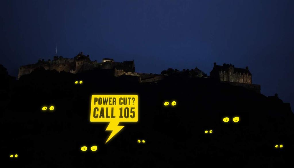
105 BRAND GUIDELINES Ensuring people aren t in the dark about their power cut.
|
|
|
- Claire Hill
- 6 years ago
- Views:
Transcription
1 105 BRAND GUIDELINES Ensuring people aren t in the dark about their power cut.
2 Contents 2 3 Brand strategy 7 Brand elements 17 Applying the elements 32 Partners best practice 4 Brand objectives 8 Logo 18 Logo sizing & positioning 33 Partner led communications 5 Brand essence diagram 10 Colour 19 Logo usage 39 Give-aways 6 Campaign delivery diagram 11 Limited space logo 20 Limited space usage best practice 12 Welsh logo 21 Logo positioning 41 PowerPoint 13 Typography 22 Logo colour usage 43 Give-aways 14 Tone of voice 23 Typography usage 44 Postcards 15 Support imagery 24 Support imagery usage 45 Projection stunt 26 Working with partners 46 Vehicle livery 47 signature 46 Contact & support
3 BRAND STRATEGY 3
4 Brand objectives 4 Communicate clearly that the 105 number is for power cuts. Ensure that people remember 105 in the event of a power cut.
5 Brand essence diagram The diagram has been created to help brief and give guidance for 105 communications. Reassure 5 PURPOSE Raise awareness Help Ensuring people know about 105 in the event of a power cut Communicate clearly that this is for power cuts CLARITY Is at the centre of everything we do Reliable Rational PERSONALITY Authoritative Straightforward Single minded Helpful
6 Campaign delivery diagram The CAMPAIGN diagram has DELIVERY been created to help brief and evaluate the 105 campaign. The 105 campaign should always start with a clear message and aim to achieve recall with the viewer. RECALL OBJECTIVE Ensuring people know about 105 in the event of a power cut 6 AUDIENCE Communicate & engage with all demographics BEHAVIOUR Get noticed / raise awareness PERSONALITY Single minded / straightforward / be distinctive CLARITY Is at the centre of everything we do
7 BRAND ELEMENTS 7
8 Logo The logo takes its inspiration from that moment when you are left in the dark. The 105 speech bubble gives us the answer. If you find yourself left in the dark during a power cut Call The speech bubble has been deliberately drawn to reference an electrical warning sign. The 105 logo has been created to communicate as quickly as possible. The message is deliberately short and to the point.
9 105 Logo There are two options for the 105 logo. Whenever possible use the full colour version Logo on black 105 Logo on white 105 Black & white logo Whenever possible the logo should be used on a black background. The black and white logo should only be used when colour is not an option or appropriate to the design treatment.
10 Colour Primary colour palette The brand colours for 105 have been selected to be as striking and eye catching as possible. Yellow and black signifies a power problem. Secondary colour palette The secondary colour palette helps support the primary. Black and white colour palette: The black and white logo should only be used when colour is not an option or appropriate to the design treatment. 10 Primary colour palette: Primary colour palette: 105 Yellow Pantone Yellow C CMYK 0, 10, 90, 0 RGB 255, 220, 0 HEX #ffdf00 Black CMYK 0, 0, 0, 100 RGB 0, 0, 0 HEX # Black CMYK 0, 0, 0, 100 RGB 0, 0, 0 HEX # White CMYK 0, 0, 0, 0 RGB 255, 255, 255 HEX #ffffff Secondary colour palette: Secondary colour palette: White CMYK 0, 0, 0, 0 RGB 255, 255, 255 HEX #ffffff Light Grey CMYK 0, 0, 0, 25 RGB 199, 200, 202 HEX #c7c8ca Light Grey CMYK 0, 0, 0, 25 RGB 199, 200, 202 HEX #c7c8ca Mid Grey CMYK 0, 0, 0, 55 RGB 138, 140, 142 HEX #8a8c8e Mid Grey CMYK 0, 0, 0, 55 RGB 138, 140, 142 HEX #8a8c8e Dark Grey CMYK 0, 0, 0, 85 RGB 77, 77, 79 HEX #4d4d4f Dark Grey CMYK 0, 0, 0, 85 RGB 77, 77, 79 HEX #4d4d4f
11 Limited space logo A limited space logo has been created for use when space is an issue. Use the primary logo whenever possible Primary logo 105 Limited space logo
12 Welsh language 105 logos Welsh language versions of the 105 logo have been created for the appropriate regions. 12
13 Typography Headline typeface The headline typeface has been selected to be as striking and eye catching as possible and to communicate clearly. Supporting typeface The supporting typeface helps support the headline. 13 Please note that the licences for Gotham bold, light and Knockout HTF69-fullliteweight will need to be purchased. Headline typeface 105 LIGHTS OUT ABCDEFGHIJKLMNOPQRSTUVWXYZ Supporting typefaces Gotham bold ABCDEFGHIJKLMNOPQRSTUVWXYZ abcdefghijklmnopqrstuvwxyz Gotham light ABCDEFGHIJKLMNOPQRSTUVWXYZ abcdefghijklmnopqrstuvwxyz When Gotham is not available use Arial Arial boldld ABCDEFGHIJKLMNOPQRSTUVWXYZ abcdefghijklmnopqrstuvwxyz Arial light ABCDEFGHIJKLMNOPQRSTUVWXYZ abcdefghijklmnopqrstuvwxyz
14 Tone of voice When creating copy for 105 remember that clarity of message is key. Anything that confuses or adds complication should be avoided. 105 copy should be: 14 CLEAR CONCISE STRAIGHTFORWARD SIMPLE
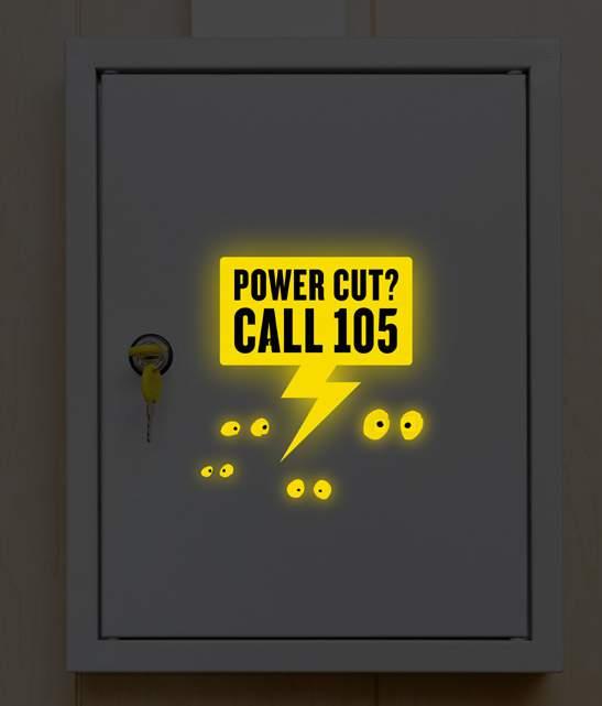
15 Support imagery The 105 eyes can be used to add warmth and humour to 105 communications. The eyes make light of that what s happening? moment! The eyes should only be used when humour and warmth are appropriate and not in more serious official communications. 15


16 Support imagery The following images have been selected to complement the 105 logo. Please match this style and colour when creating imagery for 105. This imagery style should only be used when using the eyes is not appropriate. Please note that these images have been taken from an image library and have not been purchased to date. 16
17 APPLYING THE ELEMENTS A guide to putting together 105 communications 17
18 Logo sizing & positioning Clearspace and minimum sizing 18 Clearspace We are proud of our logo, therefore it s vital that we always protect its visibility and presence. When using our logo please ensure no other elements infringe upon it. The clearspace around the logo should be the X height of the call 105 C. Minimum size To always ensure good legibility of our logo we have a minimum size restriction, seen below. 20mm x x x x
19 Logo usage examples 19 ANOTHER MESSAGE Don t use the lightning bubble for holding other messaging Don t distort the logo Don t rotate the logo


20 Limited space logo usage examples The applications below show the correct use of the limited space logo. 20 Using the 105 primary logo here would result in issues with clearspace. Limited space logo on signature Limited space logo on website Thank you for your , I will look into what was stated as work with you to resolve any issues it is that you may be having. Kind regards, John Lorem ipsum Operations Manager Address: Lorem ipsum dolor sit amet, consectetur adipiscing elit, sed do eiusmod. Loremipsum.co.uk Mobile: Website: For up to date information on power disruption visit:

21 Logo positioning examples 21 Our logo needs to communicate therefore it s vital that we always protect its visibility and presence. When using our logo please ensure no other elements infringe upon it or obstruct its clarity. Don t crop the logo Don t position the logo too close to the edge of communications See clearspace for more guidance Don t position the logo on top of crowded backgrounds
22 Logo colour usage examples 22 Don t change the logo s colour Don t adjust the logo s opacity Don t use white type on yellow Don t outline the logo The black and white version should only be used when colour is not an option The black and white version should only be used when colour is not an option
23 Typography usage examples 23 Don t use 105lightsout in lowercase Don t stretch the type lorem ipsum LOREM IPSUM lorem ipsum Don t rotate the type LOREM IPSUM lorem ipsum Don t squash the type LOREM IPSUM lorem ipsum Don t over space the type LOREM IPSUM lorem ipsum LOREM IPSUM lorem ipsum

24 Support imagery usage examples 24 Don t use different coloured eyes Don t use different eyes Give the logo space The logo should be bigger than the eyes Don t use too many eyes


25 Support imagery usage examples 25 Don t use photography that is not from the UK Don t use colours that clash with the logo Don t use black and white photography


26 Working with partners 26 To raise awareness of the 105 number, the logo must work with various partner brands. The energy networks are key partners for 105 and, as such, these guidelines focus on the use of 105 alongside their brand communications. The same guidance applies to other partner brands. The 105 logo can be used as part of a logo lock-up, seen apart from a partners logo or in isolation.


27 Working with partners Aligned right recommended lock-up sizing If both logos need to share an equal amount of importance and space, then the following is the recommended sizing guide: 27 The rectangle of the 105 logo should match the height of the network logo The type height of the 105 logo should match the height of the network logo
28 Working with partners Recommended lock-up spacing 28 When placing the 105 logo next to a network s logo it is important that both logos are given adequate space. Use the height of the 105 logo as a guide for the space between the logos. This gives us enough space to adhere to all of the networks clearspace exclusion areas.
29 Working with partners Aligned left recommended lock-up sizing If both logos need to share an equal amount of importance and space, then the following is the recommended sizing guide: 29 The rectangle of the 105 logo should match the height of the network logo The type height of the 105 logo should match the height of the network logo
30 Working with partners Recommended lock-up spacing 30 When placing the 105 logo next to a network logo it is important that both logos are given adequate space. Use the height of the 105 logo as a guide for the space between the logos. This gives us enough space to adhere to all of the networks clear space exclusion areas.
31 Working with partners Recommended lock-up positions 31 The 105 logo can be positioned either side of the network logo depending on the layout of the communication. If the network logo is ranged left on the communication then the 105 logo should sit to the right of it and vice versa. Lock-up position for a ranged left network logo Lock-up position for a ranged right network logo
32 32 WORKING WITH PARTNERS BEST PRACTICE A few examples of how the brand should come together

33 Working with partners Partner led communications 33


 Ltd.")


34 34 Working with partners Partner led communications St ap icke!! es rvices vices ks tworks works St ap icke for plic r an m atio d ins n ide a for plic rgummed Please detach along the perforated line, moisten edge, m ationd ins n ide fold and seal before posting. No stamp or envelope required. Please detach along the perforated line, moisten gummed edge, fold and seal before posting. No stamp or envelope required. Powercut? Contact us! Power cut Powercut? Contact us! Powering your home is our priority UK Power Networks Holdings Limited Registered office: Newington House, 237 Southwark Bridge Road, London SE1 6NP v5march2016 Registered number: registered in England and Wales UK Power Networks (Operations) Ltd. Registered in England and Wales. Registered No Registered Office: 237 Southwark Bridge Road, London, SE1 6NP v5march16 St ap icke for plic r an m ati d ins on ide orks (Operations) Ltd. Registered in England and Wales. Registered egistered Office: 237 Southwark Bridge Road, London, SE1 6NP! Please detach along the perforated line, moisten gummed edge, fold and seal before posting. No stamp or envelope required. Please detach along the perforated line, moisten gummed edge, fold and seal before posting. No stamp or envelope required. St ap icke for plic r an m ati d ins on ide! Powercut? Contact us! Powercut? Contact us!


35 Working with partners Partner led communications 35

36 Working with partners Partner led communications 36


37 Working with partners Partner led communications 37


38 Working with partners Partner led communications 38
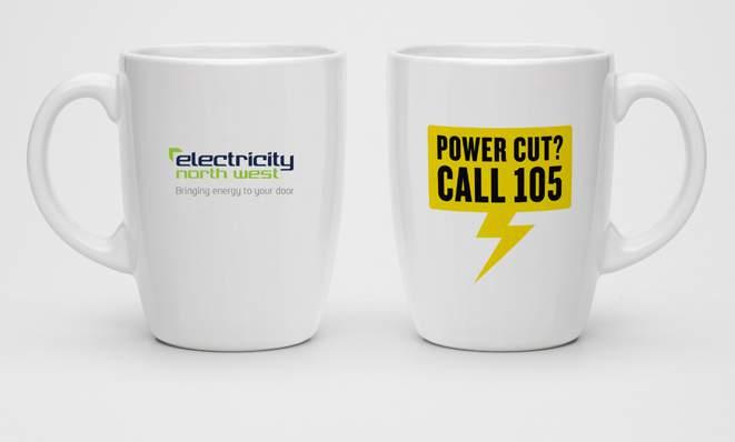
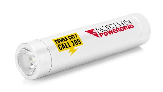
39 Co-branded give-away examples 39
40 COMMUNICATIONS BEST PRACTICE A few examples of how the brand should come together
41 PowerPoint 41


42 PowerPoint 42 Title page Contents page Primary copy page Secondary copy page Primary graphs and data page Secondary graphs and data page

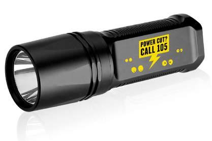
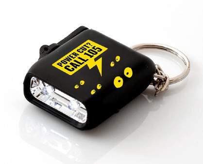
43 Give-away examples 43
44 Postcards 44 There s a new number to call if you have a power cut. Call 105.
45 Projection stunt 45

46 Vehicle livery logo option 105 logo with eyes
47 signature 47 Thank you for your , I will look into what was stated as work with you to resolve any issues it is that you may be having. Kind regards, John Currently there is planned disruption across some areas of the Devon & Cornwall which should be resolved shortly. No power-cuts are evident in other areas. But we will remain vigilant for any signs. Kind regards, John Lorem ipsum Operations Manager Address: Lorem ipsum dolor sit amet, consectetur adipiscing elit, sed do eiusmod. Loremipsum.co.uk Mobile: Website: Lorem ipsum Operations Manager Address: Lorem ipsum dolor sit amet, consectetur adipiscing elit, sed do eiusmod. Loremipsum.co.uk Mobile: Website: For up to date information on power disruption visit:
48 Contact & support 48 Please for any guideline related questions or issues.
Brand Guidelines 12 December 2014
 Brand Guidelines 12 December 2014 Our brand Introduction A distinctive new approach to the transport infrastructure of Edinburgh deserves a bold new look. A whole new brand platform has been developed
Co-branding with an Offering REGIONAL NAME
 Co-branding with an Offering REGIONAL NAME Overview The following section serves as a guide on how to apply co-branding and advertising to market the local destination or offerings of geographic regions
BASIC TEMPORARY GUIDELINES FOR LG-ERICSSON. Partly based on existing Ericsson CVI
 BASIC TEMPORARY GUIDELINES FOR LG-ERICSSON Partly based on existing Ericsson CVI The LG-Ericsson logotype 1/2 X Minimum clearspace X 1/2 X 1. PMS LG Red (PMS 27 C) White LG Grey (PMS 431 C) Ericsson Blue
Branding guidelines - V /08/23 - Company confi dential - Internal use only
 Branding guidelines - V 1.0 2012/08/23 - Company confi dential - Internal use only The following visual identity guidelines are designed to achieve the highest level of consistency throughout communications
1 AoC BRAND GUIDELINES. Brand Guidelines This is what we look like
 1 AoC BRAND GUIDELINES Brand Guidelines This is what we look like 2 AoC BRAND GUIDELINES Contents 3 Who we are 4 Our audience 5 Our mission 6 Our values 7 Our logo 17 Our fonts 21 Our colours 25 Our imagery
Using the logo. About the logo. Elements. The seal. The logotype. Third party logo use
 Style guide 218 Using the logo About the logo Jimmy is at the heart of everything we do as a charity and this is reflected by his name being at the foundation of our actions. The various elements of the
00 Table of Contents
 BRAND GUIDE 2018 00 Table of Contents Contents 01 Hello 4 Welcome to Index Exchange 5 02 Making Our Mark 6 Our Logo 7 Let it Breathe 8 Our R Is Never Silent 9 Logo Color Variations 10 The Squares Are Social
Visual Style Guide. April 2016
 Visual Style Guide April 2016 Contents Introduction to the Logo 3 Safe Area and Size 4 Incorrect Usage 5 Color Palette 6 Other Brand Elelments 7 Typography 8 Tone and Style of Photography 9 Print Examples
APPLICATION MANUAL A guide on how to visually communicate MIPS
 APPLICATION MANUAL A guide on how to visually communicate MIPS BACKGROUND, PURPOSE AND GOAL MIPS VISUAL IDENTITY By 2017, we have been working to develop an updated brand platform that, in turn, has led
Ableton Live Set Export Integration Guidelines 1.1
 Ableton Live Set Export Integration Guidelines 1.1 Ableton Live Set Export 1.2 Add Ableton Live Set Export to your application 4 Text label in action sheet Promote Ableton Live Set Export 6 Ableton Live
This guide should be read by anyone involved in creating communications for One You.
 This guide should be read by anyone involved in creating communications for One You. It explains the thinking behind our look and how easy it is to execute. Please take the time to read the following pages.
CLUB LOGO GUIDELINES
 CLUB LOGO GUIDELINES LOGO DETAIL The Surfrider Foundation logo is the key building block of our identity. It is the primary visual element that people can associate with our work and our brand. The logo
Postgraduate 2016/17 Campaign Guide
 Postgraduate 2016/17 Campaign Guide CONTENTS Messaging Postgraduate motivations 4 How to use the messaging 5 Copy composition 6 Campaign visual style The REDEFINE badge 8 Colour palette 9 Typography 10
GRAPHIC STANDARDS & STYLEGUIDE
 GRAPHIC STANDARDS & STYLEGUIDE MARCH 2016 GRAPHIC STANDARDS & STYLEGUIDE 1 Table of Contents Our Logo Logo Formats Logo Clearspace & Usage What Not To Do Typography Color Palette Photography 3 4 5 6 7
BRAND GUIDELINES. v 1.40 June 2017 Logo Best Practices & Guidelines Print & Web
 BRAND GUIDELINES v 1.40 June 2017 Logo Best Practices & Guidelines Print & Web TABLE OF CONTENTS 02 03 04 05 06 07 08 09 10 11 12 Concept & Messaging Orientation The Mark Color Systems Color Reference
Brand Guidelines January 2016
 Brand Guidelines January 2016 Contents Brand Assets Logos Lock Up Brand Properties Brand Assets 04 Grow Wild, Kew & The Big Lottery Logos Lock Up 11 Brand Property: Scattered Seeds 22 Grow Wild Logo 05
South San Antonio Independent School District. Brand Style Guide
 South San Antonio Independent School District Brand Style Guide Table of Contents Introduction... 3 Primary & Secondary Colors... 4 Fonts & Typography... 5 Logos: The Seal & State... 6 Logo Does & Don
Brand Identity & Design Standards
 Brand Identity & Design Standards Copyright 2014 by the Tahoe Truckee Community Foundation All rights reserved Originally developed for use by the Tahoe Truckee Community Foundation December 2014 Information
ECMC Brand Guidelines November 2017 Home Contents Logo Colours Typeface Tone of voice Graphics Photography Examples Contact. Brand guidelines.
 Page 1 Brand guidelines. Page 2 Introduction. Our logo Introduction 03 Centre Specific 04 Sizes and Safe areas 05 Funder lock-up 06 Do s & dont s 07 The ECMC network brings together the talent and the
BRAND STYLE GUIDE External 07/ 2011
 BRAND STYLE GUIDE External 07/ 2011 TABLE OF CONTENTS understanding the brand 01 What is a brand? 01 Why are guidelines needed? 01 Who should use these guidelines? 01 How should they be used? 01 Brand
FOREST INDUSTRY SAFETY ACCORD BRAND IDENTITY
 BRAND GUIDELINES BRAND GUIDELINES BRAND IDENTITY The Forest Industry Safety Accord Master Brand Identity shown here should be used in accordance with these guidelines. The branding has been created to
Brand Guidelines v1.0
 Brand Guidelines 2019 v1.0 Overview Ticketek is New Zealand's gateway to the live entertainment experience. Using innovative technology, we ve become New Zealand's leading platform for connecting millions
CONTENTS LOOK AND FEEL TELLING OUR STORY 15 COLOR 16 IMAGERY STYLE 17 IMAGERY CONTENT 20 TYPOGRAPHY 23 COMPOSITION 25
 IDENTITY GUIDELINES The IALD identity guidelines introduce and define the visual elements we use to create the new IALD brand; our signature, color, imagery, typography and composition. The following layout
columbusindiana Brand Graphics Information and Standards Guide
 columbusindiana Brand Graphics Information and Standards Guide August 2007 Introduction 1 A product is made in a factory. A brand is made in the mind. Walter Landor A well-respected brand can be our most
We are diligent in keeping the Truck-Lite brand clean and standardized. We created these guidelines to ensure that all parties use our brand elements
 We are diligent in keeping the Truck-Lite brand clean and standardized. We created these guidelines to ensure that all parties use our brand elements consistently. Contents 2, 3 4, 5 6, 7 8, 9 10 15 10,
The ExCeL logo. ExCeL London brand guidelines V2
 10 The ExCeL logo 11 ExCeL logo ExCeL London and The ADNEC GROUP tab have been given more space to breathe, they are now separate elements that work together. This gives the structure of the organisation
Branding principles Version 1 July 2016
 Branding principles Version 1 July 2016 Introduction The spirit of all Silent Pool Gin graphic executions should stem from the idea of Romantic Botany. This is the guiding principle behind everything that
CONTENTS. Introduction 04. Primary Logo 07. Clear Space & Size Requirements 08. Alternate Logo Usage 09. Logomark Usage 1 3.
 CONTENTS Introduction 04 Primary Logo 07 Clear Space & Size Requirements 08 Alternate Logo Usage 09 Logomark Usage 1 3 Usage Dos 14 Usage Don ts 15 Colors 16 Typography 17 Photography Guidelines 18 Tone
DentalOrganiser.com. Brand Guidelines. John Kavanagh Brand Manager +DentalOrganiserGDS
 DentalOrganiser.com @drpmoore Brand Guidelines +DentalOrganiserGDS John Kavanagh Brand Manager +353.87.9670803 john@dentalorganiser.com Gate Dental Services Ltd. Garyngarry, Rosscahill, Go. Galway, Ireland.
Roll Back Malaria Partnership. Brand Guidelines
 Roll Back Malaria Partnership Brand Guidelines How to use these guidelines Our identity is not just a logo. It is a design scheme composed of a number of core elements that come together to create a distinctive
Brand Guidebook RackN Brand Guidebook
 Brand Guidebook 10.17 1 RackN Brand Guidebook www.rackn.com Table of Contents Logo Use Logo/Lockup............................. 1 Improper Logo Usage........................ 2 Required Clear Space........................
TABLE OF INTRODUCTION
 ASSET GUIDE 1.2 TABLE OF CONTENTS 01 INTRODUCTION.................................... 3 02 LOGO............................................ 5 03 EDITORIAL STYLING.................................. 11 04
L O G O G U I D E L I N E S
 LOGO GUIDELINES To ensure consistency in Arcoaire brand communications, the Elite Dealer crest can only be used in accordance with the specifications listed in the following pages. 1 Logo Elements Crest
logo construction english
 graphic Standards versions construction english construction french 7 colours - cmyk c: 26 / M: 36 / Y: 0 / K: 0 c: 25 / M: 44 / Y: 94 / K: 0 c: 0 / M: 12 / Y: 94 / K: 0 c: 54 / M: 12 / Y: 95 / K: 0 c:
Table of Contents. 1st Source Guidelines. Overview Brand Definition st Source Brand Elements
 Table of Contents Overview......................... 1 Brand Definition..................... 2 1st Source Brand Elements............. 3 12 1st Source Elite Brand Elements..........13 21 Font...........................
UNIVERSITY OF MANITOBA VISUAL IDENTITY GUIDE. May 24, 2013
 UNIVERSITY OF MANITOBA VISUAL IDENTITY GUIDE May 24, 2013 TABLE OF CONTENTS Signature 5 Colour 25 Typography 28 Photography 31 Bringing it all together: The University of Manitoba brand 35 Templates 53
LINKED LEARNING IDENTITY GUIDELINES V
 This style guide provides important information about using brand in a consistent manner Use this guide if you are a school or partner who wants to use brand If you are working with a professional designer,
VISUAL IDENTITY GUIDELINES
 VISUAL IDENTITY GUIDELINES TABLE OF CONTENTS INTRODUCTION Using the Guidelines 1 LOGOS The Principia Seal School Wordmark School Shield Athletics Mark Athletics Branding 2 3 4 5 6 7 SOCIAL MEDIA Social
Corporate Style Guide
 Corporate Style Guide Contents Our Brand Identity 1 The Elements 2 Colours 3 Typefaces 8 Unacceptable Applications 11 corporate style guide Our Brand Identity The Iluka brand identity represents the purpose
CHECK POINT IDENTITY GUIDELINES. Version 1
 CHECK POINT IDENTITY GUIDELINES Version 1 Contents 3 Manifesto 4 Logo 9 Colors 10 Typography 11 Photography 17 Design System 18 Design System Usage 19 Design Examples 22 Contact WE SECURE THE FUTURE The
Brand identity toolkit
 Our visual identity Brand identity toolkit Typography Photography Lyon Display Medium ABCDEFGHIJKLMNOPQRSTUVWXYZ abcdefghijklmnopqrstuvwxyz 0123456789 Akkurat Regular ABCDEFGHIJKLMNOPQRSTUVWXYZ abcdefghijklmnopqrstuvwxyz
IDENTITY GUIDELINES AND GRAPHIC STANDARDS MANUAL SPRING 2017
 IDENTITY GUIDELINES AND GRAPHIC STANDARDS MANUAL SPRING 2017 THE IMPORTANCE OF GRAPHIC STANDARDS The United Mail logo is our unique graphic signature. It is one of the most visible aspects of the company
MIDDLE GEORGIA STATE UNIVERSITY - GRAPHIC STANDARDS, USAGE AND STYLE GUIDE
 MIDDLE GEORGIA STATE UNIVERSITY - GRAPHIC STANDARDS, USAGE AND STYLE GUIDE TABLE OF CONTENTS: 30. CHAPTER THREE: ATHLETIC IDENTITY 31. Primary Logo: Athletics 32. Alternate Primary Logo: Athletics Primary
L O G O G U I D E L I N E S
 LOGO GUIDELINES To ensure consistency in Comfortmaker brand communications, the Elite Dealer crest can only be used in accordance with the specifications listed in the following pages. 1 Logo Elements
THE VAN WERT COUNTY FOUNDATION BRAND STANDARDS
 THE VAN WERT COUNTY FOUNDATION BRAND STANDARDS 1.0 OVERVIEW As, The Van Wert County Foundation, our brand voice is a vehicle for the philanthropy of individuals, corporations and organizations that have
ATHLETIC BRAND STANDARDS GUIDE
 ATHLETIC BRAND STANDARDS GUIDE THE IMPORTANCE OF GRAPHIC STANDARDS TABLE OF CONTENTS The Importance Of Graphic Standards...1 Official Colors...2 Athletics Logos...3 Primary Athletics Mark...4 Use On Color
Maxis brand guide. Print guidelines. Version 1.0
 Maxis brand guide Print guidelines Version 1.0 Core elements Colours Colour palette - print Squiggle exists only in one colour. Maxis Shock Green. This is the primary, go-to colour and should be the most
UNITED WAY BRANDMARK. Brandmark Usage. The most fundamental visual element of a brand identity is its brandmark.
 OUR BRANDMARK 13 UNITED WAY BRANDMARK Brandmark Usage The most fundamental visual element of a brand identity is its brandmark. The evolution of our brandmark is most dramatic in its configuration. The
Shepard Fairey. Museum Poster & Information Card. Ashley Jordan Spring 2016
 Shepard Fairey Museum Poster & Information Card Ashley Jordan Spring 2016 Project Brief Using a grid based design and layout, the goal for this image based poster is to announce an exhibition of work by
Our guide to consistency.
 Our guide to consistency. Welcome to our branding guidelines. Nothing too rigid, but enough to help lay the foundations for what we build. www.rocketmill.co.uk We are the premium local digital team. We
BRAND GUIDELINES 2017
 BRAND GUIDELINES 2017 Working with Agtivation CONTENTS 01 - BRAND PLATFORM 03 - VISUAL SYSTEM Purpose Vision Brand Archetype Brand Platform Color Palette Primary Typography Secondary Typography Overview
LOGO USAGE JANUARY 2010 VERSION 2.0 BRAND IDENTITY GUIDELINES 6
 LOGO USAGE 6 Elements Arc Arc The Aviat Networks intersecting arcs represent our technology, guiding presence, vision for the future, and wireless network connections. Logotype Logotype The logotype for
GUIDELINES & INFORMATION
 GUIDELINES & INFORMATION This document will provide basic guidelines for the use of the World Animal Day logo and general knowledge about the various file formats provided. Adhering to these guidelines
Applying Grants for Start-ups and Acquisitions. Sam Minde, MBA President and CEO Neyaskweyahk Group of Companies Inc.
 Applying Grants for Start-ups and Acquisitions Sam Minde, MBA President and CEO Neyaskweyahk Group of Companies Inc. Tansi! Sam Minde President and CEO at Neyaskweyahk Group of Companies Inc. 2 Framework
Be Your Best Expect the Best Succeed Together
 Be Your Best Expect the Best Succeed Together Be your Best, Expect the Best, Succeed Together Be Your Best Expect the Best Succeed Together Safer Internet Day Assembly 29th January 2018 To keep safe on
Formats. Signature
 Signature Formats 03 Illustrated below are the only approved corporate signature formats for internal and external applications. To ensure our legal protection and to promote proper use, the symbol or
L O G O G U I D E L I N E S
 LOGO GUIDELINES To ensure consistency in KeepRite brand communications, the Elite Dealer crest can only be used in accordance with the specifications listed in the following pages. 1 Logo Elements Crest
MHS GENESIS Brand Style Guide Version 13.0
 MHS GENESIS is a registered trademark of the Department of Defense, Defense Health Agency. All rights reserved. MHS GENESIS Brand Style Guide Version 13.0 MHS GENESIS Brand Style Guide Table of Contents
Piece by Piece logo 2. Piece by Piece and Sean Kenney 3. The single-color logo 5. Logo clear space 6. Logo size 7.
 This document outlines how to use the Piece by Piece brand and the LEGO brand in your promotional content. If you use the Piece by Piece logo or write LEGO, send us your designs for review prior to publishing
Brand Guidelines Version 3.1
 Brand Guidelines Version 3.1 Our Mission At Checkout 51 our mission is to help millions of families save money, and use their purchase data to revolutionize marketing. We partner with the world s leading
ERO. Federal Credit Union. Brand Guidelines
 Brand Guidelines Brand Guidelines Our Visual Identity Section 1 Introduction Content Section 2 Our Visual Identity Logo Sizes Color Guide Color Process/Usage Logo Format Usage on Pictures Use on Background
Identity Guidelines 02 Signature. 03 Clear Zone and Sizing 04 Trademark 05 Configurations 06 Restrictions 07 Color Palette 08 Acceptable Usage
 Identity Guidelines 02 Signature 03 Clear Zone and Sizing 04 Trademark 05 Configurations 06 Restrictions 07 Color Palette 08 Acceptable Usage Signature The term signature commonly refers to a basic configuration
Australian Dragon Boat Federation Corporate Style Guide. Australian Dragon Boat Federation Style Guide
 Australian Dragon Boat Federation Corporate Style Guide Australian Dragon Boat Federation Style Guide 1 Contents Introduction 3 Objective 4 NATIONAL LOGO 5 Australian Dragon Boat Federation Logo 6 Australian
Table of contents. Bursts BRAND art Headlines... 6
 STYLE GUIDE UPDATED FEBRUARY 27, 2015 Table of contents CAMPAIGN art Photographic... 1 Bursts.... 2 Campaign Art Photographic Examples.... 3 BRAND art.... 4 BRAND ART Examples.... 5 Headlines.... 6 Logos...
CEVA Brand Identity Basics
 The logo and other CEVA intellectual property contained in these guidelines are protected by national and international laws and conventions on trademark and copyright. All reproduction, full or partial,
CONTENTS S1 : CORPORATE MARQUE S2 : CORPORATE TYPEFACE S3 : STATIONERY S4 : COVER DESIGNS S5 : APPLICATIONS
 CONTENTS S1 : CORPORATE MARQUE PRIME MARQUE 4 CORPORATE COLOURS 6 PRIME MARQUE DIMENSIONS 8 EXCLUSION ZONE 10 PRIME MARQUE VARIANTS 12 PROMOTIONAL VARIANTS 14 NON PERMITTED VARIANTS 16 S2 : CORPORATE TYPEFACE
Logo Usage Guidelines
 Logo Usage Guidelines Index Introduction... 03 ICM 2018... 04 Signature Logos... 05 - Basic standards... 06 - Minimum size and buffer space... 08 - Application on backgrounds... 09 - Chromatic variations...
middle georgia knights - official brand identity usage and style guide
 middle georgia knights - official brand identity usage and style guide table of contents: 1. Primary Logo - Full Color and One Color 2. Alternate Primary Logo - Full Color and One Color 3. Alternate Primary
INTRODUCTION OUR VISION: We are driven to be a preeminent college of pharmacy in the world. Our world begins in Iowa. OUR MISSION:
 BRAND GUIDE INTRODUCTION TABLE OF CONTENTS BRAND MESSAGING Introduction.... 1 Core Brand Values... 2 BRAND IDENTITY Logo Usage.... 6 Primary Logo Variations.... 7 Department & Division Logos.... 8 What
C&L WARD BRAND GUIDE 1
 CONTENTS 2 The Logo 3 Formats 4 Correct Usage 5 Incorrect Usage 6 Alternate Logos 7 The Tagline 8 Color Palette 9 Fonts 10 Complimentary Fonts 11 Photography Styles 12 Photography to Avoid C&L WARD BRAND
DRAFT UNIVERSITY OF ARKANSAS AT PINE BLUFF. Athletic Brand Identity Guidelines
 DRAFT UNIVERSITY OF ARKANSAS AT PINE BLUFF Athletic Brand Identity Guidelines August 2014 TABLE OF CONTENTS 4 6 9 13 16 19 27 32 34 37 Introduction Primary Athletic Identity Marks Secondary Athletic Identity
Branding Guidelines York Branding Guide September 2011
 Branding Guidelines COLOR 1-Color Printing: The logo prints in all black ink. 100% Black 2-Color Printing: The logo prints either in all black, or in 2 colors: Pantone 032 and black. On a black or dark
Basic guideline Corporate signature & spirits
 Corporate signature & spirits Edgecore s corporate signature consists of the English name of the company, which derives from the concept that There is no edge limit, there is no permanent core and expresses
Green Globes, GPC + Green Building Initiative GRAPHIC STANDARDS GUIDE
 Green Globes, GPC + Green Building Initiative GRAPHIC STANDARDS GUIDE Last Updated: December 29, 2014 WWW.THEGBI.ORG 503.274.0448 info@thegbi.org page 2 CONTENTS 1.0 Introduction 3 1.1 Our Mission 3 1.2
UNITED WAY MARCH 15, 2012
 UNITED WAY BRAND IDentity SYSTEM 2012 update MARCH 15, 2012 contents identity elements 125TH ANNIVERSARY Hierarchy and purpose 2 identity elements TWO EFFECTIVE BRANDS LIVE UNITED/united way lock-up LIVE
B R A N D G U I D E L I N E S
 B R A N D G U I D E L I N E S V.1.0 LAST UPDATED MARCH 30, 2017 COLOR & IMAGERY GUIDELINES FOR COLOR Color is a powerful tool that has the ability to powerfully shape the emotions of the viewer. Judicious
ACADEMIC STYLE GUIDE Last updated October 2018
 ACADEMIC STYLE GUIDE Last updated October 2018 Join us in taking pride in our brand. Our University s brand is its identity. It is what people think of and feel when they hear our name. It differentiates
SMFA at Tufts Brand Guidelines
 APRIL 20, 2018 SMFA AT TUFTS SMFA at Tufts Brand Guidelines PRESENTED BY STUDIO MERCURY A powerful and memorable brand is built with great design and consistent application. Through the repetition of its
Graphic Design Standards
 Graphic Design Standards CONTENTS 3 4 4 5 6 7 8 9 10 11 12 INTRODUCTION COLOR VALUES FONTS LOGO ARRANGEMENTS & GUIDELINES PROPER USAGE IMPROPER USAGE STAGING MINIMUM SIZE BUSINESS CARD APPAREL LINKS TO
BU3 Beijing 2008/Johnson & Johnson (English & Chinese)
") BU3 Worldwide Partner & Worldwide Olympic Partner Identity Guidelines 06/07/06 i. Overview Worldwide Partner & Worldwide Olympic Partner Table of contents Overview i. Table of contents ii. Using these
BU3 Worldwide Partner & Worldwide Olympic Partner Identity Guidelines 06/07/06 i. Overview Worldwide Partner & Worldwide Olympic Partner Table of contents Overview i. Table of contents ii. Using these
The Picture of Health. Brand Style Guide
 The Picture of Health Brand Style Guide This is the guide to the basic elements of the Revere Health identity. Have a read and learn the do s and dont s of our brand. 01 Mission and Core Values 03 Logo
graphic standards guide DATE 8.11 v1.0
 graphic standards guide DATE 8.11 v1.0 TABLE OF CONTENTS 2 Introduction 3 Primary Logo 4 Logotype 6 Type Treatment 7 Bison Head 8 Monogram Logo 9 Logo Overview 10 Color Palette 11 Colored Backgrounds 12
Brand Basic Elements Creative Services Department - August 2009
 Brand Basic Elements Creative Services Department - August 2009 Corporate Signature Primary Corporate Signature The corporate signature is the major visual element of the brand identity and comprises the
BRAND GUIDELINES 2015
 BRAND GUIDELINES 2015 FIRST EDITION November 6, 2015 CLEAR, CONSISE & CONSISTENT BAW Architecture s brand is often the first thing about us that people experience. Our brand gives the world their first
CAMPAIGN PLAYBOOK 2017
 CAMPAIGN PLAYBOOK 2017 BRANDING ETHOS The following campaign guidelines are inspired by a fundamental design principle: balance. This playbook and its suggested visual language, reflect this premise throughout
CREATIVE GUIDE CONTENTS POSITIONING PERSONALITY LOGOS IMAGERY DESIGN MOTION/TOOLKIT EXTENSIONS CREATIVE GUIDE
 CONTENTS POSITIONING 3 PERSONALITY 4 LOGOS 5 IMAGERY 6 DESIGN 8 MOTION/TOOLKIT 12 EXTENSIONS 18 2 POSITIONING Our brands are an integral part of people s lives. Our fans are inspired by our content and
contents brand promise 1 logo 3 color 6 typography 10 voice 12 photography 14 layout 17
 brand guidelines contents Introduction Brand Assets brand promise 1 logo 3 color 6 typography 10 voice 12 photography 14 layout 17 Our brand connects the community to the heart of what we stand for. The
STYLE GUIDE JUNE 2018
 STYLE GUIDE JUNE 2018 Contents June 2018 ii 1 INTRODUCTION 3 4 6 7 GRAPHIC ELEMENTS Typography Color Palette Identity and Tag Line 8 PHOTOGRAPHY 13 14 17 LAYOUT EXECUTION Execution Guides Identifying Your
BRAND IDENTITY QUICK REFERENCE GUIDE
 BRAND IDENTITY QUICK REFERENCE GUIDE Intro Intro TAHOE Boats has developed this Brand Identity Guide for you our associates, dealers and vendors. It is designed to guide you in the proper use of our company
UBC Logos: Quick Guide
 primary logo UBC Full Signature The UBC Full Signature is the primary logo to be used on all applications. Please ensure that the signature is reproduced at a legible size. In instances where the space
Atlanta Department of Parks and Recreation Visual Identity Guide
 Atlanta Department of Parks and Recreation Visual Identity Guide Assets iparcs Logo The primary iparcs logo should be on the vast majority of deliverables. Some internal materials may not need it. The
UCCS Apparel. UCCS Brand Identity Standards Appendix IV: Apparel
 UCCS Apparel UCCS Brand Identity Standards Appendix IV: Apparel UCCS apparel is divided into two categories: official apparel and promotional apparel. Official Apparel Official apparel is apparel that
JILLIAN DUMA BRAND STYLE GUIDE
 JILLIAN DUMA BRAND STYLE GUIDE 01 LOGO 02 IMAGING & PHOTOGRAPHY 05 COLORS 05 TYPOGRAPHY LOGO The logo contains capital letters J and D in the Bodoni font that have been uniquely placed to form an abstract
MITCHELL COLLEGE MITCHELL COLLEGE VISUAL STANDARDS. Visual Identity Standards
 1 MITCHELL COLLEGE Visual Identity Standards 2 TABLE OF CONTENTS PURPOSE, BACKGROUND, ELEMENTS...4 3 HOW TO USE THE MITCHELL COLLEGE LOGO...5 SIZE and SPACING...6 MITCHELL COLLEGE COLOR USAGE...7 OFFICIAL
Identity Guidelines VER 1.6
 Identity Guidelines VER 1.6 hortonworks.com 2018 Hortonworks Table Of Contents INTRODUCTION VISUAL IDENTITY Welcome to the Future of Data... 3 Brand Manifesto... 4 Brand Pillars... 5 Messaging Brand Messaging...
Revised Graphic Standards Guidelines
 Revised 9.17 Graphic Standards Guidelines Building a New Brand Identity 1 Why We Value Our Brand Identity Our brand identity distinguishes us as an institution. It is a promise of the kind of experience
TABLE OF CONTENTS. 1 - AGORA logo Security Area & Minimum Size Dont s AGORA colours. 3 - AGORA typography
 Graphic Charter TABLE OF CONTENTS 1 - AGORA logo Security Area & Minimum Size Dont s 2 - AGORA colours 3 - AGORA typography 4 - AGORA graphic elements Banner Pictos Maps 5 - AGORA photographic style 6
Created October Brand Guidelines Version 1.1 IR EVENTS
 Created October 2016 Brand Guidelines Version 1.1 IR EVENTS CONTENTS 03 INTRODUCTION BRAND STRATEGY FOR IR EVENTS AND SUB-EVENTS 04 IR EVENTS ARCHITECTURE EVENT 05 LOGO TYPES 07 COLOURS THEME AND BRAND
/ (Excluding advertising) Header-positioned gradient bands / Headline placement/ Headline placement
 Header-positioned gradient bands / Headline placement/ Headline placement") Booth Guidelines contents 1 Total Sign / Composition / Clear Space and Minimum Size / Monochrome and Negative Space Versions / Incorrect Usage / Construction Methods / Reverse Cut-Out Illuminated / Reverse
Booth Guidelines contents 1 Total Sign / Composition / Clear Space and Minimum Size / Monochrome and Negative Space Versions / Incorrect Usage / Construction Methods / Reverse Cut-Out Illuminated / Reverse
Brand Identity System Interim Guidelines 12/2011
 Brand Identity System Interim Guidelines 12/2011 Table of Contents Introduction 2 The jcp Flag 3 The Brand Identity Components 4 About the jcp Flag 5 Using the jcp Flag Three Size Versions 6 Using the