This guide should be read by anyone involved in creating communications for One You.
|
|
|
- Clifton Ball
- 5 years ago
- Views:
Transcription
1
2 This guide should be read by anyone involved in creating communications for One You. It explains the thinking behind our look and how easy it is to execute. Please take the time to read the following pages.
3 The context Our approach Our view Why One You? Writing our name Logo Logo proportions Tagline Clear space Colour palette Typography The underline Our language How to speak We ask questions We focus on the positive Tips for writing Our principles Our image bank Our grid Our typestyle Our logo size How it works Reproduction of materials
4
5 Without knowing it, by the time we reach our 40s and 50s many of us will have dramatically increased our chances of becoming ill later in life. Whether we are eating the wrong things, drinking more than we should, continuing to smoke despite everything we know, or just not being active enough, all of these small things can add up to an unhealthy you. Making better choices today can have a huge influence on our health, and could prevent conditions like type 2 diabetes, cancer and heart disease, and reduce our risk of suffering a stroke or living with dementia, disability and frailty in later life. But it s not easy in our busy lives tempting treats in easy reach, bigger portions for everything we eat and technology that allows us to shop, stay in touch and be entertained without ever having to leave the sofa. Modern life is ganging up on us. The good news is we can fight back. One You can help you get back to a healthier you, and support you to make simple changes towards a longer and happier life. One You will provide tools, motivational support and encouragement every step of the way, to help improve your health right away. You are not alone we have the tools and personalised support to help you make small changes yourself, or with friends and family. Search One You now. 5
6 Whether that s help to lose weight by eating better, or help on how to stop smoking, or how to cut down on drinking or where and how to get active again, One You gives people the chance to reappraise their lifestyle choices, put themselves first and do something about their own health before it s too late. One You will help adults to move more, eat well, drink less, be smoke free, stress less and sleep better. One You will provide tools, motivational support and encouragement every step of the way. 6
7 Optimism, getting involved, being down-to-earth, trying, being enthusiastic, offering encouragement and lending support, having fun, dishing out a bit of tough love, being on your side, empowering, enabling and rewarding people when they make positive changes to their lifestyle. Finger-wagging, being exclusive, difficult or out of reach, being pessimistic, hopeless or fatalistic, excuses, and talking down to people. 7
8
9 Why? We are all totally unique. We only have one life and our health has a profound effect on its quality and our level of happiness. It s down to YOU to look after you. 9
10 How to write One You. 10 One You ONE YOU Always refer to our brand as it is written here, One You or ONE YOU. When written as text within a sentence, use a capital O, a capital Y and write the rest in lowercase. Never write our name in allcapitals, unless it is used in a headline. Never abbreviate the One with the number 1. Please remember to use a space between One and You. 1 You OneYou ONEYOU one you One U 1 U
11 There are several basic elements that make up the One You brand. We ll take you through them over the next few pages.
12 This is our logo. It has been specially created and is unique to One You. To ensure clear communication, here are several guidelines to observe. And don t forget, always use master digital artwork, never try to recreate the logo yourself. 12
13 We have two logos. The version that you choose is dependent on the format that you are applying the logotype to. Landscape logo For use in landscape and large portrait formats. This logo is used to sign off a message as it s easier to read. Portrait logo For use in formats that are tight vertically. It also sits nicely in square profile pictures like Twitter and Facebook. Just a reminder, always use master digital artwork, never try to recreate the logo yourself. Landscape logo Portrait logo 13
14 To maximise the impact of our logo, ensure that no other elements appear too close to it. The area is defined by using the height of the O. A margin of clear space is drawn around the logo to create the invisible boundary which marks the area of isolation. No other graphic element may encroach on this clear zone. Landscape logo Portrait logo 14
15 This is our tagline. To help reinforce our new positioning it will appear on almost every piece of communication. This has been created to match our logo, so where possible, use master digital artwork. Never try and recreate the tagline artwork yourself. Note: the application of the tagline is shown on the following pages. 15
16 The teal and yellow colour is one of the most recognisable elements of the One You brand. The correct usage of colour enables One You to create a strong connection between the various messages. Teal is the modern colour of health. Yellow is the voice of optimism. 16
17 So how does the colour palette work? The dominant colour is teal with accents in yellow, white and grey. Here are the correct colour values for print (CMYK) screen (RGB) and online (HEX). 17
18 We have one logotype. There are five colour variations. The version that you choose is dependent on the background that you are applying the logotype to. 1. Single colour Yellow 2. Two colour Yellow & White 3. Single colour Reverse (white) 4. Single colour Black 5. Single colour Dark Grey Single colour If you are restricted to a single colour, then use black and white. It s good. It s strong. Colour and backgrounds There are two main versions of the logo for light and dark backgrounds. If the logo is placed on a light background, use the black or grey version. If the logo is on a dark background, use the yellow or white version. Single colour (Yellow) Single colour reverse (Yellow) Single colour (Dark grey) Two colour This logo is used when it sits alone, away from headlines. For example on TV end frames. Two colour This logo is used when it sits alone, away from headlines (i.e. On TV). Single colour reverse (white) Single colour (black) 18
19 It s clear, it s flexible and it s ours. 19
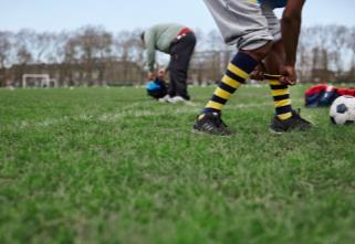
20 The line highlights the positive and the action. When using text on a solid teal background please underline in yellow. When text is placed on an image please underline in white. 20
21 The One You Bold and Script typefaces should be used for headlines, bold statements and other text that needs to jump off the page. Think of it as a shout in the reader s ear. ONE YOU is a custom designed typeface and made available to anyone producing communications for the brand. It s highly legible, works well at all sizes and across different media. Sourcing fonts: The ONE YOU font family is available for both PC and Apple platforms. Please contact the manager of the brand to see if you have permission to use the font. 21
22 The Helvetica typeface should be used for body copy. When typesetting body copy, please use 12pt and above. When Helvetica is not available use Arial, it s compatible with most media and available to everyone. Sourcing fonts: The Arial font family is installed on all PC and Apple platforms. Helvetica Bold light Abcdefghijklmnopqrstuvwxyz Abcdefghijklmnopqrstuvwxyz Arial Bold Abcdefghijklmnopqrstuvwxyz Abcdefghijklmnopqrstuvwxyz
23 The words we choose help to define our character. The tone of One You will essentially depend on the particular need of the message being expressed. However, there are some broad, all-encompassing points that should be observed to reflect our brand.
24 One You is committed to getting you to live healthily, and like a determined friend who has your best interests at heart, it won t give up until you do. It always looks on the bright side and is positive and optimistic. One You talks with insight, understanding and empathy, but it doesn t beat about the bush. When it needs to get serious, One You does not shy away from offering a little tough love. One You uses real, down-to-earth, everyday language. Ultimately, One You is your ally in life. It will say what it takes to motivate, encourage and support you to make the changes that will make all the difference to you. 24
25 One You will get you thinking about the difficult subjects that you often choose to ignore and shy away from. Whether that s quitting smoking, or taking the first steps toward getting more active. One You is a brand that asks a question and provokes a response. 25
26 This section demonstrates how imagery can be used to bring One You and the ideas behind it to life. Here are some principles to apply when using imagery for One You. 26
27 There are some key points to take into consideration when selecting, commissioning and using photography. When used, imagery always appears from the point of view of the individual, putting them into the picture and allowing them to identify with the message. We allow people to put themselves in the picture. Never in studio. In the real world. It s in action. The act of doing. Not posed. Never staged. Cropped in a graphic way. 27
28 There are some key points to take into consideration when selecting, commissioning and using photography. Imagery needs to reflect healthy living in a positive way that appeals to our audience. For example, to get people eating well, we have to make healthy food look tasty. To get people moving more, activity needs to look fun and engaging. We re selling the benefits of living more healthily. 28 Our audience believe health is expensive and time-consuming. Our imagery needs to show that living healthily is attainable. Activities must look accessible, for example walking or running in the local park, swimming in the local pool. And good value eating well doesn t need to involve quinoa.


29 Move More Eat Well Smoke Free Drink Less Check Yourself
30 We ve put together a set of grid templates ranging from A4 to 48-sheet sizes. A clear grid system provides order and consistency. All the basic elements are already locked in and where they should be on the grid, giving you more time to come up with great ideas.


31 The grid will help you to structure layouts and bring focus to information. We use a grid across headlines and photography. It will help make our brand stand out and capture attention. The grid can be used to inform where a headline, images and body copy are positioned. The logo size is defined by using the width of the ONE and dividing the shortest side by eight. Use the spacing guidelines to the right to inform where it s safe to position copy. 31
32 Our graphic system has been designed to be simple and very easy to use. The starting point for any communication is left aligned or centered. Whether leading with a headline, an illustration or body copy, the creative then flows downward from this point. Neither type nor images should ever be left floating on the page, each item should follow on from the last. Only use centered copy when body copy and headlines are short. Body copy is set in Helvetica or Arial. Ranging the text left helps the eye too. Put a one line break between the paragraphs, rather than an indent. Keep your sentences short and to the point. They are more elegant and easier to read. Avoid long line lengths as the eye will struggle to find the start of each new line of text. Ideally, keep to between words per line. Try and avoid lines of more than 20 words. 32
33 To help, we have some minimum sizes for the most common formats in print. A6: logo width 30 mm A5: logo width 44 mm A4: logo width 58 mm A3: logo width 84 mm A2: logo width 126 mm A1: logo width 178 mm A0: logo width 253 mm Minimum size: logo with tagline width 30 mm logo without tagline width 10 mm For formats other than ISO A paper sizes or for smaller formats, i.e. advertising, calculate the proportion from the nearest A size equivalent or use the grid as a guide. Extreme formats are to be looked at on a case by case basis. width 126 mm width 84 mm width 58 mm width 44 mm width 30 mm

34 When creating digital and printed communications with One You there are two options available. Using only words Don t be afraid to use just copy. Words are a powerful medium and a strong way to communicate. Our style can help you to write. By using words, questions or the Different Yous we can grab their attention and make the audience want to read on. Using words with imagery We combine text and pictures when we want to pull people in a direct and powerful way. The text needs to be easy to read. 34
35 Here s how to construct a One You advert. The background colour must be the One You Teal. If selecting an image, a relevant library shot should be selected. (See imagery) The headline must use the One You Sans Bold. When against a teal background the underlined word should appear in the One You yellow, as well as the underline. 35 The One You lock up appears in the bottom left hand corner. The body copy must be short and to the point. The Partner logo appears in the bottom right hand corner.

36 When headlines are long or you need to communicate some longer copy, then set the copy left aligned.

37 When headlines are long or you need to communicate some longer copy, then set the copy left aligned. Please note the underline should appear in white when set against imagery.


38 When copy is kept to a minimum then you may use centered copy.
39 Managing the One You brand means aligning all of our communications and behaviours to deliver a seamless, cohesive brand experience.
40 The One You brand elements must be reproduced digitally from the reproduction materials available from the Public Health England Marketing Team and not traced, redrawn, photocopied, or typeset. The upmost care should be taken to ensure sharpness and quality of reproduction in all applications. The One You name and logo is a fully protected registered trademark and cannot be altered in any way. This logo replaces all previous devices used to identify Live Well. The One You font has been named as One You for use by Public Health England in all their communications. Please reference the font s licensing rules for details on the font usage for Helvetica and Arial. 40
Using the logo. About the logo. Elements. The seal. The logotype. Third party logo use
 Style guide 218 Using the logo About the logo Jimmy is at the heart of everything we do as a charity and this is reflected by his name being at the foundation of our actions. The various elements of the
Brand Guidelines 12 December 2014
 Brand Guidelines 12 December 2014 Our brand Introduction A distinctive new approach to the transport infrastructure of Edinburgh deserves a bold new look. A whole new brand platform has been developed
Brand Guidelines v1.0
 Brand Guidelines 2019 v1.0 Overview Ticketek is New Zealand's gateway to the live entertainment experience. Using innovative technology, we ve become New Zealand's leading platform for connecting millions
BRAND STYLE GUIDE External 07/ 2011
 BRAND STYLE GUIDE External 07/ 2011 TABLE OF CONTENTS understanding the brand 01 What is a brand? 01 Why are guidelines needed? 01 Who should use these guidelines? 01 How should they be used? 01 Brand
DentalOrganiser.com. Brand Guidelines. John Kavanagh Brand Manager +DentalOrganiserGDS
 DentalOrganiser.com @drpmoore Brand Guidelines +DentalOrganiserGDS John Kavanagh Brand Manager +353.87.9670803 john@dentalorganiser.com Gate Dental Services Ltd. Garyngarry, Rosscahill, Go. Galway, Ireland.
CONTENTS LOOK AND FEEL TELLING OUR STORY 15 COLOR 16 IMAGERY STYLE 17 IMAGERY CONTENT 20 TYPOGRAPHY 23 COMPOSITION 25
 IDENTITY GUIDELINES The IALD identity guidelines introduce and define the visual elements we use to create the new IALD brand; our signature, color, imagery, typography and composition. The following layout
105 BRAND GUIDELINES Ensuring people aren t in the dark about their power cut.
 105 BRAND GUIDELINES Ensuring people aren t in the dark about their power cut. Contents 2 3 Brand strategy 7 Brand elements 17 Applying the elements 32 Partners best practice 4 Brand objectives 8 Logo
Graphic Design Standards
 Graphic Design Standards CONTENTS 3 4 4 5 6 7 8 9 10 11 12 INTRODUCTION COLOR VALUES FONTS LOGO ARRANGEMENTS & GUIDELINES PROPER USAGE IMPROPER USAGE STAGING MINIMUM SIZE BUSINESS CARD APPAREL LINKS TO
Visual Style Guide. April 2016
 Visual Style Guide April 2016 Contents Introduction to the Logo 3 Safe Area and Size 4 Incorrect Usage 5 Color Palette 6 Other Brand Elelments 7 Typography 8 Tone and Style of Photography 9 Print Examples
Branding guidelines - V /08/23 - Company confi dential - Internal use only
 Branding guidelines - V 1.0 2012/08/23 - Company confi dential - Internal use only The following visual identity guidelines are designed to achieve the highest level of consistency throughout communications
BASIC TEMPORARY GUIDELINES FOR LG-ERICSSON. Partly based on existing Ericsson CVI
 BASIC TEMPORARY GUIDELINES FOR LG-ERICSSON Partly based on existing Ericsson CVI The LG-Ericsson logotype 1/2 X Minimum clearspace X 1/2 X 1. PMS LG Red (PMS 27 C) White LG Grey (PMS 431 C) Ericsson Blue
Roll Back Malaria Partnership. Brand Guidelines
 Roll Back Malaria Partnership Brand Guidelines How to use these guidelines Our identity is not just a logo. It is a design scheme composed of a number of core elements that come together to create a distinctive
columbusindiana Brand Graphics Information and Standards Guide
 columbusindiana Brand Graphics Information and Standards Guide August 2007 Introduction 1 A product is made in a factory. A brand is made in the mind. Walter Landor A well-respected brand can be our most
IDENTITY GUIDELINES AND GRAPHIC STANDARDS MANUAL SPRING 2017
 IDENTITY GUIDELINES AND GRAPHIC STANDARDS MANUAL SPRING 2017 THE IMPORTANCE OF GRAPHIC STANDARDS The United Mail logo is our unique graphic signature. It is one of the most visible aspects of the company
Corporate Style Guide
 Corporate Style Guide Contents Our Brand Identity 1 The Elements 2 Colours 3 Typefaces 8 Unacceptable Applications 11 corporate style guide Our Brand Identity The Iluka brand identity represents the purpose
A Guide to Using the Generic Flyer Template
 A Guide to Using the Generic Flyer Template The purpose of this document is to demonstrate the creative uses of the Generic Flyer Template as well as providing a style guide for the successful application
BRAND IDENTITY QUICK REFERENCE GUIDE
 BRAND IDENTITY QUICK REFERENCE GUIDE Intro Intro TAHOE Boats has developed this Brand Identity Guide for you our associates, dealers and vendors. It is designed to guide you in the proper use of our company
THE LOGO 4 COLOR PALETTE 6 LOGO USAGE 7 THE TYPEFACE 8 GENERAL GUIDELINES 10 TYPOGRAPHY USAGE 11 SUPPLEMENTAL ICONS 12
 BRAND GUIDELINES THE LOGO 4 Clear Area Alternate Logo Versions COLOR PALETTE 6 Color Options LOGO USAGE 7 THE TYPEFACE 8 Suggested Uses GENERAL GUIDELINES 10 TYPOGRAPHY USAGE 11 SUPPLEMENTAL ICONS 12
Aston Martin Red Bull Racing Partner Logos
 The Aston Martin Red Bull Racing Technology Partner Logo has been developed to help reinforce the partnership between the Aston Martin Red Bull Racing Formula 1 team and ExxonMobil. In 2018 versions are
Australian Dragon Boat Federation Corporate Style Guide. Australian Dragon Boat Federation Style Guide
 Australian Dragon Boat Federation Corporate Style Guide Australian Dragon Boat Federation Style Guide 1 Contents Introduction 3 Objective 4 NATIONAL LOGO 5 Australian Dragon Boat Federation Logo 6 Australian
Corporate Brand Guidelines....your local connection
 Corporate Brand Guidelines Content Description of the whl.travel Logo 2 Explanation of the whl.travel Logo 3 Isolation Area 4 Typography 5 Minimum Size 6 Colour 7 Colour Reproduction 8 Incorrect Uses of
January 2016 Catalyst brand guidelines
 January 2016 Catalyst brand guidelines Introduction 2. Catalyst is one of the leading housing associations in London and the South East. We are a large social enterprise driven by a compelling social purpose
CONTENTS. Introduction 04. Primary Logo 07. Clear Space & Size Requirements 08. Alternate Logo Usage 09. Logomark Usage 1 3.
 CONTENTS Introduction 04 Primary Logo 07 Clear Space & Size Requirements 08 Alternate Logo Usage 09 Logomark Usage 1 3 Usage Dos 14 Usage Don ts 15 Colors 16 Typography 17 Photography Guidelines 18 Tone
Identity Guidelines 02 Signature. 03 Clear Zone and Sizing 04 Trademark 05 Configurations 06 Restrictions 07 Color Palette 08 Acceptable Usage
 Identity Guidelines 02 Signature 03 Clear Zone and Sizing 04 Trademark 05 Configurations 06 Restrictions 07 Color Palette 08 Acceptable Usage Signature The term signature commonly refers to a basic configuration
Branding principles Version 1 July 2016
 Branding principles Version 1 July 2016 Introduction The spirit of all Silent Pool Gin graphic executions should stem from the idea of Romantic Botany. This is the guiding principle behind everything that
Logo & Campaign Standards
 Logo & Campaign Standards January 1, 2009 Copyright 2009, Park & Company Marketing Communications, Inc. TABLE OF CONTENTS Water Use It Wisely Overview.....................................................
2.1. The Corporate Signature and Colors
 The Corporate Signature and Colors 2.1 The Southern States signature is the foundation for our brand identity system. Proper use of the signature is fundamental to the success of all applications. The
Brand identity toolkit
 Our visual identity Brand identity toolkit Typography Photography Lyon Display Medium ABCDEFGHIJKLMNOPQRSTUVWXYZ abcdefghijklmnopqrstuvwxyz 0123456789 Akkurat Regular ABCDEFGHIJKLMNOPQRSTUVWXYZ abcdefghijklmnopqrstuvwxyz
UNITED WAY BRANDMARK. Brandmark Usage. The most fundamental visual element of a brand identity is its brandmark.
 OUR BRANDMARK 13 UNITED WAY BRANDMARK Brandmark Usage The most fundamental visual element of a brand identity is its brandmark. The evolution of our brandmark is most dramatic in its configuration. The
Brand Identity System Interim Guidelines 12/2011
 Brand Identity System Interim Guidelines 12/2011 Table of Contents Introduction 2 The jcp Flag 3 The Brand Identity Components 4 About the jcp Flag 5 Using the jcp Flag Three Size Versions 6 Using the
THE VAN WERT COUNTY FOUNDATION BRAND STANDARDS
 THE VAN WERT COUNTY FOUNDATION BRAND STANDARDS 1.0 OVERVIEW As, The Van Wert County Foundation, our brand voice is a vehicle for the philanthropy of individuals, corporations and organizations that have
OUR MASTER BRANDMARK BRANDMARK USAGE LIVE UNITED TAGLINE PRIMARY BRANDMARK OUR PURPOSE WHAT IT MEANS TO JOIN
 OUR MASTER BRANDMARK PRIMARY BRANDMARK The most fundamental visual element of a brand identity is its brandmark. The evolution of our brandmark is most dramatic in its configuration. The United Way symbol
CONTENTS S1 : CORPORATE MARQUE S2 : CORPORATE TYPEFACE S3 : STATIONERY S4 : COVER DESIGNS S5 : APPLICATIONS
 CONTENTS S1 : CORPORATE MARQUE PRIME MARQUE 4 CORPORATE COLOURS 6 PRIME MARQUE DIMENSIONS 8 EXCLUSION ZONE 10 PRIME MARQUE VARIANTS 12 PROMOTIONAL VARIANTS 14 NON PERMITTED VARIANTS 16 S2 : CORPORATE TYPEFACE
Introduction NANO-TEX BRAND GUIDELINES
 2 Introduction A new vision. Nano-Tex s new brand has been developed to strongly represent our company and instantly convey the benefits of our technology in the marketplace. This document will explain
STYLE GUIDE JUNE 2018
 STYLE GUIDE JUNE 2018 Contents June 2018 ii 1 INTRODUCTION 3 4 6 7 GRAPHIC ELEMENTS Typography Color Palette Identity and Tag Line 8 PHOTOGRAPHY 13 14 17 LAYOUT EXECUTION Execution Guides Identifying Your
The ExCeL logo. ExCeL London brand guidelines V2
 10 The ExCeL logo 11 ExCeL logo ExCeL London and The ADNEC GROUP tab have been given more space to breathe, they are now separate elements that work together. This gives the structure of the organisation
ATHLETIC BRAND STANDARDS GUIDE
 ATHLETIC BRAND STANDARDS GUIDE THE IMPORTANCE OF GRAPHIC STANDARDS TABLE OF CONTENTS The Importance Of Graphic Standards...1 Official Colors...2 Athletics Logos...3 Primary Athletics Mark...4 Use On Color
Penn State Law Identity Standards
 Penn State Law Identity Standards The Penn State Law identity standards provide key information needed to accurately and consistently produce internal and external communication materials. The goal is
table of contents how to use the brand architecture book intro to Littleton history of Littleton history of logos brand analysis competitive landscape
 table of contents how to use the brand architecture book intro to Littleton history of Littleton history of logos brand analysis competitive landscape target audience the brand essence tagline positioning
C&L WARD BRAND GUIDE 1
 CONTENTS 2 The Logo 3 Formats 4 Correct Usage 5 Incorrect Usage 6 Alternate Logos 7 The Tagline 8 Color Palette 9 Fonts 10 Complimentary Fonts 11 Photography Styles 12 Photography to Avoid C&L WARD BRAND
L O G O G U I D E L I N E S
 LOGO GUIDELINES To ensure consistency in Comfortmaker brand communications, the Elite Dealer crest can only be used in accordance with the specifications listed in the following pages. 1 Logo Elements
We are diligent in keeping the Truck-Lite brand clean and standardized. We created these guidelines to ensure that all parties use our brand elements
 We are diligent in keeping the Truck-Lite brand clean and standardized. We created these guidelines to ensure that all parties use our brand elements consistently. Contents 2, 3 4, 5 6, 7 8, 9 10 15 10,
CHECK POINT IDENTITY GUIDELINES. Version 1
 CHECK POINT IDENTITY GUIDELINES Version 1 Contents 3 Manifesto 4 Logo 9 Colors 10 Typography 11 Photography 17 Design System 18 Design System Usage 19 Design Examples 22 Contact WE SECURE THE FUTURE The
3.9 Event Logo Primary version
 3.9 Event Logo Primary version Our CES event logo has been designed to share the same bright colors as those used in our corporate logotype. It also uses Karbon for the CES Name. No other colors or typefaces
Formats. Signature
 Signature Formats 03 Illustrated below are the only approved corporate signature formats for internal and external applications. To ensure our legal protection and to promote proper use, the symbol or
L O G O G U I D E L I N E S
 LOGO GUIDELINES To ensure consistency in Arcoaire brand communications, the Elite Dealer crest can only be used in accordance with the specifications listed in the following pages. 1 Logo Elements Crest
7 Elements of a Good Branding Campaign
 7 Elements of a Good Branding Campaign Becoming an online marketer means you have the added weight of trying to connect with your target audience in an often sterile, faceless, nameless environment. Many
Brand Identity & Design Standards
 Brand Identity & Design Standards Copyright 2014 by the Tahoe Truckee Community Foundation All rights reserved Originally developed for use by the Tahoe Truckee Community Foundation December 2014 Information
Brand Guidelines January 2016
 Brand Guidelines January 2016 Contents Brand Assets Logos Lock Up Brand Properties Brand Assets 04 Grow Wild, Kew & The Big Lottery Logos Lock Up 11 Brand Property: Scattered Seeds 22 Grow Wild Logo 05
Branding Guidelines York Branding Guide September 2011
 Branding Guidelines COLOR 1-Color Printing: The logo prints in all black ink. 100% Black 2-Color Printing: The logo prints either in all black, or in 2 colors: Pantone 032 and black. On a black or dark
UNIVERSITY OF MANITOBA VISUAL IDENTITY GUIDE. May 24, 2013
 UNIVERSITY OF MANITOBA VISUAL IDENTITY GUIDE May 24, 2013 TABLE OF CONTENTS Signature 5 Colour 25 Typography 28 Photography 31 Bringing it all together: The University of Manitoba brand 35 Templates 53
CONTENTS. 1. Our vision. 2. Our values. 3. The logo. 4. Guidance on the use of logo. 5. colourpalatte. 6. Typeface. 7. Imagery. 8.
 BRANDING GUIDELINES CONTENTS 1. Our vision 2. Our values 3. The logo 4. Guidance on the use of logo 5. colourpalatte 6. Typeface 7. Imagery 8. Merchendising 9. Advertisment OUR VISION neah is a young fashion
contents brand promise 1 logo 3 color 6 typography 10 voice 12 photography 14 layout 17
 brand guidelines contents Introduction Brand Assets brand promise 1 logo 3 color 6 typography 10 voice 12 photography 14 layout 17 Our brand connects the community to the heart of what we stand for. The
Brand Guidelines Version 3.1
 Brand Guidelines Version 3.1 Our Mission At Checkout 51 our mission is to help millions of families save money, and use their purchase data to revolutionize marketing. We partner with the world s leading
Special Olympics Delaware Logo Guidelines
 Special Olympics Logo Guidelines Introduction - Special Olympics Brand Identity Guidelines Our brand is our reputation, a reputation shared by all of the programs within Special Olympics. This reputation
Table of contents. Bursts BRAND art Headlines... 6
 STYLE GUIDE UPDATED FEBRUARY 27, 2015 Table of contents CAMPAIGN art Photographic... 1 Bursts.... 2 Campaign Art Photographic Examples.... 3 BRAND art.... 4 BRAND ART Examples.... 5 Headlines.... 6 Logos...
Craftsy is the premier destination for creative enthusiasts to pursue their passion. Brand Identity & Standards
 Craftsy is the premier destination for creative enthusiasts to pursue their passion. Craftsy s identity is inspired by an era when products were more often made by an individual, when handmade was the
Style Guide CFMWS Website. Style Guide CFMWS Website October
 Style Guide CFMWS Website Style Guide CFMWS Website October 2013 1 Style Guide CFMWS Website Colours Consistent use of colours throughout the site helps users navigate and also promotes brand/site awareness.
Issue one May Scottish Parliament Corporate Identity Quick Guide
 Issue one May 2017 Scottish Parliament Corporate Identity Quick Guide 1 Contents Introduction 3 Corporate Identity: 4 Overview 5 Versions Minimum size 7 8 Exclusion zone 9 Background 10 Colour: primary
Associate Brand Guidelines
 1 Associate Brand Guidelines Contents Identity Overview 3 Mission Statement Concept Statement Brand Statement Logo 4 Incorrect Uses Color System 5 Typography 6 Stationery 7 Overview Key Elements Business
CR7 Drive Campaign Guidelines
 CR7 Drive Campaign Guidelines Use this guide as a reference when you apply any branding to promotional assets for CR7 Drive. 2015 Herbalife. All rights reserved. USA 920649 ID11311 09/15 Table of Contents
Session 20: Balance Your Thoughts
 Session 20: Balance Your Thoughts Changing your old lifestyle habits is hard. However, you have already learned that it is possible. In addition, many of you comment on all the positive things that have
CREATIVE GUIDE CONTENTS POSITIONING PERSONALITY LOGOS IMAGERY DESIGN MOTION/TOOLKIT EXTENSIONS CREATIVE GUIDE
 CONTENTS POSITIONING 3 PERSONALITY 4 LOGOS 5 IMAGERY 6 DESIGN 8 MOTION/TOOLKIT 12 EXTENSIONS 18 2 POSITIONING Our brands are an integral part of people s lives. Our fans are inspired by our content and
BRAND GUIDELINES California College of the Arts
 October 2016 BRAND GUIDELINES A LOGO. A TYPEFACE. A PHOTO. A VOICE. Together these tools can paint a picture of California College of the Arts that is accurate, aspirational, and as awesome as we are.
LINKED LEARNING IDENTITY GUIDELINES V
 This style guide provides important information about using brand in a consistent manner Use this guide if you are a school or partner who wants to use brand If you are working with a professional designer,
Identity Guidelines VER 1.6
 Identity Guidelines VER 1.6 hortonworks.com 2018 Hortonworks Table Of Contents INTRODUCTION VISUAL IDENTITY Welcome to the Future of Data... 3 Brand Manifesto... 4 Brand Pillars... 5 Messaging Brand Messaging...
UBC Logos: Quick Guide
 primary logo UBC Full Signature The UBC Full Signature is the primary logo to be used on all applications. Please ensure that the signature is reproduced at a legible size. In instances where the space
Graphic Standards. for Logo Use. All electronic logo files can be downloaded at: North Coast Medical, Inc.
 Graphic Standards for Logo Use All electronic logo files can be downloaded at: www.ncmedical.com/logos 07/2015 Graphic Standards: Logo Overview General Logo The North Coast Medical logo should be reproduced
Basic guideline Corporate signature & spirits
 Corporate signature & spirits Edgecore s corporate signature consists of the English name of the company, which derives from the concept that There is no edge limit, there is no permanent core and expresses
PHOTOGRAPHY GUIDELINES FOR BBC PICTURES AND IPLAYER
 .08.27 PHOTOGRAPHY GUIDELINES FOR BBC PICTURES AND IPLAYER .08.27 INTRODUCTION Great pictures are essential for driving an audience to your programme. They must be eye-catching to sell the primary qualities
The National Exchange Club. Branding Guide
 The National Exchange Club Branding Guide Table of contents Introduction 1 Exchange personality 2 Logo components 3 Exchange emblem and logo 4 Clear space around the logo 5 Official Exchange colors 6 Logo
L O G O G U I D E L I N E S
 LOGO GUIDELINES To ensure consistency in KeepRite brand communications, the Elite Dealer crest can only be used in accordance with the specifications listed in the following pages. 1 Logo Elements Crest
CCIM Graphic Standards Manual EXTERNAL REFERENCE GUIDE FOR THE CCIM LOGO
 CCIM Graphic Standards Manual EXTERNAL REFERENCE GUIDE FOR THE CCIM Introduction Logo Usage 3 Standard Fonts 4 Elements of the Logo 5 Size 6 Stationery 7 Digital Websites 8 Standard Colors 9 Logo Color
GUIDELINES & INFORMATION
 GUIDELINES & INFORMATION This document will provide basic guidelines for the use of the World Animal Day logo and general knowledge about the various file formats provided. Adhering to these guidelines
ASSOCIATION SIGNATURE GUIDELINES May 2014 Based on version 2.1 of Branding Guidelines
 ASSOCIATION SIGNATURE GUIDELINES May 2014 Based on version 2.1 of Branding Guidelines ASSOCIATION OF AMI SIGNATURE 4.5 0.5 0.5 0.5 ASSOCIATION COLOR PALETTE MATCH COLOR REPRODUCTION INK SUBSTITUTION 2
All Natural Ingredients Universal fit Delivered to your door
 BRAND GUIDE 1 2 All Natural Ingredients Universal fit Delivered to your door We re obsessed with producing a superior product and customer experience. We appreciate the opportunity to earn and keep your
OUR VISUAL IDENTITY. Logo
 Logo The Pima County Public Library logo represents an inspirational place that powers possibilities by offering everyone the opportunity to discover, explore, and expand their horizons. It incorporates
Saint Mary s College of California Year of the Gael Sesquicentennial Identity STYLE GUIDE
 Saint Mary s College of California Year of the Gael Sesquicentennial Identity STYLE GUIDE Saint Mary s College of California is turning 150, and it s going to be a celebration of Sesquicentennial magnitude!
BU3 Beijing 2008/Johnson & Johnson (English & Chinese)
") BU3 Worldwide Partner & Worldwide Olympic Partner Identity Guidelines 06/07/06 i. Overview Worldwide Partner & Worldwide Olympic Partner Table of contents Overview i. Table of contents ii. Using these
BU3 Worldwide Partner & Worldwide Olympic Partner Identity Guidelines 06/07/06 i. Overview Worldwide Partner & Worldwide Olympic Partner Table of contents Overview i. Table of contents ii. Using these
Our logo First Data Corporation. All Rights Reserved. First Data Brand Guidelines, Page 4
 Our logo A logotype is the visual symbol of an organization, representing the company s strengths, its aspirations and its character. Our logotype was chosen for its ability to represent who we are today
 Introduction At Photobookshop, it s our aim to go that extra mile to deliver excellent service, products and quality. Our fresh, dynamic and flexible culture enables us to stand above the rest and produce
CEVA Brand Identity Basics
 The logo and other CEVA intellectual property contained in these guidelines are protected by national and international laws and conventions on trademark and copyright. All reproduction, full or partial,
Project: Bombed Out Church
 Project: Bombed Out Church Step 1 Write a perfect project description Step 2 Create a powerful project video Step 3 Offer great rewards Project: Maiden Rescue Write a perfect project description Your project
LOGO USAGE JANUARY 2010 VERSION 2.0 BRAND IDENTITY GUIDELINES 6
 LOGO USAGE 6 Elements Arc Arc The Aviat Networks intersecting arcs represent our technology, guiding presence, vision for the future, and wireless network connections. Logotype Logotype The logotype for
ATHLETIC/SPIRIT STYLE GUIDE
 ATHLETIC/SPIRIT STYLE GUIDE Last updated July 2018 Join us in taking pride in our brand. Our University s brand is its identity. It is what people think of and feel when they hear our name. It differentiates
Cattleman s Brand Guidelines
 Cattleman s Brand Guidelines November 25, 2013 Draft 1.2 LJ LOGO Logo 3 Quick Tip This logo should be reproduced in full color wherever possible. The Cattleman s logo, featuring a cowboy hat and belt
Branding and Visual Identity Guidelines
 Branding and Visual Identity Guidelines UPDATED: February 1, 2018 MASTER BREWERS BRAND GUIDELINES REQUIREMENTS Before grabbing a Master Brewers logo, please be sure to comply with our basic rules in the
OUR VISUAL IDENTITY LOGO
 OUR VISUAL IDENTITY LOGO The Pima County Public Library logo represents an inspirational place that powers possibilities by offering everyone the opportunity to discover, explore, and expand their horizons.
GRAPHIC STANDARDS GUIDE
 GRAPHIC STANDARDS GUIDE TABLE OF CONTENTS THE story how to use this guide color values & typography logo arrangement logo staging proper logo usage improper logo usage business card apparel links the end
middle georgia knights - official brand identity usage and style guide
 middle georgia knights - official brand identity usage and style guide table of contents: 1. Primary Logo - Full Color and One Color 2. Alternate Primary Logo - Full Color and One Color 3. Alternate Primary
Facebook: A Beginner s Guide
 Facebook: A Beginner s Guide Facebook: A Beginner s Guide Page 1 A Beginner s guide to Facebook How to use Facebook to promote your business You have probably heard a lot about Facebook but like anything,
BRAND GUIDELINES MASTERBRAND MARK. The Masterbrand Mark
 MASTERBRAND MARK The Masterbrand Mark The Masterbrand Mark is made up of custom letter forms and spacing joined together to create a unique and ownable brand mark. The Masterbrand Mark should: ONLY be
Session 15: Balance Your Thoughts for Long-Term Self-Management
 : Balance Your Thoughts for Long-Term Self-Management Many GLB participants tell us about the positive things that come from the process of weight management, both in the weight loss and weight maintenance
MITCHELL COLLEGE MITCHELL COLLEGE VISUAL STANDARDS. Visual Identity Standards
 1 MITCHELL COLLEGE Visual Identity Standards 2 TABLE OF CONTENTS PURPOSE, BACKGROUND, ELEMENTS...4 3 HOW TO USE THE MITCHELL COLLEGE LOGO...5 SIZE and SPACING...6 MITCHELL COLLEGE COLOR USAGE...7 OFFICIAL
B B M L O G O U S A G E G U I D E L I N E S Draft Aug 2, 2013
 B B M L O G O U S A G E G U I D E L I N E S Draft Aug 2, 2013 Let s send the right message. As one of the most recognized (and recognizable) BlackBerry icons, BBM has a look and feel of its own. Which
1 AoC BRAND GUIDELINES. Brand Guidelines This is what we look like
 1 AoC BRAND GUIDELINES Brand Guidelines This is what we look like 2 AoC BRAND GUIDELINES Contents 3 Who we are 4 Our audience 5 Our mission 6 Our values 7 Our logo 17 Our fonts 21 Our colours 25 Our imagery
web MASTERBRAND MARK GUIDELINES
 02.2013 web MASTERBRAND MARK GUIDELINES The Masterbrand Mark The Carestream Masterbrand Mark is more than just our logo. It s the foundation on which our powerful brand communications are built. Our Masterbrand
ACADEMIC STYLE GUIDE Last updated October 2018
 ACADEMIC STYLE GUIDE Last updated October 2018 Join us in taking pride in our brand. Our University s brand is its identity. It is what people think of and feel when they hear our name. It differentiates
What we look like. Our visual identity
 What we look like Our visual identity Our logo Our logo is the most important visual signifier of our Brand. The logo is always be presented on a white background to ensure consistency and visual impact.
ECMC Brand Guidelines November 2017 Home Contents Logo Colours Typeface Tone of voice Graphics Photography Examples Contact. Brand guidelines.
 Page 1 Brand guidelines. Page 2 Introduction. Our logo Introduction 03 Centre Specific 04 Sizes and Safe areas 05 Funder lock-up 06 Do s & dont s 07 The ECMC network brings together the talent and the