January 2016 Catalyst brand guidelines
|
|
|
- Terence Booker
- 6 years ago
- Views:
Transcription

1 January 2016 Catalyst brand guidelines
2 Introduction 2. Catalyst is one of the leading housing associations in London and the South East. We are a large social enterprise driven by a compelling social purpose but working to commercial disciplines. As our name suggests, we are a catalyst for change and improvement wherever we work delivering better homes, better service and a better future for our customers. We are experts in mixed tenure development and regeneration, developing new homes for sale, shared ownership and rent. We provide more than 21,000 homes through a wide range of rental and home ownership opportunities to over 40,000 customers. We plan to develop over 5,000 new homes by 2020, through partnerships with local authorities and others. A strong corporate identity is important in developing these partnerships. We are passionate about creating great places to live and strong communities. As a lead developer we deliver large scale regeneration which encompasses mixed tenure and mixed use. We have a long-term interest in every new neighbourhood that we develop, and creating new and improved places through creative design, effective urban planning and top quality long-term management allied to our award-winning community development work, which provides life-changing opportunities for local people. We develop housing for a range of tenures including social and submarket rent, shared ownership and private sales. Our visual identity needs to work well for a range of different people and communities. Presenting a consistent image across different platforms can be challenging. As a result, we recently reviewed and updated our visual identity and the accompanying guidelines. The main changes are: Simplifying the main logo and allowing the name Catalyst to be used separately professional images across all types of Catalyst tenures and activities Developing a wider colour palette Creating a broader range of design templates The marketing campaigns developed for individual sites by Development are not subject to these guidelines. If you have any questions about the visual identity, please contact Julie Hollings, Head of Communications, communications@chg.org.uk Our logo is available to download from our website, visit
3 Contents Logo 4 04 Photography Logo variations 4.1 Catalyst people 1.2 Clearance area 4.2 Catalyst homes 1.3 Sizes 4.3 Photography faux pas 1.4 Colour versions 1.5 Rules of use 1.6 Using the symbol as a graphic 05 Art working guides Colour palette Front covers 5.2 Layout grids 2.1 Corporate colours 2.2 Extended colour palette 2.3 Colour specification 06 Writing guidelines Typefaces Putting our brand into practice 3.1 FS Albert 07 Examples Calibri 3.3 Accent typefaces 7.1 Printed literature 3.4 Typography rules 7.2 Catalyst van livery
4 4. 01 Logo
5 01 Logo 5. The Catalyst logo is comprised of two elements: the dancing figure symbol and the word Catalyst. It is preferred that these two elements are used together but on occasion it is permissible for the elements to be used independently. 1.1 Logo variations There are four versions of the logo: A Standard logo A Standard logo B Horizontal logo B Horizontal logo C Symbol only logo D Text only logo The standard logo is the preferred version and should be used wherever possible. The horizontal version should be used when a logo is required below the minimum height of the standard version or where the space available is more appropriate to a horizontal composition. The symbol only logo should not be used in isolation as a replacement for the standard logo. It can be used as a graphic symbol or on a composition where the standard, horizontal or text only logo is used. Our logo includes Catalyst s three corporate colours and the word Catalyst is written in FS Albert bold, helping to create a consistent, professional identity for our materials. C Symbol only logo D Text only logo
6 01 Logo Clearance area A Standard logo B Horizontal logo A minimum clearance area needs to be established around the logo allowing sufficient space to avoid infringement from other elements. The guidelines opposite show the logo clearance areas. Please ensure no other graphic elements or text are placed within these areas. z z z The clearance area for the standard logo can be calculated as one quarter of the symbol height. This is defined as x. The clearance area for the horizontal and type only logo is defined as y which takes the height of the capital letter C in Catalyst. x = 1/4 symbol height y = Cap height of C C Symbol only logo D Text only logo
7 01 Logo Sizes In order to guarantee our logo s legibility and reproduction quality there are a number of size recommendations for its use. The standard and symbol only logos are measured by the width of the symbols top edge. The horizontal logo is measured by the height of the symbol and the text only logo is measured by the height of the capital C. Recommended sizes for standard logo The standard logo has a recommended width of 23mm when used at the bottom of an A4 page and 17mm when used at the bottom of an A5. Minimum sizes The standard logo should not be used smaller than 11mm in width. For instances where the logo needs to be reproduced smaller than this, the horizontal logo should be used. The horizontal logo in turn should not be used any smaller than a height of 5mm. Recommended size A4 A Standard logo 23mm Minimum size 11mm Recommended size A5 A Standard logo 17mm 5mm 5mm 3.3mm A Standard logo B Horizontal logo C Symbol only logo D Text only logo
8 01 Logo Colour versions A Standard logo The Catalyst logos should only be reproduced in the specified corporate colours as illustrated. These colours are not to be rearranged or substituted. The colours are specified in the colour palette section of this document. Versions of the full colour logos with white type are available for use on darker backgrounds. When using the standard logo on a dark background it is important the edge of the symbol is clearly defined. If there is any issue with legibility or visibility then the single colour white logo should be used. For situations where the logo needs to be reproduced in a single colour, a black version and white version are available. Full colour Cyan type Full colour White type Single colour White Single colour Black When using the white version of the logo it is important to make sure the background is dark enough so there is not an issue with legibility or visibility. B Horizontal logo Full colour Cyan type Single colour Black Full colour White type Single colour White

9 01 Logo Rules of use 1 Colour 2 Distortion 3 Composition The logo must always be used in accordance with the guidelines set out in this document. Don t chop bits off or squash it up. Give it a bit of space, and prominence. Use it confidently. By following these guidelines you will play an important part in developing our presence and reputation. 1 Colour The logo should not have its colouring altered. The logo can be used in its original state or out of a single colour in black or white. 2 Distortion Do not stretch, distort or rotate the symbol or the type. 4 Typeface 5 Defined edge 6 Legibility 3 Composition Do not alter the size of either the symbol or the text, or their positions relative to each other. 4 Typeface Do not substitute or try to recreate the logo typeface. 5 Defined edge Do not use the full colour logo on dark backgrounds which effect the definition of the symbol s edge. The full colour logo should never be us on the same background colour as the symbol box, Pantone 287 C. 6 Legibility Make sure the logo is clearly legible over any image or background colour it is placed over.

10 01 Logo. 1.6 Using the symbol as a graphic 1 Van livery The Catalyst symbol is a striking and instantly recognisable graphic. To take advantage of this, it is permissible to use cropped sections of the symbol to create an abstract effect on professionally produced items. This however should be used in conjunction with, and not as a replacement for, the full logo. Examples of where this has been used effectively are on the Catalyst Van Livery, on the back of the Catalyst business card and on the corporate PowerPoint templates. 2 Reverse of the Catalyst business card 3 PowerPoint templates
11 Colour palette
12 02 Colour palette Corporate colours Corporate Our three corporate colours are a combination of contrasting blues and a strong yellow. These colours are used on our logo and are strong, punchy and instantly recognisable. Cyan C 116 C 287 C 2.2 Extended colour palette Sea Nature To complement our three corporate colours we have an extended supporting palette. The palette contains a wide range of colours offering bold hues and subtle shades to communicate a variety emotions C 540 C 641 C 3035 C 321 C 637 C 575 C 557 C 578 C 7745 C These colours have been categorised into five groups, Earth, Mono, Nature, Passion and Sea. These sets identify colours which we suggest work harmoniously together. However these groups are not exclusive and all of the palette colours can be used in any combination to suit the needs of a project and your creativity. Earth 1535 C 130 C 4515 C 415 C BLACK 0961 C WARM GREY 1 C Mono Black 6 C 7540 C 446 C 424 C Passion 7421 C 209 C 201 C 7647 C 669 C 7675 C
13 02 Colour palette Colour specification Corporate Sea Our complete colour palette includes 26 Pantone colours. Printing inks should be matched to a Pantone swatch to ensure colour consistency. For use in four colour print please see the recommended CMYK breakdowns and for use on screen please see the RGB, and Hexadecimal breakdowns which are all shown opposite. Cyan C C0 M0 Y0 K0 R0 G173 B239 # 00ADEF 116 C C0 M20 Y96 K0 R255 G203 B29 # FFCB1D 287 C C0 M84 Y27 K9 R24 G67 B122 # 18437A 5255 C C95 M93 Y44 K61 R19 G15 B52 # 130F C C0 M79 Y42 K38 R6 G51 B82 # C C0 M45 Y18 K7 R0 G112 B158 # 00709E 3035 C C0 M62 Y45 K43 R1 G62 B81 # 013E C C0 M12 Y42 K4 R1 G150 B156 # 01969C 637 C C63 M0 Y11 K0 R65 G196 B224 # 41C4E0 Nature Earth 575 C 557 C 578 C 7745 C 1535 C 130 C 4515 C 415 C BLACK 0961 C WARM GREY 1 C C62 M31 Y89 K16 R2 G128 B67 # C53 M16 Y44 K2 R126 G174 B152 # 7EAE98 C34 M7 Y51 K0 R175 G204 B150 # AFCC96 C38 M19 Y98 K4 R164 G171 B57 # A4AB39 C28 M75 Y0 K27 R146 G73 B32 # C0 M39 Y0 K0 R250 G167 B27 # FAA71B C29 M29 Y63 K R172 G156 B5 # AC9C69 C43 M33 Y41 K15 R136 G139 B132 # 888B84 C36 M33 Y38 K14 R149 G142 B134 # 958E86 C18 M16 Y20 K1 R209 G202 B196 # D1CAC4 Mono Passion Black 6 C 7540 C 446 C 424 C 7421 C 209 C 201 C 7647 C 669 C 7675 C C92 M76 Y56 K78 R6 G16 B28 # 061C C66 M54 Y47 K43 R70 G75 B81 # 464B51 C68 M52 Y55 K54 R55 G65 B64 # 3F4140 C53 M42 Y43 K27 R3 G9 B9 # 676D6D C35 M95 Y51 K52 R0 G16 B52 # 6434 C34 M90 Y45 K47 R8 G31 B63 # 6C1F3F C24 M97 Y70 K20 R161 G34 B63 # A1223F C31 M87 Y23 K8 R170 G65 B121 # AA4179 C84 M90 Y33 K31 R60 G43 B88 # 3C2B58 C58 M50 Y14 K1 R122 G125 B168 # 7A7DA8
14 Typefaces
15 03 Typefaces FS Albert 3.2 Calibri Our primary typeface is called FS Albert. It is a classic, modern sans serif typeface, with a hint of uniqueness. FS Albert has a variety of different weights which is useful where emphasis and hierarchy is needed. All weights read well in text and are readable in small sizes too. This typeface is cross-platform, compatible and ready for use on both Mac and PC. FS Albert bold is the Typeface used in the Catalyst logo. FS Albert should be used as the primary Typeface and used for body copy on all Catalyst publications. When FS Albert is unavailable, for example in PowerPoint or Word, we use Calibri, another simple and easy to use Typeface. Its simple shapes work similarly to FS Albert, and it s very accessible and easy to read great for our wide range of audiences. FS Albert thin regular FS Albert thin italic FS Albert light regular FS Albert light italic abcdefghijklm nopqrstuvwxyz ABCDEFGHIJKLM NOPQRSTUVWXYZ Calibri light Calibri regular Calibri regular italic Calibri bold abcdefghijklm nopqrstuvwxyz ABCDEFGHIJKLM NOPQRSTUVWXYZ FS Albert regular Calibri bold italic FS Albert italic FS Albert bold FS Albert bold italic FS Albert ExtraBold
16 03 Typefaces Accent typefaces FS Albert should always be the dominant typeface used but it is permitted to include accent typefaces to add visual diversity or identity to a project. Examples: Used for pull quotes in corporate publications FuturaBT medium Masthead Typeface for Catalyst magazine Cooper Std Black Italic Used for headlines in Catalyst magazine 3.4 Typography rules 1 Size When using FS Albert or Calibri, the body copy in customer facing literature should be a minimum of 9.5pt and a minimum of 9pt in corporate documents. 2 Leading The space between lines needs to be clear and not too close together. For example, if you re using 9pt, use 11.5pt leading; A good size guide is for the leading to be 2 3pts more than the font size. 3 Ranging Generally text should be ranged left, as this tends to be easier and clearer to read. Exceptions to this may be headings that can be centred, or text that runs around an image on a spread. 4 Kerning For FS Albert and Calibri the kerning (spaces between letters) as default are nice and evenly spaced. On occasion it may be necessary to alter this slightly but try not to go too w i d e or too close. 5 General Use FS Albert regular or light or Calibri regular for longer text or body copy. Avoid the use UPPERCASE in body copy as it looks LIKE WE RE SHOUTING.
17 Photography


18 04 Photography 18. We want our photography to represent our full range of activities and our multi-tenure customer base. We also want to avoid social housing clichés. Our aim is to capture our residents in and around their properties and engaging with their environment. Photographing moments which evoke emotion and movement, striving to avoid images which look overly posed. Residents and their homes 4.1 Catalyst people We want to capture a snap shot of our residents lives, relaxed and acting naturally in their own environment. Presenting our residents in a positive light and at the same time showcasing the homes we have created for them. 1 Residents and their homes Where possible try to photograph residents in and around their homes. Capturing both the people and the buildings together in a single image. 2 Natural poses Get your subjects moving and interacting with each other or their environment. This should help them to become little less self-conscious and create a more natural looking photograph.


19 04 Photography 19. Events and news stories We want our images to tell a story and to communicate and convey the atmosphere of an event. The subjects should be active and involved, not rigid and static staring down the lens. 1 Find the right angle Walk around, try standing on a chair or ducking down low to find the best angle to get the subject s face and their activity in frame. 2 Clear the area If the background is in focus make sure it s tidy or adds to the narrative of the image. 3 Props Don t be afraid to use props if it helps to communicate the story. 4 Depth of field In instances where the background is very busy or distracting it may be beneficial to use a small depth of field. This will help to emphasize the subject while de-emphasizing the background by making it out of focus.


20 04 Photography 20. Catalyst homes 4.2 Catalyst homes Photographs of our developments should ideally contain people to give the images a sense of context, scale and life. If this is not possible then the photographs should be taken from unusual angles to add interest and dynamism. 1 Pick your time A blue sky makes the world of difference so as the majority of building shoots will be outside, where ever, possible plan around the weather. 2 Find the right angle Walk around the building to found the ideal vantage point. Is there access to a neighbouring building which would give a better view? 3 Survey the scene Is it a refuse collection day? or is something obscuring the view? Where possible move and tidy things out of shot or move to a position which means they are out of view.


21 04 Photography Photography faux pas 1 Social housing clichés Don t include clichés like face painted children or balloon modelling as the focus of an image. 2 Static portraits Avoid photographing rigid, static portraits of subjects looking straight at the camera Uninspired composition Square on shots don t present our homes in the best light. Different vantage points and angles can produce a much more dynamic image. 4 Background If there is clutter or rubbish lying around, tidy it up and if the background is unsightly move to a better position. It s easier to do it now than in post production. 5 Poor location Photographs in a dark dingy room are never going to come out well. Try and move your subjects outside or somewhere with better lighting. 6 Crowd shots The back of a group of people s heads rarely makes a good picture. 7 Weather Miserable gloomy days make it much harder to create good photographs. Good light and a blue sky can transform any location s aesthetic
22 Art working guides
23 05 Artworking guides Front covers 1 A3 297mm x 420mm 2 A4 2mm x 297mm 3 A5 148mm x 2mm To give our publications a clear structure, these grids have been developed to aid consistency and flexibility On an A5 document the logo should be 17mm wide and positioned mm from the edge of the page in either bottom corner. The tabbed version should appear mm from the right edge and touching the top edge. The size can vary between 17 23mm in width On an A4 document the logo should be 23mm wide and positioned 15mm from the edge of the page in either bottom corner. The tabbed version should appear 15mm from the right edge and touching the top edge. The size can vary between 23 30mm in width On an A3 document the logo should be 33mm wide and positioned 20mm from the edge of the page in either bottom corner. The tabbed version should appear 20mm from the right edge and touching the top edge. The size can vary between 33 42mm in width. These guidelines apply to both portrait (illustrated) and landscape formats All measurements in millimetres (mm) = measurement and guidelines
24 05 Artworking guides Layout grids 1 A4 spreads On an A4 document the margins are set at 15mm all around with a 12 column grid and 4mm gutters The 12 column grids can be easily sub-divided by two, three, and four giving flexibility in setting copy and varying design. These guidelines apply to both portrait (illustrated) and landscape formats. On an A5 document the margins are set at mm all around with a six column grid and 4mm gutters in portrait format, and a 12 column grid with 4mm gutters when in landscape. The six and 12 column grids can be easily sub-divided giving flexibility in setting copy and varying design All measurements in millimetres (mm) = measurement and guidelines 2 A5 spread Portrait Landscape
25 Writing guidelines
26 06 Writing guidelines 26. The way we present Catalyst verbally is important. The style and tone of our writing needs to fit with our values and to be clear, professional and friendly. We aim to be a catalyst for change and improvement wherever we work, pursuing better homes, better service and a better future for our customers. As a business we have a commercial focus and a social purpose. We want our customers to feel we are approachable, helpful and trustworthy. We must communicate consistently and be clear that we re action-oriented and will deliver on our promises. Within our sector we want to be known for quality, professionalism, being easy to work with and a great employer. All of this needs to be reflected in the way we talk and write. 6.1 Putting our brand into practice 1 Emphasise positive language, rather than the negative (we want to reinforce a positive message, not come across as a draconian, authority figure). This means telling users what they can do (not what they can t do) and using please rather than you must 2 Avoid clichés, jargon and overly elaborate language. We are aiming to be straighttalking, honest, direct and transparent 3 Feel free to use contractions don t instead of do not, we re instead of we are etc 4 Talk directly to your reader use you and we or us. If you have any questions, call us, not Catalyst can answer any questions on the phone 5 Always try to use the active (rather than the passive) voice. The dog bit the man, not the man was bitten by the dog. We ll look into your complaint as soon as possible, not your complaint will be looked into by us as soon as possible 6 Use plain English keep it short and simple. Break up your text into short sentences and short paragraphs. Keep it direct, straightforward and speak to your user one to one. To help define your message, ask yourself: What is it that I want to communicate? How would I sum up my message in one sentence? What one thing would I like the reader to remember? What would I like the reader to think or do after reading this? Will the reader understand my message? Further guidelines and advice on writing, including our Writer s Guide is available from the Communications Team
27 Branding examples


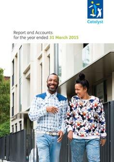
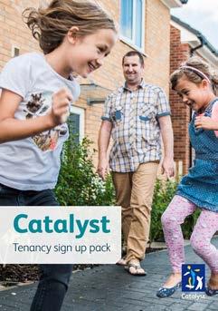
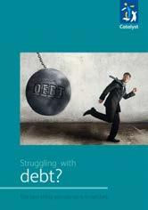

28 07 Examples Printed literature 1 Resident leaflets 2 Resident sign up pack 3 Report and accounts 4 Resident magazine
29 07 Examples Catalyst van livery
Brand Guidelines v1.0
 Brand Guidelines 2019 v1.0 Overview Ticketek is New Zealand's gateway to the live entertainment experience. Using innovative technology, we ve become New Zealand's leading platform for connecting millions
This guide should be read by anyone involved in creating communications for One You.
 This guide should be read by anyone involved in creating communications for One You. It explains the thinking behind our look and how easy it is to execute. Please take the time to read the following pages.
Using the logo. About the logo. Elements. The seal. The logotype. Third party logo use
 Style guide 218 Using the logo About the logo Jimmy is at the heart of everything we do as a charity and this is reflected by his name being at the foundation of our actions. The various elements of the
BRAND STYLE GUIDE External 07/ 2011
 BRAND STYLE GUIDE External 07/ 2011 TABLE OF CONTENTS understanding the brand 01 What is a brand? 01 Why are guidelines needed? 01 Who should use these guidelines? 01 How should they be used? 01 Brand
CEVA Brand Identity Basics
 The logo and other CEVA intellectual property contained in these guidelines are protected by national and international laws and conventions on trademark and copyright. All reproduction, full or partial,
Penn State Law Identity Standards
 Penn State Law Identity Standards The Penn State Law identity standards provide key information needed to accurately and consistently produce internal and external communication materials. The goal is
CONTENTS LOOK AND FEEL TELLING OUR STORY 15 COLOR 16 IMAGERY STYLE 17 IMAGERY CONTENT 20 TYPOGRAPHY 23 COMPOSITION 25
 IDENTITY GUIDELINES The IALD identity guidelines introduce and define the visual elements we use to create the new IALD brand; our signature, color, imagery, typography and composition. The following layout
Visual Style Guide. April 2016
 Visual Style Guide April 2016 Contents Introduction to the Logo 3 Safe Area and Size 4 Incorrect Usage 5 Color Palette 6 Other Brand Elelments 7 Typography 8 Tone and Style of Photography 9 Print Examples
UNIVERSITY OF MANITOBA VISUAL IDENTITY GUIDE. May 24, 2013
 UNIVERSITY OF MANITOBA VISUAL IDENTITY GUIDE May 24, 2013 TABLE OF CONTENTS Signature 5 Colour 25 Typography 28 Photography 31 Bringing it all together: The University of Manitoba brand 35 Templates 53
Brand Guidelines 12 December 2014
 Brand Guidelines 12 December 2014 Our brand Introduction A distinctive new approach to the transport infrastructure of Edinburgh deserves a bold new look. A whole new brand platform has been developed
contents brand promise 1 logo 3 color 6 typography 10 voice 12 photography 14 layout 17
 brand guidelines contents Introduction Brand Assets brand promise 1 logo 3 color 6 typography 10 voice 12 photography 14 layout 17 Our brand connects the community to the heart of what we stand for. The
Roll Back Malaria Partnership. Brand Guidelines
 Roll Back Malaria Partnership Brand Guidelines How to use these guidelines Our identity is not just a logo. It is a design scheme composed of a number of core elements that come together to create a distinctive
BRAND GUIDELINES 2015
 BRAND GUIDELINES 2015 FIRST EDITION November 6, 2015 CLEAR, CONSISE & CONSISTENT BAW Architecture s brand is often the first thing about us that people experience. Our brand gives the world their first
LINKED LEARNING IDENTITY GUIDELINES V
 This style guide provides important information about using brand in a consistent manner Use this guide if you are a school or partner who wants to use brand If you are working with a professional designer,
Corporate Style Guide
 Corporate Style Guide Contents Our Brand Identity 1 The Elements 2 Colours 3 Typefaces 8 Unacceptable Applications 11 corporate style guide Our Brand Identity The Iluka brand identity represents the purpose
ACADEMIC STYLE GUIDE Last updated October 2018
 ACADEMIC STYLE GUIDE Last updated October 2018 Join us in taking pride in our brand. Our University s brand is its identity. It is what people think of and feel when they hear our name. It differentiates
Branding guide. Ocean Harvest
 Branding guide Ocean Harvest Delivering results through responsible operations in a sustainable sea Contents Introduction.... 4 Vision and values.... 5 Logo.... 6 Colors.... 8 Photography.... 10 Illustrations....
THE LOGO 4 COLOR PALETTE 6 LOGO USAGE 7 THE TYPEFACE 8 GENERAL GUIDELINES 10 TYPOGRAPHY USAGE 11 SUPPLEMENTAL ICONS 12
 BRAND GUIDELINES THE LOGO 4 Clear Area Alternate Logo Versions COLOR PALETTE 6 Color Options LOGO USAGE 7 THE TYPEFACE 8 Suggested Uses GENERAL GUIDELINES 10 TYPOGRAPHY USAGE 11 SUPPLEMENTAL ICONS 12
CHECK POINT IDENTITY GUIDELINES. Version 1
 CHECK POINT IDENTITY GUIDELINES Version 1 Contents 3 Manifesto 4 Logo 9 Colors 10 Typography 11 Photography 17 Design System 18 Design System Usage 19 Design Examples 22 Contact WE SECURE THE FUTURE The
printing An designer s guide to newsprint printing
 7 Toptips printing An designer s guide to newsprint printing The Meeting Place of Intelligent Business Introduction Our aim in producing this guide is to help you modify your files to meet our paper and
PHOTOGRAPHY GUIDELINES FOR BBC PICTURES AND IPLAYER
 .08.27 PHOTOGRAPHY GUIDELINES FOR BBC PICTURES AND IPLAYER .08.27 INTRODUCTION Great pictures are essential for driving an audience to your programme. They must be eye-catching to sell the primary qualities
Australian Dragon Boat Federation Corporate Style Guide. Australian Dragon Boat Federation Style Guide
 Australian Dragon Boat Federation Corporate Style Guide Australian Dragon Boat Federation Style Guide 1 Contents Introduction 3 Objective 4 NATIONAL LOGO 5 Australian Dragon Boat Federation Logo 6 Australian
DentalOrganiser.com. Brand Guidelines. John Kavanagh Brand Manager +DentalOrganiserGDS
 DentalOrganiser.com @drpmoore Brand Guidelines +DentalOrganiserGDS John Kavanagh Brand Manager +353.87.9670803 john@dentalorganiser.com Gate Dental Services Ltd. Garyngarry, Rosscahill, Go. Galway, Ireland.
Branding guide. Estremar
 Branding guide Delivering results through responsible operations in a sustainable sea Contents Introduction.... 4 Vision and values.... 5 Logo.... 6 Colors.... 8 Photography.... 10 Illustrations.... 12
Corporate Identity Manual
 Corporate Identity Manual Index 1. The Logo 2. Corporate colors 3. Typographies 4. Logo versions 5. Banned uses 6. Readability and Protection 1. The Logo PANACEA Network looks for the promotion of Non
BRAND IDENTITY QUICK REFERENCE GUIDE
 BRAND IDENTITY QUICK REFERENCE GUIDE Intro Intro TAHOE Boats has developed this Brand Identity Guide for you our associates, dealers and vendors. It is designed to guide you in the proper use of our company
GRAPHIC IDENTITY MANUAL
 GRAPHIC IDENTITY MANUAL GRACELAND UNIVERSITY GRAPHIC IDENTITY 2 INTRODUCTION The Graceland University Graphic Identity Standards Manual was created to provide all Graceland University employees and associates
A Guide to Using the Generic Flyer Template
 A Guide to Using the Generic Flyer Template The purpose of this document is to demonstrate the creative uses of the Generic Flyer Template as well as providing a style guide for the successful application
printing A guide to newsprint printing
 A guide to newsprint A guide to newsprint Introduction Our aim in producing this guide is to help you modify your files to meet our paper and requirements, so you can receive the best print result possible.
2.1. The Corporate Signature and Colors
 The Corporate Signature and Colors 2.1 The Southern States signature is the foundation for our brand identity system. Proper use of the signature is fundamental to the success of all applications. The
Brand Identity & Design Standards
 Brand Identity & Design Standards Copyright 2014 by the Tahoe Truckee Community Foundation All rights reserved Originally developed for use by the Tahoe Truckee Community Foundation December 2014 Information
Brand Guidelines January 2016
 Brand Guidelines January 2016 Contents Brand Assets Logos Lock Up Brand Properties Brand Assets 04 Grow Wild, Kew & The Big Lottery Logos Lock Up 11 Brand Property: Scattered Seeds 22 Grow Wild Logo 05
All Natural Ingredients Universal fit Delivered to your door
 BRAND GUIDE 1 2 All Natural Ingredients Universal fit Delivered to your door We re obsessed with producing a superior product and customer experience. We appreciate the opportunity to earn and keep your
Craftsy is the premier destination for creative enthusiasts to pursue their passion. Brand Identity & Standards
 Craftsy is the premier destination for creative enthusiasts to pursue their passion. Craftsy s identity is inspired by an era when products were more often made by an individual, when handmade was the
STYLE GUIDE JUNE 2018
 STYLE GUIDE JUNE 2018 Contents June 2018 ii 1 INTRODUCTION 3 4 6 7 GRAPHIC ELEMENTS Typography Color Palette Identity and Tag Line 8 PHOTOGRAPHY 13 14 17 LAYOUT EXECUTION Execution Guides Identifying Your
CONTENTS. Introduction 04. Primary Logo 07. Clear Space & Size Requirements 08. Alternate Logo Usage 09. Logomark Usage 1 3.
 CONTENTS Introduction 04 Primary Logo 07 Clear Space & Size Requirements 08 Alternate Logo Usage 09 Logomark Usage 1 3 Usage Dos 14 Usage Don ts 15 Colors 16 Typography 17 Photography Guidelines 18 Tone
BASIC TEMPORARY GUIDELINES FOR LG-ERICSSON. Partly based on existing Ericsson CVI
 BASIC TEMPORARY GUIDELINES FOR LG-ERICSSON Partly based on existing Ericsson CVI The LG-Ericsson logotype 1/2 X Minimum clearspace X 1/2 X 1. PMS LG Red (PMS 27 C) White LG Grey (PMS 431 C) Ericsson Blue
The ExCeL logo. ExCeL London brand guidelines V2
 10 The ExCeL logo 11 ExCeL logo ExCeL London and The ADNEC GROUP tab have been given more space to breathe, they are now separate elements that work together. This gives the structure of the organisation
105 BRAND GUIDELINES Ensuring people aren t in the dark about their power cut.
 105 BRAND GUIDELINES Ensuring people aren t in the dark about their power cut. Contents 2 3 Brand strategy 7 Brand elements 17 Applying the elements 32 Partners best practice 4 Brand objectives 8 Logo
Branding Guidelines York Branding Guide September 2011
 Branding Guidelines COLOR 1-Color Printing: The logo prints in all black ink. 100% Black 2-Color Printing: The logo prints either in all black, or in 2 colors: Pantone 032 and black. On a black or dark
UBC Logos: Quick Guide
 primary logo UBC Full Signature The UBC Full Signature is the primary logo to be used on all applications. Please ensure that the signature is reproduced at a legible size. In instances where the space
BU3 Beijing 2008/Johnson & Johnson (English & Chinese)
") BU3 Worldwide Partner & Worldwide Olympic Partner Identity Guidelines 06/07/06 i. Overview Worldwide Partner & Worldwide Olympic Partner Table of contents Overview i. Table of contents ii. Using these
BU3 Worldwide Partner & Worldwide Olympic Partner Identity Guidelines 06/07/06 i. Overview Worldwide Partner & Worldwide Olympic Partner Table of contents Overview i. Table of contents ii. Using these
Corporate Brand Guidelines....your local connection
 Corporate Brand Guidelines Content Description of the whl.travel Logo 2 Explanation of the whl.travel Logo 3 Isolation Area 4 Typography 5 Minimum Size 6 Colour 7 Colour Reproduction 8 Incorrect Uses of
IDENTITY GUIDELINES AND GRAPHIC STANDARDS MANUAL SPRING 2017
 IDENTITY GUIDELINES AND GRAPHIC STANDARDS MANUAL SPRING 2017 THE IMPORTANCE OF GRAPHIC STANDARDS The United Mail logo is our unique graphic signature. It is one of the most visible aspects of the company
Identity Club Guidelines
 Identity Club Guidelines CLUB GUIDELINES DECEMBER 2015 Typography 1 Typography When it s used thoughtfully, typography becomes a powerful brand tool that can add visual meaning to what s being said. Northwestern
THINK SUMMER BRAND GUIDELINES
 THINK SUMMER BRAND GUIDELINES CORE COLORS PRIMARY COLOR C:0/M:0/Y:0/K:100 R:0/G:0/B:0 Web: 000000 PRIMARY COLOR PMS 7405C C:11/M:31/Y:100/K:0 R:227/G:174/B:36 Web: E3AE24 ACCENT COLORS When using the below
columbusindiana Brand Graphics Information and Standards Guide
 columbusindiana Brand Graphics Information and Standards Guide August 2007 Introduction 1 A product is made in a factory. A brand is made in the mind. Walter Landor A well-respected brand can be our most
Above and Beyond. designed by Stephanie Cooper 1
 Above and Beyond designed by Stephanie Cooper 1 Color Workshop Spring 2011 Above and Beyond designed by Stephanie Cooper 2 3 Introduction to Cyan A clear, cyan-colored sky is symbolic. Cyan greets us first
The expression marque.
 Brand Summary A consistent, clear and coherent identity for Durham has been developed, differentiating it from the rest of the country, with the aim of changing the perception of the county with the main
BRAND GUIDELINES California College of the Arts
 October 2016 BRAND GUIDELINES A LOGO. A TYPEFACE. A PHOTO. A VOICE. Together these tools can paint a picture of California College of the Arts that is accurate, aspirational, and as awesome as we are.
GUIDELINES & INFORMATION
 GUIDELINES & INFORMATION This document will provide basic guidelines for the use of the World Animal Day logo and general knowledge about the various file formats provided. Adhering to these guidelines
L O G O G U I D E L I N E S
 LOGO GUIDELINES To ensure consistency in KeepRite brand communications, the Elite Dealer crest can only be used in accordance with the specifications listed in the following pages. 1 Logo Elements Crest
Branding and Visual Identity Guidelines
 Branding and Visual Identity Guidelines UPDATED: February 1, 2018 MASTER BREWERS BRAND GUIDELINES REQUIREMENTS Before grabbing a Master Brewers logo, please be sure to comply with our basic rules in the
Introduction. Page 1. Welcome to the signage guidelines for St John Ambulance premises, updated as of September 2012.
 Signage guidelines Introduction Welcome to the signage guidelines for St John Ambulance premises, updated as of September 2012. These guidelines provide a signage standard for all St John Ambulance buildings,
web MASTERBRAND MARK GUIDELINES
 02.2013 web MASTERBRAND MARK GUIDELINES The Masterbrand Mark The Carestream Masterbrand Mark is more than just our logo. It s the foundation on which our powerful brand communications are built. Our Masterbrand
Graphic Standards. Graphic Standards. Graphic Standards
 Graphic Standards Graphic Standards Graphic Standards M A N U A L Introduction Graphic Design Standards astern Connecticut State University is one of four universities within the Connecticut State University
ATHLETIC/SPIRIT STYLE GUIDE
 ATHLETIC/SPIRIT STYLE GUIDE Last updated July 2018 Join us in taking pride in our brand. Our University s brand is its identity. It is what people think of and feel when they hear our name. It differentiates
Brand identity toolkit
 Our visual identity Brand identity toolkit Typography Photography Lyon Display Medium ABCDEFGHIJKLMNOPQRSTUVWXYZ abcdefghijklmnopqrstuvwxyz 0123456789 Akkurat Regular ABCDEFGHIJKLMNOPQRSTUVWXYZ abcdefghijklmnopqrstuvwxyz
We are diligent in keeping the Truck-Lite brand clean and standardized. We created these guidelines to ensure that all parties use our brand elements
 We are diligent in keeping the Truck-Lite brand clean and standardized. We created these guidelines to ensure that all parties use our brand elements consistently. Contents 2, 3 4, 5 6, 7 8, 9 10 15 10,
Graphic Identity Standards
 Graphic Identity Standards Aquinas College Graphic standards Manual Section One Contents Introduction Format Colors Isolation Acceptable Variations Unacceptable Variations Sizes Typography Letterhead Envelopes,
Branding principles Version 1 July 2016
 Branding principles Version 1 July 2016 Introduction The spirit of all Silent Pool Gin graphic executions should stem from the idea of Romantic Botany. This is the guiding principle behind everything that
ERO. Federal Credit Union. Brand Guidelines
 Brand Guidelines Brand Guidelines Our Visual Identity Section 1 Introduction Content Section 2 Our Visual Identity Logo Sizes Color Guide Color Process/Usage Logo Format Usage on Pictures Use on Background
Visual Identity guidelines. Foróige National Youth Development Organisation Visual Identity Guidelines 1
 Visual Identity guidelines Foróige National Youth Development Organisation Visual Identity Guidelines 1 Contents Our Brand 3 Our identity, our brand 3 Branding guidelines for individual projects, services
Identity Guidelines VER 1.6
 Identity Guidelines VER 1.6 hortonworks.com 2018 Hortonworks Table Of Contents INTRODUCTION VISUAL IDENTITY Welcome to the Future of Data... 3 Brand Manifesto... 4 Brand Pillars... 5 Messaging Brand Messaging...
THE VAN WERT COUNTY FOUNDATION BRAND STANDARDS
 THE VAN WERT COUNTY FOUNDATION BRAND STANDARDS 1.0 OVERVIEW As, The Van Wert County Foundation, our brand voice is a vehicle for the philanthropy of individuals, corporations and organizations that have
Using Adobe Photoshop
 Using Adobe Photoshop 4 Colour is important in most art forms. For example, a painter needs to know how to select and mix colours to produce the right tones in a picture. A Photographer needs to understand
L O G O G U I D E L I N E S
 LOGO GUIDELINES To ensure consistency in Arcoaire brand communications, the Elite Dealer crest can only be used in accordance with the specifications listed in the following pages. 1 Logo Elements Crest
OUR VISUAL IDENTITY. Logo
 Logo The Pima County Public Library logo represents an inspirational place that powers possibilities by offering everyone the opportunity to discover, explore, and expand their horizons. It incorporates
Brand Identity System Interim Guidelines 12/2011
 Brand Identity System Interim Guidelines 12/2011 Table of Contents Introduction 2 The jcp Flag 3 The Brand Identity Components 4 About the jcp Flag 5 Using the jcp Flag Three Size Versions 6 Using the
Introduction NANO-TEX BRAND GUIDELINES
 2 Introduction A new vision. Nano-Tex s new brand has been developed to strongly represent our company and instantly convey the benefits of our technology in the marketplace. This document will explain
United States Edition. Children s Miracle Network Hospitals. Brand Standards Quick Guide
 United States Edition Children s Miracle Network Hospitals Brand Standards Quick Guide 09.07.10 Core Elements Our Signature The Children s Miracle Network Hospitals signature consists of three elements:
Our brand. Guidelines / April 2016
 Our brand Guidelines / April 2016 Brand philosophy Wellcome exists to improve health for everyone by helping great ideas to thrive. We re a global charitable foundation, both politically and financially
CONTENTS S1 : CORPORATE MARQUE S2 : CORPORATE TYPEFACE S3 : STATIONERY S4 : COVER DESIGNS S5 : APPLICATIONS
 CONTENTS S1 : CORPORATE MARQUE PRIME MARQUE 4 CORPORATE COLOURS 6 PRIME MARQUE DIMENSIONS 8 EXCLUSION ZONE 10 PRIME MARQUE VARIANTS 12 PROMOTIONAL VARIANTS 14 NON PERMITTED VARIANTS 16 S2 : CORPORATE TYPEFACE
A guide to our Brand A guide to our Brand
 A guide to our Brand WHITE SPACE White space is important to our brand, in order to achieve maximum impact within an advertorial piece maintaining minimum white space requirements are essential. Please
MEDIAKIT Version 02
 MEDIAKIT 2018 Version 02 LOGO APTIM BRAND STYLE GUIDELINES LOGO 2 Our logo, with its strong modern design and bold APTIM Orange and Blue, symbolizes who we are, what we do, and how we do it. The following
Basic elements. Corporate Mark. Corporate Colors. Typeface. Avant Garde Gothic Condensed - Demi. Basic elements chart. Vertical Corporate Mark
 Basic elements chart Basic elements chart The basic elements comprise Corporate M arks, Corporate Colors and Corporate Typeface. These elements are the core for visually expressing the latest Visual I
2. Key Design Elements
 2. Key Design Elements 2. Key Design Elements CONTENT 2. Key Design Elements 2.1 Overview 2.2 Logo 2.3 Colour 2.4 Key Graphic 2.5 Imagery 2.6 Typography 2.1 OVERVIEW In a Visual Identity System, several
UNITED WAY BRANDMARK. Brandmark Usage. The most fundamental visual element of a brand identity is its brandmark.
 OUR BRANDMARK 13 UNITED WAY BRANDMARK Brandmark Usage The most fundamental visual element of a brand identity is its brandmark. The evolution of our brandmark is most dramatic in its configuration. The
P E B B L E B EAC H C O M P A N Y B R A N D I D E N T I T Y G U I D E L I N E S
 P E B B L E B EAC H C O M P A N Y B R A N D I D E N T I T Y G U I D E L I N E S Th e g a m e o f g o l f has endured for 500 years, not only because of its idyllic settings and the passions of its players
CLUB LOGO GUIDELINES
 CLUB LOGO GUIDELINES LOGO DETAIL The Surfrider Foundation logo is the key building block of our identity. It is the primary visual element that people can associate with our work and our brand. The logo
Positive & Negative Space = the area around or between a design. Asymmetrical = balanced but one part is small and one part is large
 Study Guide Compostion COMMERCIAL ART Positive & Negative Space = the area around or between a design Radial Symmetrical = balance is circular Asymmetrical = balanced but one part is small and one part
C&L WARD BRAND GUIDE 1
 CONTENTS 2 The Logo 3 Formats 4 Correct Usage 5 Incorrect Usage 6 Alternate Logos 7 The Tagline 8 Color Palette 9 Fonts 10 Complimentary Fonts 11 Photography Styles 12 Photography to Avoid C&L WARD BRAND
OUR VISUAL IDENTITY LOGO
 OUR VISUAL IDENTITY LOGO The Pima County Public Library logo represents an inspirational place that powers possibilities by offering everyone the opportunity to discover, explore, and expand their horizons.
Graphic Design Standards
 Graphic Design Standards CONTENTS 3 4 4 5 6 7 8 9 10 11 12 INTRODUCTION COLOR VALUES FONTS LOGO ARRANGEMENTS & GUIDELINES PROPER USAGE IMPROPER USAGE STAGING MINIMUM SIZE BUSINESS CARD APPAREL LINKS TO
NCEA Level 3 - Visual Arts Examples of Candidate Work Design
 NCEA Level 3 - Visual Arts 2009 Examples of Candidate Work 90517 Design 1 Achieved 2 3 4 5 Achieved The brief for this submission explores a serious social and health topic. In all artwork the candidate
OUR MASTER BRANDMARK BRANDMARK USAGE LIVE UNITED TAGLINE PRIMARY BRANDMARK OUR PURPOSE WHAT IT MEANS TO JOIN
 OUR MASTER BRANDMARK PRIMARY BRANDMARK The most fundamental visual element of a brand identity is its brandmark. The evolution of our brandmark is most dramatic in its configuration. The United Way symbol
Postgraduate 2016/17 Campaign Guide
 Postgraduate 2016/17 Campaign Guide CONTENTS Messaging Postgraduate motivations 4 How to use the messaging 5 Copy composition 6 Campaign visual style The REDEFINE badge 8 Colour palette 9 Typography 10
BRAND GUIDELINES. glasgow2018.com
 BRAND GUIDELINES glasgow2018.com Contents 1. Introducing the Brand page 3 2. Brand Elements page 4 3. Use of Welcome 2018 Logos page 6 4. Logo Association page 9 5. Applications of Glasgow 2018 Welcome
L O G O G U I D E L I N E S
 LOGO GUIDELINES To ensure consistency in Comfortmaker brand communications, the Elite Dealer crest can only be used in accordance with the specifications listed in the following pages. 1 Logo Elements
Artwork Preparation Guide
 Artwork Preparation Guide General notes Artwork Preparation Guide Size, Position and Order When displaying a series of card symbols together, the following rules apply: No logo should occupy a prominent
Issue one May Scottish Parliament Corporate Identity Quick Guide
 Issue one May 2017 Scottish Parliament Corporate Identity Quick Guide 1 Contents Introduction 3 Corporate Identity: 4 Overview 5 Versions Minimum size 7 8 Exclusion zone 9 Background 10 Colour: primary
Brand Guidelines Version 3.1
 Brand Guidelines Version 3.1 Our Mission At Checkout 51 our mission is to help millions of families save money, and use their purchase data to revolutionize marketing. We partner with the world s leading
Marketing Guidelines. Disney Meetings Catered Events Group Tickets
 Marketing Guidelines Disney Meetings Catered Events Group Tickets Disney DMMG04-2018 1 Content 1.0 Introduction...3 2.0 Approval Process...4 3.0 Marketing Guidelines at a Glance...5 4.0 Logos...6 5.0 Imagery
2018 Graphic Communication. National 5. Finalised Marking Instructions
 National Qualifications 018 018 Graphic Communication National 5 Finalised Marking Instructions Scottish Qualifications Authority 018 The information in this publication may be reproduced to support SQA
visual identity guidelines
 visual identity guidelines for the Authentic Nunavut brand for arts + crafts www.authenticnunavut.com ᓴᓇᐅᒐᐃᓪ nunavut arts + crafts sanaugait artisanats nunavois Table of Contents Visual Identity Standards
COLOR AS A DESIGN ELEMENT
 COLOR COLOR AS A DESIGN ELEMENT Color is one of the most important elements of design. It can evoke action and emotion. It can attract or detract attention. I. COLOR SETS COLOR HARMONY Color Harmony occurs
The Green Dot Standards of Use
 Introduction The Green Dot trademark is an internationally protected and well-known symbol. These guidelines are intended to help companies using The Green Dot on their packaging - based on a valid license
Assessment: 9_12 Business and IT BD10 - Multimedia and Webpage Design Test 2. Draft
 Draft Student Name: Teacher: Date: District: Iredell Assessment: 9_12 Business and IT BD10 - Multimedia and Webpage Design Test 2 Description: Unit 1 Practice Test Form: 501 Draft 1. A design team is researching
Principles of Architectural Design Lec. 2.
 Principles of Architectural Design Lec. 2. The Complementary Elements of design. The complementary elements characterize the natural elements, creating means of comparison for the primary elements used
Saint Mary s College of California Year of the Gael Sesquicentennial Identity STYLE GUIDE
 Saint Mary s College of California Year of the Gael Sesquicentennial Identity STYLE GUIDE Saint Mary s College of California is turning 150, and it s going to be a celebration of Sesquicentennial magnitude!