Introduction. Page 1. Welcome to the signage guidelines for St John Ambulance premises, updated as of September 2012.
|
|
|
- Isabel Elliott
- 5 years ago
- Views:
Transcription
1 Signage guidelines
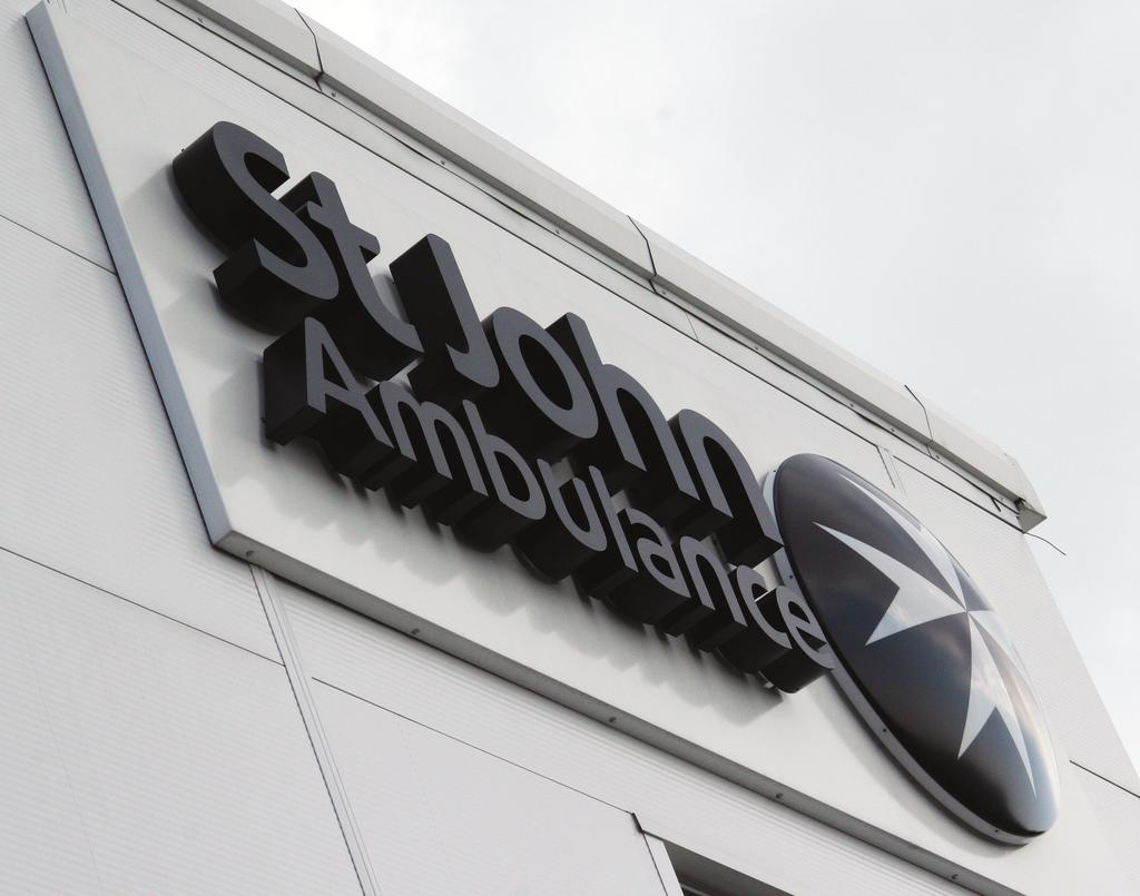
2 Introduction Welcome to the signage guidelines for St John Ambulance premises, updated as of September These guidelines provide a signage standard for all St John Ambulance buildings, incorporating fresh and modern designs that reinforce our values and comply with the charity s corporate identity. By ensuring that our properties are welcoming, fit for purpose and recognisable as St John Ambulance buildings, we make our charitable services more widely available to the communities we seek to serve. It is important that we are easily understood and identifiable. We should look professional, ensure that our buildings are as accessible as possible, and present ourselves as a single, unified organisation. Please provide your signage supplier/professional adviser with these guidelines, and instruct them to contact the Creative Services team for approval of artwork before your signage is produced. These guidelines are to be regarded as mandatory unless special local circumstances apply, in which case you should consult Creative Services at National Headquarters before proceeding. What s new? The revised and updated designs for signage, updated to coincide with the organisation s move from a county to a regional structure, vary from the old designs in two ways. Firstly, in line with the revised style adopted for our printed publications, the curve device is no longer used. Secondly, signs referring to a building being used by a particular county, region or unit of St John Ambulance, or being used as a headquarters or training centre have been replaced by standard signs with no such identifying text. Visitors simply need to know that they are visiting St John Ambulance. The new, generic signs are simpler, cheaper (in that pre-prepared artwork can be provided in many cases), and further help us to maintain a unified public face for the organisation. Contact Creative Services: creative-services@sja.org.uk my.sja.org.uk Page 1
3 Signage process There are a number of elements to consider when producing your signage. The Town and Country Planning Advertisement Regulations define all external signs as advertisements; appropriate planning consent may therefore be required for your proposed signage. You should also be aware that, in certain circumstances, other forms of statutory consent may be required including, for example, Listed Building and Highways consent. In all situations where you intend to erect signage, either on a building or site (including replacement signs), you should first consult with your local planning authority to establish what, if any, statutory consents may be required. It is always helpful in undertaking these discussions to show the local planning officer a drawing and other relevant details of what you propose. The detail contained in these guidelines will enable you to achieve this. Some signage contractors are able to undertake this consultation process and obtain the necessary consents on your behalf. However, you should remember that St John Ambulance remains legally responsible for ensuring that all necessary consents have been obtained prior to the erection of any such signage. In more complex cases, for example with listed buildings and within conservation or other special areas including national parks, you should consider instructing an appropriately qualified professional adviser to act on your behalf in obtaining all the necessary consents. You should allow sufficient time for this process which, dependent on the type of consent concerned, may take as little as two months, or, in more complex cases, a considerably longer time frame. Page 2
 St John s Gate, Clerkenwell, London EC1M 4DA Registered charity no.")
4 Compulsory signage 148mm It is a legal requirement under the Business Names Act 1985 that the full company name and registration information is displayed in a prominent place within a public area within a building. Therefore the following information needs to appear: St John Ambulance (company no ) St John s Gate, Clerkenwell, London EC1M 4DA Registered charity no /1 St John Ambulance Company no Registered office St John s Gate, Clerkenwell, London EC1M 4DA Registered charity no /1 105mm Company information sign Page 3
5 Using the logo The only version of the St John Ambulance logo to be used for building signage is the 3D version; this refers to the 3D-effect sheen within the roundel. Both the positive (black on white ground) and negative (white on black ground) styles are used for different signs, although the positive version is the default. Please contact Creative Services for high resolution versions of the logo in EPS format. 3D positive logo The exclusion zone 3D negative logo The logo must always be surrounded by an exclusion zone to ensure that it has maximum visual impact. The exclusion zone needs to be adhered to, whether the mark is placed directly onto a building or used as a graphic panel. Never position any other type, matter or graphic device within the pre-defined exclusion zone. When creating signage, the exclusion zone can be calculated by taking the measurement X from the letter m in the word Ambulance as shown. This calculation can be applied to all versions of the logo. Calculating the exclusion zone Page 4
6 How not to use the logo Misuse of the logo weakens its impact. You should not alter the logo in any way and it must always be reproduced from digital artwork provided by Creative Services. Do not: use the logo on a coloured background, or on a photographic background reproduce the logo in any colour other than black or white use alternate versions of the primary St John Ambulance logo (see examples, right) stretch the logo in any way, or use separate components of the logo (such as the roundel) in isolation attempt to recreate the logo using different fonts or alternative versions of the roundel. Do not use the centered version of the logo The only occasion when an element of the logo can be used in isolation is for the Projecting wall sign (see page X), which solely represents the roundel. If you are concerned that the primary version of the logo will not fit into the space you have available, please contact Creative Services to discuss your requirements. Do not use the thin version of the logo For more information on appropriate uses of the logo, contact the Creative Services team. Page 5
7 Our colour palette The St John Ambulance colour palette for signage consists of three colours: black, white and green. Black and white form the primary colour palette. Green is a secondary colour and is to be used only where specified. The colours have been chosen specifically to create maximum contrast: this makes text more easily readable for people with visual impairments. There are no exceptions to this colour palette. Pantone number C M Y K R G B Hexadecimal number # Page 6
8 Typography The St John Ambulance typeface is Humanist 777 (the 777 is important). This should be used for all text on St John Ambulance signage. It is a clean and modern typeface which is available in various weights. Humanist 777 is a variation of Frutiger. The two typefaces are interchangeable. No other fonts are permissible on St John Ambulance signage. The words St John Ambulance in the logo logo are not in Humanist 777 font. Never try to recreate the words St John Ambulance in the logo using Humanist 777; always use the approved artwork. Humanist 777 Black abcdefghijklmnopqrstuvwxyz ABCDEFGHIJKLMNOPQRSTUVWXYZ Humanist 777 Bold abcdefghijklmnopqrstuvwxyz ABCDEFGHIJKLMNOPQRSTUVWXYZ Humanist 777 Light abcdefghijklmnopqrstuvwxyz ABCDEFGHIJKLMNOPQRSTUVWXYZ Page 7
9 Font sizes Reading distance and letter size need to be taken into account to provide adequate signage for people with differing levels of vision. The minimum recommended letter sizes for text on St John Ambulance signage is as follows: Long distance reading 150mm caps height (Such as building entrances) Medium range reading mm caps height (Such as reception ID signs and directional signs in corridors) Close up reading 15-25mm caps height (Such as directories and wall mounted information signs) Please also note that: Consistent line spacing is essential and should be set no less than 1.5 Full capitalisation makes it more difficult for people to read signs and therefore it should not be used Symbols should be at least 100mm in overall height. Page 8
10 Text on signs All text on signage should be clear and concise. Please refer to the usual writing style guides on the resource site for clarification. Additional points to consider are: Always left align text. Don t justify or centre your text Do not use the ampersand ( & ) symbol. Use and instead Forward slashes don t need a space either side There is only one space after a full stop, not two Do not use full stops on the ends of points of lists on signage; not even on the last point As a general rule, only the first word of a point on signage takes a capital letter Exceptions include: names of places (eg. East Midlands) names of people job titles (eg. John Smith, Regional Director). Page 9
11 Principal external signage The St John Ambulance logo is the most recognisable aspect of the organisation s corporate identity, and therefore principal external signage comprises a large representation of the logo. The signage should be displayed prominently on the building, and be visible from as many of the main angles of approach as possible. The logo can either be printed onto a plain background panel, or recreated as a large three-dimensional cut out graphic in powder coated acrylic (as per the image on the front of this resource). Three sizes of the cut out graphic have been set to take into account a range of buildings: large (3,450 x 1,200mm), medium (2,300 x 800mm) and small (1,440 a 500mm). Do not alter the size ratio between the letterforms and roundel, or amend the logo in any way. Roundel profile 3D Letterform profile Cross-sections of the illuminated (above) and nonilliminated (below) variants of the cut-out graphic The cut-out graphic can be illuminated or non-illuminated. The illuminated variant comprises a 3D roundel (back-illuminated to create a halo effect), plus individually cut 3D letterforms which house the light source for back illumination. Light is also emitted from the cross. The non-illuminated version comprises a 3D roundel and individually cut 2D letterforms. Page 10 Roundel profile 2D Letterform profile
12 Positioning principal external signage x x x x x Positioning the logo An invisible exclusion zone needs to be in place around all applications of the logo. The exclusion zone needs to be adhered to whether the logo is placed directly onto a building (as in the three-dimensional cut-out design), or placed onto a plain background panel. X X X Never position any other type, matter or graphic device within the pre-defined exclusion zone. When creating signage, the exclusion zone can be calculated by taking the measurement X from the letter m in the word Ambulance. Example 1 Here are some examples of how to apply signage to building exteriors. The sign needs to be clearly visible, so positioning and size are key as well as deciding which sign you are going to use. X Example 2 Page 11
13 Secondary signage Projecting wall sign X Where the surface area on a building is limited, the roundel element from the St John Ambulance logo can appear as a projecting wall sign. There are two versions of the projecting wall sign: illuminated and non-illuminated. This projecting wall sign can only be used on buildings where the full logo already appears prominently as 3D cut out graphic signage or 2D/3D graphic panel signage. Front view Projecting wall sign size chart X Format Size 1 Size 2 Size 3 X measurement 1,200mm 800mm 500mm Profile Page 12

14 Directional signs Correct Please use the ISO 7001 recommendation for arrows, which is a solid arrow whose ends are parallel to the main stem, not cut off at 90 degrees. Incorrect The standard direction sign should not always be black copy on a white background, and should not include the St John Ambulance logo. Monolith signs are available from most signage suppliers; see p17 for information on sign dimensions. Please note: as a general rule, only the first word of a point on signage takes a capital letter. Car park Reception Exit Standard direction sign Direction monolith Page 13
15 Monolith sign X ¼ X For monoliths of different sizes, refer to the Monolith dimensions (bespoke) diagram: % of height Y ¼ X 200 X Calculate the height of the black section as 20% of the height of the sign The height of the roundel (Y) in the logo is two thirds, or 66.6%, the height of the black section Use a measurement of X taken from the letter m in the word Ambulance as an exclusion zone above and below the logo Centre the logo The width of the logo dictates the width of the text box Illuminated versions highlight the text, cross and halo. For this option, use a lightbox which leaves the cross and text showing through, cover the remainder in black and apply vinyl to the halo section as shade out % of height Only the St John Ambulance logo should appear in the black panel at the top of the sign. Monolith dimensions (for a 1500 x 800mm Monolith dimensions (bespoke) Text should be at least 150mm caps height, and aligned left, apart from on the directional monolith where the direction of the arrows will dictate whether the text is aligned left or right. monolith sign) Please refer to the arrow design guidance. Only black and white can be used on these signs. Suggested materials: aluminium or acrylic, wrapped around aluminium poles. Page 14

16 Freestanding sign (single or double sided) The height and width of your freestanding sign will depend on where you plan to position it. The two diagrams indicate general sizes for either tall or small signs. The sign should be white, with black text. There are no exceptions to these colours. Text should be at least 150mm full caps height and aligned left. Suggested materials: acrylic panel with brushed aluminium poles. To work out the dimensions and positioning: Y equals the height of the m in Ambulance As indicated in the diagrams, use the Y measurement to calculate: the space above and to the right of the logo the space below and to the left of the phone number and URL the height of the text. Page 15
17 Location signs (main entrance) 594mm Location sign dimensions Centred logo Y To create a location sign for your building (usually displayed by the main entrance door, which leads to the reception), please refer to the Location sign dimensions diagram: Y equals the height of the m in Ambulance Use the Y measurement to calculate: the space above and to the right of the logo the space below and to the left of the phone number and URL the height of the text. Text must be at least mm caps height and aligned left. Y Y sja.org.uk Y 420mm The sign should be white, with black text. There are no exceptions to these colours. Suggested materials: acrylic. Please note: you should only use either the national St John Ambulance phone number (see above), or a regional contact number. Dimensions given are a default size (A2), although signs can be smaller or larger to fit space available, providing proportions are retained. Page 16

18 External descriptor signs (long signs) To create an external descriptor sign (see diagram): Measure the height of the sign. The height of the roundel in the logo is 25% of this measurement X is the height of the S in St John Y is the height of the m in Ambulance Use the X and Y measurements to calculate: the space around the black block the space above, below and to the right of the logo Use the External long sign text box dimensions diagram to calculate the text box area, using the X and Y measurements. The solid block should be either black, or Pantone 355, with white text. These colours have been chosen to give maximum contrast. There are no exceptions to these colours. Please note: as a general rule, only the first word of your text should take a capital letter. Text must be at least mm caps height and aligned left. Suggested materials: acrylic. Page 17
19 Vinyl window graphic x x Vinyl window graphics can be used on windows, on glass doors or panels, or as stand-alone signage. Stand-alone signage The graphic can be applied to a glass or acrylic panel. The diagram on the right indicates the size of the logo in relation to the size of the panel. x x Positioning the logo x Window signage The graphic can appear at the size you choose; you must take into account the positioning guidance to ensure that the minimum exclusion zone of X, where X is the height of the letter m in Ambulance, is adhered to. 200 mm 1700 mm X 50 mm 300 mm Glass doors and panels The logo must appear within (at least) the average 1400 mm X 50 mm eye line, which is between 1400mm and 1700mm from floor level. Please ensure that the minimum exclusion zone of X is adhered to. Please note that on glass doors and panels, the positive version of the logo may not be the most visible. In this case, use the negative version of the logo, on a semi-transparent black strip as pictured. Page 18 Glass door signage

20 Internal descriptor signs To create an internal descriptor sign, refer to the diagram: Calculate the width of the sign: the logo width is 40% of this measurement X is the height of the S in St John Use the X measurement to calculate: the space around the black block the space above, below and to the right of the logo the height of the text. Internal signs should be black and white. Text should be mm caps height and aligned left. Suggested materials: acrylic, foamex. Please note: as a general rule, only the first word of your text should take a capital letter. Page 19
.")
21 Door plaques There are four styles of door plaques. Which you use is your choice, but aim for consistency throughout the entire building. Black vinyl door plaque To create door plaques: Calculate the height of the plaque as X Use the X measurement to calculate the text box dimensions and text height (equal to 1/3 X). Text should be 15-25mm caps height and aligned left. Brushed aluminium door plaque Suggested sizes for door plaques are between mm wide and at least 75mm tall, ensuring a minimum 50mm safe area around the sign. Please do not differ from these colour schemes. They have been chosen to create maximum contrast. White vinyl door plaque Green vinyl door plaque Page 20 Please note: as a general rule, only the first word of your text should take a capital letter.
The Green Dot Standards of Use
 Introduction The Green Dot trademark is an internationally protected and well-known symbol. These guidelines are intended to help companies using The Green Dot on their packaging - based on a valid license
Roll Back Malaria Partnership. Brand Guidelines
 Roll Back Malaria Partnership Brand Guidelines How to use these guidelines Our identity is not just a logo. It is a design scheme composed of a number of core elements that come together to create a distinctive
2.1. The Corporate Signature and Colors
 The Corporate Signature and Colors 2.1 The Southern States signature is the foundation for our brand identity system. Proper use of the signature is fundamental to the success of all applications. The
Australian Dragon Boat Federation Corporate Style Guide. Australian Dragon Boat Federation Style Guide
 Australian Dragon Boat Federation Corporate Style Guide Australian Dragon Boat Federation Style Guide 1 Contents Introduction 3 Objective 4 NATIONAL LOGO 5 Australian Dragon Boat Federation Logo 6 Australian
Using the logo. About the logo. Elements. The seal. The logotype. Third party logo use
 Style guide 218 Using the logo About the logo Jimmy is at the heart of everything we do as a charity and this is reflected by his name being at the foundation of our actions. The various elements of the
BUILDING SIGN PROGRAM JULY 2012
 BUILDING SIGN PROGRAM JULY 2012 TABLE OF CONTENTS Introduction... 2 General Information for all Signs... 3 Sign Selection Considerations... 4 Typography... 5 Color Schedule... 6 Glossary... 7 Interior
Brand Guidelines 12 December 2014
 Brand Guidelines 12 December 2014 Our brand Introduction A distinctive new approach to the transport infrastructure of Edinburgh deserves a bold new look. A whole new brand platform has been developed
Green Globes, GPC + Green Building Initiative GRAPHIC STANDARDS GUIDE
 Green Globes, GPC + Green Building Initiative GRAPHIC STANDARDS GUIDE Last Updated: December 29, 2014 WWW.THEGBI.ORG 503.274.0448 info@thegbi.org page 2 CONTENTS 1.0 Introduction 3 1.1 Our Mission 3 1.2
BRAND STYLE GUIDE External 07/ 2011
 BRAND STYLE GUIDE External 07/ 2011 TABLE OF CONTENTS understanding the brand 01 What is a brand? 01 Why are guidelines needed? 01 Who should use these guidelines? 01 How should they be used? 01 Brand
GRAPHIC IDENTITY MANUAL
 GRAPHIC IDENTITY MANUAL GRACELAND UNIVERSITY GRAPHIC IDENTITY 2 INTRODUCTION The Graceland University Graphic Identity Standards Manual was created to provide all Graceland University employees and associates
Issue one May Scottish Parliament Corporate Identity Quick Guide
 Issue one May 2017 Scottish Parliament Corporate Identity Quick Guide 1 Contents Introduction 3 Corporate Identity: 4 Overview 5 Versions Minimum size 7 8 Exclusion zone 9 Background 10 Colour: primary
Brand identity toolkit
 Our visual identity Brand identity toolkit Typography Photography Lyon Display Medium ABCDEFGHIJKLMNOPQRSTUVWXYZ abcdefghijklmnopqrstuvwxyz 0123456789 Akkurat Regular ABCDEFGHIJKLMNOPQRSTUVWXYZ abcdefghijklmnopqrstuvwxyz
Bemis Visual Identity Standards. Key Guidelines for External Users
 Key Guidelines for External Users February 10, 2014 Symbol The Bemis Symbol embodies who we are as a company dynamic and modern, an expression of the integration of our values and capabilities. Our symbol
UNIVERSITY OF MANITOBA VISUAL IDENTITY GUIDE. May 24, 2013
 UNIVERSITY OF MANITOBA VISUAL IDENTITY GUIDE May 24, 2013 TABLE OF CONTENTS Signature 5 Colour 25 Typography 28 Photography 31 Bringing it all together: The University of Manitoba brand 35 Templates 53
Environmental graphics
 gym floor When a gym floor is being updated from the old logo, it is not necessary to replace the old logo with the new one. Ys may have a gym floor without a logo and instead feature the new logo on a
CITY OF KENT, OHIO ZONING CODE APPENDIX B SIGN DESIGN GUIDELINES APP B - 1 ZONING CODE APPENDIX B SIGN DESIGN GUIDELINES
 APPENDIX B SIGN DESIGN GUIDELINES APP B - 1 ZONING CODE APPENDIX B SIGN DESIGN GUIDELINES Purpose and Applicability The purpose of the Sign Design Guidelines is to provide design criteria to be utilized
ATHLETIC BRAND STANDARDS GUIDE
 ATHLETIC BRAND STANDARDS GUIDE THE IMPORTANCE OF GRAPHIC STANDARDS TABLE OF CONTENTS The Importance Of Graphic Standards...1 Official Colors...2 Athletics Logos...3 Primary Athletics Mark...4 Use On Color
THE LOGO 4 COLOR PALETTE 6 LOGO USAGE 7 THE TYPEFACE 8 GENERAL GUIDELINES 10 TYPOGRAPHY USAGE 11 SUPPLEMENTAL ICONS 12
 BRAND GUIDELINES THE LOGO 4 Clear Area Alternate Logo Versions COLOR PALETTE 6 Color Options LOGO USAGE 7 THE TYPEFACE 8 Suggested Uses GENERAL GUIDELINES 10 TYPOGRAPHY USAGE 11 SUPPLEMENTAL ICONS 12
Town of Orangeville Planning Department
 Town of Orangeville Planning Department Guidelines for Signage on Heritage Properties July 2007 Table of Contents Page 1.0 Guidelines for Signage in the Heritage Sign Special Policy District 1 1.1 Introduction
GUIDELINES & INFORMATION
 GUIDELINES & INFORMATION This document will provide basic guidelines for the use of the World Animal Day logo and general knowledge about the various file formats provided. Adhering to these guidelines
ACADEMIC STYLE GUIDE Last updated October 2018
 ACADEMIC STYLE GUIDE Last updated October 2018 Join us in taking pride in our brand. Our University s brand is its identity. It is what people think of and feel when they hear our name. It differentiates
BUS RAPID TRANSIT FOURTH PLAIN BLVD
 K SIGN TYPE C BAY ID INTERNALLY ILLUMINATED, DOUBLED-SIDED SIGN CABINET MOUNT TO LIGHT POLE BY OTHERS AT DRIVER STOP LINE. ALUMINUM CABINET, DIGITALLY PRINTED GRAPHIC MOUNTED TO POLYCARBONATE LENS. 22'
ARB COMPREHENSIVE SIGN REVIEW APPROVED CONDITIONS SEMINOLE NORTH ARB AND : Seminole North TAX MAP/PARCEL#: 32-5B
 ARB COMPREHENSIVE SIGN REVIEW APPROVED CONDITIONS SEMINOLE NORTH ARB-2017-24 AND 2017-29: TAX MAP/PARCEL#: 32-5B SIGN FEATURE APPROVED CONDITION SIGN TYPE Channel Letter Cabinet Signs and Panel Signs Awnings
CONTENTS. 1. Our vision. 2. Our values. 3. The logo. 4. Guidance on the use of logo. 5. colourpalatte. 6. Typeface. 7. Imagery. 8.
 BRANDING GUIDELINES CONTENTS 1. Our vision 2. Our values 3. The logo 4. Guidance on the use of logo 5. colourpalatte 6. Typeface 7. Imagery 8. Merchendising 9. Advertisment OUR VISION neah is a young fashion
Identity Guidelines 02 Signature. 03 Clear Zone and Sizing 04 Trademark 05 Configurations 06 Restrictions 07 Color Palette 08 Acceptable Usage
 Identity Guidelines 02 Signature 03 Clear Zone and Sizing 04 Trademark 05 Configurations 06 Restrictions 07 Color Palette 08 Acceptable Usage Signature The term signature commonly refers to a basic configuration
OUR MASTER BRANDMARK BRANDMARK USAGE LIVE UNITED TAGLINE PRIMARY BRANDMARK OUR PURPOSE WHAT IT MEANS TO JOIN
 OUR MASTER BRANDMARK PRIMARY BRANDMARK The most fundamental visual element of a brand identity is its brandmark. The evolution of our brandmark is most dramatic in its configuration. The United Way symbol
Visual Style Guide. April 2016
 Visual Style Guide April 2016 Contents Introduction to the Logo 3 Safe Area and Size 4 Incorrect Usage 5 Color Palette 6 Other Brand Elelments 7 Typography 8 Tone and Style of Photography 9 Print Examples
Brand Guidelines v1.0
 Brand Guidelines 2019 v1.0 Overview Ticketek is New Zealand's gateway to the live entertainment experience. Using innovative technology, we ve become New Zealand's leading platform for connecting millions
BRAND IDENTITY QUICK REFERENCE GUIDE
 BRAND IDENTITY QUICK REFERENCE GUIDE Intro Intro TAHOE Boats has developed this Brand Identity Guide for you our associates, dealers and vendors. It is designed to guide you in the proper use of our company
Brand Guidelines January 2016
 Brand Guidelines January 2016 Contents Brand Assets Logos Lock Up Brand Properties Brand Assets 04 Grow Wild, Kew & The Big Lottery Logos Lock Up 11 Brand Property: Scattered Seeds 22 Grow Wild Logo 05
CEVA Brand Identity Basics
 The logo and other CEVA intellectual property contained in these guidelines are protected by national and international laws and conventions on trademark and copyright. All reproduction, full or partial,
Letter from the President
 Letter from the President Dear Friends and Members of the Hyundai Family: Everyday, each one of us strives for improvement in our work as we collectively take one small step closer on our long journey
Corporate Brand Guidelines....your local connection
 Corporate Brand Guidelines Content Description of the whl.travel Logo 2 Explanation of the whl.travel Logo 3 Isolation Area 4 Typography 5 Minimum Size 6 Colour 7 Colour Reproduction 8 Incorrect Uses of
ATHLETIC/SPIRIT STYLE GUIDE
 ATHLETIC/SPIRIT STYLE GUIDE Last updated July 2018 Join us in taking pride in our brand. Our University s brand is its identity. It is what people think of and feel when they hear our name. It differentiates
Artwork Preparation Guide
 Artwork Preparation Guide General notes Artwork Preparation Guide Size, Position and Order When displaying a series of card symbols together, the following rules apply: No logo should occupy a prominent
Scottish Book Trust. Brand Guidelines Scottish Book Trust
 Scottish Book Trust Brand Guidelines 2014 2. Identity The logo The new Scottish Book Trust logo defines our brand. It retains the composition and shape of the old logo to ensure it is quickly recognisable,
Tobacco Dock. Branding Opportunities
 Tobacco Dock Branding Opportunities Branding Opportunities Macro Art are the UK s leading event and exhibition branding specialists. We use the latest print and systems technology to create stunning visual
MITCHELL COLLEGE MITCHELL COLLEGE VISUAL STANDARDS. Visual Identity Standards
 1 MITCHELL COLLEGE Visual Identity Standards 2 TABLE OF CONTENTS PURPOSE, BACKGROUND, ELEMENTS...4 3 HOW TO USE THE MITCHELL COLLEGE LOGO...5 SIZE and SPACING...6 MITCHELL COLLEGE COLOR USAGE...7 OFFICIAL
DRAFT V. SITE ELEMENTS SIGNS
 1. SIGNS Intent Signs are an important streetscape design element that affect not only the visual character of the Historic District but also the vitality of its businesses. Signage provides business identification,
OVERVIEW OF SIGN BY-LAW HERITAGE GUIDELINES
 OVERVIEW OF SIGN BY-LAW Formatted: Font: (Default) Arial, 12 pt & HERITAGE GUIDELINES Formatted: Font: 12 pt To regulate signage and all other advertising devices in the Town of Cobourg, Council approved
N-Mark Trademark Usage Guidelines for Devices. November 2010
 N-Mark Trademark Usage Guidelines for Devices November 2010 RESTRICTIONS ON USE This Trademark Usage Guidelines document is Copyright 2005-2010 by NFC Forum, Inc. All rights are reserved. This document
BUILDING SIGN PROGRAM SEPTEMBER 2016
 BUILDING SIGN PROGRAM SEPTEMBER 2016 TABLE OF CONTENTS INTRODUCTION...2 GENERAL INFORMATION FOR ALL SIGNS...3 SIGN SELECTION CONSIDERATIONS...4 TYPOGRAPHY...5 COLOR SCHEDULE...6 GLOSSARY...7 INTERIOR SIGNS
WelcomeBC Graphic Standards Guide
 WelcomeBC Graphic Standards Guide The WelcomeBC Mark The WelcomeBC Mark is created by combining the BC ID with the WelcomeBC wordmark. The Mark uses the colours and typeface from the BC ID Mark to maintain
Corporate Style Guide
 Corporate Style Guide Contents Our Brand Identity 1 The Elements 2 Colours 3 Typefaces 8 Unacceptable Applications 11 corporate style guide Our Brand Identity The Iluka brand identity represents the purpose
SHOWCASING OUR VIBRANCY. Technical Supplement to the Y Graphic Standards for Signage YMCA OF THE USA
 SHOWCASING OUR VIBRANCY Technical Supplement to the Y Graphic Standards for Signage YMCA OF THE USA REVISED 08.22.2014 TABLE OF CONTENTS 3 INTRODUCTION 4 APPLYING GRAPHIC STANDARDS 5 VISUAL SYSTEM OVERVIEW
IDENTITY GUIDELINES AND GRAPHIC STANDARDS MANUAL SPRING 2017
 IDENTITY GUIDELINES AND GRAPHIC STANDARDS MANUAL SPRING 2017 THE IMPORTANCE OF GRAPHIC STANDARDS The United Mail logo is our unique graphic signature. It is one of the most visible aspects of the company
web MASTERBRAND MARK GUIDELINES
 02.2013 web MASTERBRAND MARK GUIDELINES The Masterbrand Mark The Carestream Masterbrand Mark is more than just our logo. It s the foundation on which our powerful brand communications are built. Our Masterbrand
Formats. Signature
 Signature Formats 03 Illustrated below are the only approved corporate signature formats for internal and external applications. To ensure our legal protection and to promote proper use, the symbol or
Branding guidelines - V /08/23 - Company confi dential - Internal use only
 Branding guidelines - V 1.0 2012/08/23 - Company confi dential - Internal use only The following visual identity guidelines are designed to achieve the highest level of consistency throughout communications
Agenda Item: Revised Master Sign Plan Windsor Run Retirement Center
 Agenda Item: Revised Master Sign Plan Retirement Center DATE: November 1, 2017 FROM: Mary Jo Gollnitz, Planner Background/Issue: EMH&T is requesting a revision to Retirement Center Master Sign Plan approved
SCC STYLE GUIDE 2013 LOGOS & MARKS SECTION ONLY SACRAMENTO CITY COLLEGE
 S STYLE GUIDE 2013 LGS & MARKS SETIN NLY SARAMENT ITY LLEGE NTENTS ur History UR NEW LG ur Brand Logos & Marks olor Scheme Typography The logo visually references the historic and widely recognized architectural
Graphic Communication Assignment General assessment information
 Graphic Communication Assignment General assessment information This pack contains general assessment information for centres preparing candidates for the assignment Component of Higher Graphic Communication
Graphics Standards Manual
 Graphics Standards Manual Summary This visual identity is the face Stonehill College will show the public. It is representative of Stonehill College s unique character and purpose. The signature s wide
OVERVIEW OF SIGN BY-LAW HERITAGE GUIDELINES
 OVERVIEW OF SIGN BY-LAW Formatted: Font: (Default) Arial, 12 pt & HERITAGE GUIDELINES Formatted: Font: 12 pt To regulate signage and all other advertising devices in the Town of Cobourg, Council approved
Intel Internet of Things Solutions Alliance Associate Members. Trademark and Asset Usage Guidelines
 Intel Internet of Things Solutions Alliance Associate Members Introduction Delivering on Our Brand Promise Under the Intel Internet of Things Solutions Alliance Associate Agreement you entered into with
The ExCeL logo. ExCeL London brand guidelines V2
 10 The ExCeL logo 11 ExCeL logo ExCeL London and The ADNEC GROUP tab have been given more space to breathe, they are now separate elements that work together. This gives the structure of the organisation
Basic guideline Corporate signature & spirits
 Corporate signature & spirits Edgecore s corporate signature consists of the English name of the company, which derives from the concept that There is no edge limit, there is no permanent core and expresses
panthers high point university athletics
 panthers high point university athletics Logo Standards 2004 Pantone Matching System (PMS) Color Chart hpu purple pantone 2685 4-color equivalent: C=96, M=100, Y=0, K=10 hpu purple highlight pantone 2665
VISUAL IDENTITY MANUAL
 VISUAL IDENTITY MANUAL Table of Contents i. Contents ii. About Us ii. Guideline Introduction Chapter 1 Masterbrand Chapter 2 Stationery System Chapter 3 Internet IN DEVELOPMENT Chapter 4 Presentations
ARCHITECTURAL REVIEW BOARD STAFF REPORT. ARB : Super Test Sunoco Fuel Pump Canopy and Signs
 ARCHITECTURAL REVIEW BOARD STAFF REPORT Project #/Name Review Type Parcel Identification Zoned Owner/Applicant Magisterial District Proposal Context Visibility ARB-2012-43: Super Test Sunoco Fuel Pump
Chapter 14. Signage Guidelines 14.2 GENERAL DESIGN OBJECTIVES 14.1 INTRODUCTION AND PURPOSE 14.3 GENERAL SIGN DESIGN GUIDELINES
 Chapter 14 Signage Guidelines 14.1 INTRODUCTION AND PURPOSE This Chapter addresses signage for all development types within the City of Santa Ana. The signage design guidelines are intended to ensure quality
Graphic Design Standards
 Graphic Design Standards CONTENTS 3 4 4 5 6 7 8 9 10 11 12 INTRODUCTION COLOR VALUES FONTS LOGO ARRANGEMENTS & GUIDELINES PROPER USAGE IMPROPER USAGE STAGING MINIMUM SIZE BUSINESS CARD APPAREL LINKS TO
Graphic Standards. Graphic Standards. Graphic Standards
 Graphic Standards Graphic Standards Graphic Standards M A N U A L Introduction Graphic Design Standards astern Connecticut State University is one of four universities within the Connecticut State University
Introduction NANO-TEX BRAND GUIDELINES
 2 Introduction A new vision. Nano-Tex s new brand has been developed to strongly represent our company and instantly convey the benefits of our technology in the marketplace. This document will explain
Branding Guidelines York Branding Guide September 2011
 Branding Guidelines COLOR 1-Color Printing: The logo prints in all black ink. 100% Black 2-Color Printing: The logo prints either in all black, or in 2 colors: Pantone 032 and black. On a black or dark
ARCHITECTURAL REVIEW BOARD STAFF REPORT
 ARCHITECTURAL REVIEW BOARD STAFF REPORT Project #/Name Review Type ARB-2011-98: Banfield Pet Hospital Sign Certificate of Appropriateness for a Sign Parcel Identification Tax Map 32, Parcel 43 Location
 BRANDING GUIDE 1 Table of Contents The AFL Name...2 Corporate Colors...4 Corporate Logo...5 Typography...10 Packaging...12 Vehicles...13 Signage...14 The AFL Name Throughout AFL s history, our name has
Introduction: Identification Signs
 Introduction: Identification Signs EP 310-1-6a ll Corps projects and facilities are identified with a Standard Identification sign. The graphic format has been standardized for use at all locations. The
Brand Identity & Design Standards
 Brand Identity & Design Standards Copyright 2014 by the Tahoe Truckee Community Foundation All rights reserved Originally developed for use by the Tahoe Truckee Community Foundation December 2014 Information
Signage systems by ETC
 Signage systems by ETC Built-up Premium Metal Letters 2 Fabricated Signage 7 Fabricated Totems & Monoliths 10 Flat Cut Metal Letters 12 Luxury Illuminated Letters 14 Electro-Tech Colour Ltd. 1 Blenheim
Saint Mary s College of California Year of the Gael Sesquicentennial Identity STYLE GUIDE
 Saint Mary s College of California Year of the Gael Sesquicentennial Identity STYLE GUIDE Saint Mary s College of California is turning 150, and it s going to be a celebration of Sesquicentennial magnitude!
Our logo First Data Corporation. All Rights Reserved. First Data Brand Guidelines, Page 4
 Our logo A logotype is the visual symbol of an organization, representing the company s strengths, its aspirations and its character. Our logotype was chosen for its ability to represent who we are today
Sign Construction and Implementation Principles
 Sign Construction and Implementation Principles Revision 3.1 Curtin University Cover page 001 S 2.1 Primary identification Page 004-005 S 4.1 Tertiary identification Page 014-016 Wall Mounted Super-numerals
middle georgia knights - official brand identity usage and style guide
 middle georgia knights - official brand identity usage and style guide table of contents: 1. Primary Logo - Full Color and One Color 2. Alternate Primary Logo - Full Color and One Color 3. Alternate Primary
3.9 Event Logo Primary version
 3.9 Event Logo Primary version Our CES event logo has been designed to share the same bright colors as those used in our corporate logotype. It also uses Karbon for the CES Name. No other colors or typefaces
BRAND GUIDELINES. glasgow2018.com
 BRAND GUIDELINES glasgow2018.com Contents 1. Introducing the Brand page 3 2. Brand Elements page 4 3. Use of Welcome 2018 Logos page 6 4. Logo Association page 9 5. Applications of Glasgow 2018 Welcome
Opalux Designer Window Films
 Opalux Designer Window Films gra Privacy with plenty of light The flexible alternative to acidetching Add logos or signage to internal and external glazing Instant decorative designs using patterned films
Co-branding with an Offering REGIONAL NAME
 Co-branding with an Offering REGIONAL NAME Overview The following section serves as a guide on how to apply co-branding and advertising to market the local destination or offerings of geographic regions
Penn State Law Identity Standards
 Penn State Law Identity Standards The Penn State Law identity standards provide key information needed to accurately and consistently produce internal and external communication materials. The goal is
BRANDING OPPORTUNITIES
 APRIL 2017 - END MARCH 2018 Kings Road, Harrogate, HG1 5LA Main Reception: 01423 500500 Sales Team: 01423 537474 sales@harrogateconventioncentre.co.uk RECEPTION AREA, LEVEL 4, ENTRANCE 1 Spiral walkway
The National Exchange Club. Branding Guide
 The National Exchange Club Branding Guide Table of contents Introduction 1 Exchange personality 2 Logo components 3 Exchange emblem and logo 4 Clear space around the logo 5 Official Exchange colors 6 Logo
Corporate Brand Standards
 Rev. February 2016 For external use. Overview The Gordon Food Service logo capitalizes on two key equity elements: 1. Color 2. Shape The Gordon Food Service logo is clean, strong, identifiable, and modern
Green Globes, GPC + Green Building Initiative GRAPHIC STANDARDS GUIDE
 Green Globes, GPC + Green Building Initiative GRAPHIC STANDARDS GUIDE Last Updated: October 26, 2014 WWW.THEGBI.ORG 503.274.0448 info@thegbi.org page 2 CONTENTS 1.0 2.0 3.0 Introduction 3 1.1 Our Mission
SUPPORT ROADS ALL AIRPORT SERVICES BUILDINGS. ONLY CARGO BUILDINGS (Tenants) Sign Types Summary SIGN TYPES - A.SERVICES
 Sign Types Summary SIGN TYPES - A.SERVICES") Sign Types Summary 3.1 Sign Types Usage Summary 3.1.1 This sub-section summarizes the sign types regulated by this document and their usage in the area. There are three areas into which these sign types
Sign Types Summary 3.1 Sign Types Usage Summary 3.1.1 This sub-section summarizes the sign types regulated by this document and their usage in the area. There are three areas into which these sign types
Goudy Bold ABCDEFGHI. Interior Sign Design Guidelines. Clemson University s. Prepared by:
 Clemson University s Interior Sign Design Guidelines A Comprehensive Program to Promote Campus Image, Identification, and Wayfinding Goudy Bold ABCDEFGHI Prepared by: Clemson University Campus Planning
Arbor Christian College Case Study of the Design and Supply of a Sample Sign System
 Arbor Christian College Case Study of the Design and Supply of a Sample Sign System Submitted by Danthonia Designs www.danthonia.com.au Arbor Christian College Case study of the design and supply of a
Identity Guidelines VER 1.6
 Identity Guidelines VER 1.6 hortonworks.com 2018 Hortonworks Table Of Contents INTRODUCTION VISUAL IDENTITY Welcome to the Future of Data... 3 Brand Manifesto... 4 Brand Pillars... 5 Messaging Brand Messaging...
MIDDLE GEORGIA STATE UNIVERSITY - GRAPHIC STANDARDS, USAGE AND STYLE GUIDE
 MIDDLE GEORGIA STATE UNIVERSITY - GRAPHIC STANDARDS, USAGE AND STYLE GUIDE TABLE OF CONTENTS: 30. CHAPTER THREE: ATHLETIC IDENTITY 31. Primary Logo: Athletics 32. Alternate Primary Logo: Athletics Primary
Design Guidelines for Signage
 1 Design Guidelines for Signage Signs are an essential part of any good public representation. Signs guide visitors on their way to the site, sales office or service centre and also accompany them at many
Visual Identity guidelines. Foróige National Youth Development Organisation Visual Identity Guidelines 1
 Visual Identity guidelines Foróige National Youth Development Organisation Visual Identity Guidelines 1 Contents Our Brand 3 Our identity, our brand 3 Branding guidelines for individual projects, services
ERO. Federal Credit Union. Brand Guidelines
 Brand Guidelines Brand Guidelines Our Visual Identity Section 1 Introduction Content Section 2 Our Visual Identity Logo Sizes Color Guide Color Process/Usage Logo Format Usage on Pictures Use on Background
CONTENTS S1 : CORPORATE MARQUE S2 : CORPORATE TYPEFACE S3 : STATIONERY S4 : COVER DESIGNS S5 : APPLICATIONS
 CONTENTS S1 : CORPORATE MARQUE PRIME MARQUE 4 CORPORATE COLOURS 6 PRIME MARQUE DIMENSIONS 8 EXCLUSION ZONE 10 PRIME MARQUE VARIANTS 12 PROMOTIONAL VARIANTS 14 NON PERMITTED VARIANTS 16 S2 : CORPORATE TYPEFACE
SKIFT BRAND IDENTITY BRAND GUIDELINES Design Rocket
 SKIFT BRAND IDENTITY BRAND GUIDELINES 08.12.2016 Design Rocket SKIFT BELIEFS The travel industry should be transparent, accessible, and forward-thinking. The future of travel is at the intersection of
CHECK POINT IDENTITY GUIDELINES. Version 1
 CHECK POINT IDENTITY GUIDELINES Version 1 Contents 3 Manifesto 4 Logo 9 Colors 10 Typography 11 Photography 17 Design System 18 Design System Usage 19 Design Examples 22 Contact WE SECURE THE FUTURE The
Logo Standards Guide 2013
 Logo Standards Guide 2013 www.smahc.org Page 1 Logo Usage Our logo is a visual representation of our identity and our values. It is essential to use it correctly and consistently. Correct Usage The Southwest
UNITED WAY BRANDMARK. Brandmark Usage. The most fundamental visual element of a brand identity is its brandmark.
 OUR BRANDMARK 13 UNITED WAY BRANDMARK Brandmark Usage The most fundamental visual element of a brand identity is its brandmark. The evolution of our brandmark is most dramatic in its configuration. The
Visual Guidelines Updated: April 1, 2016
 Visual Guidelines Updated: April 1, 2016 Logo Visual Guidelines/Logo Primary Logo Iconic Red M Logo This logo is the official primary logo for the Merillat brand. The red is Pantone 485, the Merillat word
BRAND GUIDELINES MASTERBRAND MARK. The Masterbrand Mark
 MASTERBRAND MARK The Masterbrand Mark The Masterbrand Mark is made up of custom letter forms and spacing joined together to create a unique and ownable brand mark. The Masterbrand Mark should: ONLY be
XAVIER MUSKETEERS OFFICIAL BRAND IDENTITY AND GRAPHIC STANDARDS
 XAVIER MUSKETEERS OFFICIAL BRAND IDENTITY AND GRAPHIC STANDARDS XAVIER ATHLETICS EMPOWERS STUDENT-ATHLETES TO EXCEL ACADEMICALLY, ATHLETICALLY AND SPIRITUALLY. ATHLETICS SERVES AS A PLATFORM FOR NATIONAL
Table of Contents. 1st Source Guidelines. Overview Brand Definition st Source Brand Elements
 Table of Contents Overview......................... 1 Brand Definition..................... 2 1st Source Brand Elements............. 3 12 1st Source Elite Brand Elements..........13 21 Font...........................