Regions Branding. Style guide.
|
|
|
- Susan Scott
- 5 years ago
- Views:
Transcription


1 Regions Branding. Style guide.

2 Contents. 3. Introduction. 4. Type faces. 5. Creating and producing communications. 6. Generic South Australian assets. 7. Adelaide Hills assets Hero and supporting imagery. 9. Barossa assets Hero and supporting imagery. 11. Clare Valley assets Hero and supporting imagery. 13. Coonawarra assets Hero and supporting imagery. 15. Langhorne Creek assets Hero and supporting imagery. 17. McLaren Vale assets Hero and supporting imagery. 19. Riverland assets Hero and supporting imagery. 21. Communication examples. Using this style guide. This document is a tool to help strengthen the body of visual communications that will help build South Australia and participating regions into a recognised and unified brand. The information provided in this manual brings a solid foundation to the brand, while allowing the artistic and creative flexibility needed to create high quality and visually stunning communication.

3 Introduction. The South Australian Wine Industry Association is committed to ensuring that South Australian wine marketing and promotional activities develop and strengthen a brand franchise for South Australian wine in a way that legitimately and relevantly provides differentiation within Wine Brand Australia. SAWIA, the South Australian Government and many of South Australia s wine regions have a long history of initiating or participating in overseas wine promotions. However, there has not been brand guidelines available to align these efforts or provide guidance on the when, where and how to use regional brands to further develop and elevate the market for South Australian wine. Those regions are: Adelaide Hills. Barossa. Clare Valley. Coonawarra. Langhorne Creek. McLaren Vale. Riverland. Working with key stakeholders, the brand essence of each of these regions has now been developed and agreed upon. A visual style has been developed to best represent South Australian and its participating regions in a unified and aesthetically unique system. A suggested guide as to how this can be achieved through application is contained hereafter in this document. p.3
4 Type faces. Primary Typefaces. The primary typeface for the South Australian Wine Regions is the Dax family. This typeface is suggested to be used for all external communications. If the primary typeface is unavailable this fonts can be substituted for the default typeface of Arial [4/5] Dax Light ABCDEFGHIJKLMNOPQRSTUVWYXZ abcdefghijklmnopqrstuvwyxz Dax Medium ABCDEFGHIJKLMNOPQRSTUVWYXZ abcdefghijklmnopqrstuvwyxz Helvetica Neue 77 Bold Condensed ABCDEFGHIJKLMNOPQRSTUVWYXZ abcdefghijklmnopqrstuvwyxz 4. Arial Regular ABCDEFGHIJKLMNOPQRSTUVWYXZ abcdefghijklmnopqrstuvwyxz 5. Arial Bold ABCDEFGHIJKLMNOPQRSTUVWYXZ abcdefghijklmnopqrstuvwyxz Using Dax In any communication, Dax Medium would be recommended for use in headlines, pull quotes, statements, etc. Subsequently all supporting body copy, Dax Light would be best suited. Using Helvetica Neue 77 Bold Condensed Helvetica Neue 77 Bold Condensed should be used only for the names/titles of any region in order to differentiate the name of the region from supporting text. Using Arial Arial Regular and Bold can be the substitute typefaces for when Dax and Helvetica Neue 77 Bold Condensed are unanvailable (for example, when producing inhouse work). These typefaces are commonly found as standard in packages such as Microsoft Word. The Regular and Bold are to be used similarly to Dax Light and Medium respectively as detailed above. p.4
 has a suite of assets which can be accessed to complile any number of communications from printed material and press, to interactive media (such as")
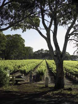
5 Creating and producing communications. Creative assets. Each region (including Generic South Australia) has a suite of assets which can be accessed to complile any number of communications from printed material and press, to interactive media (such as powerpoint or websites). These assets can be downloaded from To obtain a guide of possible visual styles, it is recommended to review some of the finished assets located on page 21 and the aforementioned site. Colours. Each region has a specially selected colour to be used in association with each region s communications and these colours can be found on their respective page in this document. Hero and supporting imagery. One hero image and twelve supporting images have been selected to represent each region and are also found for visual reference in the following pages, and can also be downloaded from the website. Printing specifications. Although there are no restrictions on how to print materials, it is recommended that all printing be: Printed full colour (CMYK) off-set for quantities over 500. Printed full colour (CMYK) digital for lower quantities. Paper suggestions for printing. For a guide on what paper to select when organising printing: 100gsm Satin Coated paper for light weight material (such as single sided A4 hand-outs). 170gsm Satin Coated paper for mid weight material (such as a DL brochure). 300gsm Satin Coated Art Board for thicker card feel (such as a booklet front cover). For designers and printers. All assets needed to create any printed material, can be accessed through the website as mentioned earlier, including collected InDesign files, illustrator eps files, and hi-res CMYK tiff images. Please negotiate with your region contact to access their username and password for this site. p.5
.")
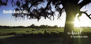
6 Generic South Australian assets. Generic SA phrase (top & middle left). These assets can be downloaded as an eps file for insertion to any media. It is recommended to appear as white on solid green/blue, or positioned atop either of the two hero images (right). This is the official supporting phrase of the South Australian umbrella region and can appear as shown close or seperated, though always in the order shown. This phrase should not be altered or unproportionally scaled in any way other than to convert it to solid black. Region colour (bottom left). When any Generic SA comunication is being created, it is essential that this colour be consistent with the region. The colour breakdowns are as follows. Spot Colour: PMS 5473C Four Colour: C-87 / M-50 / Y-50 / K-15 Screen Colour: R-39 / G-101 / B-110 Hero images (right). The images (right) have been selected as the hero images for use when representing South Australia as a region. The image selected should depend on the orientation of the graphic, ie. the horizontal image (bottom) should be used for landscape applications and the vertical image (top) for portrait applications. p.6
7 Adelaide Hills assets. Adelaide Hills name title (top left). This asset can be downloaded as an eps file for insertion to any media. It is recommended to appear as white on solid green, or positioned atop any image where contrast is strong enough to support the white type. Adelaide Hills phrase (bottom left). This is the official supporting phrase of the Adelaide Hills region and can appear as above on a highly contrasting portion of image, or stand alone atop the solid green. This phrase should not be altered or unproportionally scaled in any way other than to convert it to solid black (or green). Region colour (top right). When any Adelaide Hills comunication is being created, it is essential that this colour be consistent with the region. The colour breakdowns are as follows. Spot Colour: PMS 382C Four Colour: C-40 / M-0 / Y-90 / K-0 Screen Colour: R-165 / G-207 / B-76 Location map (bottom right). One hero image and twelve supporting images have been selected to represent each region and are also found for visual reference in the following pages, and can also be downloaded from the above site. p.7


8 Hero image. The image below has been selected as the hero image for use when representing the Adelaide Hills with one single image. Supporting images. This suite of images can be accessed through the Asset Management website. Each of these images exist as screen resolution and print resolution file. These images may be cropped as necessary, provided the essence of the image is not comprimised. The supporting images (right) can accompany this image in any combination or order, though the hero must accompany the phrase and region title when representing Adelaide Hills. p.8
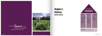
9 Barossa assets. Barossa name title (top left). This asset can be downloaded as an eps file for insertion to any media. It is recommended to appear as white on solid purple, or positioned atop any image where contrast is strong enough to support the white type. Barossa phrase (bottom left). This is the official supporting phrase of the Barossa region and can appear as above on a highly contrasting portion of image, or stand alone atop the solid purple. This phrase should not be altered or unproportionally scaled in any way other than to convert it to solid black (or purple). Region colour (top right). When any Barossa comunication is being created, it is essential that this colour be consistent with the region. The colour breakdowns are as follows. Spot Colour: PMS 242C Four Colour: C-60 / M-100 / Y-40 / K-20 Screen Colour: R-109 / G-33 / B-88 Location map (bottom right). One hero image and twelve supporting images have been selected to represent each region and are also found for visual reference in the following pages, and can also be downloaded from the above site. p.9


10 Hero image. The image below has been selected as the hero image for use when representing the Barossa with one single image. Supporting images. This suite of images can be accessed through the Asset Management website. Each of these images exist as screen resolution and print resolution file. These images may be cropped as necessary provided the essence of the image is not comprimised. The supporting images (right) can accompany this image in any combination or order, though the hero must accompany the phrase and region title when representing Barossa. p.10
11 Clare Valley assets. Clare Valley name title (top left). to any media. It is recommended to appear as white on solid yellow, or positioned atop any image where contrast is strong enough to support the white type. Clare Valley phrase (bottom left). region and can appear as above on a highly contrasting portion of image, or stand alone atop the solid yellow. This phrase should not be altered or unproportionally scaled in any way other than to convert it to solid black (or yellow). Region colour (top right). When any Clare Valley comunication is being created, it is essential that this colour be consistent with the region. The colour breakdowns are as follows. Spot Colour: PMS 7405C Four Colour: C-10 / M-20 / Y-100 / K-0 Screen Colour: R-233 / G-195 / B-30 Location map (bottom right). One hero image and twelve supporting images have been selected to represent each region and are also found for visual reference in the following pages, and can also be downloaded from the above site. p.11


12 Hero image. The image below has been selected as the hero image for use when representing the Clare Valley with one single image. Supporting images. This suite of images can be accessed through the Asset Management website. Each of these images exist as screen resolution and print resolution file. These images may be cropped as necessary provided the essence of the image is not comprimised. The supporting images (right) can accompany this image in any combination or order, though the hero must accompany the phrase and region title when representing Clare Valley p.12
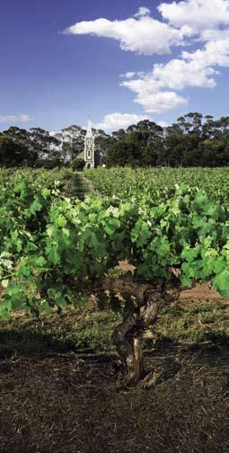
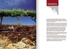
13 Coonawarra assets. Coonawarra name title (top left). This asset can be downloaded as an eps file for insertion to any media. It is recommended to appear as white on solid burgandy, or positioned atop any image where contrast is strong enough to support the white type. Coonawarra phrase (bottom left). This is the official supporting phrase of the Coonawarra region and can appear as above on a highly contrasting portion of image, or stand alone atop the solid burgandy. This phrase should not be altered or unproportionally scaled in any way other than to convert it to solid black (or burgandy). Region colour (top right). When any Coonawarra comunication is being created, it is essential that this colour be consistent with the region. The colour breakdowns are as follows. Spot Colour: PMS 1807C Four Colour: C-15 / M-100 / Y-88 / K-35 Screen Colour: R-148 / G-17 / B-31 Location map (bottom right). One hero image and twelve supporting images have been selected to represent each region and are also found for visual reference in the following pages, and can also be downloaded from the above site. p.13


14 Hero image. The image below has been selected as the hero image for use when representing the Coonawarra with one single image. Supporting images. This suite of images can be accessed through the Asset Management website. Each of these images exist as screen resolution and print resolution file. These images may be cropped as necessary provided the essence of the image is not comprimised. The supporting images (right) can accompany this image in any combination or order, though the hero must accompany the phrase and region title when representing Coonawarra p.14
15 Langhorne Creek assets. Langhorne Creek name title (top left). This asset can be downloaded as an eps file for insertion to any media. It is recommended to appear as white on solid brown, or positioned atop any image where contrast is strong enough to support the white type. Langhorne Creek phrase (bottom left). This is the official supporting phrase of the Langhorne Creek region and can appear as above on a highly contrasting portion of image, or stand alone atop the solid brown. This phrase should not be altered or unproportionally scaled in any way other than to convert it to solid black (or brown). Region colour (top right). When any Langhorne Creek comunication is being created, it is essential that this colour be consistent with the region. The colour breakdowns are as follows. Spot Colour: PMS 140C Four Colour: C-56 / M-65 / Y-100 / K-0 Screen Colour: R-138 / G-105 / B-58 Location map (bottom right). One hero image and twelve supporting images have been selected to represent each region and are also found for visual reference in the following pages, and can also be downloaded from the above site. p.15


 can accompany")

16 Hero image. The image below has been selected as the hero image for use when representing the Langhorne Creek with one single image. Supporting images. This suite of images can be accessed through the Asset Management website. Each of these images exist as screen resolution and print resolution file. These images may be cropped as necessary provided the essence of the image is not comprimised. The supporting images (right) can accompany this image in any combination or order, though the hero must accompany the phrase and region title when representing Langhorne Creek p.16
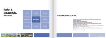
17 McLaren Vale assets. McLaren Vale name title (top left). This asset can be downloaded as an eps file for insertion to any media. It is recommended to appear as white on solid blue, or positioned atop any image where contrast is strong enough to support the white type. McLaren Vale phrase (bottom left). This is the official supporting phrase of the McLaren Vale region and can appear as above on a highly contrasting portion of image, or stand alone atop the solid blue. This phrase should not be altered or unproportionally scaled in any way other than to convert it to solid black (or blue). Region colour (top right). When any McLaren Vale comunication is being created, it is essential that this colour be consistent with the region. The colour breakdowns are as follows. Spot Colour: PMS 285C Four Colour: C-90 / M-50 / Y-0 / K-0 Screen Colour: R-0 / G-116 / B-188 Location map (bottom right). One hero image and twelve supporting images have been selected to represent each region and are also found for visual reference in the following pages, and can also be downloaded from the above site. p.17


18 Hero image. The image below has been selected as the hero image for use when representing the McLaren Vale with one single image. Supporting images. This suite of images can be accessed through the Asset Management website. Each of these images exist as screen resolution and print resolution file. These images may be cropped as necessary provided the essence of the image is not comprimised. The supporting images (right) can accompany this image in any combination or order, though the hero must accompany the phrase and region title when representing McLaren Vale p.18
19 Riverland assets. Riverland name title (top left). This asset can be downloaded as an eps file for insertion to any media. It is recommended to appear as white on solid pale blue, or positioned atop any image where contrast is strong enough to support the white type. Riverland phrase (bottom left). This is the official supporting phrase of the Riverland region and can appear as above on a highly contrasting portion of image, or stand alone atop the solid pale blue. This phrase should not be altered or unproportionally scaled in any way other than to convert it to solid black (or pale blue). Region colour (top right). When any Riverland comunication is being created, it is essential that this colour be consistent with the region. The colour breakdowns are as follows. Spot Colour: PMS 278C Four Colour: C-46 / M-17 / Y-0 / K-0 Screen Colour: R-132 / G-182 / B-226 Location map (bottom right). One hero image and twelve supporting images have been selected to represent each region and are also found for visual reference in the following pages, and can also be downloaded from the above site. p.19


20 Hero image. The image below has been selected as the hero image for use when representing the Riverland with one single image. Supporting images. This suite of images can be accessed through the Asset Management website. Each of these images exist as screen resolution and print resolution file. These images may be cropped as necessary provided the essence of the image is not comprimised. The supporting images (right) can accompany this image in any combination or order, though the hero must accompany the phrase and region title when representing Riverland p.20


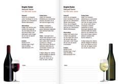

21 Communication examples. All region brochure. Adelaide Hills. C l a r eva l l e y. R i v e rla n d. How we got here document. Generic and regional 2metre banners. Tasting notes template. p.21
A Guide to Using the Generic Flyer Template
 A Guide to Using the Generic Flyer Template The purpose of this document is to demonstrate the creative uses of the Generic Flyer Template as well as providing a style guide for the successful application
Corporate Style Guide
 Corporate Style Guide Contents Our Brand Identity 1 The Elements 2 Colours 3 Typefaces 8 Unacceptable Applications 11 corporate style guide Our Brand Identity The Iluka brand identity represents the purpose
Brand Identity & Design Standards
 Brand Identity & Design Standards Copyright 2014 by the Tahoe Truckee Community Foundation All rights reserved Originally developed for use by the Tahoe Truckee Community Foundation December 2014 Information
OUR MASTER BRANDMARK BRANDMARK USAGE LIVE UNITED TAGLINE PRIMARY BRANDMARK OUR PURPOSE WHAT IT MEANS TO JOIN
 OUR MASTER BRANDMARK PRIMARY BRANDMARK The most fundamental visual element of a brand identity is its brandmark. The evolution of our brandmark is most dramatic in its configuration. The United Way symbol
columbusindiana Brand Graphics Information and Standards Guide
 columbusindiana Brand Graphics Information and Standards Guide August 2007 Introduction 1 A product is made in a factory. A brand is made in the mind. Walter Landor A well-respected brand can be our most
Using the logo. About the logo. Elements. The seal. The logotype. Third party logo use
 Style guide 218 Using the logo About the logo Jimmy is at the heart of everything we do as a charity and this is reflected by his name being at the foundation of our actions. The various elements of the
Branding guidelines - V /08/23 - Company confi dential - Internal use only
 Branding guidelines - V 1.0 2012/08/23 - Company confi dential - Internal use only The following visual identity guidelines are designed to achieve the highest level of consistency throughout communications
table of contents how to use the brand architecture book intro to Littleton history of Littleton history of logos brand analysis competitive landscape
 table of contents how to use the brand architecture book intro to Littleton history of Littleton history of logos brand analysis competitive landscape target audience the brand essence tagline positioning
ACADEMIC STYLE GUIDE Last updated October 2018
 ACADEMIC STYLE GUIDE Last updated October 2018 Join us in taking pride in our brand. Our University s brand is its identity. It is what people think of and feel when they hear our name. It differentiates
web MASTERBRAND MARK GUIDELINES
 02.2013 web MASTERBRAND MARK GUIDELINES The Masterbrand Mark The Carestream Masterbrand Mark is more than just our logo. It s the foundation on which our powerful brand communications are built. Our Masterbrand
Australian Dragon Boat Federation Corporate Style Guide. Australian Dragon Boat Federation Style Guide
 Australian Dragon Boat Federation Corporate Style Guide Australian Dragon Boat Federation Style Guide 1 Contents Introduction 3 Objective 4 NATIONAL LOGO 5 Australian Dragon Boat Federation Logo 6 Australian
Green Globes, GPC + Green Building Initiative GRAPHIC STANDARDS GUIDE
 Green Globes, GPC + Green Building Initiative GRAPHIC STANDARDS GUIDE Last Updated: December 29, 2014 WWW.THEGBI.ORG 503.274.0448 info@thegbi.org page 2 CONTENTS 1.0 Introduction 3 1.1 Our Mission 3 1.2
IDENTITY GUIDELINES AND GRAPHIC STANDARDS MANUAL SPRING 2017
 IDENTITY GUIDELINES AND GRAPHIC STANDARDS MANUAL SPRING 2017 THE IMPORTANCE OF GRAPHIC STANDARDS The United Mail logo is our unique graphic signature. It is one of the most visible aspects of the company
CONTENTS. 1. Our vision. 2. Our values. 3. The logo. 4. Guidance on the use of logo. 5. colourpalatte. 6. Typeface. 7. Imagery. 8.
 BRANDING GUIDELINES CONTENTS 1. Our vision 2. Our values 3. The logo 4. Guidance on the use of logo 5. colourpalatte 6. Typeface 7. Imagery 8. Merchendising 9. Advertisment OUR VISION neah is a young fashion
Roll Back Malaria Partnership. Brand Guidelines
 Roll Back Malaria Partnership Brand Guidelines How to use these guidelines Our identity is not just a logo. It is a design scheme composed of a number of core elements that come together to create a distinctive
UNITED WAY BRANDMARK. Brandmark Usage. The most fundamental visual element of a brand identity is its brandmark.
 OUR BRANDMARK 13 UNITED WAY BRANDMARK Brandmark Usage The most fundamental visual element of a brand identity is its brandmark. The evolution of our brandmark is most dramatic in its configuration. The
Brand Guidelines January 2016
 Brand Guidelines January 2016 Contents Brand Assets Logos Lock Up Brand Properties Brand Assets 04 Grow Wild, Kew & The Big Lottery Logos Lock Up 11 Brand Property: Scattered Seeds 22 Grow Wild Logo 05
printing A guide to newsprint printing
 A guide to newsprint A guide to newsprint Introduction Our aim in producing this guide is to help you modify your files to meet our paper and requirements, so you can receive the best print result possible.
Green Globes, GPC + Green Building Initiative GRAPHIC STANDARDS GUIDE
 Green Globes, GPC + Green Building Initiative GRAPHIC STANDARDS GUIDE Last Updated: October 26, 2014 WWW.THEGBI.ORG 503.274.0448 info@thegbi.org page 2 CONTENTS 1.0 2.0 3.0 Introduction 3 1.1 Our Mission
Brand Identity System Interim Guidelines 12/2011
 Brand Identity System Interim Guidelines 12/2011 Table of Contents Introduction 2 The jcp Flag 3 The Brand Identity Components 4 About the jcp Flag 5 Using the jcp Flag Three Size Versions 6 Using the
Visual Identity guidelines. Foróige National Youth Development Organisation Visual Identity Guidelines 1
 Visual Identity guidelines Foróige National Youth Development Organisation Visual Identity Guidelines 1 Contents Our Brand 3 Our identity, our brand 3 Branding guidelines for individual projects, services
WelcomeBC Graphic Standards Guide
 WelcomeBC Graphic Standards Guide The WelcomeBC Mark The WelcomeBC Mark is created by combining the BC ID with the WelcomeBC wordmark. The Mark uses the colours and typeface from the BC ID Mark to maintain
INTRODUCTION OUR VISION: We are driven to be a preeminent college of pharmacy in the world. Our world begins in Iowa. OUR MISSION:
 BRAND GUIDE INTRODUCTION TABLE OF CONTENTS BRAND MESSAGING Introduction.... 1 Core Brand Values... 2 BRAND IDENTITY Logo Usage.... 6 Primary Logo Variations.... 7 Department & Division Logos.... 8 What
printing An designer s guide to newsprint printing
 7 Toptips printing An designer s guide to newsprint printing The Meeting Place of Intelligent Business Introduction Our aim in producing this guide is to help you modify your files to meet our paper and
Green Globes, GPC + Green Building Initiative GRAPHIC STANDARDS GUIDE
 Green Globes, GPC + Green Building Initiative GRAPHIC STANDARDS GUIDE Last Updated: October 21, 2017 WWW.THEGBI.ORG 503.274.0448 info@thegbi.org CONTENTS 1.0 Introduction 3 2.0 Official GBI Marks (Logo
The ExCeL logo. ExCeL London brand guidelines V2
 10 The ExCeL logo 11 ExCeL logo ExCeL London and The ADNEC GROUP tab have been given more space to breathe, they are now separate elements that work together. This gives the structure of the organisation
LOGO USAGE JANUARY 2010 VERSION 2.0 BRAND IDENTITY GUIDELINES 6
 LOGO USAGE 6 Elements Arc Arc The Aviat Networks intersecting arcs represent our technology, guiding presence, vision for the future, and wireless network connections. Logotype Logotype The logotype for
GUIDELINES & INFORMATION
 GUIDELINES & INFORMATION This document will provide basic guidelines for the use of the World Animal Day logo and general knowledge about the various file formats provided. Adhering to these guidelines
ATHLETIC/SPIRIT STYLE GUIDE
 ATHLETIC/SPIRIT STYLE GUIDE Last updated July 2018 Join us in taking pride in our brand. Our University s brand is its identity. It is what people think of and feel when they hear our name. It differentiates
UBC Logos: Quick Guide
 primary logo UBC Full Signature The UBC Full Signature is the primary logo to be used on all applications. Please ensure that the signature is reproduced at a legible size. In instances where the space
Visual Guidelines Updated: April 1, 2016
 Visual Guidelines Updated: April 1, 2016 Logo Visual Guidelines/Logo Primary Logo Iconic Red M Logo This logo is the official primary logo for the Merillat brand. The red is Pantone 485, the Merillat word
Vision and Mission Statements
 Branding Guide Vision and Mission Statements Better evidence for a better world -Campbell Collaboration vision statement The Campbell Collaboration promotes positive social and economic change through
Identity Club Guidelines
 Identity Club Guidelines CLUB GUIDELINES DECEMBER 2015 Typography 1 Typography When it s used thoughtfully, typography becomes a powerful brand tool that can add visual meaning to what s being said. Northwestern
Graphic Standards. Graphic Standards. Graphic Standards
 Graphic Standards Graphic Standards Graphic Standards M A N U A L Introduction Graphic Design Standards astern Connecticut State University is one of four universities within the Connecticut State University
BRAND GUIDELINES. glasgow2018.com
 BRAND GUIDELINES glasgow2018.com Contents 1. Introducing the Brand page 3 2. Brand Elements page 4 3. Use of Welcome 2018 Logos page 6 4. Logo Association page 9 5. Applications of Glasgow 2018 Welcome
 BRANDING GUIDE 1 Table of Contents The AFL Name...2 Corporate Colors...4 Corporate Logo...5 Typography...10 Packaging...12 Vehicles...13 Signage...14 The AFL Name Throughout AFL s history, our name has
UNIVERSITY OF MANITOBA VISUAL IDENTITY GUIDE. May 24, 2013
 UNIVERSITY OF MANITOBA VISUAL IDENTITY GUIDE May 24, 2013 TABLE OF CONTENTS Signature 5 Colour 25 Typography 28 Photography 31 Bringing it all together: The University of Manitoba brand 35 Templates 53
LINKED LEARNING IDENTITY GUIDELINES V
 This style guide provides important information about using brand in a consistent manner Use this guide if you are a school or partner who wants to use brand If you are working with a professional designer,
Basic guideline Corporate signature & spirits
 Corporate signature & spirits Edgecore s corporate signature consists of the English name of the company, which derives from the concept that There is no edge limit, there is no permanent core and expresses
Visual Style Guide. April 2016
 Visual Style Guide April 2016 Contents Introduction to the Logo 3 Safe Area and Size 4 Incorrect Usage 5 Color Palette 6 Other Brand Elelments 7 Typography 8 Tone and Style of Photography 9 Print Examples
This guide should be read by anyone involved in creating communications for One You.
 This guide should be read by anyone involved in creating communications for One You. It explains the thinking behind our look and how easy it is to execute. Please take the time to read the following pages.
Brand Guidelines 12 December 2014
 Brand Guidelines 12 December 2014 Our brand Introduction A distinctive new approach to the transport infrastructure of Edinburgh deserves a bold new look. A whole new brand platform has been developed
A guide to our Brand A guide to our Brand
 A guide to our Brand WHITE SPACE White space is important to our brand, in order to achieve maximum impact within an advertorial piece maintaining minimum white space requirements are essential. Please
2.1. The Corporate Signature and Colors
 The Corporate Signature and Colors 2.1 The Southern States signature is the foundation for our brand identity system. Proper use of the signature is fundamental to the success of all applications. The
Graphic Standards Guide
 Graphic Standards Guide Purpose of this document This graphic standards guide is designed to assist CACCN members, staff and contracted suppliers in maintaining a consistent usage of the elements of the
CONTENTS LOOK AND FEEL TELLING OUR STORY 15 COLOR 16 IMAGERY STYLE 17 IMAGERY CONTENT 20 TYPOGRAPHY 23 COMPOSITION 25
 IDENTITY GUIDELINES The IALD identity guidelines introduce and define the visual elements we use to create the new IALD brand; our signature, color, imagery, typography and composition. The following layout
OUR VISUAL IDENTITY LOGO
 OUR VISUAL IDENTITY LOGO The Pima County Public Library logo represents an inspirational place that powers possibilities by offering everyone the opportunity to discover, explore, and expand their horizons.
APPROX SIZE_33.125"( mm)(W) x "( mm) (H) x 4"(101.6mm) (D) NOTE: THE DIGITAL FILE S ARTWORK IS 100% ACTUAL SIZE
(W) x ( mm) (H) x 4(101.6mm) (D) NOTE: THE DIGITAL FILE S ARTWORK IS 100% ACTUAL SIZE") 2010 Geoffrey, LLC Client: Toys R Us File Name: FAO_BigPiano_Corrugate_V1.ai Application: Adobe Illustrator CS3 One Geoffrey Way, Wayne, NJ 07480 tel. 973-617-3500 toysrus.com Date: 09/24/10 COLORS: Description:
2010 Geoffrey, LLC Client: Toys R Us File Name: FAO_BigPiano_Corrugate_V1.ai Application: Adobe Illustrator CS3 One Geoffrey Way, Wayne, NJ 07480 tel. 973-617-3500 toysrus.com Date: 09/24/10 COLORS: Description:
Corporate Brand Guidelines....your local connection
 Corporate Brand Guidelines Content Description of the whl.travel Logo 2 Explanation of the whl.travel Logo 3 Isolation Area 4 Typography 5 Minimum Size 6 Colour 7 Colour Reproduction 8 Incorrect Uses of
GRAPHIC IDENTITY MANUAL
 GRAPHIC IDENTITY MANUAL GRACELAND UNIVERSITY GRAPHIC IDENTITY 2 INTRODUCTION The Graceland University Graphic Identity Standards Manual was created to provide all Graceland University employees and associates
United States Edition. Children s Miracle Network Hospitals. Brand Standards Quick Guide
 United States Edition Children s Miracle Network Hospitals Brand Standards Quick Guide 09.07.10 Core Elements Our Signature The Children s Miracle Network Hospitals signature consists of three elements:
ELECTRONIC DRAFTING GUIDELINES
 ELECTRONIC DRAFTING GUIDELINES Edition No. 6 Updated November 2016 TABLE OF CONTENTS Section Title Page 1 Definitions 3 2 Drawing Format 3 2.1 Standards & Guidelines 3 2.2 Survey Plans 4 2.3 Underground
OUR VISUAL IDENTITY. Logo
 Logo The Pima County Public Library logo represents an inspirational place that powers possibilities by offering everyone the opportunity to discover, explore, and expand their horizons. It incorporates
Graphics Standards Manual
 Graphics Standards Manual Summary This visual identity is the face Stonehill College will show the public. It is representative of Stonehill College s unique character and purpose. The signature s wide
Graphic Design Standards
 Graphic Design Standards CONTENTS 3 4 4 5 6 7 8 9 10 11 12 INTRODUCTION COLOR VALUES FONTS LOGO ARRANGEMENTS & GUIDELINES PROPER USAGE IMPROPER USAGE STAGING MINIMUM SIZE BUSINESS CARD APPAREL LINKS TO
Graphic Identity Standards
 Graphic Identity Standards Aquinas College Graphic standards Manual Section One Contents Introduction Format Colors Isolation Acceptable Variations Unacceptable Variations Sizes Typography Letterhead Envelopes,
MNAO ACCESSORY OPERATIONS. GENUINE ACCESSORIES Packaging Guidelines
 MNAO ACCESSORY OPERATIONS GENUINE ACCESSORIES Packaging Guidelines 1 Introduction The brand Mazda has become a mark of excellence worldwide. With a rich history in technology development and a wide variety
DESIGN GUIDE CUSTOM BOTTLES
 DESIGN GUIDE CUSTOM BOTTLES Artwork File Formats Artwork for custom bottle printing may be received in both vector or raster file formats depending on the type of artwork. Artwork will be determined by
Our logo First Data Corporation. All Rights Reserved. First Data Brand Guidelines, Page 4
 Our logo A logotype is the visual symbol of an organization, representing the company s strengths, its aspirations and its character. Our logotype was chosen for its ability to represent who we are today
BRAND STYLE GUIDE External 07/ 2011
 BRAND STYLE GUIDE External 07/ 2011 TABLE OF CONTENTS understanding the brand 01 What is a brand? 01 Why are guidelines needed? 01 Who should use these guidelines? 01 How should they be used? 01 Brand
Branding and Visual Identity Guidelines
 Branding and Visual Identity Guidelines UPDATED: February 1, 2018 MASTER BREWERS BRAND GUIDELINES REQUIREMENTS Before grabbing a Master Brewers logo, please be sure to comply with our basic rules in the
L O G O G U I D E L I N E S
 LOGO GUIDELINES To ensure consistency in Arcoaire brand communications, the Elite Dealer crest can only be used in accordance with the specifications listed in the following pages. 1 Logo Elements Crest
L O G O G U I D E L I N E S
 LOGO GUIDELINES To ensure consistency in Comfortmaker brand communications, the Elite Dealer crest can only be used in accordance with the specifications listed in the following pages. 1 Logo Elements
CHECK POINT IDENTITY GUIDELINES. Version 1
 CHECK POINT IDENTITY GUIDELINES Version 1 Contents 3 Manifesto 4 Logo 9 Colors 10 Typography 11 Photography 17 Design System 18 Design System Usage 19 Design Examples 22 Contact WE SECURE THE FUTURE The
APTIM MEDIA KIT 2018 Version
 APTIM MEDIA KIT 2018 Version 2018.01 LOGO STACKED LOGO The stacked logo should be used as the default logo throughout the APTIM brand, unless there are issues with horizontal spacing or alignment. STACKED
Creating Digital Artwork
 5Steps to Creating Digital Artwork (For more detailed instructions, please click here) Introduction to Digital Artwork Authors often choose to include digital artwork as part of a submission to a medical
We are diligent in keeping the Truck-Lite brand clean and standardized. We created these guidelines to ensure that all parties use our brand elements
 We are diligent in keeping the Truck-Lite brand clean and standardized. We created these guidelines to ensure that all parties use our brand elements consistently. Contents 2, 3 4, 5 6, 7 8, 9 10 15 10,
BRAND COMMUNICATION STANDARDS. February 20121
 BRAND COMMUNICATION STANDARDS February 20121 Overview & Contacts Snap-on is a world class brand and well-known trademarks that has gained the recognition and respect of professionals across the world.
L O G O G U I D E L I N E S
 LOGO GUIDELINES To ensure consistency in KeepRite brand communications, the Elite Dealer crest can only be used in accordance with the specifications listed in the following pages. 1 Logo Elements Crest
ReadBox Project -Newspaper front page-
 ReadBox Project -Newspaper front page- Let s write your own newspaper front page! During this Readbox project you are going to become a real newspaper writer. For this project, you will create a newspaper
CEVA Brand Identity Basics
 The logo and other CEVA intellectual property contained in these guidelines are protected by national and international laws and conventions on trademark and copyright. All reproduction, full or partial,
BRAND COMMUNICATION STANDARDS
 BRAND COMMUNICATION STANDARDS March 2010 1 Overview & Contacts Snap-on is a world class brand and well-known trademarks that has gained the recognition and respect of professionals across the world. Accordingly,
What we look like. Our visual identity
 What we look like Our visual identity Our logo Our logo is the most important visual signifier of our Brand. The logo is always be presented on a white background to ensure consistency and visual impact.
V I S U A L S TA N D A R D S G U I D E
 V I S U A L S TA N D A R D S G U I D E table of contents Introduction 1 elements of the visual identity Wordmark 2 Tagline 2 Additional identifiers 3 Using the institutional acronym 3 Signature 4 Using
RUNNING FOR ALL LOGO STYLE GUIDE Edition 1 March 2017
 RUNNING FOR ALL LOGO STYLE GUIDE Edition 1 March 2017 Using this Logo Style Guide 2 This Style Logo Guide is for the use of those involved in the design and production of promotional or information material
The National Exchange Club. Branding Guide
 The National Exchange Club Branding Guide Table of contents Introduction 1 Exchange personality 2 Logo components 3 Exchange emblem and logo 4 Clear space around the logo 5 Official Exchange colors 6 Logo
ECMC Brand Guidelines November 2017 Home Contents Logo Colours Typeface Tone of voice Graphics Photography Examples Contact. Brand guidelines.
 Page 1 Brand guidelines. Page 2 Introduction. Our logo Introduction 03 Centre Specific 04 Sizes and Safe areas 05 Funder lock-up 06 Do s & dont s 07 The ECMC network brings together the talent and the
BU3 Beijing 2008/Johnson & Johnson (English & Chinese)
") BU3 Worldwide Partner & Worldwide Olympic Partner Identity Guidelines 06/07/06 i. Overview Worldwide Partner & Worldwide Olympic Partner Table of contents Overview i. Table of contents ii. Using these
BU3 Worldwide Partner & Worldwide Olympic Partner Identity Guidelines 06/07/06 i. Overview Worldwide Partner & Worldwide Olympic Partner Table of contents Overview i. Table of contents ii. Using these
THE PARTNERSHIP FOR THE EAST ASIAN-AUSTRALIASIAN FLYWAY LOGO
 Partnership of the East Asian-Australasian Flyway I LOGO Guide THE PARTNERSHIP FOR THE EAST ASIAN-AUSTRALIASIAN FLYWAY LOGO Pantone 654 Process C: 100 / M: 67 / Y: 0 / K: 38 Web Safe R: 0 / G: 51 / B:
Blue Light Brand Guidelines Phase 1 The Logo. Fostering positive youth and community relationships
 Blue Light Brand Guidelines Phase 1 The Logo Fostering positive youth and community relationships Introduction Blue Light has grown rapidly in the past 30 years and the charity should be very proud of
Instructions for Figure Submission
 Instructions for Figure Submission Please double check that your figures meet ALL of the following criteria: 1. Authors should be pleased with the figure submission quality before submission. It is recommended
Letter from the President
 Letter from the President Dear Friends and Members of the Hyundai Family: Everyday, each one of us strives for improvement in our work as we collectively take one small step closer on our long journey
BRAND IDENTITY QUICK REFERENCE GUIDE
 BRAND IDENTITY QUICK REFERENCE GUIDE Intro Intro TAHOE Boats has developed this Brand Identity Guide for you our associates, dealers and vendors. It is designed to guide you in the proper use of our company
Brand Guidelines v1.0
 Brand Guidelines 2019 v1.0 Overview Ticketek is New Zealand's gateway to the live entertainment experience. Using innovative technology, we ve become New Zealand's leading platform for connecting millions
Introduction NANO-TEX BRAND GUIDELINES
 2 Introduction A new vision. Nano-Tex s new brand has been developed to strongly represent our company and instantly convey the benefits of our technology in the marketplace. This document will explain
Logo & Campaign Standards
 Logo & Campaign Standards January 1, 2009 Copyright 2009, Park & Company Marketing Communications, Inc. TABLE OF CONTENTS Water Use It Wisely Overview.....................................................
Logo Usage Guidelines
 Logo Usage Guidelines Index Introduction... 03 ICM 2018... 04 Signature Logos... 05 - Basic standards... 06 - Minimum size and buffer space... 08 - Application on backgrounds... 09 - Chromatic variations...
APPROVED LOGOS LOGO USAGE GUIDELINES SUBLOGOS TAGLINE USAGE DISCONTINUED LOGOS COLOR GUIDE STATIONERY SUITE
 APPROVED LOGOS LOGO USAGE GUIDELINES SUBLOGOS TAGLINE USAGE DISCONTINUED LOGOS COLOR GUIDE STATIONERY SUITE APPROVED LOGOS PRIMARY LOGO Preferred usage of the primary logo is in conjunction with the It
105 BRAND GUIDELINES Ensuring people aren t in the dark about their power cut.
 105 BRAND GUIDELINES Ensuring people aren t in the dark about their power cut. Contents 2 3 Brand strategy 7 Brand elements 17 Applying the elements 32 Partners best practice 4 Brand objectives 8 Logo
CATEGORY SKILL SET REF. TASK ITEM
 ECDL / ICDL Image Editing This module sets out essential concepts and skills relating to the ability to understand the main concepts underlying digital images and to use an image editing application to
CREATIVITY AND DESIGN SKILLS QUESTION BANK
 UNIVERSITY OF CALICUT SCHOOL OF DISTANCE EDUCATION BMMC (2011 Admn.) IV SEMESTER CORE COURSE CREATIVITY AND DESIGN SKILLS QUESTION BANK 1. Creativity a. Origination of new thing b. Duplication c. modified
Standard Typefaces. Conditions of Sale and Standard Typefaces. The following typestyles available when using ink printing:
 Typefaces Select from the following typefaces if you want us to do the production. We ll be happy to prepare the camera-ready artwork for your materials. Simply give us a detailed description of the design
Portfolio Primer University of Minnesota School of Architecture College of Design
 Portfolio Primer University of Minnesota School of Architecture College of Design John Comazzi, Associate Professor of Architecture Let your images breath. Avoid overlaps of images and text over images.
Identity Guidelines 02 Signature. 03 Clear Zone and Sizing 04 Trademark 05 Configurations 06 Restrictions 07 Color Palette 08 Acceptable Usage
 Identity Guidelines 02 Signature 03 Clear Zone and Sizing 04 Trademark 05 Configurations 06 Restrictions 07 Color Palette 08 Acceptable Usage Signature The term signature commonly refers to a basic configuration
Our brand. Guidelines / April 2016
 Our brand Guidelines / April 2016 Brand philosophy Wellcome exists to improve health for everyone by helping great ideas to thrive. We re a global charitable foundation, both politically and financially
2018 MEDIA KIT SEPTEMBER expochicago.com OPENING PREVIEW THURSDAY 27 SEPT CHICAGO NAVY PIER
 THURSDAY 27 SEPT Presenting Sponsor 2018 MEDIA KIT epochicago.com Photo: Lincoln Schatz OVERVIEW EXPO CHICAGO, the International Eposition of Contemporary & Modern Art, takes place each September at historic
Branding guide. Ocean Harvest
 Branding guide Ocean Harvest Delivering results through responsible operations in a sustainable sea Contents Introduction.... 4 Vision and values.... 5 Logo.... 6 Colors.... 8 Photography.... 10 Illustrations....
DRAFT UNIVERSITY OF ARKANSAS AT PINE BLUFF. Athletic Brand Identity Guidelines
 DRAFT UNIVERSITY OF ARKANSAS AT PINE BLUFF Athletic Brand Identity Guidelines August 2014 TABLE OF CONTENTS 4 6 9 13 16 19 27 32 34 37 Introduction Primary Athletic Identity Marks Secondary Athletic Identity
OUR VISION Provide exceptional printed products and services to the trade
 100% WHOLESALE OUR VISION Provide exceptional printed products and services to the trade OUR MISSION Provide peace of mind through empowered dedicated associates who strive to exceed our customers expectations
Marketing Guidelines. Disney Meetings Catered Events Group Tickets
 Marketing Guidelines Disney Meetings Catered Events Group Tickets Disney DMMG04-2018 1 Content 1.0 Introduction...3 2.0 Approval Process...4 3.0 Marketing Guidelines at a Glance...5 4.0 Logos...6 5.0 Imagery