BRAND COMMUNICATION STANDARDS. February 20121
|
|
|
- Julius Carter
- 5 years ago
- Views:
Transcription

1 BRAND COMMUNICATION STANDARDS February 20121
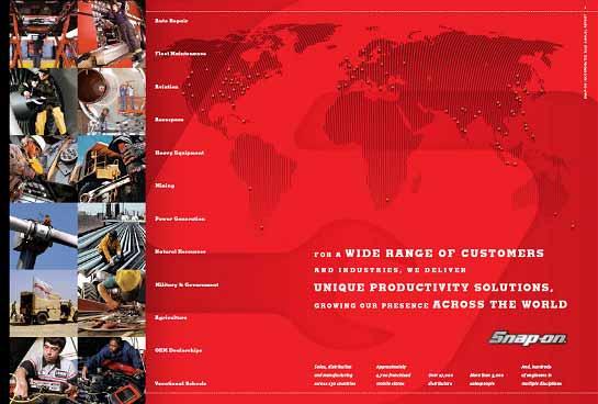
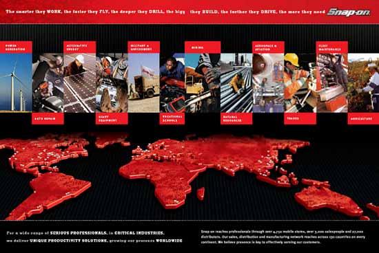
2 Overview & Contacts Snap-on is a world class brand and well-known trademarks that has gained the recognition and respect of professionals across the world. Accordingly, we have established standards and guidelines to maintain a consistent and powerful image for the brand. Please follow them carefully and consistently. These standards will be updated from time to time. If you have questions, need files or wish to discuss your project, please contact these Snap-on people. Approvals, Primary Graphics, Standards & Files: Al Mueller, Brand Marketing al.mueller@snapon.com Files are available on the intranet at: Brand Management, Policies & Practices: Alicia Smales, CMO alicia.a.smales@snapon.com 2
3 Brand Messaging Direction Align all communications to this core message. All branded communications should deliver against one or more of these ideas in copy, tone and manner. Core Message Snap-on has earned the trust and respect of generations of professionals passionate about finding smart solutions for their challenges. By creating and standing behind the best productivity solutions in the world, Snap-on has become an extension of their hands and hearts. That is the Snap-on difference. Key Message Points Working Smarter The Defining Standard for Professionals The Most Practical, Original, Inventive Solutions A Relentless Determination to Be The Best 3
4 Use Of Trademark In Publications The following general guidelines should ALWAYS be followed when using a trademark owned or licensed by Snap-on. These guidelines should be followed on every publication, such as an advertisement, catalog or the like, both online and in print. 1. Follow the applicable Style Guide when using a Snap-on trademark. Style Guides ( Brand Communication Standards ) are available from Al Mueller, Brand Marketing: al.mueller@snapon.com 2. When using Snap-on trademarks in publications, use (designating a registered mark) or (designating a mark that is not registered) where proper and feasible. It is important to include these symbols with the Snap-on marks because this provides others with notice of our rights and deters others from making unauthorized use of our marks. These symbols should be placed immediately after the mark, in either subscript or superscript. A should be used only when a mark is registered in the country to which the publication is directed and for the product or service featured or discussed in the publication. To find out whether the mark is registered in a particular country: - use the Trademark Database accessible from the Snap-on IP Website, or contact the Legal Department. 3. If a trademark is used many times in one publication, the most prominent occurrence must include the or as specified in 2. above. Subsequent occurrences of the same trademark should be set off from surrounding text and displayed in ITALIC CAPS. Slogans are written title case in italic such as Excellent Individually... Better Together for RSI 4
5 Use Of Trademark In Publications 4. No other artwork or text touches a trademark 5. Avoid allowing trademarks to stand alone. Present them as modifying a generic term. - For example: Snap-on socks or Snap-on, not simply a Snap-on 6. Trademarks are not to be modified in any way. Trademarks cannot be used in the possessive - For example: SNAP-ON s socks Trademarks cannot be made plural - For example: SNAP-ONs Trademarks cannot be hyphenated - For example: SNAP-ON-related items or the SNAP-ON-family Trademarks cannot be made into a verb - For example: SNAP-ONized or SNAPPED-ON Trademarks cannot be abbreviated, altered, extended or modified - For example: SNAP-ONation, SNAP-ONit 7. In all publications, include a footnote indicating the ownership of any of the Snap-on marks referenced in the publication: λλλλλis a trademark of Snap-on Incorporated. (λλλλλ is the space for the trademark(s)) For copyrighted material, proper notice is given by: - (YEAR OF FIRST PUBLICATION) Snap-on Incorporated. All rights reserved. 5
6 Use Of Trademark In Publications 8. Snap-on respects other companies trademarks. Under certain circumstances, it may be appropriate to use another company s trademark in order to: (1) truthfully refer to the other company or its products or (2) because Snap-on has a license to use another company s trademark. Please consult legal for any questions regarding appropriate use of another company s trademark. If a another company s trademark is being used to truthfully refer to another company or its product, but is not a trademark that Snap-on licenses, the publication should endeavor to include the appropriate symbol ( or ) and the following notice should be included in a footnote along with the Snap-on trademark ownership statement (discussed in above in 7): All other trademarks are the property of their respective owners. If another company s trademark is being used subject to a license that Snap-on has with that company, trademark notices and ownership statements must be in accordance with any license terms. 9. If many trademarks are in the publication, then λλλλλmay be a list of all of the trademarks, or you may adopt the following statement: This publication contains many Snap-on Incorporated trademarks, including but not limited to λ λλλλ[and list several of the primary marks referenced in the materials]. 10. ALWAYS VERIFY how a particular term is intended to be used. - For example, if SNAP-ON is used to identify the company Snap-on Incorporated, then NO or is used because this is not a trademark, but a company name. 11. Contact the Legal Department, your local TAM or IPC with any questions. 6
7 Badge And Primary Logos Badge The 3D badge incorporates dimension as a key element. It reflects the brand s chrome tool heritage while imparting a sense of strength and modernity. It is consistent with a super premium brand. Red Logo Red logo on white background is preferred usage when 3D logo is not appropriate. Black Logo Use on white or light colored background unsuitable for red. White Logo Use on red, black or other dark colored background unsuitable for red. 7
8 Logo Usage Trademark Legal Statement: Snap-on is a trademark of Snap-on Incorporated. (year of first publication) Snap-on Incorporated. All rights reserved. Trademark Legal Statement For Licensees: Snap-on is a trademark of Snap-on Incorporated and used under license. (year of first publication) Snap-on Incorporated. All rights reserved. On licensed products, licensees also need to include the Official License Product hangtag. Registered Trademark Symbol Placement of the must be following the second n in the logo and baselined with the n. This mark must be visually represented each time the Snap-on trademark is used. In those instances where the logo is repeated frequently within a document, the must be shown at least once. In documents where the trademark only appears in copy blocks, the registered trademark symbol should be shown in the first, or most prominent usage. When the trademark and/or logo are used, they should be accompanied by the trademark legal statement within document or usage. 8
9 Logo Usage x x x Minimum Clear Space Allow for minimum clear space equal to x on all sides of the logo. This area must be left empty of ANY typographic or design elements. x x x x Minimum Size The 3D logo s minimum width is 1-3/8. It should not be used in sizes smaller than this. Use the black, red or white logos for projects requiring a smaller size. x x Min width 1-3/8 Wrong Correct 9

10 Badge Logo Usage Coloring The 3D badge prints in 4-color Use grayscale where 4-color process is not applicable. Four Color Badge Usage Guidelines The logo always has a shine in the middle. Do not add a glint or highlight to any part of the logo. The logo is an illustration do not try to recreate it using type. Grayscale Badge Badge without drop shadow for use in non-print situations such as embroidery or emblems 10
11 Badge Logo Usage Technical Considerations Preferred Logo DCS Version Working with InDesign or Quark 7 (or later version) Use of 4-color native Illustrator (.ai) version of the 3D logo with drop shadow is recommended. Logo was created for use in any release of InDesign or Quark 7. Both allow placement of illustrator files into layout. If using 3D logo over a spot color (such as PMS 485 Red), or over a 4-color build or photo, use the native Illustrator file in your layout. Otherwise, you will encounter transparency issues with the logo s drop shadow. When printing on a laser printer from InDesign or Quark 7 using Illustrator file, logo may be surrounded by a box whose color varies from the background it was placed on. This should not be an issue in commercial offset printing. Working with an earlier release of Quark If placing the 3D logo over a spot color, use DCS version which employs PMS 485 as a placeholder color and then place into the Quark document. To change spot color used in the file, open file in Photoshop, double click on spot channel, find the preferred PMS and save. If placing 3D logo over a 4-color build or photo, burn the.tiff file into Photoshop, add a layer behind the logo with build or photo, then place file into Quark. 11

12 Incorrect Logo Usage Don t alter the logo in any way 2. Don t add graphic elements to the logo 3. Don t add type elements to the logo 4. Don t enclose within a shape 5. Don t use the logo without a register mark 6. Do not use in white on background except red or black 7. Don t use in color except red, black, white or 3D photo 8. Don t duplicate the logo style in type 9. Do not use logo in a headline or as a read-thru in text 10. Do not apply visually competitive backgrounds 11. Don t us the logo with borders around it 12. Do not use vintage logos without prior approval 13. Do not add a glint or highlight to the logo 14. Don t use graphic elements within the clear space 15. Do not overprint or use as a background pattern 16. Do not superimpose logo as a graphic element 12

13 Brand & Logo Colors RED CMYK RGB PMS 485 HEX ED1C24 RAL 3024 WHITE CMYK RGB Logo Colors The Snap-on logo can ONLY appear in Red, Black, White and 4-color 3D. The wrench S icon logo can ONLY appear in Red, Black or White. These logos may not be used in any other colors. GRAY CMYK RGB HEX RAL PMS Cool Gray 11 BLACK CMYK RGB PMS Process Black GOLD CMYK RGB PMS 136 HEX FDBA40 RAL 1017 Brand Colors These are the only Snap-on brand colors. The Gold color is designated as an accent color. It should be used to add emphasis, NOT as a field color. 13
14 Wrench S Icon Logos Red S on white is the preferred usage White S on a red colored background Minimum Height 3/8 Minimum Height 3/8 Black S on white or light colored background when the red S does not work Minimum Height 3/8 Wrench S Icon Logo This logo is used in situations where an icon is appropriate and the brand is well-known. It carries a TM following the same guidelines as the full logo. Colors should be used in the same order of preference: red, black, white. In some cases a true metallic or silver treatment may be used with approval from Snap-on. Clear space requirements (X height around logo) are the same as the full logo. Minimum Size The Wrench S logo minimum height is 3/8. It should not be used in sizes smaller than this. Minimum Height 3/8 White S on a black or other dark colored background 14

15 Wrench S and TIAD Logos 2 color Red S and black TIAD on white is the preferred usage Minimum Width 1-3/8 Minimum Width 1-3/8 Black icon on white or light colored background when the 2 color does not work Minimum Width 1-3/8 Wrench S with There is a Difference This logo is not be used for licensed product or apparel. The use of the tagline There is a Difference may be used if separated (and in a different location) from the Wrench S This logo may be used on product packaging and print material ONLY when the product is manufactured by Snap-on and the Snap-on difference is explained in the copy. It carries a TM following the same guidelines as the full logo. Clear space requirements (X height around logo) are the same as the full logo. White icon on red, black or other dark colored background Minimum Width 1-3/8 Minimum Size The Wrench S with TIAD logo minimum width is 1-3/8. It should not be used in sizes smaller than this. 2 color Red S and white TIAD on black or other dark colored background 15
16 Lifetime Warranty Logos Two color on light colored background is the preferred usage Two color on light colored background One color on white or light colored background Minimum Height 3/8 Minimum Height 3/8 Minimum Height 3/8 Lifetime Warranty Logo In specific situations, following direction of Snap-on product management, a lifetime warranty logo may be used in direct application to a product carrying this warranty. Full compliance with warranty notification rules are required for use. Clear space requirements (X height around logo) are the same as the full logo. Minimum Size The warranty logo minimum height is 3/8. It should not be used in sizes smaller than this. One color on red, black or other dark colored background Minimum Height 3/8 Minimum Height 3/8 16
17 Racing Logo PREFERED: 3 Color Flat Snap-on logo on white 3 Color 3d Snap-on logo on white 4 Color Process 3d chrome Snap-on logo on white Minimum Width 1-3/8 Racing Logo Racing logo incorporates the trademark logo with stylized racing & checker flag. Clear space requirements (X height around logo) are the same as the full logo. Do s and Don ts Follow the recommended usage. Do not make the racing logo s difficult to read or adorn them with techniques. Do not change the color of racing logos. Coloring Colors are limited to red, yellow, black, gray and white. In some cases, an acceptable color for embroidery would be light gray or silver with approval. Minimum Size The race logo minimum width is 1-3/8. It should not be used in sizes smaller than this. 1 Color Flat Snap-on logo on white 17

18 Racing Logo Usage 18


19 Official Licensed Product Logo Minimum Height 1 Black rule indicates trim, does not print OLP apparel: inside label on white background Minimum Width 1-3/8 OLP printed material: flyers and sales literature Black rule indicates trim, does not print OLP apparel hangtag: trim size 1-3/4 x4 on white Do s and Don ts Follow the recommended usage. Do not make the OLP logo difficult to read or adorn it with techniques. Do not change the colors. Coloring 4 color process is the preferred usage. Acceptable spot colors are PMS485 red, PMS136 gold and 100% black. Grayscale version can be used for 1 color printed material. Minimum Size Horizontal OLP min. width is 1-3/8 Vertical OLP min. width is 1. Apparel hangtag trim size; 1-3/4 x 4, prints 4 color process with an 1/8 diameter hole in upper left hand corner. 19

20 Hand Tool Product Logo s Minimum Width 1-3/8 Minimum Width 2-1/8 Minimum Width 1-3/8 Minimum Width 1-3/8 Do s and Don ts Follow the recommended usage. Do not make the product logo s difficult to read or adorn them with techniques. Do not change the color of product logos. Minimum Size The product logo minimum width is 1-3/8 unless specified different. It should not be used in sizes smaller than this. Coloring Logo color version shown is the preferred usage. 100% black or 100% white logos may be acceptable if files are provided. 20


21 Tool Storage Product Logo s Minimum Width 1-3/8 Minimum Height 1 Do NOT use Snap-on logo at this size Minimum Width 1-7/5 Minimum Width 1-7/5 Do s and Don ts Follow the recommended usage. Do not make the product logo s difficult to read or adorn them with techniques. Do not change the color of product logos. Minimum Size The product logo minimum width is 1-3/8 unless specified different. It should not be used in sizes smaller than this. Coloring Logo color version shown is the preferred usage. 100% black or 100% white logos may be acceptable if files are provided. Minimum Width 1-7/5 21


22 Diagnostic Product Logo s Minimum Width 1-3/8 Minimum Height 1-3/8 Minimum Width 1-3/8 Do s and Don ts Follow the recommended usage. Do not make the product logo s difficult to read or adorn them with techniques. Do not change the color of product logos. Minimum Size The product logo minimum width is 1-3/8 unless specified different. It should not be used in sizes smaller than this. Coloring Logo color version shown is the preferred usage. 100% black or 100% white logos may be acceptable if files are provided. 22
23 Equipment Product Logo s Minimum Width 1-3/8 Minimum Width 1-3/4 Do s and Don ts Follow the recommended usage. Do not make the product logo s difficult to read or adorn them with techniques. Do not change the color of product logos. Minimum Size The product logo minimum width is 1-3/8 unless specified different. It should not be used in sizes smaller than this. Coloring Logo color version shown is the preferred usage. 100% black or 100% white logos may be acceptable if files are provided. 23

24 Tool Control Product Logo s Minimum Width 1-3/8 DO NOT use the Snap-on logo at this size Do s and Don ts Follow the recommended usage. Do not make the product logo s difficult to read or adorn them with techniques. Do not change the color of product logos. Minimum Size The product logo minimum width is 1-3/8 unless specified different. It should not be used in sizes smaller than this. Coloring Logo color version shown is the preferred usage. 100% black or 100% white logos may be acceptable if files are provided. Minimum Height 1-3/8 24
25 Typography MEMPHIS Meta Fonts can be ordered at: Memphis Its boldness suggests power and will correspond to solid messages where visual impact is important. As a display type, this face is recommended for use over 24 point for titles, headlines or advertisements. A consistently popular typeface over the years for large headlines that need attention grabbing muscle. Meta Meta was chosen for its dynamic, clean and progressive appearance. It offers a complete family of options, condensed and regular, with weights from light to black, including italic. This extensive selection provides the flexibility needed for diverse applications. It is easy to read and globally available. 25
26 Typography MEMPHIS EXTRA BOLD ABCDEFGHIJKLMNOPQRSTUVWXYZ MEMPHIS BOLD ABCDEFGHIJKLMNOPQRSTUVWXYZ For use in: >Headlines >Subheads >Callouts Memphis Extra Bold Its boldness suggests power and will correspond to solid messages where visual impact is important. As a display face, this face is recommended for use over 24 point, in all caps, for titles, headlines and impact. A consistently popular typeface over the years for headlines that need attention grabbing muscle needed for diverse applications. It is easy to read and globally available. Memphis Bold When space becomes an issue in design, or for use under 24 point, this type display can be used for impact in headlines and titles. Fonts can be ordered at: 26
27 Typography Meta Book ABCDEFGHIJKLMNOPQRSTUVWXYZ Meta Medium ABCDEFGHIJKLMNOPQRSTUVWXYZ Meta Bold ABCDEFGHIJKLMNOPQRSTUVWXYZ Meta Black ABCDEFGHIJKLMNOPQRSTUVWXYZ For use in: >Headlines >Subheads >Body Text >Captions >Charts Meta Condensed Book ABCDEFGHIJKLMNOPQRSTUVWXYZ Meta Condensed Medium ABCDEFGHIJKLMNOPQRSTUVWXYZ Meta Condensed Bold ABCDEFGHIJKLMNOPQRSTUVWXYZ Meta Condensed Black ABCDEFGHIJKLMNOPQRSTUVWXYZ Italic versions available for each font shown above Fonts can be ordered at: Meta Meta was chosen for its dynamic, clean and progressive appearance. It offers a complete family of options, condensed and regular, with weights from light to black, including italic and ligatures. This extensive selection provides the flexibility needed for diverse applications. It is easy to read and globally available. When using this typography in catalogs and number-heavy applications, note that the numerals ascend and descend. Meta LF is the recommended alternative for these applications. 27
28 Typography Meta Book LF ABCDEFGHIJKLMNOPQRSTUVWXYZ Meta Medium LF ABCDEFGHIJKLMNOPQRSTUVWXYZ Meta Bold LF ABCDEFGHIJKLMNOPQRSTUVWXYZ Meta Condensed Book LF ABCDEFGHIJKLMNOPQRSTUVWXYZ Meta Condensed Medium LF ABCDEFGHIJKLMNOPQRSTUVWXYZ Meta Condensed Bold LF ABCDEFGHIJKLMNOPQRSTUVWXYZ Meta LF Meta LF can be used when numbers are required. The numerals align evenly, without ascenders and descenders distracting the eye. Meta Black LF ABCDEFGHIJKLMNOPQRSTUVWXYZ For use in: >Headlines >Subheads >Body Text >Captions >Charts Meta Condensed Black LF ABCDEFGHIJKLMNOPQRSTUVWXYZ Italic versions available for each font shown above Fonts can be ordered at: 28
29 Typography Computer Applications Ariel Regular ABCDEFGHIJKLMNOPQRSTUVWXYZ Ariel Black ABCDEFGHIJKLMNOPQRSTUVWXYZ Ariel Narrow ABCDEFGHIJKLMNOPQRSTUVWXYZ Ariel Ariel is an acceptable typography choice for computer-based applications like Microsoft Office, all forms of websites and online communications. It is a globally used typeface. Helvetica is an acceptable substitute where Ariel is not available or for exceptionally dense documents. For use in: >Headlines >Subheads >Body Text >Captions >Charts Italic versions available for each font shown above Fonts can be ordered at: 29
30 Typography DO YOUR TOOLS SPEAK TO YOU? YES D O Y O U R T O O L S S P E A K? NO Do not letter space type Do s and Don ts Follow the recommended usage. Do not make the fonts difficult to read or adorn them with techniques that are not consistent with a professional brand. NO Do not manipulate type Do your tools speak to you? NO Especially below 24 point, use all caps with Memphis 30


31 Graphic Elements Recommended Bullet Hierarchy First level bullets» Second level bullets Third level bullets Fourth level bullets Other Graphic Elements Rules black, white, gray, red» Dotted line ok Corners radius preferred Field colors lighter, or screened, variations of PMS Cool Gray 11» 10% black for a background color would be appropriate» Appropriate textures ok, even with black Accent or pop color for type and small graphic elements: PMS 136 Gold. 31


32 Box Front Photography Snap-on tool storage is an icon for the brand. Box front elements are used as graphic elements, backgrounds, borders and dividers within layouts. These are photographic. They may be cropped as needed, offering great flexibility. In their simplest form, they create red, photographic fields. See example ads that follow. 32
33 User Photography Guidelines Snap-on delivers productivity solutions to PROFESSIONAL users. When users are depicted, they should be working with tools, not mugging for the camera. Images should be crafted by desaturating overall color, while highlighting the red Snap-on color in the images. 1. This tech is concentrating on his work. Photography should look real, not posed. 2. Always show a safe working environment and correct gear, like eye protection and helmet here. 3. Lighting should be subdued and create a gritty, industrial feeling. 4. When focusing on a specific tool, show it in the proper work context. 33


34 Product Photography Guidelines A stylized approach should be used when depicting tools as still-life. The product should be shown as hero, cropping tightly to create tension and power in the photo. Use interesting textures from tool use or storage situations. 1. Show tools on an endemic background. 2. Shoot in tight close-up with handle/edge in the foreground. 3. Shoot at an angle that makes the product look strong, proud and heroic. Keep the logo in focus. 34

35 Photography Guidelines Photography Don ts 1. Do not show a professional user with a product that is not in active use. 2. Do not have a user directly engaged with the camera. They should be depicted working with a product. 3. Lighting should be realistic, not unusually bright for the situation. 4. Professional users and subjects should not be depicted as mugging for the camera they should be concentrating on the job. Posed photos are appropriate for INTERNAL audiences. 35
36 Putting It Together Ads and communications should have the same look, tone and manner across all businesses. This will build recognition and impact with customers. 1. Headline should drive active engagement with the reader or state a clear point of difference. 2. Photography is the dominant element, depicting tools at work. Color is desaturated, emphasizing red Snap-on equipment. 3. Always include a call to action 4. Drawer front art at the base of the ad provides strength and power to anchor the ad and draw attention to copy elements. 36

37 Magazine Ad Examples 37


38 Magazine Ad Examples 38


39 Magazine Ad Examples 39


40 Magazine Ad Examples 40


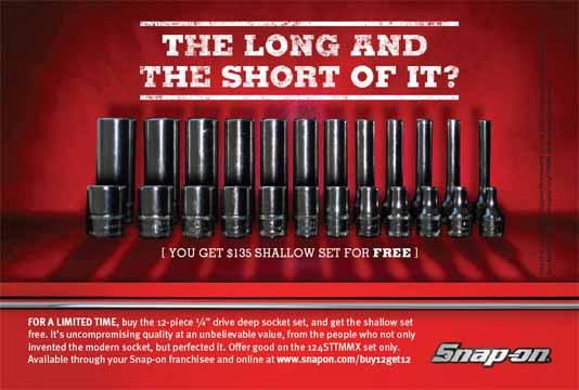
41 Magazine Ad Examples 41


42 Community Relations Examples 42

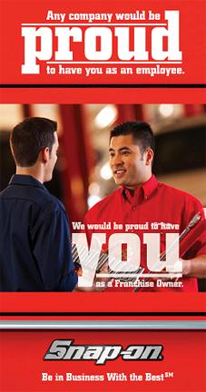
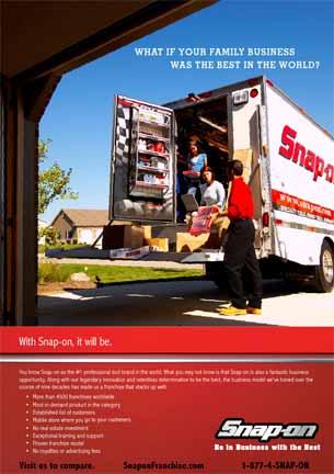
43 Recruiting Ad Examples 43


44 Trade Show Banners 44


45 Catalog Cover Examples 45

46 Catalog Inside Spread Example 46
47 E-Marketing Examples 47


48 Business Materials Snap-on business materials also need to conform to the brand communication standards. Typically, these materials are not product related and are branding the company or a person to various constituents like associates, investors, business partners, suppliers, etc. Overall, these materials should reflect a consistency of graphics and a professional look in keeping with a NYSE-traded company selling to serious, high-end professional users. 48


49 Business Material Examples << CD or DVD Label Meeting Binder Cover >> Sales Material Folder 49

50 Annual Reports 50

51 Annual Reports 51


52 Safety Brochure Example 52


53 Innovation Works Example 53

54 Meeting Materials Nametags are particularly important to the success of meetings and conferences. In preparing these, follow the direction below on all details. If a lanyard is used to display the tag, the tag must be printed on both sides with the same information. The first name should be significantly larger than the last name. The Snap-on logo against the storage bar is required at top or bottom. If color coding of tags is required, move the logo bar to the top. If additional information like title or location is desired, it should appear below the last name. Nametag template is available at: 54

 Field Sales Example Certification & Region ID Field Sales Example Military & Government Name in 9.5 pt.")
55 Business Cards As a professional, global company, Snap-on wants associates and representatives to present themselves in a dignified and professional manner. Business cards should meet this standard. They are not sales promotion materials. The red Snap-on logo is presented in the clear at top left on all cards. Some associates are required to display product brands they represent see example. Some associates may include approved icons to communicate certifications or associations. Order business cards at: Division in 8.5 pt. Meta Bold Contact Info in 8.5 pt. Meta Normal (Tel/Cell/Fax, etc. = Meta Normal Small Caps) Field Sales Example Certification & Region ID Field Sales Example Military & Government Name in 9.5 pt. Meta Bold Title in 8.5 pt. Meta Normal International Example Divisional Example Multi Product Brand Sales 55
56 Stationary Your Name Your Title The red logo is used here to carry the primary brand color. Name and title appear near the logo, following the clear space guidelines. These are indented to establish alignment of the body copy with the logo. Divisional and address information should appear at bottom left on correspondence and below the logo on envelopes. Order these materials at: Name th Street Kenosha, WI Division th Street, Kenosha, WI ph: / fax: your.name@snapon.com 56


57 Presentation Format & Guidelines The standard slide template and formatting directions are available at: Snap-on Associates External Suppliers CD/DVD or your Snap-on contact 57

58 Event Marketing Collateral 58


59 Event Marketing Displays 59

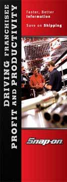
60 Collateral Material 60


61 Sales Promotion Materials 61


62 Direct Mail Example 62

63 Sales Collateral Examples 63
BRAND COMMUNICATION STANDARDS
 BRAND COMMUNICATION STANDARDS March 2010 1 Overview & Contacts Snap-on is a world class brand and well-known trademarks that has gained the recognition and respect of professionals across the world. Accordingly,
IDENTITY GUIDELINES AND GRAPHIC STANDARDS MANUAL SPRING 2017
 IDENTITY GUIDELINES AND GRAPHIC STANDARDS MANUAL SPRING 2017 THE IMPORTANCE OF GRAPHIC STANDARDS The United Mail logo is our unique graphic signature. It is one of the most visible aspects of the company
THE LOGO 4 COLOR PALETTE 6 LOGO USAGE 7 THE TYPEFACE 8 GENERAL GUIDELINES 10 TYPOGRAPHY USAGE 11 SUPPLEMENTAL ICONS 12
 BRAND GUIDELINES THE LOGO 4 Clear Area Alternate Logo Versions COLOR PALETTE 6 Color Options LOGO USAGE 7 THE TYPEFACE 8 Suggested Uses GENERAL GUIDELINES 10 TYPOGRAPHY USAGE 11 SUPPLEMENTAL ICONS 12
BRAND STYLE GUIDE External 07/ 2011
 BRAND STYLE GUIDE External 07/ 2011 TABLE OF CONTENTS understanding the brand 01 What is a brand? 01 Why are guidelines needed? 01 Who should use these guidelines? 01 How should they be used? 01 Brand
Visual Style Guide. April 2016
 Visual Style Guide April 2016 Contents Introduction to the Logo 3 Safe Area and Size 4 Incorrect Usage 5 Color Palette 6 Other Brand Elelments 7 Typography 8 Tone and Style of Photography 9 Print Examples
Green Globes, GPC + Green Building Initiative GRAPHIC STANDARDS GUIDE
 Green Globes, GPC + Green Building Initiative GRAPHIC STANDARDS GUIDE Last Updated: December 29, 2014 WWW.THEGBI.ORG 503.274.0448 info@thegbi.org page 2 CONTENTS 1.0 Introduction 3 1.1 Our Mission 3 1.2
SUBMITTING A PRESS-READY COVER For Paperback Books with Perfect Binding, Plastic Comb, and Plastic Coil Binding
 For Paperback Books with Perfect Binding, Plastic Comb, and Plastic Coil Binding Press-Ready Material We will only accept a digital file for a press-ready cover. The file must be print-ready with no typesetting
web MASTERBRAND MARK GUIDELINES
 02.2013 web MASTERBRAND MARK GUIDELINES The Masterbrand Mark The Carestream Masterbrand Mark is more than just our logo. It s the foundation on which our powerful brand communications are built. Our Masterbrand
C&L WARD BRAND GUIDE 1
 CONTENTS 2 The Logo 3 Formats 4 Correct Usage 5 Incorrect Usage 6 Alternate Logos 7 The Tagline 8 Color Palette 9 Fonts 10 Complimentary Fonts 11 Photography Styles 12 Photography to Avoid C&L WARD BRAND
THE VAN WERT COUNTY FOUNDATION BRAND STANDARDS
 THE VAN WERT COUNTY FOUNDATION BRAND STANDARDS 1.0 OVERVIEW As, The Van Wert County Foundation, our brand voice is a vehicle for the philanthropy of individuals, corporations and organizations that have
Brand Identity & Design Standards
 Brand Identity & Design Standards Copyright 2014 by the Tahoe Truckee Community Foundation All rights reserved Originally developed for use by the Tahoe Truckee Community Foundation December 2014 Information
ACADEMIC STYLE GUIDE Last updated October 2018
 ACADEMIC STYLE GUIDE Last updated October 2018 Join us in taking pride in our brand. Our University s brand is its identity. It is what people think of and feel when they hear our name. It differentiates
Introduction NANO-TEX BRAND GUIDELINES
 2 Introduction A new vision. Nano-Tex s new brand has been developed to strongly represent our company and instantly convey the benefits of our technology in the marketplace. This document will explain
Visual Guidelines Updated: April 1, 2016
 Visual Guidelines Updated: April 1, 2016 Logo Visual Guidelines/Logo Primary Logo Iconic Red M Logo This logo is the official primary logo for the Merillat brand. The red is Pantone 485, the Merillat word
UNIVERSITY OF MANITOBA VISUAL IDENTITY GUIDE. May 24, 2013
 UNIVERSITY OF MANITOBA VISUAL IDENTITY GUIDE May 24, 2013 TABLE OF CONTENTS Signature 5 Colour 25 Typography 28 Photography 31 Bringing it all together: The University of Manitoba brand 35 Templates 53
LINKED LEARNING IDENTITY GUIDELINES V
 This style guide provides important information about using brand in a consistent manner Use this guide if you are a school or partner who wants to use brand If you are working with a professional designer,
Green Globes, GPC + Green Building Initiative GRAPHIC STANDARDS GUIDE
 Green Globes, GPC + Green Building Initiative GRAPHIC STANDARDS GUIDE Last Updated: October 26, 2014 WWW.THEGBI.ORG 503.274.0448 info@thegbi.org page 2 CONTENTS 1.0 2.0 3.0 Introduction 3 1.1 Our Mission
MIT ATHLETICS. LOGO STANDARD GUIDELINES
 MIT ATHLETICS. LOGO STANDARD GUIDELINES LOGO STANDARD GUIDELINES: TABLE OF CONTENTS Copyright...03 Introduction...04 Our Colors...05 Our Font...06 Primary Mark Full Color...07 Grayscale and Black & White...08
Brand Guidelines 12 December 2014
 Brand Guidelines 12 December 2014 Our brand Introduction A distinctive new approach to the transport infrastructure of Edinburgh deserves a bold new look. A whole new brand platform has been developed
Using the logo. About the logo. Elements. The seal. The logotype. Third party logo use
 Style guide 218 Using the logo About the logo Jimmy is at the heart of everything we do as a charity and this is reflected by his name being at the foundation of our actions. The various elements of the
CHECK POINT IDENTITY GUIDELINES. Version 1
 CHECK POINT IDENTITY GUIDELINES Version 1 Contents 3 Manifesto 4 Logo 9 Colors 10 Typography 11 Photography 17 Design System 18 Design System Usage 19 Design Examples 22 Contact WE SECURE THE FUTURE The
L O G O G U I D E L I N E S
 LOGO GUIDELINES To ensure consistency in KeepRite brand communications, the Elite Dealer crest can only be used in accordance with the specifications listed in the following pages. 1 Logo Elements Crest
Green Globes, GPC + Green Building Initiative GRAPHIC STANDARDS GUIDE
 Green Globes, GPC + Green Building Initiative GRAPHIC STANDARDS GUIDE Last Updated: October 21, 2017 WWW.THEGBI.ORG 503.274.0448 info@thegbi.org CONTENTS 1.0 Introduction 3 2.0 Official GBI Marks (Logo
GRAPHIC IDENTITY MANUAL
 GRAPHIC IDENTITY MANUAL GRACELAND UNIVERSITY GRAPHIC IDENTITY 2 INTRODUCTION The Graceland University Graphic Identity Standards Manual was created to provide all Graceland University employees and associates
STEAM BRANDING GUIDELINES. Revised December 6, 2017
 STEAM BRANDING GUIDELINES Revised December 6, 2017 CONTENTS Branding Assets 1 General Guidelines 2 1 STEAM SYMBOL AND LOGO Hardware Application 4 On-screen and Printed Applications 6 2 STEAM MACHINES LOGO
Bemis Visual Identity Standards. Key Guidelines for External Users
 Key Guidelines for External Users February 10, 2014 Symbol The Bemis Symbol embodies who we are as a company dynamic and modern, an expression of the integration of our values and capabilities. Our symbol
L O G O G U I D E L I N E S
 LOGO GUIDELINES To ensure consistency in Arcoaire brand communications, the Elite Dealer crest can only be used in accordance with the specifications listed in the following pages. 1 Logo Elements Crest
L O G O G U I D E L I N E S
 LOGO GUIDELINES To ensure consistency in Comfortmaker brand communications, the Elite Dealer crest can only be used in accordance with the specifications listed in the following pages. 1 Logo Elements
CREATIVE GUIDE CONTENTS POSITIONING PERSONALITY LOGOS IMAGERY DESIGN MOTION/TOOLKIT EXTENSIONS CREATIVE GUIDE
 CONTENTS POSITIONING 3 PERSONALITY 4 LOGOS 5 IMAGERY 6 DESIGN 8 MOTION/TOOLKIT 12 EXTENSIONS 18 2 POSITIONING Our brands are an integral part of people s lives. Our fans are inspired by our content and
columbusindiana Brand Graphics Information and Standards Guide
 columbusindiana Brand Graphics Information and Standards Guide August 2007 Introduction 1 A product is made in a factory. A brand is made in the mind. Walter Landor A well-respected brand can be our most
Revised Graphic Standards Guidelines
 Revised 9.17 Graphic Standards Guidelines Building a New Brand Identity 1 Why We Value Our Brand Identity Our brand identity distinguishes us as an institution. It is a promise of the kind of experience
2.1. The Corporate Signature and Colors
 The Corporate Signature and Colors 2.1 The Southern States signature is the foundation for our brand identity system. Proper use of the signature is fundamental to the success of all applications. The
Brand Identity System Interim Guidelines 12/2011
 Brand Identity System Interim Guidelines 12/2011 Table of Contents Introduction 2 The jcp Flag 3 The Brand Identity Components 4 About the jcp Flag 5 Using the jcp Flag Three Size Versions 6 Using the
The National Exchange Club. Branding Guide
 The National Exchange Club Branding Guide Table of contents Introduction 1 Exchange personality 2 Logo components 3 Exchange emblem and logo 4 Clear space around the logo 5 Official Exchange colors 6 Logo
OUR MASTER BRANDMARK BRANDMARK USAGE LIVE UNITED TAGLINE PRIMARY BRANDMARK OUR PURPOSE WHAT IT MEANS TO JOIN
 OUR MASTER BRANDMARK PRIMARY BRANDMARK The most fundamental visual element of a brand identity is its brandmark. The evolution of our brandmark is most dramatic in its configuration. The United Way symbol
Logo & Campaign Standards
 Logo & Campaign Standards January 1, 2009 Copyright 2009, Park & Company Marketing Communications, Inc. TABLE OF CONTENTS Water Use It Wisely Overview.....................................................
UNITED WAY BRANDMARK. Brandmark Usage. The most fundamental visual element of a brand identity is its brandmark.
 OUR BRANDMARK 13 UNITED WAY BRANDMARK Brandmark Usage The most fundamental visual element of a brand identity is its brandmark. The evolution of our brandmark is most dramatic in its configuration. The
CONTENTS. Introduction 04. Primary Logo 07. Clear Space & Size Requirements 08. Alternate Logo Usage 09. Logomark Usage 1 3.
 CONTENTS Introduction 04 Primary Logo 07 Clear Space & Size Requirements 08 Alternate Logo Usage 09 Logomark Usage 1 3 Usage Dos 14 Usage Don ts 15 Colors 16 Typography 17 Photography Guidelines 18 Tone
This guide should be read by anyone involved in creating communications for One You.
 This guide should be read by anyone involved in creating communications for One You. It explains the thinking behind our look and how easy it is to execute. Please take the time to read the following pages.
CEVA Brand Identity Basics
 The logo and other CEVA intellectual property contained in these guidelines are protected by national and international laws and conventions on trademark and copyright. All reproduction, full or partial,
B R A N D I D E N T I T Y G U I D E L I N E S
 B R A N D I D E N T I T Y G U I D E L I N E S About Pointwise/Pointwise Logos 3 The Pointwise Corporate Logo 5 The Pointwise Product Logo 9 The Let s Talk Meshing Logo 13 The Pointwise Support Team Logo
ATHLETIC/SPIRIT STYLE GUIDE
 ATHLETIC/SPIRIT STYLE GUIDE Last updated July 2018 Join us in taking pride in our brand. Our University s brand is its identity. It is what people think of and feel when they hear our name. It differentiates
Brand Guidelines Version 3.1
 Brand Guidelines Version 3.1 Our Mission At Checkout 51 our mission is to help millions of families save money, and use their purchase data to revolutionize marketing. We partner with the world s leading
We are diligent in keeping the Truck-Lite brand clean and standardized. We created these guidelines to ensure that all parties use our brand elements
 We are diligent in keeping the Truck-Lite brand clean and standardized. We created these guidelines to ensure that all parties use our brand elements consistently. Contents 2, 3 4, 5 6, 7 8, 9 10 15 10,
Brand Guidelines v1.0
 Brand Guidelines 2019 v1.0 Overview Ticketek is New Zealand's gateway to the live entertainment experience. Using innovative technology, we ve become New Zealand's leading platform for connecting millions
N-Mark Trademark Usage Guidelines for Devices. November 2010
 N-Mark Trademark Usage Guidelines for Devices November 2010 RESTRICTIONS ON USE This Trademark Usage Guidelines document is Copyright 2005-2010 by NFC Forum, Inc. All rights are reserved. This document
Branding guidelines - V /08/23 - Company confi dential - Internal use only
 Branding guidelines - V 1.0 2012/08/23 - Company confi dential - Internal use only The following visual identity guidelines are designed to achieve the highest level of consistency throughout communications
Graphic Identity Standards
 Graphic Identity Standards Aquinas College Graphic standards Manual Section One Contents Introduction Format Colors Isolation Acceptable Variations Unacceptable Variations Sizes Typography Letterhead Envelopes,
MEDIAKIT Version 02
 MEDIAKIT 2018 Version 02 LOGO APTIM BRAND STYLE GUIDELINES LOGO 2 Our logo, with its strong modern design and bold APTIM Orange and Blue, symbolizes who we are, what we do, and how we do it. The following
Positive & Negative Space = the area around or between a design. Asymmetrical = balanced but one part is small and one part is large
 Study Guide Compostion COMMERCIAL ART Positive & Negative Space = the area around or between a design Radial Symmetrical = balance is circular Asymmetrical = balanced but one part is small and one part
STYLE GUIDE JUNE 2018
 STYLE GUIDE JUNE 2018 Contents June 2018 ii 1 INTRODUCTION 3 4 6 7 GRAPHIC ELEMENTS Typography Color Palette Identity and Tag Line 8 PHOTOGRAPHY 13 14 17 LAYOUT EXECUTION Execution Guides Identifying Your
VISUAL STANDARDS M ANUAL
 VISUAL STANDARDS M ANUAL introduction A well-respected presence in the city of Chicago, The John Marshall Law School has demonstrated an unfailing commitment not only to its own students, but also to the
Ultrium Compliance Marks Style Guide
 Ultrium Compliance Marks Style Guide Generation 7 Trademark Style Guide Document #U-S51 Revision 2 July 2015 1.0 Basic Identity Standards The LTO Program trademarks are important assets of the LTO Program.
Graphic Standards. Graphic Standards. Graphic Standards
 Graphic Standards Graphic Standards Graphic Standards M A N U A L Introduction Graphic Design Standards astern Connecticut State University is one of four universities within the Connecticut State University
Brand identity toolkit
 Our visual identity Brand identity toolkit Typography Photography Lyon Display Medium ABCDEFGHIJKLMNOPQRSTUVWXYZ abcdefghijklmnopqrstuvwxyz 0123456789 Akkurat Regular ABCDEFGHIJKLMNOPQRSTUVWXYZ abcdefghijklmnopqrstuvwxyz
APTIM MEDIA KIT 2018 Version
 APTIM MEDIA KIT 2018 Version 2018.01 LOGO STACKED LOGO The stacked logo should be used as the default logo throughout the APTIM brand, unless there are issues with horizontal spacing or alignment. STACKED
Penn State Law Identity Standards
 Penn State Law Identity Standards The Penn State Law identity standards provide key information needed to accurately and consistently produce internal and external communication materials. The goal is
Brand Guidelines Help us tell the Red Lion story:
 Brand Guidelines Help us tell the Red Lion story: Global experts in communication, monitoring and control for industrial automation and networking Table of Contents Introduction... Artwork Distribution
VISUAL IDENTITY STANDARDS USER GUIDELINES. Version 1.2
 VISUAL IDENTITY STANDARDS USER GUIDELINES Version 1.2 In September of 2015, President Barron announced a refreshed Penn State academic mark and standards for its use. A primary goal of the new system is
APPROX SIZE_33.125"( mm)(W) x "( mm) (H) x 4"(101.6mm) (D) NOTE: THE DIGITAL FILE S ARTWORK IS 100% ACTUAL SIZE
(W) x ( mm) (H) x 4(101.6mm) (D) NOTE: THE DIGITAL FILE S ARTWORK IS 100% ACTUAL SIZE") 2010 Geoffrey, LLC Client: Toys R Us File Name: FAO_BigPiano_Corrugate_V1.ai Application: Adobe Illustrator CS3 One Geoffrey Way, Wayne, NJ 07480 tel. 973-617-3500 toysrus.com Date: 09/24/10 COLORS: Description:
2010 Geoffrey, LLC Client: Toys R Us File Name: FAO_BigPiano_Corrugate_V1.ai Application: Adobe Illustrator CS3 One Geoffrey Way, Wayne, NJ 07480 tel. 973-617-3500 toysrus.com Date: 09/24/10 COLORS: Description:
BRAND IDENTITY QUICK REFERENCE GUIDE
 BRAND IDENTITY QUICK REFERENCE GUIDE Intro Intro TAHOE Boats has developed this Brand Identity Guide for you our associates, dealers and vendors. It is designed to guide you in the proper use of our company
Branding and Visual Identity Guidelines
 Branding and Visual Identity Guidelines UPDATED: February 1, 2018 MASTER BREWERS BRAND GUIDELINES REQUIREMENTS Before grabbing a Master Brewers logo, please be sure to comply with our basic rules in the
Graphic Design Standards
 Graphic Design Standards CONTENTS 3 4 4 5 6 7 8 9 10 11 12 INTRODUCTION COLOR VALUES FONTS LOGO ARRANGEMENTS & GUIDELINES PROPER USAGE IMPROPER USAGE STAGING MINIMUM SIZE BUSINESS CARD APPAREL LINKS TO
DRAFT UNIVERSITY OF ARKANSAS AT PINE BLUFF. Athletic Brand Identity Guidelines
 DRAFT UNIVERSITY OF ARKANSAS AT PINE BLUFF Athletic Brand Identity Guidelines August 2014 TABLE OF CONTENTS 4 6 9 13 16 19 27 32 34 37 Introduction Primary Athletic Identity Marks Secondary Athletic Identity
A Guide to Using the Generic Flyer Template
 A Guide to Using the Generic Flyer Template The purpose of this document is to demonstrate the creative uses of the Generic Flyer Template as well as providing a style guide for the successful application
CR7 Drive Campaign Guidelines
 CR7 Drive Campaign Guidelines Use this guide as a reference when you apply any branding to promotional assets for CR7 Drive. 2015 Herbalife. All rights reserved. USA 920649 ID11311 09/15 Table of Contents
BrAnD guide. Version 0.5 Last updated: March 26, :23 PM. Please direct branding inquiries to
 BrAnD guide Version 0.5 Last updated: March 26, 2015 1:23 PM Please direct branding inquiries to marketing@slideboarding.com The word brand could be replaced with personality. It s way we showcase Slideboarding
Intel Internet of Things Solutions Alliance Associate Members. Trademark and Asset Usage Guidelines
 Intel Internet of Things Solutions Alliance Associate Members Introduction Delivering on Our Brand Promise Under the Intel Internet of Things Solutions Alliance Associate Agreement you entered into with
Identity Guidelines VER 1.6
 Identity Guidelines VER 1.6 hortonworks.com 2018 Hortonworks Table Of Contents INTRODUCTION VISUAL IDENTITY Welcome to the Future of Data... 3 Brand Manifesto... 4 Brand Pillars... 5 Messaging Brand Messaging...
Graphic Standards Guide
 Graphic Standards Guide Purpose of this document This graphic standards guide is designed to assist CACCN members, staff and contracted suppliers in maintaining a consistent usage of the elements of the
MITCHELL COLLEGE MITCHELL COLLEGE VISUAL STANDARDS. Visual Identity Standards
 1 MITCHELL COLLEGE Visual Identity Standards 2 TABLE OF CONTENTS PURPOSE, BACKGROUND, ELEMENTS...4 3 HOW TO USE THE MITCHELL COLLEGE LOGO...5 SIZE and SPACING...6 MITCHELL COLLEGE COLOR USAGE...7 OFFICIAL
Identity Guidelines 02 Signature. 03 Clear Zone and Sizing 04 Trademark 05 Configurations 06 Restrictions 07 Color Palette 08 Acceptable Usage
 Identity Guidelines 02 Signature 03 Clear Zone and Sizing 04 Trademark 05 Configurations 06 Restrictions 07 Color Palette 08 Acceptable Usage Signature The term signature commonly refers to a basic configuration
P E B B L E B EAC H C O M P A N Y B R A N D I D E N T I T Y G U I D E L I N E S
 P E B B L E B EAC H C O M P A N Y B R A N D I D E N T I T Y G U I D E L I N E S Th e g a m e o f g o l f has endured for 500 years, not only because of its idyllic settings and the passions of its players
BASIC TEMPORARY GUIDELINES FOR LG-ERICSSON. Partly based on existing Ericsson CVI
 BASIC TEMPORARY GUIDELINES FOR LG-ERICSSON Partly based on existing Ericsson CVI The LG-Ericsson logotype 1/2 X Minimum clearspace X 1/2 X 1. PMS LG Red (PMS 27 C) White LG Grey (PMS 431 C) Ericsson Blue
V I S U A L S TA N D A R D S G U I D E
 V I S U A L S TA N D A R D S G U I D E table of contents Introduction 1 elements of the visual identity Wordmark 2 Tagline 2 Additional identifiers 3 Using the institutional acronym 3 Signature 4 Using
GUIDELINES FOR PROPER TRADEMARK AND LOGO USE
 GUIDELINES FOR PROPER TRADEMARK AND LOGO USE Last Update: March 21, 2006 A. Preface. These Ocimum Biosolutions ( Ocimum ) Trademark and Logo Usage Requirements ("Usage Requirements") set forth Ocimum's
United States Edition. Children s Miracle Network Hospitals. Brand Standards Quick Guide
 United States Edition Children s Miracle Network Hospitals Brand Standards Quick Guide 09.07.10 Core Elements Our Signature The Children s Miracle Network Hospitals signature consists of three elements:
BRAND GUIDELINES MASTERBRAND MARK. The Masterbrand Mark
 MASTERBRAND MARK The Masterbrand Mark The Masterbrand Mark is made up of custom letter forms and spacing joined together to create a unique and ownable brand mark. The Masterbrand Mark should: ONLY be
Special Olympics Delaware Logo Guidelines
 Special Olympics Logo Guidelines Introduction - Special Olympics Brand Identity Guidelines Our brand is our reputation, a reputation shared by all of the programs within Special Olympics. This reputation
Creating Digital Artwork
 5Steps to Creating Digital Artwork (For more detailed instructions, please click here) Introduction to Digital Artwork Authors often choose to include digital artwork as part of a submission to a medical
BRAND IDENTITY AND IMAGE SYSTEM guidelines
 BRAND IDENTITY AND IMAGE SYSTEM guidelines makemusic finale smartmusic TABLE OF contents MAKEMUSIC 1 2 3 4 5 6 7 8 Brand Identity and Brand Core Identity Usage CORRECT USAGE BACKGROUND CONTROL CLEAR ZONE
ATHLETIC BRAND STANDARDS GUIDE
 ATHLETIC BRAND STANDARDS GUIDE THE IMPORTANCE OF GRAPHIC STANDARDS TABLE OF CONTENTS The Importance Of Graphic Standards...1 Official Colors...2 Athletics Logos...3 Primary Athletics Mark...4 Use On Color
UCCS Apparel. UCCS Brand Identity Standards Appendix IV: Apparel
 UCCS Apparel UCCS Brand Identity Standards Appendix IV: Apparel UCCS apparel is divided into two categories: official apparel and promotional apparel. Official Apparel Official apparel is apparel that
BELGARD BRAND GUIDELINES
 BELGARD BRAND GUIDELINES This is the verbal, visual and tonal blueprint of the Belgard brand. From our purpose and positioning, to the tools we use to communicate consistently, the elements of how our
 BRANDING GUIDE 1 Table of Contents The AFL Name...2 Corporate Colors...4 Corporate Logo...5 Typography...10 Packaging...12 Vehicles...13 Signage...14 The AFL Name Throughout AFL s history, our name has
ISSUES IN TYPOGRAPHY An Introduction
 An Introduction CONTENTS Chapter 1 Visual Hierarchy Reviewed Chapter 2 Type Parts and Measurement Chapter 3 Contrast of Typographic Elements Chapter 4 Typographic Spacing Basic Chapter 5 Alignment or Structure
the Venue Graphic Standards
 the Venue Graphic Standards by Alexandra Richardson for AAD 584 Fall Term 2012 Table of Contents About and Mission....................... 3 Logo and Logotype....................... 4 Use of Space..............................
XXXX - MAKING A FLYER BOOKLET COVER 1 N/08/08
 INTRODUCTION TO GRAPHICS Making a flyer booklet cover Information Sheet No. XXXX Create a new document with these settings. Note that you will be using 300 dpi because this will be made for print. Keepit
TABLE OF INTRODUCTION
 ASSET GUIDE 1.2 TABLE OF CONTENTS 01 INTRODUCTION.................................... 3 02 LOGO............................................ 5 03 EDITORIAL STYLING.................................. 11 04
The ExCeL logo. ExCeL London brand guidelines V2
 10 The ExCeL logo 11 ExCeL logo ExCeL London and The ADNEC GROUP tab have been given more space to breathe, they are now separate elements that work together. This gives the structure of the organisation
Best price. Reliable quality.
 Brand Overview Positioning Statement: Best price. Reliable quality. One Sentence Description: Brand Attributes: A collection of dependable foodservice basics at a value our customers can appreciate. Basic
LOGO USAGE JANUARY 2010 VERSION 2.0 BRAND IDENTITY GUIDELINES 6
 LOGO USAGE 6 Elements Arc Arc The Aviat Networks intersecting arcs represent our technology, guiding presence, vision for the future, and wireless network connections. Logotype Logotype The logotype for
FILE ASSEMBLY GUIDE. ~ File Assembly Guidelines ~
 To reduce your costs in prepress and turn-around time for proofs, Standard Printing Company recommends using the following information as a guide for correct file assembly: Acceptable File Formats QuarkXpress
NAC Logomarks. Logomarks
 NAC Logomarks Always use the approved master art for the NAC logomarks. The logomarks serve as both a corporate and brand identifier, and therefore must be used in strict accordance with these standards.
Marketing Guidelines. Disney Meetings Catered Events Group Tickets
 Marketing Guidelines Disney Meetings Catered Events Group Tickets Disney DMMG04-2018 1 Content 1.0 Introduction...3 2.0 Approval Process...4 3.0 Marketing Guidelines at a Glance...5 4.0 Logos...6 5.0 Imagery
Corporate Style Guide
 Corporate Style Guide Contents Our Brand Identity 1 The Elements 2 Colours 3 Typefaces 8 Unacceptable Applications 11 corporate style guide Our Brand Identity The Iluka brand identity represents the purpose
University Identity Graphic Standards
 brand: (1) kind, grade, or make, as indicated by a stamp, trademark, or the like; (2) mark made by burning or otherwise, to indicate kind, grade, make, ownership, etc.; (3) a characteristic or distinctive
Brand Implementation Standards
 Building Our Visual Identity Brand Implementation Standards Kennametal Corporate Edition Engineering Your Competitive Edge Table of Contents Introduction 0.01 Introduction and Purpose 0.02 Overview Section
Regions Branding. Style guide.
 Regions Branding. Style guide. Contents. 3. Introduction. 4. Type faces. 5. Creating and producing communications. 6. Generic South Australian assets. 7. Adelaide Hills assets. 8. - Hero and supporting
Identity Club Guidelines
 Identity Club Guidelines CLUB GUIDELINES DECEMBER 2015 Typography 1 Typography When it s used thoughtfully, typography becomes a powerful brand tool that can add visual meaning to what s being said. Northwestern