GRAPHIC IDENTITY GOTHENBURG THE DESTINATION
|
|
|
- Augustus Summers
- 5 years ago
- Views:
Transcription
1 GRAPHIC IDENTITY GOTHENBURG THE DESTINATION
2 DEFINING THE IMAGE OF GOTHENBURG TOGETHER Every successful organisation is represented by a clear symbol a logo. In addition, they are characterised by an ability to successfully convey who they are and what they are good at. Of course, this can only be achieved through careful management of the organisation s identity. Our identity comprises far more aspects than just our logo. This graphic identity manual describes how we manage our brand from a graphic perspective, and provides rules for how our graphics should look. With the help of the guidelines in this manual, we can create the associations we want our brand to evoke. The manual supports our communication activities, and should be used for all our visual material from advertisements and signs to web publications. A consistent image makes us more competitive. A graphic identity manual can never be either exhaustive or definitive. We will continuously update this manual as new guidelines and applications are introduced. OUR CORE VALUES CREATE THE SOUL OF THE BRAND All communication regarding the destination starts with our core values. They are the very soul in our brand and business. PLEASANT Gothenburg is a city where people flourish. Locals and visitors think of the city as a friendly and welcoming place where it is easy to find positive connections with others. PLURALISTIC Gothenburg has a fantastic range of activities and meeting places. The attitude is open and tolerant we see pluralism as a great asset in Gothenburg s continuous development as a destination. INSPIRING The city offers creative experiences and brings out the desire and creativity in people. The selection and pluralism are unique features and inspire locals and visitors to see and think in new ways. If you have any questions about our graphic identity please contact Ulrika Green, ulrika.green@goteborg.com,
3 LOGOTYPE Gothenburg s identity as a destination is based on people s different needs and desires to do something. It is about the desire to travel to Gothenburg to do or experience something special. We use an international version of the logotype for communication outside the Nordic and German markets. We have inverted the letter ö one step clockwise to get both the letters ö and o in the same written word. go as in the word go in English. go as in the word go in Gothenburg vernacular. (Meaning friendly or likable.) The logotype for the destination Gothenburg is used on the Swedish and Nordic market. We use an international version of the logotype for communication outside the Nordic and German markets. NOTE! The Swedish logotype should always be used when in Sweden or other Nordic countries even for communication in English.
4 LOGO COLOUR Gothenburg s logo colour is blue. The white logo should be used when the logo appears on pictures or against a coloured background. The black logo should be used if specific printing conditions require it. PANTONE PROCESS BLUE C CMYK: 100/10/0/0 srgb: 0/148/216 HEX: 0094D8 NCS: S 1565-B The white logo should be used when the logo appears on pictures or against a coloured background. The black logo should be used if specific printing conditions require it.
5 FREE SPACE AND PROHIBITED USE The logo is often displayed along with other information, other graphics or other logos. To ensure that the logo is clearly visible in these contexts, a specific amount of free space must be left around it. No elements can be placed in this space. A good rule is to always leave the area around the logo free from other graphic elements. The size of the free space is determined by the size of the letter o in the logo. Our logo is unique and patented. This means that it is strictly prohibited to recreate the logo in a different version, with a similar design and similar lettering, or to use any parts of the logo separately. It is also forbidden to manipulate the logo s shape in any way. The logo may never be placed in or used as part of the body text. The word image can in no way be emulated within the text. Want to explore Go :teborg on your own? We have produced two nice trips that take you to several historic sites in town. The first foot and the other with a tram. has something for all tastes world-class shopping, star restaurants and a rich entertainment and cultural events. Most are within short walking distance, which makes for a busy long weekend.
6 SMALLEST PERMITTED SIZE To guarantee readability, the colour logo may never be smaller than 18 mm. The black and white logo is permitted in sizes down to 13 mm. 18 mm 60 px at thes webb Smallest permitted size. Colour logo 13 mm 45 px at thes webb Smallest permitted size. Black and white logo 13 mm 45 px at thes webb Smallest permitted size. Negative logo
7 GO Gothenburg has a new identity and tone based on the go: concept. This concept is central to all communication regarding Gothenburg as a desti nation. Our aim is to enhance Gothenburg s image as a city associated with tourism, events and knowledge. The logo go may only be used along with the logo for the destination.
8 MESSAGES WITH GO The go logo could preferably be used along with a message. The approved word are listed here. If you want to use other words please contact the communications department for approval. ACCESSIBLE AHEAD ALL IN BE AMAZED DISCOVER ENJOY EXPERIENCE EXPLORE FEEL THE BEAT FEEL THE VIBE FOR CHANGE FOR GOLD FOR SUCCESS FORWARD GOURMET JOIN THE PARTY MAKE MEMORIES MEET PARTY SHARE YOUR IDEA SHOPPING SUSTAINABLE TASTE TOGETHER VISIT
9 MESSAGES WITH GO The go logo may only be used with Lutz Headline. The height of the letter t in the Gothenburg logo determines the height of the upper case letters in the text. EXPLORE Example of the go logo in combination with text. EXPLORE The height of the letter t in the Gothenburg logo determines the height of the upper-case letters in the text.
10 PLACING AND SIZE When the logos appear on the same page, go is normally placed in the upper left corner and Göteborg down to the right. The starting-point is that the logos are given the same width. It is important that the logos get the right size, placing and free space to do them justice.
11 Aa Identifying typography consists of a few carefully selected fonts that are consistently used in all our printed material. Identifying typography makes it easier to distinguish Gothenburg as the issuer. IDENTIFYING TYPOGRAPHY DIN Pro DIN Regular and Light is used for shorter facts and information texts and intermediate headings in print productions. DIN Bold is used for headings and only in upper-case letters. GEORGIA Georgia Regular is used for body copy in communication material and in web publications. LUTZ HEADLINE Lutz Headline is used along with the go logo. Lutz Headline is only available in the upper-case. ARIAL Arial Regular is used for headlines and information texts at goteborg.com
12 Aa When producing material in-house and in a daily context, we use fonts that already exist in our computers. Gothenburg uses Georgia as an every day font, except for charts and tables, Excel-documents, where Arial is to preferred. EVERYDAY TYPOGRAPHY GEORGIA Georgia is used for material such as letters and PowerPoint presentations. ARIAL Arial Regular is used for charts and tables.
13 COLOURS Colours are an important part of the graphic identity. The broad colour palette is carefully chosen, signalling the destination core value pluralism and typical Gothenburg features. From the ocean, the Älvsborg bridge, harbour cranes and navigation marks via parks, the lion and crown on the fortifications, to bricks, cobblestones, concrete and cliffs. COOL GRAY 11 C CMYK: 0/0/0/80 srgb: 87/87/87 HEX: PANTONE 302 C CMYK: 100/75/40/0 srgb: 0/74/110 HEX: 004A6E PANTONE PROCESS BLUE C CMYK: 100/10/0/0 srgb: 0/148/216 HEX: 0094D8 PANTONE 7472 C CMYK: 60/0/30/0 srgb: 102/193/191 HEX: 66C1BF PANTONE 376 C CMYK: 50/0/90/0 srgb: 149/194/61 HEX: 95C23D PANTONE 7405 C CMYK: 0/14/100/5 srgb: 248/207/0 HEX: F8CF00 PANTONE 173 C CMYK: 0/80/95/0 srgb: 233/78/36 HEX: E94E24 COOL GRAY 5 C CMYK: 0/0/0/40 srgb: 178/178/178 HEX: B2B2B2 CMYK: 37/18/15/5 srgb: 167/186/200 HEX: A6BBC9 CMYK: 100/10/0/0 40% srgb: 164/214/245 HEX: A4D6F5 CMYK: 60/0/30/0 40% srgb: 205/232/231 HEX: CDE8E7 CMYK: 50/0/90/0 40% srgb: 216/231/185 HEX: D8E7B9 CMYK: 0/14/100/5 40% srgb: 255/236/173 HEX: FFECAD CMYK: 0/80/95/0 40% srgb: 249/191/159 HEX: F9BF9F COOL GRAY 1 C CMYK: 0/0/0/15 srgb: 227/227/227 HEX: E3E3E3 CMYK: 10/3/2/5 srgb: 226/235/239 HEX: E2E9EF CMYK: 100/10/0/0 20% srgb: 212/234/250 HEX: D4EAFA CMYK: 60/0/30/0 20% srgb: 234/243/243 HEX: EAF3F3 CMYK: 50/0/90/0 20% srgb: 236/243/222 HEX: ECF3DE CMYK: 0/14/100/5 20% srgb: 255/246/217 HEX: FFF6D9 CMYK: 0/80/95/0 20% srgb: 253/224/208 HEX: FDE0D0


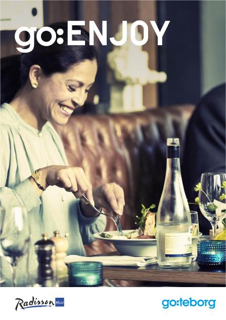
14 IMAGE PHOTO STYLE The image photo style plays a vital part in the graphic identity of the destination. In brief, the selection of images should reflect our core values: pleasant, pluralistic and inspiring. Views and perspectives A view has to say more than just landmarks, buildings or scenery. Add inspiration with an interesting angle, light or cut. Details Show the city from a close up perspective. It is sometimes preferred when showing characteristic features for the destination: a tram number, a detail from the shipyards or the yellow bricks. People The core value pleasant is best c ommunicated close up. It is important that portraits feel spontaneous to show life and movement. Variation and dynamics We work with images of various kinds. It can often get boring if all images are photographed from the same distance and angle. It is better to let different kinds of images complement each other. Let the images reflect pluralism. In style we should always aim for images with a mild colour tone, with less saturation a modern, creative feeling.
15 CHOICE OF PAPER An uncoated paper gives a calm and elegant impression. The matte finish is pleasant for the eye and suitable for text as well as photography. It works well for correspondence and more. A coated paper is a useful complement to the uncoated paper. The glossy finish makes it suitable for photographs, covers and more. UNCOATED Exemple: Scandia2000,Anatalis. Munken Polar, Arctic Paper. COATED Exemple: Imperial Gloss MultiArt Silk, Papyrus


16 COLLABORATIVE USE The logotypes can be used in collaborative projects between Göteborg & Co and others marketing the destination. This should be c arried out according to guidelines in the manual. One condition is that the project should be clearly in line with the core values and message that the brand Gothenburg aims to represent. Feel the Vibe Please note that the project logotype should be placed in the lower left corner, in the same size as the Gothenburg logotype. The project logotype is placed in the lower left corner, in the same size as the logotype for destination Gothenburg. The destination Gothenburg logotype is always placed in the lower right corner.

17 EXAMPLES OF COLLABORATIVE USE


18 EXAMPLES OF COLLABORATIVE USE STUDY
Brand identity toolkit
 Our visual identity Brand identity toolkit Typography Photography Lyon Display Medium ABCDEFGHIJKLMNOPQRSTUVWXYZ abcdefghijklmnopqrstuvwxyz 0123456789 Akkurat Regular ABCDEFGHIJKLMNOPQRSTUVWXYZ abcdefghijklmnopqrstuvwxyz
Using the logo. About the logo. Elements. The seal. The logotype. Third party logo use
 Style guide 218 Using the logo About the logo Jimmy is at the heart of everything we do as a charity and this is reflected by his name being at the foundation of our actions. The various elements of the
Visual Style Guide. April 2016
 Visual Style Guide April 2016 Contents Introduction to the Logo 3 Safe Area and Size 4 Incorrect Usage 5 Color Palette 6 Other Brand Elelments 7 Typography 8 Tone and Style of Photography 9 Print Examples
CONTENTS LOOK AND FEEL TELLING OUR STORY 15 COLOR 16 IMAGERY STYLE 17 IMAGERY CONTENT 20 TYPOGRAPHY 23 COMPOSITION 25
 IDENTITY GUIDELINES The IALD identity guidelines introduce and define the visual elements we use to create the new IALD brand; our signature, color, imagery, typography and composition. The following layout
Brand Guidelines v1.0
 Brand Guidelines 2019 v1.0 Overview Ticketek is New Zealand's gateway to the live entertainment experience. Using innovative technology, we ve become New Zealand's leading platform for connecting millions
web MASTERBRAND MARK GUIDELINES
 02.2013 web MASTERBRAND MARK GUIDELINES The Masterbrand Mark The Carestream Masterbrand Mark is more than just our logo. It s the foundation on which our powerful brand communications are built. Our Masterbrand
APPLICATION MANUAL A guide on how to visually communicate MIPS
 APPLICATION MANUAL A guide on how to visually communicate MIPS BACKGROUND, PURPOSE AND GOAL MIPS VISUAL IDENTITY By 2017, we have been working to develop an updated brand platform that, in turn, has led
BASIC TEMPORARY GUIDELINES FOR LG-ERICSSON. Partly based on existing Ericsson CVI
 BASIC TEMPORARY GUIDELINES FOR LG-ERICSSON Partly based on existing Ericsson CVI The LG-Ericsson logotype 1/2 X Minimum clearspace X 1/2 X 1. PMS LG Red (PMS 27 C) White LG Grey (PMS 431 C) Ericsson Blue
CONTENTS. Introduction 04. Primary Logo 07. Clear Space & Size Requirements 08. Alternate Logo Usage 09. Logomark Usage 1 3.
 CONTENTS Introduction 04 Primary Logo 07 Clear Space & Size Requirements 08 Alternate Logo Usage 09 Logomark Usage 1 3 Usage Dos 14 Usage Don ts 15 Colors 16 Typography 17 Photography Guidelines 18 Tone
table of contents how to use the brand architecture book intro to Littleton history of Littleton history of logos brand analysis competitive landscape
 table of contents how to use the brand architecture book intro to Littleton history of Littleton history of logos brand analysis competitive landscape target audience the brand essence tagline positioning
BRAND IDENTITY AND IMAGE SYSTEM guidelines
 BRAND IDENTITY AND IMAGE SYSTEM guidelines makemusic finale smartmusic TABLE OF contents MAKEMUSIC 1 2 3 4 5 6 7 8 Brand Identity and Brand Core Identity Usage CORRECT USAGE BACKGROUND CONTROL CLEAR ZONE
CHECK POINT IDENTITY GUIDELINES. Version 1
 CHECK POINT IDENTITY GUIDELINES Version 1 Contents 3 Manifesto 4 Logo 9 Colors 10 Typography 11 Photography 17 Design System 18 Design System Usage 19 Design Examples 22 Contact WE SECURE THE FUTURE The
ACADEMIC STYLE GUIDE Last updated October 2018
 ACADEMIC STYLE GUIDE Last updated October 2018 Join us in taking pride in our brand. Our University s brand is its identity. It is what people think of and feel when they hear our name. It differentiates
This guide should be read by anyone involved in creating communications for One You.
 This guide should be read by anyone involved in creating communications for One You. It explains the thinking behind our look and how easy it is to execute. Please take the time to read the following pages.
Style guide. November 2015 v1.0; CC BY 4.0.
 Style guide November 2015 v1.0; CC BY 4.0 http://creativecommons.org/licenses/by/4.0/ Introduction Our visual identity is a core part of our user experience, so it s important to us that it be used correctly.
Branding and Visual Identity Guidelines
 Branding and Visual Identity Guidelines UPDATED: February 1, 2018 MASTER BREWERS BRAND GUIDELINES REQUIREMENTS Before grabbing a Master Brewers logo, please be sure to comply with our basic rules in the
IDENTITY GUIDELINES AND GRAPHIC STANDARDS MANUAL SPRING 2017
 IDENTITY GUIDELINES AND GRAPHIC STANDARDS MANUAL SPRING 2017 THE IMPORTANCE OF GRAPHIC STANDARDS The United Mail logo is our unique graphic signature. It is one of the most visible aspects of the company
columbusindiana Brand Graphics Information and Standards Guide
 columbusindiana Brand Graphics Information and Standards Guide August 2007 Introduction 1 A product is made in a factory. A brand is made in the mind. Walter Landor A well-respected brand can be our most
Branding guide. Ocean Harvest
 Branding guide Ocean Harvest Delivering results through responsible operations in a sustainable sea Contents Introduction.... 4 Vision and values.... 5 Logo.... 6 Colors.... 8 Photography.... 10 Illustrations....
OUR VISUAL IDENTITY. Logo
 Logo The Pima County Public Library logo represents an inspirational place that powers possibilities by offering everyone the opportunity to discover, explore, and expand their horizons. It incorporates
GRAPHIC IDENTITY MANUAL
 GRAPHIC IDENTITY MANUAL GRACELAND UNIVERSITY GRAPHIC IDENTITY 2 INTRODUCTION The Graceland University Graphic Identity Standards Manual was created to provide all Graceland University employees and associates
All Natural Ingredients Universal fit Delivered to your door
 BRAND GUIDE 1 2 All Natural Ingredients Universal fit Delivered to your door We re obsessed with producing a superior product and customer experience. We appreciate the opportunity to earn and keep your
2.1. The Corporate Signature and Colors
 The Corporate Signature and Colors 2.1 The Southern States signature is the foundation for our brand identity system. Proper use of the signature is fundamental to the success of all applications. The
Branding guide. Estremar
 Branding guide Delivering results through responsible operations in a sustainable sea Contents Introduction.... 4 Vision and values.... 5 Logo.... 6 Colors.... 8 Photography.... 10 Illustrations.... 12
OUR VISUAL IDENTITY LOGO
 OUR VISUAL IDENTITY LOGO The Pima County Public Library logo represents an inspirational place that powers possibilities by offering everyone the opportunity to discover, explore, and expand their horizons.
BRAND GUIDELINES 2015
 BRAND GUIDELINES 2015 FIRST EDITION November 6, 2015 CLEAR, CONSISE & CONSISTENT BAW Architecture s brand is often the first thing about us that people experience. Our brand gives the world their first
Branding Guidelines York Branding Guide September 2011
 Branding Guidelines COLOR 1-Color Printing: The logo prints in all black ink. 100% Black 2-Color Printing: The logo prints either in all black, or in 2 colors: Pantone 032 and black. On a black or dark
2018 Identity Manual. Healthy. Safe. Strong.
 2018 Identity Manual Contents The Logomark Color Palette Typography EveryParent 3 4 5 6 Who We Are About Children s Services Council of Palm Beach County Children s Services Council of Palm Beach County
Graphic Design Standards
 Graphic Design Standards CONTENTS 3 4 4 5 6 7 8 9 10 11 12 INTRODUCTION COLOR VALUES FONTS LOGO ARRANGEMENTS & GUIDELINES PROPER USAGE IMPROPER USAGE STAGING MINIMUM SIZE BUSINESS CARD APPAREL LINKS TO
The expression marque.
 Brand Summary A consistent, clear and coherent identity for Durham has been developed, differentiating it from the rest of the country, with the aim of changing the perception of the county with the main
Brand Guidelines January 2016
 Brand Guidelines January 2016 Contents Brand Assets Logos Lock Up Brand Properties Brand Assets 04 Grow Wild, Kew & The Big Lottery Logos Lock Up 11 Brand Property: Scattered Seeds 22 Grow Wild Logo 05
SKIFT BRAND IDENTITY BRAND GUIDELINES Design Rocket
 SKIFT BRAND IDENTITY BRAND GUIDELINES 08.12.2016 Design Rocket SKIFT BELIEFS The travel industry should be transparent, accessible, and forward-thinking. The future of travel is at the intersection of
MEDIAKIT Version 02
 MEDIAKIT 2018 Version 02 LOGO APTIM BRAND STYLE GUIDELINES LOGO 2 Our logo, with its strong modern design and bold APTIM Orange and Blue, symbolizes who we are, what we do, and how we do it. The following
MIDDLE GEORGIA STATE UNIVERSITY - GRAPHIC STANDARDS, USAGE AND STYLE GUIDE
 MIDDLE GEORGIA STATE UNIVERSITY - GRAPHIC STANDARDS, USAGE AND STYLE GUIDE TABLE OF CONTENTS: 30. CHAPTER THREE: ATHLETIC IDENTITY 31. Primary Logo: Athletics 32. Alternate Primary Logo: Athletics Primary
L O G O G U I D E L I N E S
 LOGO GUIDELINES To ensure consistency in KeepRite brand communications, the Elite Dealer crest can only be used in accordance with the specifications listed in the following pages. 1 Logo Elements Crest
A guide to our Brand A guide to our Brand
 A guide to our Brand WHITE SPACE White space is important to our brand, in order to achieve maximum impact within an advertorial piece maintaining minimum white space requirements are essential. Please
BRAND STYLE GUIDE External 07/ 2011
 BRAND STYLE GUIDE External 07/ 2011 TABLE OF CONTENTS understanding the brand 01 What is a brand? 01 Why are guidelines needed? 01 Who should use these guidelines? 01 How should they be used? 01 Brand
Letter from the President
 Letter from the President Dear Friends and Members of the Hyundai Family: Everyday, each one of us strives for improvement in our work as we collectively take one small step closer on our long journey
DentalOrganiser.com. Brand Guidelines. John Kavanagh Brand Manager +DentalOrganiserGDS
 DentalOrganiser.com @drpmoore Brand Guidelines +DentalOrganiserGDS John Kavanagh Brand Manager +353.87.9670803 john@dentalorganiser.com Gate Dental Services Ltd. Garyngarry, Rosscahill, Go. Galway, Ireland.
Corporate Identity Manual
 Corporate Identity Manual Index 1. The Logo 2. Corporate colors 3. Typographies 4. Logo versions 5. Banned uses 6. Readability and Protection 1. The Logo PANACEA Network looks for the promotion of Non
panthers high point university athletics
 panthers high point university athletics Logo Standards 2004 Pantone Matching System (PMS) Color Chart hpu purple pantone 2685 4-color equivalent: C=96, M=100, Y=0, K=10 hpu purple highlight pantone 2665
contents brand promise 1 logo 3 color 6 typography 10 voice 12 photography 14 layout 17
 brand guidelines contents Introduction Brand Assets brand promise 1 logo 3 color 6 typography 10 voice 12 photography 14 layout 17 Our brand connects the community to the heart of what we stand for. The
ATHLETIC/SPIRIT STYLE GUIDE
 ATHLETIC/SPIRIT STYLE GUIDE Last updated July 2018 Join us in taking pride in our brand. Our University s brand is its identity. It is what people think of and feel when they hear our name. It differentiates
Co-branding with an Offering REGIONAL NAME
 Co-branding with an Offering REGIONAL NAME Overview The following section serves as a guide on how to apply co-branding and advertising to market the local destination or offerings of geographic regions
105 BRAND GUIDELINES Ensuring people aren t in the dark about their power cut.
 105 BRAND GUIDELINES Ensuring people aren t in the dark about their power cut. Contents 2 3 Brand strategy 7 Brand elements 17 Applying the elements 32 Partners best practice 4 Brand objectives 8 Logo
INTRODUCTION OUR VISION: We are driven to be a preeminent college of pharmacy in the world. Our world begins in Iowa. OUR MISSION:
 BRAND GUIDE INTRODUCTION TABLE OF CONTENTS BRAND MESSAGING Introduction.... 1 Core Brand Values... 2 BRAND IDENTITY Logo Usage.... 6 Primary Logo Variations.... 7 Department & Division Logos.... 8 What
Brand Guidelines 12 December 2014
 Brand Guidelines 12 December 2014 Our brand Introduction A distinctive new approach to the transport infrastructure of Edinburgh deserves a bold new look. A whole new brand platform has been developed
L O G O G U I D E L I N E S
 LOGO GUIDELINES To ensure consistency in Arcoaire brand communications, the Elite Dealer crest can only be used in accordance with the specifications listed in the following pages. 1 Logo Elements Crest
Saint Mary s College of California Year of the Gael Sesquicentennial Identity STYLE GUIDE
 Saint Mary s College of California Year of the Gael Sesquicentennial Identity STYLE GUIDE Saint Mary s College of California is turning 150, and it s going to be a celebration of Sesquicentennial magnitude!
L O G O G U I D E L I N E S
 LOGO GUIDELINES To ensure consistency in Comfortmaker brand communications, the Elite Dealer crest can only be used in accordance with the specifications listed in the following pages. 1 Logo Elements
OVERVIEW OF SIGN BY-LAW HERITAGE GUIDELINES
 OVERVIEW OF SIGN BY-LAW Formatted: Font: (Default) Arial, 12 pt & HERITAGE GUIDELINES Formatted: Font: 12 pt To regulate signage and all other advertising devices in the Town of Cobourg, Council approved
Special Olympics Delaware Logo Guidelines
 Special Olympics Logo Guidelines Introduction - Special Olympics Brand Identity Guidelines Our brand is our reputation, a reputation shared by all of the programs within Special Olympics. This reputation
SPONSORED BY 1 MARCH Illustrations Jim Field. Photography Simon Webb DESIGN GUIDELINES
 SPONSORED BY 1 MARCH 2018 Illustrations Jim Field. Photography Simon Webb. 2018 DESIGN GUIDELINES World Book Day is the biggest celebration of books and reading in the world. This toolkit outlines how
OVERVIEW OF SIGN BY-LAW HERITAGE GUIDELINES
 OVERVIEW OF SIGN BY-LAW Formatted: Font: (Default) Arial, 12 pt & HERITAGE GUIDELINES Formatted: Font: 12 pt To regulate signage and all other advertising devices in the Town of Cobourg, Council approved
LOGO USAGE JANUARY 2010 VERSION 2.0 BRAND IDENTITY GUIDELINES 6
 LOGO USAGE 6 Elements Arc Arc The Aviat Networks intersecting arcs represent our technology, guiding presence, vision for the future, and wireless network connections. Logotype Logotype The logotype for
CLUB LOGO GUIDELINES
 CLUB LOGO GUIDELINES LOGO DETAIL The Surfrider Foundation logo is the key building block of our identity. It is the primary visual element that people can associate with our work and our brand. The logo
Raleigh, N.C. Destination Brand Visual Manual
 Pink Owl Photography Raleigh, N.C. Destination Brand Visual Manual Edition 1.1 Provided by the Greater Raleigh Convention and Visitors Bureau as the area s accredited destination marketing organization
APTIM MEDIA KIT 2018 Version
 APTIM MEDIA KIT 2018 Version 2018.01 LOGO STACKED LOGO The stacked logo should be used as the default logo throughout the APTIM brand, unless there are issues with horizontal spacing or alignment. STACKED
Corporate Style Guide
 Corporate Style Guide Contents Our Brand Identity 1 The Elements 2 Colours 3 Typefaces 8 Unacceptable Applications 11 corporate style guide Our Brand Identity The Iluka brand identity represents the purpose
BRAND GUIDELINES MASTERBRAND MARK. The Masterbrand Mark
 MASTERBRAND MARK The Masterbrand Mark The Masterbrand Mark is made up of custom letter forms and spacing joined together to create a unique and ownable brand mark. The Masterbrand Mark should: ONLY be
Brand Guidelines Version 3.1
 Brand Guidelines Version 3.1 Our Mission At Checkout 51 our mission is to help millions of families save money, and use their purchase data to revolutionize marketing. We partner with the world s leading
UNIVERSITY OF MANITOBA VISUAL IDENTITY GUIDE. May 24, 2013
 UNIVERSITY OF MANITOBA VISUAL IDENTITY GUIDE May 24, 2013 TABLE OF CONTENTS Signature 5 Colour 25 Typography 28 Photography 31 Bringing it all together: The University of Manitoba brand 35 Templates 53
Brochures and Flyers. Daimler Brand & Design Navigator
 Daimler Brand & Design Navigator 29. Mai 2016 Brochures and Flyers Label on Front Covers The Daimler Fleet Management label is always located in the upper left corner of the format. The exact distance
THINK SUMMER BRAND GUIDELINES
 THINK SUMMER BRAND GUIDELINES CORE COLORS PRIMARY COLOR C:0/M:0/Y:0/K:100 R:0/G:0/B:0 Web: 000000 PRIMARY COLOR PMS 7405C C:11/M:31/Y:100/K:0 R:227/G:174/B:36 Web: E3AE24 ACCENT COLORS When using the below
2. Key Design Elements
 2. Key Design Elements 2. Key Design Elements CONTENT 2. Key Design Elements 2.1 Overview 2.2 Logo 2.3 Colour 2.4 Key Graphic 2.5 Imagery 2.6 Typography 2.1 OVERVIEW In a Visual Identity System, several
Corporate Brand Guidelines....your local connection
 Corporate Brand Guidelines Content Description of the whl.travel Logo 2 Explanation of the whl.travel Logo 3 Isolation Area 4 Typography 5 Minimum Size 6 Colour 7 Colour Reproduction 8 Incorrect Uses of
January 2016 Catalyst brand guidelines
 January 2016 Catalyst brand guidelines Introduction 2. Catalyst is one of the leading housing associations in London and the South East. We are a large social enterprise driven by a compelling social purpose
Basic guideline Corporate signature & spirits
 Corporate signature & spirits Edgecore s corporate signature consists of the English name of the company, which derives from the concept that There is no edge limit, there is no permanent core and expresses
Introduction NANO-TEX BRAND GUIDELINES
 2 Introduction A new vision. Nano-Tex s new brand has been developed to strongly represent our company and instantly convey the benefits of our technology in the marketplace. This document will explain
ONE K CREATIVE. tools for social impact storytelling: color
 tools for social impact storytelling: color THe basics of color application EACH COLOR EVOKES A DIFFERENT EMOTION IN HUMANS; MAKE SURE YOU ARE AWARE OF THE EMOTIONAL RESPONSES TO COLOR, AS WELL AS WHEN
Barcode and label areas technical guide
 auspost.com.au Barcode and label areas technical guide Small letters and Large letters barcodes and yellow labels applied by Australia Post s letter processing equipment We understand that the visual appeal
BRAND GUIDELINES. glasgow2018.com
 BRAND GUIDELINES glasgow2018.com Contents 1. Introducing the Brand page 3 2. Brand Elements page 4 3. Use of Welcome 2018 Logos page 6 4. Logo Association page 9 5. Applications of Glasgow 2018 Welcome
Visual Identity guidelines. Foróige National Youth Development Organisation Visual Identity Guidelines 1
 Visual Identity guidelines Foróige National Youth Development Organisation Visual Identity Guidelines 1 Contents Our Brand 3 Our identity, our brand 3 Branding guidelines for individual projects, services
Brand Identity System Interim Guidelines 12/2011
 Brand Identity System Interim Guidelines 12/2011 Table of Contents Introduction 2 The jcp Flag 3 The Brand Identity Components 4 About the jcp Flag 5 Using the jcp Flag Three Size Versions 6 Using the
Issue one May Scottish Parliament Corporate Identity Quick Guide
 Issue one May 2017 Scottish Parliament Corporate Identity Quick Guide 1 Contents Introduction 3 Corporate Identity: 4 Overview 5 Versions Minimum size 7 8 Exclusion zone 9 Background 10 Colour: primary
Roll Back Malaria Partnership. Brand Guidelines
 Roll Back Malaria Partnership Brand Guidelines How to use these guidelines Our identity is not just a logo. It is a design scheme composed of a number of core elements that come together to create a distinctive
Introduction. Page 1. Welcome to the signage guidelines for St John Ambulance premises, updated as of September 2012.
 Signage guidelines Introduction Welcome to the signage guidelines for St John Ambulance premises, updated as of September 2012. These guidelines provide a signage standard for all St John Ambulance buildings,
BRAND IDENTITY QUICK REFERENCE GUIDE
 BRAND IDENTITY QUICK REFERENCE GUIDE Intro Intro TAHOE Boats has developed this Brand Identity Guide for you our associates, dealers and vendors. It is designed to guide you in the proper use of our company
CITY OF KENT, OHIO ZONING CODE APPENDIX B SIGN DESIGN GUIDELINES APP B - 1 ZONING CODE APPENDIX B SIGN DESIGN GUIDELINES
 APPENDIX B SIGN DESIGN GUIDELINES APP B - 1 ZONING CODE APPENDIX B SIGN DESIGN GUIDELINES Purpose and Applicability The purpose of the Sign Design Guidelines is to provide design criteria to be utilized
Stantec Brand Identity Guidelines
 Stantec Brand Identity Guidelines August 2013 Stantec Brand Identity Guidelines 2 Contents 1 About the Stantec Brand 1.1 Introduction 4 2 Basic Identity Components 2.1 Logo 6 2.2 Logo Clear Space & Scale
Green Globes, GPC + Green Building Initiative GRAPHIC STANDARDS GUIDE
 Green Globes, GPC + Green Building Initiative GRAPHIC STANDARDS GUIDE Last Updated: December 29, 2014 WWW.THEGBI.ORG 503.274.0448 info@thegbi.org page 2 CONTENTS 1.0 Introduction 3 1.1 Our Mission 3 1.2
CREATIVE GUIDE CONTENTS POSITIONING PERSONALITY LOGOS IMAGERY DESIGN MOTION/TOOLKIT EXTENSIONS CREATIVE GUIDE
 CONTENTS POSITIONING 3 PERSONALITY 4 LOGOS 5 IMAGERY 6 DESIGN 8 MOTION/TOOLKIT 12 EXTENSIONS 18 2 POSITIONING Our brands are an integral part of people s lives. Our fans are inspired by our content and
DRAFT UNIVERSITY OF ARKANSAS AT PINE BLUFF. Athletic Brand Identity Guidelines
 DRAFT UNIVERSITY OF ARKANSAS AT PINE BLUFF Athletic Brand Identity Guidelines August 2014 TABLE OF CONTENTS 4 6 9 13 16 19 27 32 34 37 Introduction Primary Athletic Identity Marks Secondary Athletic Identity
Artwork Preparation Guide
 Artwork Preparation Guide General notes Artwork Preparation Guide Size, Position and Order When displaying a series of card symbols together, the following rules apply: No logo should occupy a prominent
Logo Standards Guide 2013
 Logo Standards Guide 2013 www.smahc.org Page 1 Logo Usage Our logo is a visual representation of our identity and our values. It is essential to use it correctly and consistently. Correct Usage The Southwest
Logo guidelines National Physician Suicide Awareness Day
 Logo guidelines National Physician Suicide Awareness Day Prepared by Jeff Ondeyka on 4/30/18 Logos Full color Grayscale Color options: Full Color is preferred and should be used whenever possible. Grayscale
Vision and Mission Statements
 Branding Guide Vision and Mission Statements Better evidence for a better world -Campbell Collaboration vision statement The Campbell Collaboration promotes positive social and economic change through
MNAO ACCESSORY OPERATIONS. GENUINE ACCESSORIES Packaging Guidelines
 MNAO ACCESSORY OPERATIONS GENUINE ACCESSORIES Packaging Guidelines 1 Introduction The brand Mazda has become a mark of excellence worldwide. With a rich history in technology development and a wide variety
BRAND GUIDE ENGLISH VERSION 1.0
 BRAND GUIDE ENGLISH VERSION 1.0 Welcome to Greater Copenhagen. This is your guide to our common brand and the tools we can use to strengthen our place in the world together. We are greater together Introducing
Australian Dragon Boat Federation Corporate Style Guide. Australian Dragon Boat Federation Style Guide
 Australian Dragon Boat Federation Corporate Style Guide Australian Dragon Boat Federation Style Guide 1 Contents Introduction 3 Objective 4 NATIONAL LOGO 5 Australian Dragon Boat Federation Logo 6 Australian
CEVA Brand Identity Basics
 The logo and other CEVA intellectual property contained in these guidelines are protected by national and international laws and conventions on trademark and copyright. All reproduction, full or partial,
Colours and Control for Designers. This article is supported by...
 Wild Format Technology Guides Series 3 The Wild Format guides are intended to expand awareness and understanding of the craziness that can be created on wide format digital printing devices, from floors
BRAND MANUAL GUIDELINES
 IME BRAND MANUAL GUIDELINES PHONE +58 416 605 5915 CONTACT euriciamadrid@gmail.com ON LINE @euricia_madrid BRAND GUIDELINES 02 BRAND GUIDELINES POWERED BY EURICIA MADRID IME 03 IME TABLE OF CONTENTS 01
GRAPHIC STANDARDS GUIDE
 GRAPHIC STANDARDS GUIDE TABLE OF CONTENTS THE story how to use this guide color values & typography logo arrangement logo staging proper logo usage improper logo usage business card apparel links the end
BELGARD BRAND GUIDELINES
 BELGARD BRAND GUIDELINES This is the verbal, visual and tonal blueprint of the Belgard brand. From our purpose and positioning, to the tools we use to communicate consistently, the elements of how our
A Guide to Using the Generic Flyer Template
 A Guide to Using the Generic Flyer Template The purpose of this document is to demonstrate the creative uses of the Generic Flyer Template as well as providing a style guide for the successful application
THE VAN WERT COUNTY FOUNDATION BRAND STANDARDS
 THE VAN WERT COUNTY FOUNDATION BRAND STANDARDS 1.0 OVERVIEW As, The Van Wert County Foundation, our brand voice is a vehicle for the philanthropy of individuals, corporations and organizations that have
Table of Contents. 1st Source Guidelines. Overview Brand Definition st Source Brand Elements
 Table of Contents Overview......................... 1 Brand Definition..................... 2 1st Source Brand Elements............. 3 12 1st Source Elite Brand Elements..........13 21 Font...........................
BrAnD guide. Version 0.5 Last updated: March 26, :23 PM. Please direct branding inquiries to
 BrAnD guide Version 0.5 Last updated: March 26, 2015 1:23 PM Please direct branding inquiries to marketing@slideboarding.com The word brand could be replaced with personality. It s way we showcase Slideboarding
Our brand. Guidelines / April 2016
 Our brand Guidelines / April 2016 Brand philosophy Wellcome exists to improve health for everyone by helping great ideas to thrive. We re a global charitable foundation, both politically and financially