SKIFT BRAND IDENTITY BRAND GUIDELINES Design Rocket
|
|
|
- Lewis Chandler
- 6 years ago
- Views:
Transcription
1 SKIFT BRAND IDENTITY BRAND GUIDELINES Design Rocket
2 SKIFT BELIEFS The travel industry should be transparent, accessible, and forward-thinking. The future of travel is at the intersection of technology, marketing and design. Travel should be defined by trend lines and not headlines.
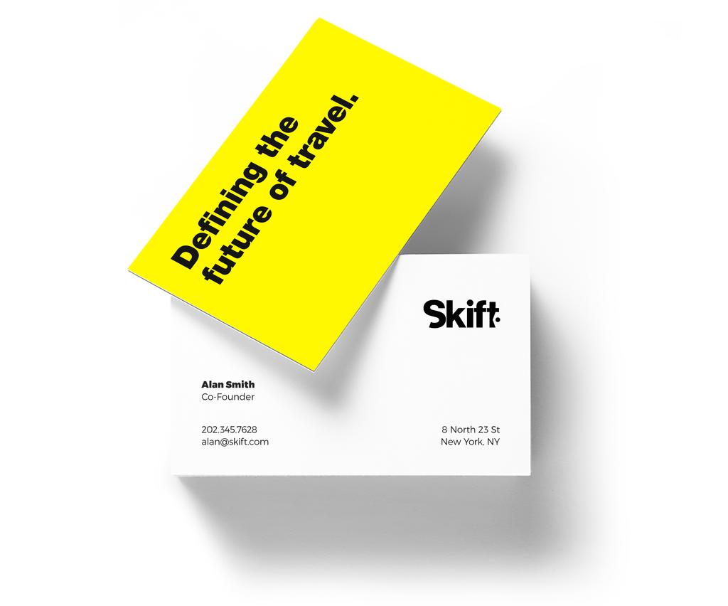
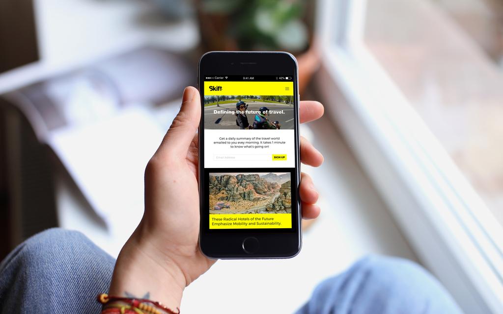
3 DEFINING THE FUTURE OF TRAVEL.
4 LOGO Skift has boldly taken the travel world to a new, fresh and transparent place. This visual language explores how we can bring Skift s opinionated, informal, unapologetic conversation to the brand identity. Some elements explored: strong type, bold colors, flat solid icons Design Rocket
5 Wordmark Use The wordmark should mainly be used as black over white.
6 Wordmark Space Clear space around the logo helps it stand out by separating it from any other visual elements or copy near it. In any scenario or situation use the height pixels of the logo as a guide. In this case the logo height is 50 pixels, there should be 50 pixels of padding around the logo. 50 pixels height 50 pixels width 50 pixels width 50 pixels height
7
8 Wordmark Use In other cases the wordmark can be used as white over black or it can also be used as black over yellow, the brand color. Wordmark as black over primary brand color yellow. Wordmark as white over secondary brand color black.
9
10
11 COLOR PALETTE Design Rocket
12 Color Palette Skift color palette is composed of Primary black, white and yellow. Supported by a secondary supporting shades of gray and deep green. Black HEX # Yellow HEX #FFF200 White HEX #FFFFFF RGB 255, 242, 0 Gray Soft Gray Deep Green HEX #58585B HEX # HEX #4C6C6F RGB 88, 88, 90 RGB 188, 188, 189 RGB 76, 108, 111 Supporting - Web Red Pink Purple HEX #D14339 HEX #C8265D HEX #8A2D9A RGB 209, 67, 57 RGB 200, 38, 93 RGB 138, 45, 154 Blue Green Orange HEX #2886D0 HEX #4A9A4E HEX #D85914 RGB 40, 134, 208 RGB 74, 154, 78 RGB 216, 89, 20
13 TYPOGRAPHY
14 Montserrat is a typeface that rescues the beauty of urban typography from the first half of the twentieth century. We chose a geometric typeface for it s contemporary qualities, but with it s own variants in length, width and height proportions, each adding to the Montserrat family. These aspects give a more organic and humanist touch to the typeface.
15 Typography Skift s primary typeface is Montserrat. Montserrat light should be used for body copy in digital and printed material. Trade Gothic Bold Condensed is a supporting typeface used for long headlines and quotes. Montserrat Black Montserrat Bold Montserrat Light TRADE GOTHIC BOLD CONDENSED NO 20
16 Typography Montserrat is a Google Font and can be used for web and mobile devices. Heading 1 Montserrat Black 60px # or #FFFFFF Our Story Heading 2 Montserrat Bold 28px # or #FFFFFF Skift, as a company, is about that transformation. Heading 3 Montserrat Black 20px # or #FFFFFF Body Montserrat Light 15px # or #FFFFFF ABOUT SKIFT We launched in August 2012, with the big ambition of becoming the daily homepage of the global travel industry. Our underlying premise was to be fanatically focused on documenting and helping the travel industry understand the changing traveler behavior. From the two founders who launched the company out of their bedrooms to now 26 people on the Skift team in a light-filled New York City office, we have grown into the biggest business intelligence brand in travel. Quotes Trade Gothic Bold Condensed No px # or #FFFFFF SKIFT DECIPHERS AND DEFINES GLOBAL TRAVEL TRENDS.

17 Long Headlines Trade Gothic Bold Condensed No20 DEFINING THE FUTURE OF TRAVEL. # or #FFFFFF
18 SKIFT DECIPHERS AND DEFINES GLOBAL TRAVEL TRENDS. Long Statements Trade Gothic Bold Condensed No20 # or #FFFFFF
19 PHOTOGRAPHY Design Rocket


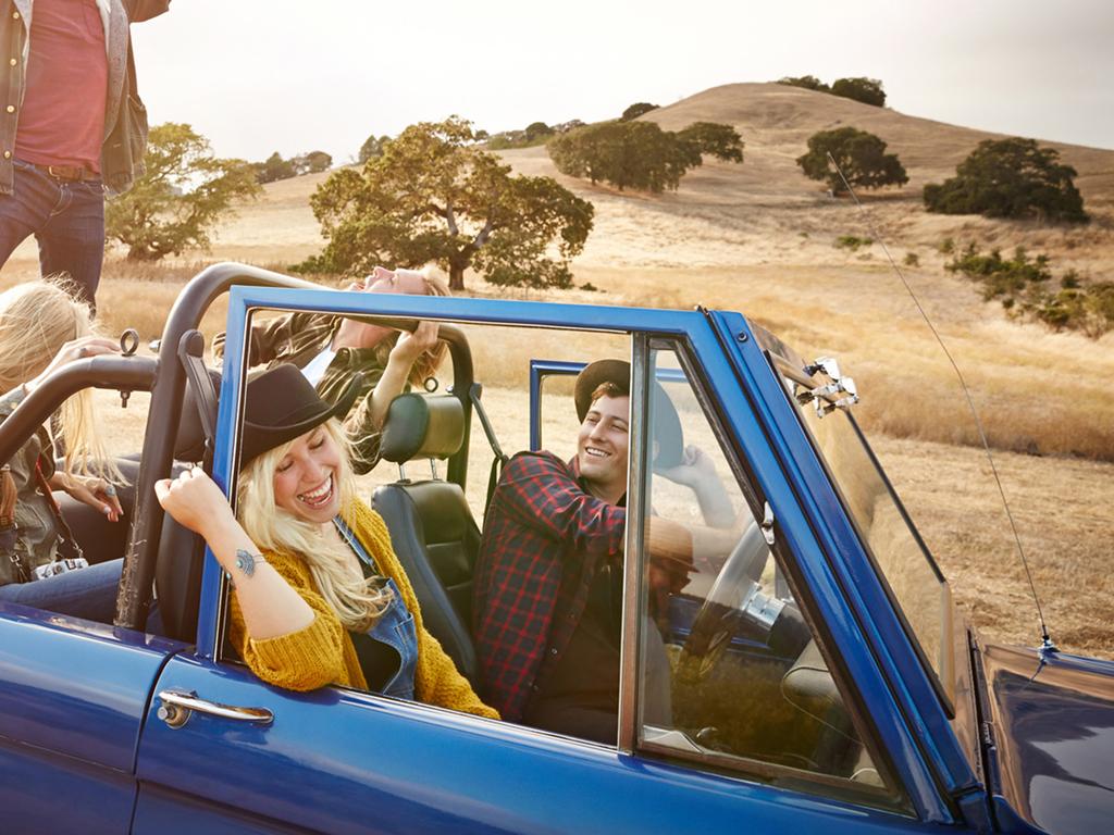
20 Photography Use Skift photography should be used natural. In cases where text needs to be applied a black overlay, color block or tag graphic can be used. Natural photography Black overlay set to 30% opacity. Yellow block graphic element use at 1/4 lenght of image. Yellow tag graphic element. Use at half length of the image.
21
22 GRAPHICS Design Rocket
23 Graphic Element Skift graphic element is distilled from it s tag icon, a cut of the tag in forward motion to use as a supporting graphic element.

24 Photography Use SKIFT DECIPHERS AND DEFINES GLOBAL TRAVEL TRENDS. Learn More The graphic tag element works great on digital advertisement, a balance of color and photography.

25 Graphic Element On Photography Skift graphic element should be used at half lenght of the canvas, and only when text or logo need to be used. DEFINING THE FUTURE OF TRAVEL. Skift is the largest industry intelligence platform providing Media, Insights and Marketing to key sectors of travel. You can find more about Skit at
26 Pattern Skift pattern is composed of bold tag graphics in sequence at a 45 degree angle. It is used as a super graphic to cut and break sinlge photographs.


27
28 THANKS Design Rocket
Brand identity toolkit
 Our visual identity Brand identity toolkit Typography Photography Lyon Display Medium ABCDEFGHIJKLMNOPQRSTUVWXYZ abcdefghijklmnopqrstuvwxyz 0123456789 Akkurat Regular ABCDEFGHIJKLMNOPQRSTUVWXYZ abcdefghijklmnopqrstuvwxyz
Brand Guidelines v1.0
 Brand Guidelines 2019 v1.0 Overview Ticketek is New Zealand's gateway to the live entertainment experience. Using innovative technology, we ve become New Zealand's leading platform for connecting millions
Style guide. November 2015 v1.0; CC BY 4.0.
 Style guide November 2015 v1.0; CC BY 4.0 http://creativecommons.org/licenses/by/4.0/ Introduction Our visual identity is a core part of our user experience, so it s important to us that it be used correctly.
BRAND GUIDELINES MASTERBRAND MARK. The Masterbrand Mark
 MASTERBRAND MARK The Masterbrand Mark The Masterbrand Mark is made up of custom letter forms and spacing joined together to create a unique and ownable brand mark. The Masterbrand Mark should: ONLY be
Using the logo. About the logo. Elements. The seal. The logotype. Third party logo use
 Style guide 218 Using the logo About the logo Jimmy is at the heart of everything we do as a charity and this is reflected by his name being at the foundation of our actions. The various elements of the
We are diligent in keeping the Truck-Lite brand clean and standardized. We created these guidelines to ensure that all parties use our brand elements
 We are diligent in keeping the Truck-Lite brand clean and standardized. We created these guidelines to ensure that all parties use our brand elements consistently. Contents 2, 3 4, 5 6, 7 8, 9 10 15 10,
Visual Style Guide. April 2016
 Visual Style Guide April 2016 Contents Introduction to the Logo 3 Safe Area and Size 4 Incorrect Usage 5 Color Palette 6 Other Brand Elelments 7 Typography 8 Tone and Style of Photography 9 Print Examples
CONTENTS LOOK AND FEEL TELLING OUR STORY 15 COLOR 16 IMAGERY STYLE 17 IMAGERY CONTENT 20 TYPOGRAPHY 23 COMPOSITION 25
 IDENTITY GUIDELINES The IALD identity guidelines introduce and define the visual elements we use to create the new IALD brand; our signature, color, imagery, typography and composition. The following layout
ATHLETIC BRAND STANDARDS GUIDE
 ATHLETIC BRAND STANDARDS GUIDE THE IMPORTANCE OF GRAPHIC STANDARDS TABLE OF CONTENTS The Importance Of Graphic Standards...1 Official Colors...2 Athletics Logos...3 Primary Athletics Mark...4 Use On Color
STYLE GUIDE JUNE 2018
 STYLE GUIDE JUNE 2018 Contents June 2018 ii 1 INTRODUCTION 3 4 6 7 GRAPHIC ELEMENTS Typography Color Palette Identity and Tag Line 8 PHOTOGRAPHY 13 14 17 LAYOUT EXECUTION Execution Guides Identifying Your
Identity Guidelines VER 1.6
 Identity Guidelines VER 1.6 hortonworks.com 2018 Hortonworks Table Of Contents INTRODUCTION VISUAL IDENTITY Welcome to the Future of Data... 3 Brand Manifesto... 4 Brand Pillars... 5 Messaging Brand Messaging...
CONTENTS. 1. Our vision. 2. Our values. 3. The logo. 4. Guidance on the use of logo. 5. colourpalatte. 6. Typeface. 7. Imagery. 8.
 BRANDING GUIDELINES CONTENTS 1. Our vision 2. Our values 3. The logo 4. Guidance on the use of logo 5. colourpalatte 6. Typeface 7. Imagery 8. Merchendising 9. Advertisment OUR VISION neah is a young fashion
C&L WARD BRAND GUIDE 1
 CONTENTS 2 The Logo 3 Formats 4 Correct Usage 5 Incorrect Usage 6 Alternate Logos 7 The Tagline 8 Color Palette 9 Fonts 10 Complimentary Fonts 11 Photography Styles 12 Photography to Avoid C&L WARD BRAND
columbusindiana Brand Graphics Information and Standards Guide
 columbusindiana Brand Graphics Information and Standards Guide August 2007 Introduction 1 A product is made in a factory. A brand is made in the mind. Walter Landor A well-respected brand can be our most
BRAND STYLE GUIDE External 07/ 2011
 BRAND STYLE GUIDE External 07/ 2011 TABLE OF CONTENTS understanding the brand 01 What is a brand? 01 Why are guidelines needed? 01 Who should use these guidelines? 01 How should they be used? 01 Brand
IDENTITY GUIDELINES AND GRAPHIC STANDARDS MANUAL SPRING 2017
 IDENTITY GUIDELINES AND GRAPHIC STANDARDS MANUAL SPRING 2017 THE IMPORTANCE OF GRAPHIC STANDARDS The United Mail logo is our unique graphic signature. It is one of the most visible aspects of the company
BELGARD BRAND GUIDELINES
 BELGARD BRAND GUIDELINES This is the verbal, visual and tonal blueprint of the Belgard brand. From our purpose and positioning, to the tools we use to communicate consistently, the elements of how our
CONTENTS. Introduction 04. Primary Logo 07. Clear Space & Size Requirements 08. Alternate Logo Usage 09. Logomark Usage 1 3.
 CONTENTS Introduction 04 Primary Logo 07 Clear Space & Size Requirements 08 Alternate Logo Usage 09 Logomark Usage 1 3 Usage Dos 14 Usage Don ts 15 Colors 16 Typography 17 Photography Guidelines 18 Tone
Penn State Law Identity Standards
 Penn State Law Identity Standards The Penn State Law identity standards provide key information needed to accurately and consistently produce internal and external communication materials. The goal is
Corporate Logo Guidelines
 Corporate Logo Guidelines 2 Aldec Globe Primary Logo to be used in 4-color applications greater than 200 pixels or 3 wide. Aldec Crescent Secondary logo to be used horizontal and/or 1 color applications
Brand Guidelines Version 3.1
 Brand Guidelines Version 3.1 Our Mission At Checkout 51 our mission is to help millions of families save money, and use their purchase data to revolutionize marketing. We partner with the world s leading
LOGO COLORS. These process colors have been chosen. as the signature colors of Montgomery County Public Schools.
 STYLE GUIDE LOGO COLORS This is the official version of the logo. The colors, their relationship, and the wordmark should never be altered. These process colors have been chosen C = 89 M = 40 Y = 44 K
Brand Identity System Interim Guidelines 12/2011
 Brand Identity System Interim Guidelines 12/2011 Table of Contents Introduction 2 The jcp Flag 3 The Brand Identity Components 4 About the jcp Flag 5 Using the jcp Flag Three Size Versions 6 Using the
OUR VISUAL IDENTITY. Logo
 Logo The Pima County Public Library logo represents an inspirational place that powers possibilities by offering everyone the opportunity to discover, explore, and expand their horizons. It incorporates
GRAPHIC STANDARDS & STYLEGUIDE
 GRAPHIC STANDARDS & STYLEGUIDE MARCH 2016 GRAPHIC STANDARDS & STYLEGUIDE 1 Table of Contents Our Logo Logo Formats Logo Clearspace & Usage What Not To Do Typography Color Palette Photography 3 4 5 6 7
DentalOrganiser.com. Brand Guidelines. John Kavanagh Brand Manager +DentalOrganiserGDS
 DentalOrganiser.com @drpmoore Brand Guidelines +DentalOrganiserGDS John Kavanagh Brand Manager +353.87.9670803 john@dentalorganiser.com Gate Dental Services Ltd. Garyngarry, Rosscahill, Go. Galway, Ireland.
BRAND GUIDELINES 2017
 BRAND GUIDELINES 2017 Working with Agtivation CONTENTS 01 - BRAND PLATFORM 03 - VISUAL SYSTEM Purpose Vision Brand Archetype Brand Platform Color Palette Primary Typography Secondary Typography Overview
Branding guide. Ocean Harvest
 Branding guide Ocean Harvest Delivering results through responsible operations in a sustainable sea Contents Introduction.... 4 Vision and values.... 5 Logo.... 6 Colors.... 8 Photography.... 10 Illustrations....
Logo Usage Guidelines
 Logo Usage Guidelines Index Introduction... 03 ICM 2018... 04 Signature Logos... 05 - Basic standards... 06 - Minimum size and buffer space... 08 - Application on backgrounds... 09 - Chromatic variations...
web MASTERBRAND MARK GUIDELINES
 02.2013 web MASTERBRAND MARK GUIDELINES The Masterbrand Mark The Carestream Masterbrand Mark is more than just our logo. It s the foundation on which our powerful brand communications are built. Our Masterbrand
OUR VISUAL IDENTITY LOGO
 OUR VISUAL IDENTITY LOGO The Pima County Public Library logo represents an inspirational place that powers possibilities by offering everyone the opportunity to discover, explore, and expand their horizons.
Branding guide. Estremar
 Branding guide Delivering results through responsible operations in a sustainable sea Contents Introduction.... 4 Vision and values.... 5 Logo.... 6 Colors.... 8 Photography.... 10 Illustrations.... 12
GRAPHIC IDENTITY MANUAL
 GRAPHIC IDENTITY MANUAL GRACELAND UNIVERSITY GRAPHIC IDENTITY 2 INTRODUCTION The Graceland University Graphic Identity Standards Manual was created to provide all Graceland University employees and associates
middle georgia knights - official brand identity usage and style guide
 middle georgia knights - official brand identity usage and style guide table of contents: 1. Primary Logo - Full Color and One Color 2. Alternate Primary Logo - Full Color and One Color 3. Alternate Primary
APTIM MEDIA KIT 2018 Version
 APTIM MEDIA KIT 2018 Version 2018.01 LOGO STACKED LOGO The stacked logo should be used as the default logo throughout the APTIM brand, unless there are issues with horizontal spacing or alignment. STACKED
MEDIAKIT Version 02
 MEDIAKIT 2018 Version 02 LOGO APTIM BRAND STYLE GUIDELINES LOGO 2 Our logo, with its strong modern design and bold APTIM Orange and Blue, symbolizes who we are, what we do, and how we do it. The following
MY17 CAMPAIGN STYLE GUIDE
 MY17 CAMPAIGN STYLE GUIDE WHAT MATTERS IS WHAT S NEXT. In the summer, Ski-Doo riders anxiously wait for the next snow. In the fall, they count the days until they pick up their new sled. And in the winter,
THE LOGO 4 COLOR PALETTE 6 LOGO USAGE 7 THE TYPEFACE 8 GENERAL GUIDELINES 10 TYPOGRAPHY USAGE 11 SUPPLEMENTAL ICONS 12
 BRAND GUIDELINES THE LOGO 4 Clear Area Alternate Logo Versions COLOR PALETTE 6 Color Options LOGO USAGE 7 THE TYPEFACE 8 Suggested Uses GENERAL GUIDELINES 10 TYPOGRAPHY USAGE 11 SUPPLEMENTAL ICONS 12
BRAND IDENTITY GUIDELINES NOVEMBER 2017
 03 BRAND IDENTITY GUIDELINES NOVEMBER 2017 CONTENTS Page 03 Colors What CMYK, RGB & Hex color values are mandatory or to be achieved when printing? Page 04 Color Variants When should which color variant
A guide to our Brand A guide to our Brand
 A guide to our Brand WHITE SPACE White space is important to our brand, in order to achieve maximum impact within an advertorial piece maintaining minimum white space requirements are essential. Please
Corporate Identity Quick Reference Guide
 Corporate Identity Quick Reference Guide The Logo true form The Cold Jet logo is most effective when used on a white background. There is also a reversed version of the logo that is acceptable for use
CEVA Brand Identity Basics
 The logo and other CEVA intellectual property contained in these guidelines are protected by national and international laws and conventions on trademark and copyright. All reproduction, full or partial,
APPLICATION MANUAL A guide on how to visually communicate MIPS
 APPLICATION MANUAL A guide on how to visually communicate MIPS BACKGROUND, PURPOSE AND GOAL MIPS VISUAL IDENTITY By 2017, we have been working to develop an updated brand platform that, in turn, has led
CHECK POINT IDENTITY GUIDELINES. Version 1
 CHECK POINT IDENTITY GUIDELINES Version 1 Contents 3 Manifesto 4 Logo 9 Colors 10 Typography 11 Photography 17 Design System 18 Design System Usage 19 Design Examples 22 Contact WE SECURE THE FUTURE The
BRAND GUIDELINES 2015
 BRAND GUIDELINES 2015 FIRST EDITION November 6, 2015 CLEAR, CONSISE & CONSISTENT BAW Architecture s brand is often the first thing about us that people experience. Our brand gives the world their first
CLUB LOGO GUIDELINES
 CLUB LOGO GUIDELINES LOGO DETAIL The Surfrider Foundation logo is the key building block of our identity. It is the primary visual element that people can associate with our work and our brand. The logo
Branding Guidelines York Branding Guide September 2011
 Branding Guidelines COLOR 1-Color Printing: The logo prints in all black ink. 100% Black 2-Color Printing: The logo prints either in all black, or in 2 colors: Pantone 032 and black. On a black or dark
NC.GOV. Creating Assets & Pages GUIDELINES
 NC.GOV Creating Assets & Pages GUIDELINES Introduction Providing meaningful, fascinating content to your users is essential. It can also be challenging. We understand that. That s why we put together some
Our logo First Data Corporation. All Rights Reserved. First Data Brand Guidelines, Page 4
 Our logo A logotype is the visual symbol of an organization, representing the company s strengths, its aspirations and its character. Our logotype was chosen for its ability to represent who we are today
GUIDELINES & INFORMATION
 GUIDELINES & INFORMATION This document will provide basic guidelines for the use of the World Animal Day logo and general knowledge about the various file formats provided. Adhering to these guidelines
ACADEMIC STYLE GUIDE Last updated October 2018
 ACADEMIC STYLE GUIDE Last updated October 2018 Join us in taking pride in our brand. Our University s brand is its identity. It is what people think of and feel when they hear our name. It differentiates
UNIVERSITY OF MANITOBA VISUAL IDENTITY GUIDE. May 24, 2013
 UNIVERSITY OF MANITOBA VISUAL IDENTITY GUIDE May 24, 2013 TABLE OF CONTENTS Signature 5 Colour 25 Typography 28 Photography 31 Bringing it all together: The University of Manitoba brand 35 Templates 53
ArtPrize Nine Brand Guidelines
 ArtPrize Nine Brand Guidelines Table of Contents 2 3 4 5 6 7 9 10 11 12 13 14 16 17 18 19 20 21 22 Introduction Registered ArtPrize Trademarks ArtPrize Logo Stylized Word Mark The Term ArtPrize Using the
Introduction NANO-TEX BRAND GUIDELINES
 2 Introduction A new vision. Nano-Tex s new brand has been developed to strongly represent our company and instantly convey the benefits of our technology in the marketplace. This document will explain
T H E IMP O R T A N C E O F G RAP H I C S T ANDAR D S
 T A B L E O F CONTEN T S The Importance Of Graphic Standards...1 Official Colors...2 Athletics Logos...3 Primary Athletics Mark...4 Use On Color Backgrounds...5 Eagle Monogram Mark...6 Use On Color Backgrounds...7
BASIC TEMPORARY GUIDELINES FOR LG-ERICSSON. Partly based on existing Ericsson CVI
 BASIC TEMPORARY GUIDELINES FOR LG-ERICSSON Partly based on existing Ericsson CVI The LG-Ericsson logotype 1/2 X Minimum clearspace X 1/2 X 1. PMS LG Red (PMS 27 C) White LG Grey (PMS 431 C) Ericsson Blue
ITP 140 Mobile App Technologies. Colors Images Icons
 ITP 140 Mobile App Technologies Colors Images Icons Establish a style Look and Feel Create or choose a color palette Pick colors that complement each other Pick colors that are representative of your app
Brand Guidelines January 2016
 Brand Guidelines January 2016 Contents Brand Assets Logos Lock Up Brand Properties Brand Assets 04 Grow Wild, Kew & The Big Lottery Logos Lock Up 11 Brand Property: Scattered Seeds 22 Grow Wild Logo 05
DRAFT UNIVERSITY OF ARKANSAS AT PINE BLUFF. Athletic Brand Identity Guidelines
 DRAFT UNIVERSITY OF ARKANSAS AT PINE BLUFF Athletic Brand Identity Guidelines August 2014 TABLE OF CONTENTS 4 6 9 13 16 19 27 32 34 37 Introduction Primary Athletic Identity Marks Secondary Athletic Identity
contents brand promise 1 logo 3 color 6 typography 10 voice 12 photography 14 layout 17
 brand guidelines contents Introduction Brand Assets brand promise 1 logo 3 color 6 typography 10 voice 12 photography 14 layout 17 Our brand connects the community to the heart of what we stand for. The
Stantec Brand Identity Guidelines
 Stantec Brand Identity Guidelines August 2013 Stantec Brand Identity Guidelines 2 Contents 1 About the Stantec Brand 1.1 Introduction 4 2 Basic Identity Components 2.1 Logo 6 2.2 Logo Clear Space & Scale
Branding and Visual Identity Guidelines
 Branding and Visual Identity Guidelines UPDATED: February 1, 2018 MASTER BREWERS BRAND GUIDELINES REQUIREMENTS Before grabbing a Master Brewers logo, please be sure to comply with our basic rules in the
Corporate Identity Manual
 Corporate Identity Manual Index 1. The Logo 2. Corporate colors 3. Typographies 4. Logo versions 5. Banned uses 6. Readability and Protection 1. The Logo PANACEA Network looks for the promotion of Non
Brand Identity & Design Standards
 Brand Identity & Design Standards Copyright 2014 by the Tahoe Truckee Community Foundation All rights reserved Originally developed for use by the Tahoe Truckee Community Foundation December 2014 Information
OUR MASTER BRANDMARK BRANDMARK USAGE LIVE UNITED TAGLINE PRIMARY BRANDMARK OUR PURPOSE WHAT IT MEANS TO JOIN
 OUR MASTER BRANDMARK PRIMARY BRANDMARK The most fundamental visual element of a brand identity is its brandmark. The evolution of our brandmark is most dramatic in its configuration. The United Way symbol
Style Guide CFMWS Website. Style Guide CFMWS Website October
 Style Guide CFMWS Website Style Guide CFMWS Website October 2013 1 Style Guide CFMWS Website Colours Consistent use of colours throughout the site helps users navigate and also promotes brand/site awareness.
Introduction. Page 1. Welcome to the signage guidelines for St John Ambulance premises, updated as of September 2012.
 Signage guidelines Introduction Welcome to the signage guidelines for St John Ambulance premises, updated as of September 2012. These guidelines provide a signage standard for all St John Ambulance buildings,
Graphic Design Standards
 Graphic Design Standards CONTENTS 3 4 4 5 6 7 8 9 10 11 12 INTRODUCTION COLOR VALUES FONTS LOGO ARRANGEMENTS & GUIDELINES PROPER USAGE IMPROPER USAGE STAGING MINIMUM SIZE BUSINESS CARD APPAREL LINKS TO
Unit 4.4 Representing Images
 Unit 4.4 Representing Images Candidates should be able to: a) Explain the representation of an image as a series of pixels represented in binary b) Explain the need for metadata to be included in the file
Athletics Brand Standards Guide
 I L L I N O I S W E S L E Y A N T I T A N S Athletics Brand Standards Guide THE IMPORTANCE OF GRAPHIC STANDARDS TABLE OF CONTENTS The Importance Of Graphic Standards 1 Official Colors 2 Full Color Athletics
Visual Guidelines Updated: April 1, 2016
 Visual Guidelines Updated: April 1, 2016 Logo Visual Guidelines/Logo Primary Logo Iconic Red M Logo This logo is the official primary logo for the Merillat brand. The red is Pantone 485, the Merillat word
Reflection Project. Please start by resetting all tools in Photoshop.
 Reflection Project You will be creating a floor and wall for your advertisement. Before you begin on the Reflection Project, create a new composition. File New: Width 720 Pixels / Height 486 Pixels. Resolution
THE VAN WERT COUNTY FOUNDATION BRAND STANDARDS
 THE VAN WERT COUNTY FOUNDATION BRAND STANDARDS 1.0 OVERVIEW As, The Van Wert County Foundation, our brand voice is a vehicle for the philanthropy of individuals, corporations and organizations that have
L O G O G U I D E L I N E S
 LOGO GUIDELINES To ensure consistency in KeepRite brand communications, the Elite Dealer crest can only be used in accordance with the specifications listed in the following pages. 1 Logo Elements Crest
Corporate Style Guide
 Corporate Style Guide Contents Our Brand Identity 1 The Elements 2 Colours 3 Typefaces 8 Unacceptable Applications 11 corporate style guide Our Brand Identity The Iluka brand identity represents the purpose
Identity Guidelines 02 Signature. 03 Clear Zone and Sizing 04 Trademark 05 Configurations 06 Restrictions 07 Color Palette 08 Acceptable Usage
 Identity Guidelines 02 Signature 03 Clear Zone and Sizing 04 Trademark 05 Configurations 06 Restrictions 07 Color Palette 08 Acceptable Usage Signature The term signature commonly refers to a basic configuration
Banner. Double Banner
 Banner Dimension: Mobile: 640 (W) x 100 (H) Tablet Portrait - 1536 (W) x 180 (H) [For mytv only] Tablet Landscape - 2048 (W) x 180 (H) [For mytv only] File format/ size: Must provide (.gif or.jpg) still
RUCKUS NETWORKS STYLE GUIDE
 RUCKUS NETWORKS STYLE GUIDE DISCOVER RUCKUS 4 WHO IS RUCKUS? 07 OUR MISSION AND MESSAGING 8 LOGO 09 LOGOS APPROPRIATE USAGE 10 PROPER CLEAR SPACE 11 INCORRECT LOGO USAGE DON'TS 12 OLD LOGOS DON'T USE THESE
 BRANDING GUIDE 1 Table of Contents The AFL Name...2 Corporate Colors...4 Corporate Logo...5 Typography...10 Packaging...12 Vehicles...13 Signage...14 The AFL Name Throughout AFL s history, our name has
LAT Apparel Brand Standards Manual BRAND STANDARDS MANUAL
 BRAND STANDARDS MANUAL Table of Contents Table of Contents... 2 Introduction... 3 Typography... 4 Color Palette... 5 Tagline... 6 LAT APPAREL... 7 Introduction to LAT Apparel... 7 Logo Anatomy... 8 Clear
PAYONEER BRAND GUIDELINES
 PAYONEER BRAND GUIDELINES GRAPHIC LANGUAGE Graphic Language / Colors 333333 RGB: 51/51/51 CMYK: 0/0/0/90 ff4800 RGB: 255/70/0 CMYK: 0/80/100/0 ffae8f RGB: 255/174/143 CMYK: 0/38/40/0 e2e4e6 RGB: 226/228/230
Digital Specs Atomic Enterprises, LLC. All rights reserved.
 Digital Specs Atomic Enterprises, LLC o: 316.351.8228 f: 316.854.8630 Email: sales@atomicbillboards.com www.atomicbillboards.com 216 North Mosley, Suite 200 Wichita, Kansas 67202 2014 Atomic Enterprises,
Saint Mary s College of California Year of the Gael Sesquicentennial Identity STYLE GUIDE
 Saint Mary s College of California Year of the Gael Sesquicentennial Identity STYLE GUIDE Saint Mary s College of California is turning 150, and it s going to be a celebration of Sesquicentennial magnitude!
INTRODUCTION OUR VISION: We are driven to be a preeminent college of pharmacy in the world. Our world begins in Iowa. OUR MISSION:
 BRAND GUIDE INTRODUCTION TABLE OF CONTENTS BRAND MESSAGING Introduction.... 1 Core Brand Values... 2 BRAND IDENTITY Logo Usage.... 6 Primary Logo Variations.... 7 Department & Division Logos.... 8 What
How do brands work on a day-to-day basis?
 Contents Social Media at a glance Profile- and cover pictures represent the brand DB provides a wide range of information on social media. For demands on visual communications, that means a high degree
Create a Candy Cane. Create a new canvas with the size 8x10 inches at 300 pixel/inch. See image below Ctrl + N
 Create a Candy Cane The Basic Candy Cane Canvas and Shape 1. Create a new folder, name it Candy Cane your name. Create a new canvas with the size 8x10 inches at 300 pixel/inch. See image below Ctrl + N
The ExCeL logo. ExCeL London brand guidelines V2
 10 The ExCeL logo 11 ExCeL logo ExCeL London and The ADNEC GROUP tab have been given more space to breathe, they are now separate elements that work together. This gives the structure of the organisation
Introduction. Contents. Branding 5 Logo Guidelines 6-7 Typography 8 Color Palette 9
 Style Guide Introduction Contents Introduction is an iconic American brand that ran as a popular weekly news magazine from 1936 to 1972, monthly until 2002 and now lives on as special editions and online,
00 Table of Contents
 BRAND GUIDE 2018 00 Table of Contents Contents 01 Hello 4 Welcome to Index Exchange 5 02 Making Our Mark 6 Our Logo 7 Let it Breathe 8 Our R Is Never Silent 9 Logo Color Variations 10 The Squares Are Social
Evercord event-in-a-box Instruction guide
 A range of Evercord resources has been created to enable you to spread the word about private cord blood banking and Evercord in your offices, community, organization, and patient groups. This PDF will
GRAPHIC IDENTITY GOTHENBURG THE DESTINATION
 GRAPHIC IDENTITY GOTHENBURG THE DESTINATION DEFINING THE IMAGE OF GOTHENBURG TOGETHER Every successful organisation is represented by a clear symbol a logo. In addition, they are characterised by an ability
Identity Club Guidelines
 Identity Club Guidelines CLUB GUIDELINES DECEMBER 2015 Typography 1 Typography When it s used thoughtfully, typography becomes a powerful brand tool that can add visual meaning to what s being said. Northwestern
Brand Guidebook RackN Brand Guidebook
 Brand Guidebook 10.17 1 RackN Brand Guidebook www.rackn.com Table of Contents Logo Use Logo/Lockup............................. 1 Improper Logo Usage........................ 2 Required Clear Space........................
Converse Chuck Taylor Shoes Photoshop Tutorial
 20 Converse Chuck Taylor Shoes Photoshop Tutorial Step 1 Create A New Document Create a New Document. The size of my canvas is 600px x 700px with a 72dpi resolution. Save as Chuck Taylor - Your Name. Step
B B M L O G O U S A G E G U I D E L I N E S Draft Aug 2, 2013
 B B M L O G O U S A G E G U I D E L I N E S Draft Aug 2, 2013 Let s send the right message. As one of the most recognized (and recognizable) BlackBerry icons, BBM has a look and feel of its own. Which
visual identity guidelines
 visual identity guidelines for the Authentic Nunavut brand for arts + crafts www.authenticnunavut.com ᓴᓇᐅᒐᐃᓪ nunavut arts + crafts sanaugait artisanats nunavois Table of Contents Visual Identity Standards
XAVIER MUSKETEERS OFFICIAL BRAND IDENTITY AND GRAPHIC STANDARDS
 XAVIER MUSKETEERS OFFICIAL BRAND IDENTITY AND GRAPHIC STANDARDS XAVIER ATHLETICS EMPOWERS STUDENT-ATHLETES TO EXCEL ACADEMICALLY, ATHLETICALLY AND SPIRITUALLY. ATHLETICS SERVES AS A PLATFORM FOR NATIONAL
The Picture of Health. Brand Style Guide
 The Picture of Health Brand Style Guide This is the guide to the basic elements of the Revere Health identity. Have a read and learn the do s and dont s of our brand. 01 Mission and Core Values 03 Logo
Graphics Standards Manual
 Graphics Standards Manual Summary This visual identity is the face Stonehill College will show the public. It is representative of Stonehill College s unique character and purpose. The signature s wide
L O G O G U I D E L I N E S
 LOGO GUIDELINES To ensure consistency in Arcoaire brand communications, the Elite Dealer crest can only be used in accordance with the specifications listed in the following pages. 1 Logo Elements Crest