Atlanta Department of Parks and Recreation Visual Identity Guide
|
|
|
- Georgina Morton
- 5 years ago
- Views:
Transcription

1 Atlanta Department of Parks and Recreation Visual Identity Guide


2 Assets
3 iparcs Logo The primary iparcs logo should be on the vast majority of deliverables. Some internal materials may not need it. The iparcs logo should be accompanied by the DPR seal. To drive consistency of placement and size, a lockup with the DPR seal has been created. The lockup should be used whenever possible. More information on the iparcs/dpr lockup may be found on page XX.
4 DPR Seal and iparcs Lockup Full Color (Preferred) The iparcs logo and the DPR seal should be used together. To drive consistency of placement and size, a lockup with the DPR seal has been created. The lockup should be used whenever possible. The full color versions are preferred for full color applications. Information on 1-color versions may be found on the following page. Without Description Text With Description Text Please see page XX for use on backgrounds, including solid colors and photography.
5 City Seal and iparcs Lockup Limited Use Versions The black version and the white (reversed) version of the DPR seal and iparcs logo lockup should be used primarily for applications where use of full-color versions is not possible or is cost prohibitive. Some examples: for black and white printing or for deliverables where each color is a separate cost, such as screenprinting. Without Description Text With Description Text In limited applications, the white (reversed) version may be used on solid colors in the color palette or reversed out of photography. This is a useful option as the primary lockup may only be used on a white or on light colored background (see page XX). This option should not be overused, however, as the full-color version is the primary signifier of the brand.
6 DPR Seal and iparcs Lockup Minimum Size The version with the iparcs description text may not be smaller than 2.625" wide due to loss of legibility. The version without the iparcs description text may be smaller, down to 1.75 wide. (These numbers need to be tested, so final minimum size is TBD.) Without Description Text With Description Text These minimum sizes also apply to both the black versions and white (reversed) versions. 1.75" wide 2.625" wide

.")

7 DPR Seal and iparcs Lockup Backgrounds The Lockup should be used on only certain color backrounds. Both the DPR Seal and the iparcs logo are colorful, and are visually jarring and unappealing on a colorful background. Similarly, both are intricate and have small type, so a busy or complex background fights the Lockup for visual dominance. For solid colors, the Lockup may only be used on a white background or on a solid field of PRec Dark Grey or Grey (see page 11). On PRec Dark Grey or Grey, the version of the Lockup with white type should be used (see page XX). The Lockup may be used on photography in a limited way. The color version may only be used on a section of a photo which is mostly white or slightly off-white, and is limited in contrast (see bottom left). The Lockup which is reversed to white may be used on dark portions of a photo which do not have a lot of contrast and is relatively solid.
8 Identifier The Identifier is the primary design element of the Look. It is not a logo, and instead is meant to be used as a supergraphic or a background. More to come.
9 Identifier Primary and Secondary The PRec Identifier is provided as art in two variations, with the ATL top left and bottom right. These may be used interchangeably. The PRec Identifier was initially designed to be rotated with ATL top right and bottom left as additional variations. For now, these versions are not being used until the primary versions are established: the secondary versions may be added for use at some future date.
10 Identifier Color The PRec Identifier may be used in full color or in PRec Light Grey as a background. Full Color: For Color Applications Background: For Color or B&W Applications A version has been created in greyscale for B&W print applications only. If color is available (color printing and all digital applications) the full color version and not the greyscale version must be used. The full color PRec Identifier must never be screened back or tinted. Use at 100% opacity at all times. Greyscale: For B&W Print Applications Only NO:

.")

11 Identifier Backgrounds The PRec Identifier in full-color should be used on solid fields of white or a grey from the color palette. It may also be used on any of the correct black and white photograph + color overlay combos (see page XX). The Identifier may be set to Multiply similar to the color overlays (see page XX) but only on black and white photographs. (Note: full color photography (see bottom right) has not been fully explored as a background yet. I don t think it can be excluded, but it should be used very very judiciously. It feels a little off-brand, but it might work.)
12 Identifier Backgrounds The PRec Identifier should not be used on solid fields of color (only white and grey from the color palette). This includes colors from the iparcs color palette (top row) or other (bottom row). NO: NO: NO: Do not place the Identifier on patterns. There aren t any in the Look and should be avoided. NO: NO: NO:
13 Identifier Backgrounds / Exception The colors in the Identifier itself may be used as a background only when the identifier is a supergraphic and the background is the color which is not visible.
14 Identifier Scale The PRec Identifier is not a logo. It is a graphic element which is meant to be used at a large scale. It should not be scaled visually equal to the DPR Seal + iparcs Logo Lockup. YES: NO: It should not be smaller in width than the DPR Seal + iparcs Logo Lockup NO:
15 Color Palette The iparcs color palette has been refined and expanded. Two greys have been added to expand and support the visual identity. Pantone colors, CMYK, RGB and Web Safe colors have been identified for use. Only the colors shown here may be used. No tints of these colors may be used. Primary PRec Green PRec Aqua PRec Gold Pantone 376 C57 R122 M0 G193 Y99 B68 K0 #7ac143 Pantone 3252 C65 R70 M1 G191 Y29 B191 K0 #46bfbe Pantone 143 C0 R251 M35 G176 Y85 B64 K0 #fbaf3f PRec Orange Pantone Orange 021 C0 R241 M80 G90 Y95 B41 K0 #f05a28 PRec Magenta Pantone Rubine Red C10 R218 M100 G28 Y50 B92 K0 #d91b5b PRec Blue Pantone 3005 C85 R28 M50 G117 Y0 B188 K0 #1b75bb Secondary PRec Dark Grey PRec Grey PRec Light Grey Pantone 432 C78 R51 M64 G62 Y53 B72 K44 #333d47 Pantone 431 C66 R92 M52 G102 Y45 B112 K17 #5c666f Pantone 432 / 8% C5 R239 M4 G238 Y4 B238 K0 #eeeee PRec Text Grey For Body Copy in CMYK Only: K75
16 Typography Display Novecento Wide is the display typeface for all Parks and Rec applications. It should be used primarily for headlines, subheads and callouts. The typeface is small caps, and should be used primarily in upper- and lowercase. Some variation is appropriate (all caps or all lowercase) but most uses should be upperand lowercase. This typeface should never be used for body copy. Switch to Avenir for body copy (see the following page). Other weights of Novecento Wide may be used, but Light and Bold weights should be used most often. The contrast of light and bold/heavy is integral to the look. This typeface does not provide an italic. If an italic is needed for a headline (and cannot be reworked in some other way) then use Avenir instead. Do not skew the typeface in the character palette to create a fake italic. This makes Baby Jesus cry. Novecento Wide Light Novecento Wide Bold The only colors for type are black, reversed to white and in colors from the color palette.
17 Typography Text Avenir is an open and welcoming typeface which is also highly legible. It is the workhorse of the Look. It may be used for all applications, for any use: display, subheads, callouts and especially body copy. Like Novecento Wide, any weight may be used, but Book and Heavy should be used most often. Medium is a good substitute for Book when using color type on a color background: Book is too spindly and fragile for those uses. Avenir should be used for all body copy. The only colors for type are black, reversed to white and in colors from the color palette. Avenir Book (and Italic) Avenir Medium (and Italic) Avenir Heavy (and Italic)
18 Tagline Our new tagline is provided as art. Always use the art file. Do not recreate in text. Use only the colors provided as art. Use only on a white background or on a background of one of the greys in the color palette.
19 Tagline / Identifier Lockup Identifier Dominant A lockup has been provided for the Identifier and Tagline lockup. The version has the Identifier dominant. Use only the art provided: do not recreate. A version in white is also provided.
20 Tagline / Identifier Lockup Tagline Dominant A lockup has been provided for the Identifier and Tagline lockup. The version has the Tagline dominant. Use only the art provided: do not recreate. A version in white is also provided.
21 Icon System Icons have been created to denote the offerings by PRec. These Icons are not color coded. Any color from the color palette may be used for any icon. Randomizing is encouraged. The Icons should be tiny pops of color among the greys and blacks in application. Sports football baseball & t-ball basketball goal ball golf tennis kickboxing Do not use as a primary visual element or as a predominant visual element. cheerleading softball martial arts track and field volleyball kickball soccer Fitness weight room walking hydrotherapy aerobics & fitness water aerobics ballroom dancing line dancing swimming zumba dance running chair exercise Arts & Crafts arts photography crochet jewelry ceramics crafts Learning & Financial computer tutoring lunch n learn couponing job hunting Other choir music (instruments) movies games bingo bridge & card games
22 Campaign This campaign has been developed for future use. An art file with live type has been created to create subsequent action words as needed in the future.


23 Imagery


24 Photography Color Overlays A proprietary treatment for photography has been developed for the Look. This allows for a consistant and dynamic look despite photography which ranges hugely in image quality. Overlays of the iparcs colors over black and white photographs create the look. Do not selectively color parts of the image. Large fields of colors are crucial. The effect is easy to create. In Photoshop, InDesign or Illustrator, overlay a color field over the black and white phote and change the effect to Multiply. Not all colors are effective with all images: if a combo doesn t work, change the overlay color or choose another photograph. Keep the overlay at 100%. Do not use less than 100% opacity.


25 Photography Color Color photographs are also important. When possible, use only the best photographs for full-color. Using a color overlay is a better option for images that are poor quality, whether visually or of insufficient resolution. Using color photographs together with color overlays is recommended whenever possible.

26 Photography Silhouettes Another option for photography is to create silhouettes. These carefully masked images can be used with the identifier. This is a clean and dynamic treatment which adds seeming dimensionality to the identifier. Silhouettes should be only black and white, and may be tinted back as needed. Do not colorize silhouettes. As the image library is developed, more fullbody images need to be captured for use as silhouettes. There is not a need for a huge amount of these. Ten would be a great number to aim for creating, and their use should be limited for the most impact.


27


28


29

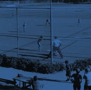
30 2014 Spring Tennis Zaban Recreation Center 2/2/14 5/13/14 morning, evening & weekend options Play / Fit / Fun Sign Up for Spring Athletic Leagues Play / Fit / Fun Sign Up for Spring Athletic Leagues Learn to Play Basketball League Play Starts soon
31 Play / Fit / Fun Play / Fit / Fun Sign Up for Spring Athletic Leagues Sign Up for Spring Athletic Leagues Play / Fit / Fun Sign Up for Spring Athletic Leagues Play / Fit / Fun tic Leagues Sign Up for Spring Athletic Leagues Play / Fit / Fun Sign Up for Spring Athletic Leagues Sign Up for Spring Athletic Leagues
32


33 Be Cool at the City of Atlanta s Splash Pads


34

35 Print

36 Print

37 Signage Paint color is a high-impact way to bring the Look into facilities.

38 Signage

39 Signage

40 Apparel

41 Apparel

42 Vehicles

43 Signage

44 Signage

45 Signage

46 Campaign

47 Campaign
48 Promotional

49 Promotional
50 Promotional Bumper Stickers Stickers Chastain Rosel Fann Candler Bumper Stickers Personalized with a Sticker Old Fourth Ward Grant Pittman Adamsville Thomasville

51 Banners

52 Banners

53 Banners
54 Banners
ATHLETIC BRAND STANDARDS GUIDE
 ATHLETIC BRAND STANDARDS GUIDE THE IMPORTANCE OF GRAPHIC STANDARDS TABLE OF CONTENTS The Importance Of Graphic Standards...1 Official Colors...2 Athletics Logos...3 Primary Athletics Mark...4 Use On Color
Athletics Brand Standards Guide
 I L L I N O I S W E S L E Y A N T I T A N S Athletics Brand Standards Guide THE IMPORTANCE OF GRAPHIC STANDARDS TABLE OF CONTENTS The Importance Of Graphic Standards 1 Official Colors 2 Full Color Athletics
graphic standards guide DATE 8.11 v1.0
 graphic standards guide DATE 8.11 v1.0 TABLE OF CONTENTS 2 Introduction 3 Primary Logo 4 Logotype 6 Type Treatment 7 Bison Head 8 Monogram Logo 9 Logo Overview 10 Color Palette 11 Colored Backgrounds 12
Visual Style Guide. April 2016
 Visual Style Guide April 2016 Contents Introduction to the Logo 3 Safe Area and Size 4 Incorrect Usage 5 Color Palette 6 Other Brand Elelments 7 Typography 8 Tone and Style of Photography 9 Print Examples
Brand Guidelines 12 December 2014
 Brand Guidelines 12 December 2014 Our brand Introduction A distinctive new approach to the transport infrastructure of Edinburgh deserves a bold new look. A whole new brand platform has been developed
Brand Guidelines v1.0
 Brand Guidelines 2019 v1.0 Overview Ticketek is New Zealand's gateway to the live entertainment experience. Using innovative technology, we ve become New Zealand's leading platform for connecting millions
IDENTITY GUIDELINES AND GRAPHIC STANDARDS MANUAL SPRING 2017
 IDENTITY GUIDELINES AND GRAPHIC STANDARDS MANUAL SPRING 2017 THE IMPORTANCE OF GRAPHIC STANDARDS The United Mail logo is our unique graphic signature. It is one of the most visible aspects of the company
Using the logo. About the logo. Elements. The seal. The logotype. Third party logo use
 Style guide 218 Using the logo About the logo Jimmy is at the heart of everything we do as a charity and this is reflected by his name being at the foundation of our actions. The various elements of the
Green Globes, GPC + Green Building Initiative GRAPHIC STANDARDS GUIDE
 Green Globes, GPC + Green Building Initiative GRAPHIC STANDARDS GUIDE Last Updated: December 29, 2014 WWW.THEGBI.ORG 503.274.0448 info@thegbi.org page 2 CONTENTS 1.0 Introduction 3 1.1 Our Mission 3 1.2
ASSOCIATION SIGNATURE GUIDELINES May 2014 Based on version 2.1 of Branding Guidelines
 ASSOCIATION SIGNATURE GUIDELINES May 2014 Based on version 2.1 of Branding Guidelines ASSOCIATION OF AMI SIGNATURE 4.5 0.5 0.5 0.5 ASSOCIATION COLOR PALETTE MATCH COLOR REPRODUCTION INK SUBSTITUTION 2
Brand Identity System Interim Guidelines 12/2011
 Brand Identity System Interim Guidelines 12/2011 Table of Contents Introduction 2 The jcp Flag 3 The Brand Identity Components 4 About the jcp Flag 5 Using the jcp Flag Three Size Versions 6 Using the
C&L WARD BRAND GUIDE 1
 CONTENTS 2 The Logo 3 Formats 4 Correct Usage 5 Incorrect Usage 6 Alternate Logos 7 The Tagline 8 Color Palette 9 Fonts 10 Complimentary Fonts 11 Photography Styles 12 Photography to Avoid C&L WARD BRAND
Brand Guidelines Version 3.1
 Brand Guidelines Version 3.1 Our Mission At Checkout 51 our mission is to help millions of families save money, and use their purchase data to revolutionize marketing. We partner with the world s leading
Brand identity toolkit
 Our visual identity Brand identity toolkit Typography Photography Lyon Display Medium ABCDEFGHIJKLMNOPQRSTUVWXYZ abcdefghijklmnopqrstuvwxyz 0123456789 Akkurat Regular ABCDEFGHIJKLMNOPQRSTUVWXYZ abcdefghijklmnopqrstuvwxyz
LINKED LEARNING IDENTITY GUIDELINES V
 This style guide provides important information about using brand in a consistent manner Use this guide if you are a school or partner who wants to use brand If you are working with a professional designer,
DRAFT UNIVERSITY OF ARKANSAS AT PINE BLUFF. Athletic Brand Identity Guidelines
 DRAFT UNIVERSITY OF ARKANSAS AT PINE BLUFF Athletic Brand Identity Guidelines August 2014 TABLE OF CONTENTS 4 6 9 13 16 19 27 32 34 37 Introduction Primary Athletic Identity Marks Secondary Athletic Identity
Branding Guidelines York Branding Guide September 2011
 Branding Guidelines COLOR 1-Color Printing: The logo prints in all black ink. 100% Black 2-Color Printing: The logo prints either in all black, or in 2 colors: Pantone 032 and black. On a black or dark
CONTENTS. Introduction 04. Primary Logo 07. Clear Space & Size Requirements 08. Alternate Logo Usage 09. Logomark Usage 1 3.
 CONTENTS Introduction 04 Primary Logo 07 Clear Space & Size Requirements 08 Alternate Logo Usage 09 Logomark Usage 1 3 Usage Dos 14 Usage Don ts 15 Colors 16 Typography 17 Photography Guidelines 18 Tone
Graphic Design Standards
 Graphic Design Standards CONTENTS 3 4 4 5 6 7 8 9 10 11 12 INTRODUCTION COLOR VALUES FONTS LOGO ARRANGEMENTS & GUIDELINES PROPER USAGE IMPROPER USAGE STAGING MINIMUM SIZE BUSINESS CARD APPAREL LINKS TO
middle georgia knights - official brand identity usage and style guide
 middle georgia knights - official brand identity usage and style guide table of contents: 1. Primary Logo - Full Color and One Color 2. Alternate Primary Logo - Full Color and One Color 3. Alternate Primary
BRAND STYLE GUIDE External 07/ 2011
 BRAND STYLE GUIDE External 07/ 2011 TABLE OF CONTENTS understanding the brand 01 What is a brand? 01 Why are guidelines needed? 01 Who should use these guidelines? 01 How should they be used? 01 Brand
THE LOGO 4 COLOR PALETTE 6 LOGO USAGE 7 THE TYPEFACE 8 GENERAL GUIDELINES 10 TYPOGRAPHY USAGE 11 SUPPLEMENTAL ICONS 12
 BRAND GUIDELINES THE LOGO 4 Clear Area Alternate Logo Versions COLOR PALETTE 6 Color Options LOGO USAGE 7 THE TYPEFACE 8 Suggested Uses GENERAL GUIDELINES 10 TYPOGRAPHY USAGE 11 SUPPLEMENTAL ICONS 12
2.1. The Corporate Signature and Colors
 The Corporate Signature and Colors 2.1 The Southern States signature is the foundation for our brand identity system. Proper use of the signature is fundamental to the success of all applications. The
BrAnD guide. Version 0.5 Last updated: March 26, :23 PM. Please direct branding inquiries to
 BrAnD guide Version 0.5 Last updated: March 26, 2015 1:23 PM Please direct branding inquiries to marketing@slideboarding.com The word brand could be replaced with personality. It s way we showcase Slideboarding
105 BRAND GUIDELINES Ensuring people aren t in the dark about their power cut.
 105 BRAND GUIDELINES Ensuring people aren t in the dark about their power cut. Contents 2 3 Brand strategy 7 Brand elements 17 Applying the elements 32 Partners best practice 4 Brand objectives 8 Logo
CEVA Brand Identity Basics
 The logo and other CEVA intellectual property contained in these guidelines are protected by national and international laws and conventions on trademark and copyright. All reproduction, full or partial,
GRAPHIC IDENTITY MANUAL
 GRAPHIC IDENTITY MANUAL GRACELAND UNIVERSITY GRAPHIC IDENTITY 2 INTRODUCTION The Graceland University Graphic Identity Standards Manual was created to provide all Graceland University employees and associates
T H E IMP O R T A N C E O F G RAP H I C S T ANDAR D S
 T A B L E O F CONTEN T S The Importance Of Graphic Standards...1 Official Colors...2 Athletics Logos...3 Primary Athletics Mark...4 Use On Color Backgrounds...5 Eagle Monogram Mark...6 Use On Color Backgrounds...7
GRAPHIC STANDARDS GUIDE
 GRAPHIC STANDARDS GUIDE TABLE OF CONTENTS THE story how to use this guide color values & typography logo arrangement logo staging proper logo usage improper logo usage business card apparel links the end
UCCS Apparel. UCCS Brand Identity Standards Appendix IV: Apparel
 UCCS Apparel UCCS Brand Identity Standards Appendix IV: Apparel UCCS apparel is divided into two categories: official apparel and promotional apparel. Official Apparel Official apparel is apparel that
ACADEMIC STYLE GUIDE Last updated October 2018
 ACADEMIC STYLE GUIDE Last updated October 2018 Join us in taking pride in our brand. Our University s brand is its identity. It is what people think of and feel when they hear our name. It differentiates
Style guide. November 2015 v1.0; CC BY 4.0.
 Style guide November 2015 v1.0; CC BY 4.0 http://creativecommons.org/licenses/by/4.0/ Introduction Our visual identity is a core part of our user experience, so it s important to us that it be used correctly.
ERO. Federal Credit Union. Brand Guidelines
 Brand Guidelines Brand Guidelines Our Visual Identity Section 1 Introduction Content Section 2 Our Visual Identity Logo Sizes Color Guide Color Process/Usage Logo Format Usage on Pictures Use on Background
Green Globes, GPC + Green Building Initiative GRAPHIC STANDARDS GUIDE
 Green Globes, GPC + Green Building Initiative GRAPHIC STANDARDS GUIDE Last Updated: October 26, 2014 WWW.THEGBI.ORG 503.274.0448 info@thegbi.org page 2 CONTENTS 1.0 2.0 3.0 Introduction 3 1.1 Our Mission
CONTENTS LOOK AND FEEL TELLING OUR STORY 15 COLOR 16 IMAGERY STYLE 17 IMAGERY CONTENT 20 TYPOGRAPHY 23 COMPOSITION 25
 IDENTITY GUIDELINES The IALD identity guidelines introduce and define the visual elements we use to create the new IALD brand; our signature, color, imagery, typography and composition. The following layout
OUR MASTER BRANDMARK BRANDMARK USAGE LIVE UNITED TAGLINE PRIMARY BRANDMARK OUR PURPOSE WHAT IT MEANS TO JOIN
 OUR MASTER BRANDMARK PRIMARY BRANDMARK The most fundamental visual element of a brand identity is its brandmark. The evolution of our brandmark is most dramatic in its configuration. The United Way symbol
UNITED WAY BRANDMARK. Brandmark Usage. The most fundamental visual element of a brand identity is its brandmark.
 OUR BRANDMARK 13 UNITED WAY BRANDMARK Brandmark Usage The most fundamental visual element of a brand identity is its brandmark. The evolution of our brandmark is most dramatic in its configuration. The
Table of contents. Bursts BRAND art Headlines... 6
 STYLE GUIDE UPDATED FEBRUARY 27, 2015 Table of contents CAMPAIGN art Photographic... 1 Bursts.... 2 Campaign Art Photographic Examples.... 3 BRAND art.... 4 BRAND ART Examples.... 5 Headlines.... 6 Logos...
Associate Brand Guidelines
 1 Associate Brand Guidelines Contents Identity Overview 3 Mission Statement Concept Statement Brand Statement Logo 4 Incorrect Uses Color System 5 Typography 6 Stationery 7 Overview Key Elements Business
Visual Guidelines Updated: April 1, 2016
 Visual Guidelines Updated: April 1, 2016 Logo Visual Guidelines/Logo Primary Logo Iconic Red M Logo This logo is the official primary logo for the Merillat brand. The red is Pantone 485, the Merillat word
Branding guide. Ocean Harvest
 Branding guide Ocean Harvest Delivering results through responsible operations in a sustainable sea Contents Introduction.... 4 Vision and values.... 5 Logo.... 6 Colors.... 8 Photography.... 10 Illustrations....
Brand Identity & Design Standards
 Brand Identity & Design Standards Copyright 2014 by the Tahoe Truckee Community Foundation All rights reserved Originally developed for use by the Tahoe Truckee Community Foundation December 2014 Information
Our logo First Data Corporation. All Rights Reserved. First Data Brand Guidelines, Page 4
 Our logo A logotype is the visual symbol of an organization, representing the company s strengths, its aspirations and its character. Our logotype was chosen for its ability to represent who we are today
THE VAN WERT COUNTY FOUNDATION BRAND STANDARDS
 THE VAN WERT COUNTY FOUNDATION BRAND STANDARDS 1.0 OVERVIEW As, The Van Wert County Foundation, our brand voice is a vehicle for the philanthropy of individuals, corporations and organizations that have
CREATIVE GUIDE CONTENTS POSITIONING PERSONALITY LOGOS IMAGERY DESIGN MOTION/TOOLKIT EXTENSIONS CREATIVE GUIDE
 CONTENTS POSITIONING 3 PERSONALITY 4 LOGOS 5 IMAGERY 6 DESIGN 8 MOTION/TOOLKIT 12 EXTENSIONS 18 2 POSITIONING Our brands are an integral part of people s lives. Our fans are inspired by our content and
Branding guide. Estremar
 Branding guide Delivering results through responsible operations in a sustainable sea Contents Introduction.... 4 Vision and values.... 5 Logo.... 6 Colors.... 8 Photography.... 10 Illustrations.... 12
Postgraduate 2016/17 Campaign Guide
 Postgraduate 2016/17 Campaign Guide CONTENTS Messaging Postgraduate motivations 4 How to use the messaging 5 Copy composition 6 Campaign visual style The REDEFINE badge 8 Colour palette 9 Typography 10
Graphic Identity Standards
 Graphic Identity Standards Aquinas College Graphic standards Manual Section One Contents Introduction Format Colors Isolation Acceptable Variations Unacceptable Variations Sizes Typography Letterhead Envelopes,
L O G O G U I D E L I N E S
 LOGO GUIDELINES To ensure consistency in Arcoaire brand communications, the Elite Dealer crest can only be used in accordance with the specifications listed in the following pages. 1 Logo Elements Crest
Bemis Visual Identity Standards. Key Guidelines for External Users
 Key Guidelines for External Users February 10, 2014 Symbol The Bemis Symbol embodies who we are as a company dynamic and modern, an expression of the integration of our values and capabilities. Our symbol
UBC Logos: Quick Guide
 primary logo UBC Full Signature The UBC Full Signature is the primary logo to be used on all applications. Please ensure that the signature is reproduced at a legible size. In instances where the space
L O G O G U I D E L I N E S
 LOGO GUIDELINES To ensure consistency in Comfortmaker brand communications, the Elite Dealer crest can only be used in accordance with the specifications listed in the following pages. 1 Logo Elements
TABLE OF INTRODUCTION
 ASSET GUIDE 1.2 TABLE OF CONTENTS 01 INTRODUCTION.................................... 3 02 LOGO............................................ 5 03 EDITORIAL STYLING.................................. 11 04
Identity Guidelines 02 Signature. 03 Clear Zone and Sizing 04 Trademark 05 Configurations 06 Restrictions 07 Color Palette 08 Acceptable Usage
 Identity Guidelines 02 Signature 03 Clear Zone and Sizing 04 Trademark 05 Configurations 06 Restrictions 07 Color Palette 08 Acceptable Usage Signature The term signature commonly refers to a basic configuration
V I S U A L S TA N D A R D S G U I D E
 V I S U A L S TA N D A R D S G U I D E table of contents Introduction 1 elements of the visual identity Wordmark 2 Tagline 2 Additional identifiers 3 Using the institutional acronym 3 Signature 4 Using
VISUAL STANDARDS M ANUAL
 VISUAL STANDARDS M ANUAL introduction A well-respected presence in the city of Chicago, The John Marshall Law School has demonstrated an unfailing commitment not only to its own students, but also to the
MITCHELL COLLEGE MITCHELL COLLEGE VISUAL STANDARDS. Visual Identity Standards
 1 MITCHELL COLLEGE Visual Identity Standards 2 TABLE OF CONTENTS PURPOSE, BACKGROUND, ELEMENTS...4 3 HOW TO USE THE MITCHELL COLLEGE LOGO...5 SIZE and SPACING...6 MITCHELL COLLEGE COLOR USAGE...7 OFFICIAL
 BRANDING GUIDE 1 Table of Contents The AFL Name...2 Corporate Colors...4 Corporate Logo...5 Typography...10 Packaging...12 Vehicles...13 Signage...14 The AFL Name Throughout AFL s history, our name has
OUR VISUAL IDENTITY. Logo
 Logo The Pima County Public Library logo represents an inspirational place that powers possibilities by offering everyone the opportunity to discover, explore, and expand their horizons. It incorporates
TABLE OF CONTENTS. Product Listing Index. Look for this symbol. It let s you know which products are available in 4-Color Process. BLUE FROG PRINTING
 www.bluefrogprinting.net BFP16C The Roll Labels, Decals, Banners & Static Clings you ve come to expect and so much more! Product Listing Index Blue Frog Printing is proud to offer a large selection of
columbusindiana Brand Graphics Information and Standards Guide
 columbusindiana Brand Graphics Information and Standards Guide August 2007 Introduction 1 A product is made in a factory. A brand is made in the mind. Walter Landor A well-respected brand can be our most
Penn State Law Identity Standards
 Penn State Law Identity Standards The Penn State Law identity standards provide key information needed to accurately and consistently produce internal and external communication materials. The goal is
GUIDELINES & INFORMATION
 GUIDELINES & INFORMATION This document will provide basic guidelines for the use of the World Animal Day logo and general knowledge about the various file formats provided. Adhering to these guidelines
Green Globes, GPC + Green Building Initiative GRAPHIC STANDARDS GUIDE
 Green Globes, GPC + Green Building Initiative GRAPHIC STANDARDS GUIDE Last Updated: October 21, 2017 WWW.THEGBI.ORG 503.274.0448 info@thegbi.org CONTENTS 1.0 Introduction 3 2.0 Official GBI Marks (Logo
XAVIER MUSKETEERS OFFICIAL BRAND IDENTITY AND GRAPHIC STANDARDS
 XAVIER MUSKETEERS OFFICIAL BRAND IDENTITY AND GRAPHIC STANDARDS XAVIER ATHLETICS EMPOWERS STUDENT-ATHLETES TO EXCEL ACADEMICALLY, ATHLETICALLY AND SPIRITUALLY. ATHLETICS SERVES AS A PLATFORM FOR NATIONAL
ATHLETIC/SPIRIT STYLE GUIDE
 ATHLETIC/SPIRIT STYLE GUIDE Last updated July 2018 Join us in taking pride in our brand. Our University s brand is its identity. It is what people think of and feel when they hear our name. It differentiates
OUR VISUAL IDENTITY LOGO
 OUR VISUAL IDENTITY LOGO The Pima County Public Library logo represents an inspirational place that powers possibilities by offering everyone the opportunity to discover, explore, and expand their horizons.
Australian Dragon Boat Federation Corporate Style Guide. Australian Dragon Boat Federation Style Guide
 Australian Dragon Boat Federation Corporate Style Guide Australian Dragon Boat Federation Style Guide 1 Contents Introduction 3 Objective 4 NATIONAL LOGO 5 Australian Dragon Boat Federation Logo 6 Australian
Roll Back Malaria Partnership. Brand Guidelines
 Roll Back Malaria Partnership Brand Guidelines How to use these guidelines Our identity is not just a logo. It is a design scheme composed of a number of core elements that come together to create a distinctive
CLUB LOGO GUIDELINES
 CLUB LOGO GUIDELINES LOGO DETAIL The Surfrider Foundation logo is the key building block of our identity. It is the primary visual element that people can associate with our work and our brand. The logo
Graphic Standards. Graphic Standards. Graphic Standards
 Graphic Standards Graphic Standards Graphic Standards M A N U A L Introduction Graphic Design Standards astern Connecticut State University is one of four universities within the Connecticut State University
BELGARD BRAND GUIDELINES
 BELGARD BRAND GUIDELINES This is the verbal, visual and tonal blueprint of the Belgard brand. From our purpose and positioning, to the tools we use to communicate consistently, the elements of how our
Logo & Campaign Standards
 Logo & Campaign Standards January 1, 2009 Copyright 2009, Park & Company Marketing Communications, Inc. TABLE OF CONTENTS Water Use It Wisely Overview.....................................................
Brand Guidelines January 2016
 Brand Guidelines January 2016 Contents Brand Assets Logos Lock Up Brand Properties Brand Assets 04 Grow Wild, Kew & The Big Lottery Logos Lock Up 11 Brand Property: Scattered Seeds 22 Grow Wild Logo 05
MIDDLE GEORGIA STATE UNIVERSITY - GRAPHIC STANDARDS, USAGE AND STYLE GUIDE
 MIDDLE GEORGIA STATE UNIVERSITY - GRAPHIC STANDARDS, USAGE AND STYLE GUIDE TABLE OF CONTENTS: 30. CHAPTER THREE: ATHLETIC IDENTITY 31. Primary Logo: Athletics 32. Alternate Primary Logo: Athletics Primary
Branding principles Version 1 July 2016
 Branding principles Version 1 July 2016 Introduction The spirit of all Silent Pool Gin graphic executions should stem from the idea of Romantic Botany. This is the guiding principle behind everything that
UNIVERSITY OF MANITOBA VISUAL IDENTITY GUIDE. May 24, 2013
 UNIVERSITY OF MANITOBA VISUAL IDENTITY GUIDE May 24, 2013 TABLE OF CONTENTS Signature 5 Colour 25 Typography 28 Photography 31 Bringing it all together: The University of Manitoba brand 35 Templates 53
Name Class Date. Division Equations
 Name Class Date Division Equations Modeling Essential question: How do you solve whole-number equations that contain division? 2-8 video tutor CC.6.EE.7 EXPLORE Division Equations Nolan and his two friends
CHECK POINT IDENTITY GUIDELINES. Version 1
 CHECK POINT IDENTITY GUIDELINES Version 1 Contents 3 Manifesto 4 Logo 9 Colors 10 Typography 11 Photography 17 Design System 18 Design System Usage 19 Design Examples 22 Contact WE SECURE THE FUTURE The
APPROVED LOGOS LOGO USAGE GUIDELINES SUBLOGOS TAGLINE USAGE DISCONTINUED LOGOS COLOR GUIDE STATIONERY SUITE
 APPROVED LOGOS LOGO USAGE GUIDELINES SUBLOGOS TAGLINE USAGE DISCONTINUED LOGOS COLOR GUIDE STATIONERY SUITE APPROVED LOGOS PRIMARY LOGO Preferred usage of the primary logo is in conjunction with the It
INTRODUCTION OUR VISION: We are driven to be a preeminent college of pharmacy in the world. Our world begins in Iowa. OUR MISSION:
 BRAND GUIDE INTRODUCTION TABLE OF CONTENTS BRAND MESSAGING Introduction.... 1 Core Brand Values... 2 BRAND IDENTITY Logo Usage.... 6 Primary Logo Variations.... 7 Department & Division Logos.... 8 What
STYLE GUIDE JUNE 2018
 STYLE GUIDE JUNE 2018 Contents June 2018 ii 1 INTRODUCTION 3 4 6 7 GRAPHIC ELEMENTS Typography Color Palette Identity and Tag Line 8 PHOTOGRAPHY 13 14 17 LAYOUT EXECUTION Execution Guides Identifying Your
MEDIAKIT Version 02
 MEDIAKIT 2018 Version 02 LOGO APTIM BRAND STYLE GUIDELINES LOGO 2 Our logo, with its strong modern design and bold APTIM Orange and Blue, symbolizes who we are, what we do, and how we do it. The following
BRAND GUIDELINES. v 1.40 June 2017 Logo Best Practices & Guidelines Print & Web
 BRAND GUIDELINES v 1.40 June 2017 Logo Best Practices & Guidelines Print & Web TABLE OF CONTENTS 02 03 04 05 06 07 08 09 10 11 12 Concept & Messaging Orientation The Mark Color Systems Color Reference
contents brand promise 1 logo 3 color 6 typography 10 voice 12 photography 14 layout 17
 brand guidelines contents Introduction Brand Assets brand promise 1 logo 3 color 6 typography 10 voice 12 photography 14 layout 17 Our brand connects the community to the heart of what we stand for. The
DentalOrganiser.com. Brand Guidelines. John Kavanagh Brand Manager +DentalOrganiserGDS
 DentalOrganiser.com @drpmoore Brand Guidelines +DentalOrganiserGDS John Kavanagh Brand Manager +353.87.9670803 john@dentalorganiser.com Gate Dental Services Ltd. Garyngarry, Rosscahill, Go. Galway, Ireland.
United States Edition. Children s Miracle Network Hospitals. Brand Standards Quick Guide
 United States Edition Children s Miracle Network Hospitals Brand Standards Quick Guide 09.07.10 Core Elements Our Signature The Children s Miracle Network Hospitals signature consists of three elements:
3.9 Event Logo Primary version
 3.9 Event Logo Primary version Our CES event logo has been designed to share the same bright colors as those used in our corporate logotype. It also uses Karbon for the CES Name. No other colors or typefaces
Introduction NANO-TEX BRAND GUIDELINES
 2 Introduction A new vision. Nano-Tex s new brand has been developed to strongly represent our company and instantly convey the benefits of our technology in the marketplace. This document will explain
We are diligent in keeping the Truck-Lite brand clean and standardized. We created these guidelines to ensure that all parties use our brand elements
 We are diligent in keeping the Truck-Lite brand clean and standardized. We created these guidelines to ensure that all parties use our brand elements consistently. Contents 2, 3 4, 5 6, 7 8, 9 10 15 10,
BRAND IDENTITY QUICK REFERENCE GUIDE
 BRAND IDENTITY QUICK REFERENCE GUIDE Intro Intro TAHOE Boats has developed this Brand Identity Guide for you our associates, dealers and vendors. It is designed to guide you in the proper use of our company
L O G O G U I D E L I N E S
 LOGO GUIDELINES To ensure consistency in KeepRite brand communications, the Elite Dealer crest can only be used in accordance with the specifications listed in the following pages. 1 Logo Elements Crest
Ryerson University Brand Standards Guide. Version 1.0
 Ryerson University Brand Standards Guide Version 1.0 Document Overview This document provides guidelines and tools for using Ryerson University's visual brand. It outlines the building blocks of the brand
the Venue Graphic Standards
 the Venue Graphic Standards by Alexandra Richardson for AAD 584 Fall Term 2012 Table of Contents About and Mission....................... 3 Logo and Logotype....................... 4 Use of Space..............................
P E B B L E B EAC H C O M P A N Y B R A N D I D E N T I T Y G U I D E L I N E S
 P E B B L E B EAC H C O M P A N Y B R A N D I D E N T I T Y G U I D E L I N E S Th e g a m e o f g o l f has endured for 500 years, not only because of its idyllic settings and the passions of its players
Corporate Brand Guidelines....your local connection
 Corporate Brand Guidelines Content Description of the whl.travel Logo 2 Explanation of the whl.travel Logo 3 Isolation Area 4 Typography 5 Minimum Size 6 Colour 7 Colour Reproduction 8 Incorrect Uses of
B R A N D I D E N T I T Y G U I D E L I N E S
 B R A N D I D E N T I T Y G U I D E L I N E S About Pointwise/Pointwise Logos 3 The Pointwise Corporate Logo 5 The Pointwise Product Logo 9 The Let s Talk Meshing Logo 13 The Pointwise Support Team Logo
MNAO ACCESSORY OPERATIONS. GENUINE ACCESSORIES Packaging Guidelines
 MNAO ACCESSORY OPERATIONS GENUINE ACCESSORIES Packaging Guidelines 1 Introduction The brand Mazda has become a mark of excellence worldwide. With a rich history in technology development and a wide variety
ECMC Brand Guidelines November 2017 Home Contents Logo Colours Typeface Tone of voice Graphics Photography Examples Contact. Brand guidelines.
 Page 1 Brand guidelines. Page 2 Introduction. Our logo Introduction 03 Centre Specific 04 Sizes and Safe areas 05 Funder lock-up 06 Do s & dont s 07 The ECMC network brings together the talent and the
web MASTERBRAND MARK GUIDELINES
 02.2013 web MASTERBRAND MARK GUIDELINES The Masterbrand Mark The Carestream Masterbrand Mark is more than just our logo. It s the foundation on which our powerful brand communications are built. Our Masterbrand