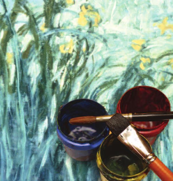
ART I: UNIT TWO PRINCIPLES OF COLOR
|
|
|
- Ariel Ross
- 6 years ago
- Views:
Transcription
1 Unit 2
2 ART I: UNIT TWO PRINCIPLES OF COLOR CONTENTS INTRODUCTION I. THE COLOR WHEEL Basic Color Mixing Value Scale in Color Color Spotting II. COLOR PHENOMENON Local Color Optical Color Arbitrary Color III. THE MEANING OF COLOR Color Theory EVALUATION GLOSSARY Author: Editor: Illustrators: Keith Rosko, B.S./M.A. Alan Christopherson, M.S. Annette M. Walker, B.S. Keith Rosko, B.S./M.A. Lauren Durain, A.S.T. Laura Miller Alpha Omega Graphics 804 N. 2nd Ave. E., Rock Rapids, IA MM by Alpha Omega Publications, Inc. All rights reserved. LIFEPAC is a registered trademark of Alpha Omega Publications, Inc. All trademarks and/or service marks referenced in this material are the property of their respective owners. Alpha Omega Publications, Inc. makes no claim of ownership to any trademarks and/or service marks other than their own and their affiliates, and makes no claim of affiliation to any companies whose trademarks may be listed in this material, other than their own.
3 PRINCIPLES OF COLOR For this Unit, you will need a few basic supplies. These can be purchased at any arts and craft store. Some items can even be purchased at places such as K-Mart or Wal Mart. 1. Tempera paint* (liquid, not solid) in the following colors: Red Blue Yellow Black White *You will be mixing all of your other colors from various combinations of these five colors. No others are needed. 2. Artist brushes* in several sizes. #3 #2 #1 #0 *These should be natural or synthetic hair and need not be overly expensive, but not the cheapest either. GOOD BAD It is important the brush have a tapered tip, or a rounded one, not a flat tip. 3. Paint mixing trays or cups. You can buy individual cups, you will need six, or a paint tray that contains six cups. Plastic or wax cups, or even an old ice cube tray will also work for this. 4. Wax palette paper is an option for mixing colors on but is not a necessity. Some people find it easier to mix on a larger flat surface instead of in cups. Wax palette paper has the advantage of being disposable, but a plastic or ceramic plate will also work, as long as the surface is not porous. I choose to mix my colors on a piece of glass. 1
4 INTRODUCTION Of all the elements and principles the artist or designer has to work with, color is probably the most exciting. It is constantly changing with the time of day and the amount of sunlight or artificial light in the atmosphere. It affects our senses directly, in a way no other element does and it is universal in its appeal and effects on people and animals. Color is also the only element of design that effects can be measured directly by science. When any one element can have as much impact on our perceptions, it is imperative that the artist have an understanding of how color works, so it may be used effectively, as well as to get the utmost meaning and enjoyment out of others artwork and the world around us in general. Before beginning this Unit, take a moment and write in the space below, what you expect this Unit to be about. What will it include, what do you expect it to be like and what do you expect to learn? OBJECTIVES Read these objectives. The objectives tell you what you will be able to do when you have successfully completed this Unit. When you have finished this Unit, you will: 1. Have an understanding of what color is and how it works. 2. Have insight into how color is used by the many different types of artists. 3. Learn to better interpret a work of art. 4. Have an appreciation for the many factors an artist or designer must consider when using color. 5. See how color affects our everyday lives. Note: All vocabulary words in this Unit appear in boldface the first time they are used. If you are unsure of the meaning when you are reading, study the definitions given. 2

5 WHAT IS COLOR? It is important to understand how we perceive color before we can begin to use color. The brighter the light, the more intense the color; the less intense the light, the less color we see. It is possible to see evidence of this on any night brightly lit by a full moon. If you stand in a room with the lights on you can see a full range of colors, but if you turn out the light and wait for your eyes to adjust to the moonlight, you will notice that if you can see any color at all, it will be very dull and gray-looking. The sun gives off radiation and electromagnetic radiation. What we call white light is only one small part of this radiation. White light is the radiation we can see, and it is this radiation that creates color. Gamma Rays X-Rays White Light* Infrared Rays Radar Radio Waves A-C Circuits *WHITE LIGHT OR THE SPECTRUM-VIOLET, BLUE, GREEN, YELLOW, ORANGE, RED. COLOR AS LIGHT Sometime around 1676, Sir Isaac Newton passed a beam of sunlight (or white light) through a prism. This caused the light to break up into what we call the spectrum, or a range of light wave lengths. We see a transition from red to blue to green. These wave lengths are called "additive" color because if a blue light, a red light, and a green light are mixed together the result is "normal white light." The primary colors of light are red, green and blue. It is varying mixtures of these wave lengths that give objects their color. The process works as follows. White light shines onto an object such as an apple. The apple absorbs almost all of the light rays, with the exception of the red wavelengths. These are reflected back into our eyes, where receptors called rods and cones perceive the sensation we call red. If the apple reflects a bit of blue light along with the red, we see it as more of a purple color. REFLECTED LIGHT Reflected light is light that bounces off an object into our eye which causes the object to take on the color of that light. 3

6 When an object is transparent, such as the glass in a Tiffany lamp, the light passes through the object. The object filters out most of the light waves, and what passes through into our eye, is what we perceive as the color of that object. Additive color, or colored light mixtures, is how your television works. A set designer for a stage will use additive color to create the mood of a play. TRANSMITTED LIGHT Transmitted light waves pass through an object. All but some are absorbed, causing an object to take on the color of the non-absorbing light. COLOR AS PIGMENT Through the centuries, artists and scientists have discovered that certain objects can be ground up and mixed together to form pigments or dyes. When these pigments or dyes (ground up insect or plant parts or certain minerals) are applied to the surface of an object it can change its "color" or what light wavelengths it reflects. Subtractive color, or pigments, is how printed matter works. When working with pigment (subtractive color), the three primary colors are red, blue and yellow. When printers mix pure pigments called "process colors" the results can be seen in the chart at the left. An equal mixture of all three produces black. Artist pigments are rarely as pure as "process colors," however so, artists arrange color a bit differently on what is known as a color wheel. Review the material in this section in preparation for the Self Test. The Self Test will check your mastery of this particular section. The items missed on this Self Test will indicate specific areas where restudy is needed for mastery. 4
7 SELF TEST INTRODUCTION Complete the following activities (each answer 5 points). I.01 Define color. I.02 What is another name for the range of wavelengths that make up white light? I.03 Name one other type of solar radiation besides white light. I.04 What did Sir Isaac Newton do in 1676 that was important to artists? I.05 Explain the difference between reflected light and transmitted light. I.06 Why does an object appear to have a specific color? I.07 Who would be more likely to work with additive color, a painter or a set designer? Why? I.08 Which primary color does not belong when working with subtractive color? a. red b. yellow c. green d. blue I.09 Define process color. I.10 Which primary does not belong when working with additive color? a. red b. yellow c. green d. blue Score Instructor Check Initial Date 5
8 I. THE COLOR WHEEL AND ARTISTIC USE OF COLOR. When an artist uses color, it is in a very different way from the way in which science uses color; therefore artists set up color, or organize color in a different way. The artist also uses slightly different terminology to talk about color. Understanding how and why the artist organizes color, and how the artist talks about color is of the utmost importance when creating or even looking at art. The color wheel is the traditional way in which artists separate color. Over the years three separate "wheels" have come into popular use. For our purposes, we will present the most common, the Ives color wheel. The Oswald and Munsell wheels will be used for comparison only. red purple orange blue Wilhelm Oswald created this wheel based on four primary colors, mixing everything else from these four (yellow, red, blue and green). yellow turquoise Oswald s wheel shows twenty-four colors for use by the artists. leaf green green sea purple red green redyellow yellow- yellow redpurple purpleblue Albert Munsell created a wheel based on five basic colors chosen for their psychological impact. These colors were red, yellow, green, blue and purple. For working ease, Munsell limited his wheel to a total of ten colors. blue bluegreen green The most commonly used and the easiest to follow is the Ives color wheel created by Herbert Ives. This wheel is divided into three sets of colors; the three primary colors, three secondary colors and six intermediate colors making a total of twelve basic colors. 6
9 The Ives wheel is organized as follows: A. The three primary colors; red, yellow and blue. These are called primary because all other colors are mixed from combinations of these three. These are also the three colors that cannot be made from mixing other colors together. For example, try as you might, no combination of other colors will produce blue. B. Located between the primaries are the secondary colors of green, orange and purple. Secondary colors are created by mixing two primaries together. They are also located between the mixing colors on the wheel. For example, blue and yellow produce green, so green is placed between blue and yellow on the wheel. Purple is produced by mixing blue and red; and orange by mixing red and yellow. C. The final group of colors are called intermediates. These are created by mixing a primary and a secondary color together. Again, the resulting color is placed between the two used to create it, and is also named after those two colors (with the primary always coming first). For example, red and orange will produce a color called redorange and placed between red and orange on the wheel. Notice how the complete wheel creates a spectrum, going from blue to red to yellow and back to blue again. The six intermediate colors are red-orange, redpurple, blue-purple, blue-green, yellowgreen and yellow-orange. red red-orange red-purple orange purple yellow-orange blue-purple yellow blue yellow-green blue-green green 7

10 Activity 1.1 Basic Color Mixing To see how colors mix, we will begin by drawing and painting a basic Ives color wheel. 1. To begin, draw a large circle on a sheet of 9 x 12 of white construction paper. Be sure to leave about 1 of space between the edge of the paper and the circle. Lightly, label the circle as if it were the face of a clock. 2. Next, use a ruler to draw a straight line through the center of the circle connecting 12 and 6. Draw one which connects 2 to 8 and one which connects 10 to Use the compass, or a circle template to draw a large circle where your lines touch 12, 4 and 8. Draw a smaller circle at 2, 6 and 10. Draw a slightly smaller circles at 1, 3, 5, 7, 9 and Take your six-dish paint tray and fill cups. One with red, one with yellow and one with blue. Paint the large circles red, yellow and blue. You now have three primary colors In one of the remaining cups, add one brush of red and one brush of blue, being sure to clean your brush out in between. Mix the two colors fully to create purple. Do this two more times to create green and orange Clean your paint tray and start again. Using equal amounts of each primary, mix two cups of green, two cups of purple and two cups of orange. You are now ready to create your intermediate colors. In one of the purple cups, add an additional brush full of blue and mix fully. You will see a purple that is slightly more blue in color, but not a true blue. Paint this in the small circle between blue and purple. In the remaining purple cup, add a brush full of red and mix. You will now have a purple that is a bit more reddish in color, but still not a true red. Paint this in the small circle between red and purple. Continue this process until you have created all six secondary colors

11 Obviously, these twelve colors do not account for the huge numbers of colors you see in works of art or in the world around you. There are countless numbers of intermediate colors in countless variations between the primaries and secondaries. Even these however do not account for all the color we see in the world around us. There is another way artists can alter or change colors for their use. You may have noticed that none of the color wheels mentioned show any black or white. These are called neutral colors and are not on the color wheel because they are not actual colors, but either the absence of color, or the mixing of all color. White is created when no pigment is present, so all the light waves are reflected and we see a lack of color. Black, in theory, is created when all the colors are mixed together. However, since pigments are not pure, a more brownish black is usually produced and special materials (such as iron) are added to create a perfect black. Gray is a mixture of equal parts of black and white, and is also used by the artist to alter colors. These neutral colors are used to alter and change colors, to create additional variations for the artist. A similar wheel can be set up demonstrating how to alter an existing color. Hue Tint Shade Tone White Black Gray THE TONE WHEEL 9
12 Hue is a term that refers to a pure color, straight from the color wheel. Red would be an example of a hue. Each hue has its distinct value, or corresponding light or dark. Red for example, is darker in value than yellow, but lighter in value than blue. Adding white to a color produces what is known as a tint, the tint of red is pink, and pink is lighter in value than red. The result of adding black to a color is a darker value of that color, a dark red for example, and is called a shade. When gray (equal parts of black and white) is added to a hue, a slightly different effect is created. If the gray added is the same value as the color, the color is not changed in value, it gets no lighter or darker, but its intensity changes. Intensity refers to how bright a color is; the more gray, the duller the color. This is called a tone. A color can also be "toned down" or made duller by adding its complement. A complementary color is the hue that is directly opposite another hue on the color wheel. The opposite of red is green. When green is added to red, a dull red is produced, but with a slightly brown color. By mixing colors on the wheel and altering them by using varying amounts of white an infinite number of colors can be created. 10
13 Activity 1.2 Value Scale in Color The point of this activity is to understand color not only in terms of the hue, but of value and intensity as well. Begin by taking a sheet of 9 x 12 construction paper. On this piece of paper draw four rows of squares. The squares will be 1" x 1" and you should put 10 squares in each row. The finished page should look like this: Leave 1 between the rows and the edge of the paper. Example shown is 1/2 size. Leave 1 between each row. 1 wide 10 long In the top row create a value scale by painting square #1 a pure hue, paint square #10 black. The squares in between with eight different shades of red, getting gradually darker from two to nine. Start by filling a cup with hue and add one drop of black and mix. Use this to paint the second square. Add another drop of black and mix again. Follow this procedure until all the squares are filled. In the second row, follow the same procedure but substitute white for black (when mixing tints, add the color to the white rather than add the white to the color.) 11 Row three is an exercise in tone, square #1 is a hue, square #10 is gray, create the steps in between. Row four is also an exercise in tone, but this time, instead of using gray, use the complement of the hue. Concentrate on making each square as smooth as possible, with a minimum of brush strokes and neat, clean edges. Concentrate also to make sure each square is is a slightly different value than the one on either side. Create one of these pages for each primary color and one for each secondary color (a total of six color experiment sheets).
14 The color wheel can also be used to organize color for the artist to use. For years, artists have used specific groups of colors because they look good together, or are capable of creating a specific response in the viewer. These groups of color are visually called color harmonies or color schemes. When you choose your wardrobe each morning, you unconsciously make use of these harmonies. The first, and probably most common, is called a monochromatic scheme, mono meaning one and chroma meaning color. A monochromatic scheme uses all one family of colors such as blue and all its assorted shades, tints and tones. This scheme produces a feeling of unity throughout the design. MONOCHROMATIC BLUE A complementary color scheme uses colors that are opposite on the color wheel. Placed next to each other these colors tend to make each other look brighter and more vivid. When mixed, as you may remember, complements cancel each other out making a brownish tone. COMPLEMENTARY COLORS Analogous colors are related colors. Any three colors that are adjacent on the color wheel and as a result, have a common color can be called analogous. Along with the tints, tones and shades, this scheme provides a wide variety of colors that still go well together. ANALOGOUS COLORS 12
15 Split-complement colors are a fourth scheme, a variation on the complementary scheme. If you take the color blue for example, and look at its complement of orange, this scheme would use the adjacent orange colors of red-orange and yellow-orange, the resulting scheme has a great deal of contrast without the jarring effect of straight complements. SPLIT-COMPLEMENT COLORS Triadic colors are those that are equally spaced on the wheel. Since tri means three, we will only be using three colors such as red, blue and yellow or green, purple and orange. TRIADIC COLORS The colors in between yellow and red-purple form the warm color scheme. These colors are called warm, because we tend to associate them with warm objects such as sand, fire or the sun. Notice also, that these colors are very similar in value. WARM COLORS Cool colors run from purple to yellow, green and are so called because of the feel of things we tend to think of as being these colors. Think of water, ice or grass and these colors come to mind. These colors, also not only look good together, but tend to be very similar in value. COOL COLORS 13
16 The colors that we choose for a particular design can have a great deal of effect on how the finished design looks and is interpreted by people. Observe the following design, with the seven previouslydiscussed schemes, and you can see how different they appear. COMPLEMENTARY ANALOGOUS SPLIT-COMPLEMENTARY TRIADIC MONOCHROMATIC WARM COOL You can see how color schemes fill the world around you. Notice the fall leaves, the night landscape, the beach and ocean, the sky and landscape during a sunset. What schemes do you see? 14

17 Activity 1.3 Color Spotting Each of the seven following pages is labeled with the name of a common color scheme. During the course of your study of this Unit, look through magazines and see if you can find examples of the color schemes used in advertising, landscape photography, pictures of artwork or magazine illustrations. Cut as many as you can find for each scheme and tape them to the proper pages. Example: Monochromatic CLAUDE MONET S WATER LILIES (1906) Art Institute of Chicago. 15
18 COMPLEMENTARY 16
19 ANALOGOUS 17
20 SPLIT-COMPLEMENTARY 18
Color Theory and Mixing
 MODULE 4 Color Theory and Mixing? What is explored in this module? In this module, we ll look at basic color theory and mixing colors. You ll find that color theory and mixing is not a perfect science.
What is Color? The element of art derived from reflected light. Light reflects off objects, sending colors back to our eyes.
 Chapter 7: COLOR What is Color? The element of art derived from reflected light. Light reflects off objects, sending colors back to our eyes. I. Color Spectrum Color Spectrum: The bands of color created
COLOR AS A DESIGN ELEMENT
 COLOR COLOR AS A DESIGN ELEMENT Color is one of the most important elements of design. It can evoke action and emotion. It can attract or detract attention. I. COLOR SETS COLOR HARMONY Color Harmony occurs
Color Wheel. Warm Colors. Cool Colors
 Color Wheel Warm Colors Cool Colors How we see color: the light source gives a full spectrum of wavelengths (All 6 colors). The cup absorbs every wave length of color except Blue. Blue is reflected back
NEWTONIAN COLOR THEORY
 THEORY 2D Design Color Crash Course NEWTONIAN THEORY Color in a picture is like enthusiasm in life. -incent an Gogh In 1666 Sir Isaac Newton (1642-1726) passed a beam of light through a prism and proved
Value. Value-It is the lightness or darkness of an object, regardless of color. Value is relative to the background color and other items on the page.
 Value Value-It is the lightness or darkness of an object, regardless of color. Value is relative to the background color and other items on the page. Value is created by a light source that shines on an
Color Studies for Kids
 Color Studies for Kids By C.L. Swanner 2011 C.L. Swanner All rights reserved. Special Thanks To: God, who designed me with a great love for His creation and gave me the ability to explore His creation
Color is derived from Reflected Light.
 How We See Color Color is derived from Reflected Light. White light from the sun is actually a combination of all colors. When light passes through a prism, a wedge-shaped glass, the beam of light bends
This chapter will cover the following topics: Colour terminology. The colour spectrum. The colour wheel. Organisation of colour.
 What would the world be like without colour? Colour brings vitality to everything it touches, be it the clothes we wear or the homes we live in and as a painter and decorator, you need to understand colour,
With colours you can set a mood, attract attention, or make a statement. You can use colour to energise, or to cool down. By selecting the right
 COLOUR With colours you can set a mood, attract attention, or make a statement. You can use colour to energise, or to cool down. By selecting the right colour scheme, you can create an ambiance of elegance,
Hue is what makes a color identifiable and different from any other color, e.g. orange, red-orange, red.
 Hue Hue is what makes a color identifiable and different from any other color, e.g. orange, red-orange, red. Hues are determined (and can be measured) by a color's wavelength. There are millions of hues
The Color Wheel is a visual representation of color theory. It is the color spectrum wrapped onto a circle.
 The Color Wheel is a visual representation of color theory. It is the color spectrum wrapped onto a circle. It creates an orderly progression of color that helps us understand color balance and harmony.
Color Theory. Additive Color
 Color Theory A primary color is a color that cannot be made from a combination of any other colors. A secondary color is a color created from a combination of two primary colors. Tertiary color is a combination
color basics theory & application Fall 2013 Ahmed Ansari Communication Design Fundamentals
 color basics theory & application Fall 2013 Ahmed Ansari Communication Design Fundamentals Presentation 7 Tom Fraser + Adam Banks Designer's Color Manual Johannes Itten The Art of Color Ellen Lupton &
The Color Wheel. The color wheel shows relationships between the colors.
 Color Wheel The Color Wheel The color wheel shows relationships between the colors. Artists often use the color wheel to help understand how colors relate to one another. The Color Wheel Let s learn about
UBT128X Colour theory
 UBT128X Colour theory Unit reference number: L/507/5481 Level: 3 Guided Learning (GL) hours: 25 Overview This unit is about exploring the concepts and theories of colour. Learners will develop the knowledge
Color is a property of light.
 Color Theory I Color is a property of light. -Objects have no color of their own, they just reflect a particular wavelength from the color spectrum. (For example a blue object absorbs all of the wavelengths,
Elements Of Art Study Guide
 Elements Of Art Study Guide General Elements of Art- tools artists use to create artwork; Line, shape, color, texture, value, space, form Composition- the arrangement of elements of art to create a balanced
Primary Hue Color Wheels
 Primary Hue Color Wheels You can make your own basic six color wheels using different combinations of your primary colors, and then mixing the secondaries from your choices. This will give you a quick
THE MEANING OF COLOR VISUAL COMMUNICATION III 3D DESIGN PRINCIPLES
 COLOR THE MEANING OF COLOR Color in design is very subjective. What evokes one reaction in one person may evoke a very different reaction in someone else. Sometimes this is due to personal preference,
Hue Value Intensity tint shade Tones
 COLOR Color Color is the element of art that is derived from reflective light. You see color because light waves are reflected from objects to your eyes. White light from the sun is actually a combination
Wright Field Scale Modelers. Color Mixing: Everything you thought you knew about color is wrong.
 Wright Field Scale Modelers Color Mixing: Everything you thought you knew about color is wrong. Sources http://www.huevaluechroma.com/ Written by a color scientist, Dr. Briggs. It is a bit technical. Principles
LIGHTIG FOR INTERIORS
 LIGHTIG FOR INTERIORS COLORS LIGHTING Interior Design Department Third grade/ Fall semester Siba nazem Kady COLORS THEORIES OF COLOR DESIGN Review The Hue REVIEW HUE,VALUE, AND SATURATION - Gradation of
H10: Description of Colour
 page 1 of 7 H10: Description of Colour Appearance of objects and materials Appearance attributes can be split into primary and secondary parts, as shown in Table 1. Table 1: The attributes of the appearance
Drawing terms Shading terms Design elements Explanation and assignments.
 Drawing terms Shading terms Design elements Explanation and assignments. 1 Art terminology Portrait View Format what you are doing art on. Medium What you are using to create the art. Ex. Use watercolor
Notes on colour mixing
 INFORMATION SHEET These notes, with the diagrams in colour, can be found on the internet at: http://www.andrewnewland.com/homepage/teaching Notes on colour mixing Andrew Newland T E A C H I N G A R T &
elements of design worksheet
 elements of design worksheet Line Line: An element of art that is used to define shape, contours, and outlines, also to suggest mass and volume. It may be a continuous mark made on a surface with a pointed
In a physical sense, there really is no such thing as color, just light waves of different wavelengths.
 Color Concept Basis Color Concept What is Color? In a physical sense, there really is no such thing as color, just light waves of different wavelengths. Color comes from light. The human eye can distinguish
COLOR THEORY. The Color Wheel
 COLOR THEORY COLOR THEORY Color theory encompasses a multitude of definitions, concepts and design applications. All the information would fill several encyclopedias. As an introduction, here are a few
GRAPHICS TECHNOLOGY II
 GRAPHICS TECHNOLOGY II COLORS ARE PART OF OUR LIFE From the clothes we wear, to the things around us, the food we eat, the things we use- everything. Colors are said to activate the right brain for emotions.
Answer the questions below.
 Color Theory Answer the questions below. The two images to the right were created by the same artist. How is the color in these two paintings different? How does the color tone of these paintings effect
Tiered Assignments th Grade Art I
 Value & Color Tiered Assignments 9-12 th Grade Art I Color is one of the most powerful elements the artist uses for expression, prompting aesthetic responses, creating contrast, value, mood, and expressive
Line Line Characteristic of Line are: Width Length Direction Focus Feeling Types of Line: Outlines Contour Lines Gesture Lines Sketch Lines
 Line Line: An element of art that is used to define shape, contours, and outlines, also to suggest mass and volume. It may be a continuous mark made on a surface with a pointed tool or implied by the edges
color & dye chemisty Explore in a scientific way! Learn how and why we see color, and how dye chemically reacts with fabric!
 for ages 12-17 color & dye chemisty Explore in a scientific way! Learn how and why we see color, and how dye chemically reacts with fabric! objectives and materials what is color? types of color how reactive
Example: Leaf. Cut out the shape using scissors, and carefully use the template to place your sampling outlines evenly around the drawing paper.
 Colored Pencil Samplings Because of the technical skills required to successfully manipulate colored pencils, you must first practice some of the basic techniques involved with drawing colored pencil compositions.
Art & Design visual elements
 Make your own colour scheme Which 20 colours suit you best? Choose 20 of your favourite colours out of the different stacks on the tables. Make sure to group harmonious colours together. Discuss the place
Line. The path created by a point moving through space. i n. Horizontal Line. Thin Line. Thick Line
 Line The path created by a point moving through space. V er Horizontal Line Diagonal Line Zig-Zag Line Wavy Line t i c a l L i n e Spiral Line Thin Line Thick Line Line can help create the illusion of
Light waves interact with materials.
 Page of 7 KEY CONCEPT Light waves interact with materials. BEFORE, you learned Mechanical waves respond to a change in medium Visible light is made up of EM waves EM waves interact with a new medium in
SCIENCE Student Book. 2nd Grade Unit 7
 SCIENCE Student Book 2nd Grade Unit 7 Unit 7 PHYSICAL PROPERTIES PHYSICAL PROPERTIES SCIENCE 207 Introduction 4 1. All about Colors... 7 Primary Colors 8 The Rainbow 13 Seasons and Holidays 19 Self Test
DESIGNING FLOWER BEDS with
 DESIGNING FLOWER BEDS with Good flower bed designs incorporate many different features Relative surface feel or look On plants, texture comes from Leaves Twigs Bark Texture also comes from Rocks Pavement
Horace A picture is worth a thousand words. Napoleon Bonaparte A work of art is the unique result of a unique
 A man paints with his brains and not with his hands. Michelangelo A painting that is well composed is half finished. A picture is a poem without words. Pierre Bonnard Horace A picture is worth a thousand
Elements of Art. Define: Line. Shape. Value. Texture. Color. Form. Space
 Elements of Art Line Shape Value Texture Color Form Space Directions: When we talk about the parts that make up a picture or work of art, we refer to them as elements. In the space below, draw a picture
Introduction to Color Theory
 Systems & Biomedical Engineering Department SBE 306B: Computer Systems III (Computer Graphics) Dr. Ayman Eldeib Spring 2018 Introduction to With colors you can set a mood, attract attention, or make a
TRADE OF PAINTING & DECORATING
 TRADE OF PAINTING & DECORATING PHASE 2 Module 3 Imitative and Decorative Arts UNIT: 1 Table of Contents Introduction... 1 Learning Outcomes... 2 1.0 Pigmental, primary, secondary & tertiary colours...
Art 177 :: Creative Photography. Color & Color Theory
 Art 177 :: Creative Photography Color & Color Theory Color I never met a color I didn t like. Dale Chihuly Color [electromagnetic spectrum] The electromagnetic spectrum is made up of all forms of electromagnetic
check it out online at
 check it out online at www.belyea.com/svc/all_about_color.pdf Who am I? I got the blues Experience and Emotions through color PASSION JOY Depression HARMONY CREATIVITY PEACE MOURNING It s a bird, it s
De Angela Duff Fall HOMEWORK EXERCISES Wk 7 DUE NEXT WEEK ASSIGNED SHOW & TELLS: Mark Rothko (Daniella)
") VCS Visual Communication Studio De Angela Duff Fall 2007 HOMEWORK EXERCISES Wk 7 DUE NEXT WEEK ASSIGNED SHOW & TELLS: Mark Rothko (Daniella) READ: BOOK: Understanding Comics by Scott McCloud (on reserve
VCS Visual Communication Studio De Angela Duff Fall 2007 HOMEWORK EXERCISES Wk 7 DUE NEXT WEEK ASSIGNED SHOW & TELLS: Mark Rothko (Daniella) READ: BOOK: Understanding Comics by Scott McCloud (on reserve
Part I: Color Foundations The Basic Principles of COLOUR theory
 Part I: Color Foundations The Basic Principles of COLOUR theory Colour Systems Available colour systems are dependent on the medium with which a designer is working. When painting, an artist has a variety
Review Questions for Design Final Exam Correct answers are highlighted in RED
 Review Questions for Design Final Exam Correct answers are highlighted in RED 1. What type of art is this image? a. Abstract b. Non-Objective c. Realistic 2. What type of art is this image? a. Abstract
Principles of Design
 Principles of Design Balance A. Stability of an arrangement 1. Arrangement appears secure and stable 2. Balance must be both visual and actual Balance a. visual balance refers to the way an arrangement
ARTS D Design. Project 1: Art Elements. Reading Guide: form. elements of art. line. shape. value. texture. color. principles of organization
 ARTS 101 2-D Design Project 1: Art Elements Reading Guide: form elements of art line shape value texture color principles of organization harmony variety balance proportion dominance movement economy unity
Properties of Color. Value: Tint: Shade: Tone: Intensity:
 Seeing Color Color and light are inseparable, without light there would be no color When light passes through a prism a spectrum of colors becomes visible Defining Color Hue The name of a color, such
Choose Paint Colors and Schemes
 Choose Paint Colors and Schemes When you re decorating your home, choosing the right paint colors is the most important decision you ll make. As fun as choosing colors can be, this part of the planning
Year 6 Visual Arts Unit 2017 Colour and Tone Term: Week:
 Term: 1 2 3 4 Week: 1 2 3 4 5 6 7 8 9 10 11 OUTCOMES Making: investigates subject matter in an attempt to represent likenesses of things in the world - makes artworks for different audiences, assembling
Colors in Images & Video
 LECTURE 8 Colors in Images & Video CS 5513 Multimedia Systems Spring 2009 Imran Ihsan Principal Design Consultant OPUSVII www.opuseven.com Faculty of Engineering & Applied Sciences 1. Light and Spectra
CUT the wheel vertically IN HALF: WARM (right) AND COOL COLORS (left)
 AND COOL COLORS (left)") COLOR CHEAT SHEET! Simons Arts123 The following information has been collected from a number of websites. See: http://www.youtube.com/watch?v=059-0wrjpau Karen Kavet http://www.color-wheel-pro.com/color-schemes.html
COLOR CHEAT SHEET! Simons Arts123 The following information has been collected from a number of websites. See: http://www.youtube.com/watch?v=059-0wrjpau Karen Kavet http://www.color-wheel-pro.com/color-schemes.html
The art of colour Date: Venerdì, febbraio 12:17:49 CET Topic: Educational Lighting Site
 The art of colour Date: Venerdì, febbraio 15 @ 12:17:49 CET Topic: Educational Lighting Site Primary colours Newton's disc Complementary colours Secondary colours Tertiary colours Warm and cold colours
CColor Theory in Design
 CColor Theory in Design The Color Wheel The Color Wheel A color circle, based on red, yellow and blue, is traditional in the field of art. Sir Isaac Newton developed the first circular diagram of colors
Name: Period: THE ELEMENTS OF ART
 Name: Period: THE ELEMENTS OF ART Name: Period: An element of art that is used to define shape, contours, and outlines, also to suggest mass and volume. It may be a continuous mark made on a surface with
Color in Landscaping. By C. Kohn Agricultural Sciences Waterford WI
 Color in Landscaping By C. Kohn Agricultural Sciences Waterford WI Color Color is the difference in the visual appearance of objects due to how they reflect light into a person s eyes. Different objects
Principles of Architectural Design Lec. 2.
 Principles of Architectural Design Lec. 2. The Complementary Elements of design. The complementary elements characterize the natural elements, creating means of comparison for the primary elements used
Designing Flower Beds with Colors
 Utah State University DigitalCommons@USU All Archived Publications Archived USU Extension Publications 1-1-2005 Designing Flower Beds with Colors Larry A. Sagers Follow this and additional works at: http://digitalcommons.usu.edu/extension_histall
THE SCIENCE OF COLOUR
 THE SCIENCE OF COLOUR Colour can be described as a light wavelength coming from a light source striking the surface of an object which in turns reflects the incoming light from were it is received by the
LECTURE 07 COLORS IN IMAGES & VIDEO
 MULTIMEDIA TECHNOLOGIES LECTURE 07 COLORS IN IMAGES & VIDEO IMRAN IHSAN ASSISTANT PROFESSOR LIGHT AND SPECTRA Visible light is an electromagnetic wave in the 400nm 700 nm range. The eye is basically similar
Elements of Art. Line Shape Form Space Value Color Texture
 Elements of Art Line Shape Form Space Value Color Texture Line Line is the path of a moving point through space. Mark on a surface usually created by a pencil, pen, crayon, marker or paintbrush. Thick
Art Vocabulary Assessment
 Art Vocabulary Assessment Name: Date: Abstract Artwork in which the subject matter is stated in a brief, simplified manner; little or no attempt is made to represent images realistically, and objects are
OBJECT OF THE GAME The goal of Pastiche is to score the most points, which are earned by completing commission cards through collecting the necessary
 A world of beautiful colors comes alive as players complete commissions that picture some of the finest European and American art works from the past six centuries. The word pastiche is used in the fields
Lesson Title: The Science of Light and Photography Subject Grade Level Timeline. Physical Science minutes. Objectives
 Lesson Title: The Science of Light and Photography Subject Grade Level Timeline Physical Science 5-12 60-90 minutes Objectives This lesson explores some of the ways in which light can be manipulated to
GAME SETUP. Game Setup Diagram
 A world of beautiful colors comes alive as players complete commissions that picture some of the finest European and American art works from the past six centuries. The word pastiche is used in the fields
The Elements of Art: Photography Edition. Directions: Copy the notes in red. The notes in blue are art terms for the back of your handout.
 The Elements of Art: Photography Edition Directions: Copy the notes in red. The notes in blue are art terms for the back of your handout. The elements of art a set of 7 techniques which describe the characteristics
Color Theory. Chapter 2 Color Basics. Color as Light. Light as Color
 Color Theory Chapter 2 Color Basics Color as Light Light as Color Last Class: Color Coding & Color as Communication Color as cultural & personal expression Current technology driving color availability
TEACH THE CORRECT COLOR THEORY SCHOOL
 Page 1 of 7 TEACH THE CORRECT COLOR THEORY IN SCHOOL Teachers in public schools are still teaching the wrong color theory to children. Here is a list of reasons why this is done, why it is wrong for teachers
9/1/2015 Elements and Principles of Design. Color and value
 Color and value Colors are light waves reflected and absorbed by objects. Hues are the names of colors. Primary hues are red, yellow and blue. Secondary hues are green, orange, and violet. Tertiary hues
Color theory Quick guide for graphic artists
 Quick guide for graphic artists We can talk about color using two kinds of terminology: Color generation systems. Color harmony system. Graphic artists and photographers certainly have to understand color
Understanding Color Theory Excerpt from Fundamental Photoshop by Adele Droblas Greenberg and Seth Greenberg
 Understanding Color Theory Excerpt from Fundamental Photoshop by Adele Droblas Greenberg and Seth Greenberg Color evokes a mood; it creates contrast and enhances the beauty in an image. It can make a dull
Grade 7 Visual Art Term 1
 1 Grade 7 Visual Art Term 1 Unit One: Art Elements and Design Principles Every piece of artwork contains one, some or all of the art elements and design principles. So understanding these helps you create
Color Schemes.
 Color Schemes http://www.hgtv.com/video/warm-orangelivingdining-room-video/index.html COLOR (Schemes)HARMONIES A color (scheme) harmony is a pleasing combination of colors based on their respective positions
Deposit Central School District Curriculum Map
 GRADE LEVEL: 5-6 What are the most effective ways to use the elements of art and principals of design in art? In what ways can I incorporate the elements of art and principles of design together in art?
The Color Wheel. The color wheel is a chart of colors of the visible spectrum that is used to show how colors relate to each other.
 The Color Wheel The color wheel is a chart of colors of the visible spectrum that is used to show how colors relate to each other. Color is Emotion Color is not given to us in order that we should imitate
Chapter 16 Light Waves and Color
 Chapter 16 Light Waves and Color Lecture PowerPoint Copyright The McGraw-Hill Companies, Inc. Permission required for reproduction or display. What causes color? What causes reflection? What causes color?
Lecture 6 6 Color, Waves, and Dispersion Reading Assignment: Read Kipnis Chapter 7 Colors, Section I, II, III 6.1 Overview and History
 Lecture 6 6 Color, Waves, and Dispersion Reading Assignment: Read Kipnis Chapter 7 Colors, Section I, II, III 6.1 Overview and History In Lecture 5 we discussed the two different ways of talking about
Art 2D Mid-Term Review 2018
 Art 2D Mid-Term Review 2018 Definition: What is a Line? Definition: Line is the most basic design tool. A line has length, width, tone, and texture. It may divide space, define a form, describe contour,
Psy 280 Fall 2000: Color Vision (Part 1) Oct 23, Announcements
 Oct 23, Announcements") Announcements 1. This week's topic will be COLOR VISION. DEPTH PERCEPTION will be covered next week. 2. All slides (and my notes for each slide) will be posted on the class web page at the end of the week.
Announcements 1. This week's topic will be COLOR VISION. DEPTH PERCEPTION will be covered next week. 2. All slides (and my notes for each slide) will be posted on the class web page at the end of the week.
Vocabulary Glossary Visual Arts K-4
 Vocabulary Glossary Visual Arts K-4 1. abstract- Artwork in which little or no attempt is made to represent images realistically and where objects are often simplified or distorted. 2. abstraction- The
Sketchbook Assignments Due Monday, November 15, 2010
 Sketchbook Assignments Due Monday, November 15, 2010 1. CONTINUOUS LINE DRAWING - From observation, create a continuous line drawing of an object or person as you look at it. The line in the continuous
CS 565 Computer Vision. Nazar Khan PUCIT Lecture 4: Colour
 CS 565 Computer Vision Nazar Khan PUCIT Lecture 4: Colour Topics to be covered Motivation for Studying Colour Physical Background Biological Background Technical Colour Spaces Motivation Colour science
Hot or Cold? Warm Colors: Yellow, Orange, Red (excitement) Cool Colors: Green, Blue, Violet (calmness)
 Cool Colors: Green, Blue, Violet (calmness)") Art Basics The Color Wheel Primary Colors: a group of colors from which all other colors can be obtained by mixing. Ex: Yellow, Red, and Blue Secondary Colors: a color resulting from the mixing of two
Art Basics The Color Wheel Primary Colors: a group of colors from which all other colors can be obtained by mixing. Ex: Yellow, Red, and Blue Secondary Colors: a color resulting from the mixing of two
DESIGN CHALLENGE 6 Color Project Due: 11/20/17. Size : minimum dimension of 12 X 14. Project Objectives
 DESIGN CHALLENGE 6 Color Project Due: 11/20/17 Size : minimum dimension of 12 X 14 Project Objectives Develop visual understanding of the differences between subject matter and form.intentionally translate
Elements of Art Principles of Organization
 Elements of Art Principles of Organization Robert Spahr Associate Professor Department of Cinema & Photography rspahr@siu.edu http://www.robertspahr.com Pieter Claesz. (Dutch, about 1597 1660), Still
COLOR. and the human response to light
 COLOR and the human response to light Contents Introduction: The nature of light The physiology of human vision Color Spaces: Linear Artistic View Standard Distances between colors Color in the TV 2 Amazing
Design and Colour. Jacquie Wilson
 Design and Colour Jacquie Wilson The colours of the spectrum violet, blue, cyan, green, yellow, orange, red Colour range for questionnaire violet, blue, cyan, green, yellow, orange, red black, white Colour
Elements of Art. Robert Spahr Associate Professor Department of Cinema & Photography
 Elements of Art Robert Spahr Associate Professor Department of Cinema & Photography rspahr@siu.edu http://www.robertspahr.com Pieter Claesz. (Dutch, about 1597 1660), Still Life with Stoneware Jug, Wine
Fundamentals of color. Color temperature
 Fundamentals of color Color temperature color temperature, such as 3400 K for halogen lamps, 4200 K for certain fluorescent tubes (Temperature is measured in Kelvin, which is a scale that has its zero
Spears Art Studio High School and Adult Beginners Painting with Oil and/oracrylic. Can You Answer? Brushy Creek
 Spears Art Studio High School and Adult Beginners Painting with Oil and/oracrylic Can You Answer? Brushy Creek Brushy Creek reference photo and painting D. S. Spears oil on canvas image size: 40"x30" Spears
Chapter Objectives. Color Management. Color Management. Chapter Objectives 1/27/12. Beyond Design
 1/27/12 Copyright 2009 Fairchild Books All rights reserved. No part of this presentation covered by the copyright hereon may be reproduced or used in any form or by any means graphic, electronic, or mechanical,
Seeing the Values of Colors
 Level: Beginner to Intermediate Flesch-Kincaid Grade Level:. Flesch-Kincaid Reading Ease:. Drawspace Curriculum..R - Pages and 9 Illustrations Seeing the Values of Colors A richly-illustrated introduction
7 KEYS TO USING COLOR 2015
 TIPS FOR CREATING DYNAMIC COMPOSITION AND COLOR HAVE YOU GOTTEN FRUSTRATED BY COLOR THEORY? THE EASIEST WAY TO DISCOVER COLOR IS THROUGH PAINTING. Fields, Last Glow, oil, 4 x 6 And learning that way has
Contents. Teachers Notes 4 Handy Hints 5 Colour 7 Techniques Explained 8 How To Use This Book 9
 Contents Teachers Notes 4 Handy Hints 5 Colour 7 Techniques Explained 8 How To Use This Book 9 Beach Umbrella 10-12 Chameleon 13-15 Banana Sundae 16-18 Life Cycle 19-21 Don t Bully Me 22-23 Balloon Faces
COLOR and the human response to light
 COLOR and the human response to light Contents Introduction: The nature of light The physiology of human vision Color Spaces: Linear Artistic View Standard Distances between colors Color in the TV 2 How
Elements and Principles
 Elements and Principles of Art The building blocks and how we use them Your recipe for creating art! Lets learn the ingredients! ART INGREDIENTS! Elements of Art: The basic building blocks/ foundation