STK110. Chapter 2: Tabular and Graphical Methods Lecture 1 of 2. ritakeller.com. mathspig.wordpress.com
|
|
|
- Janis Cannon
- 5 years ago
- Views:
Transcription

1 STK110 Chapter 2: Tabular and Graphical Methods Lecture 1 of 2 ritakeller.com mathspig.wordpress.com


2 Frequency distribution Example Data from a sample of 50 soft drink purchases
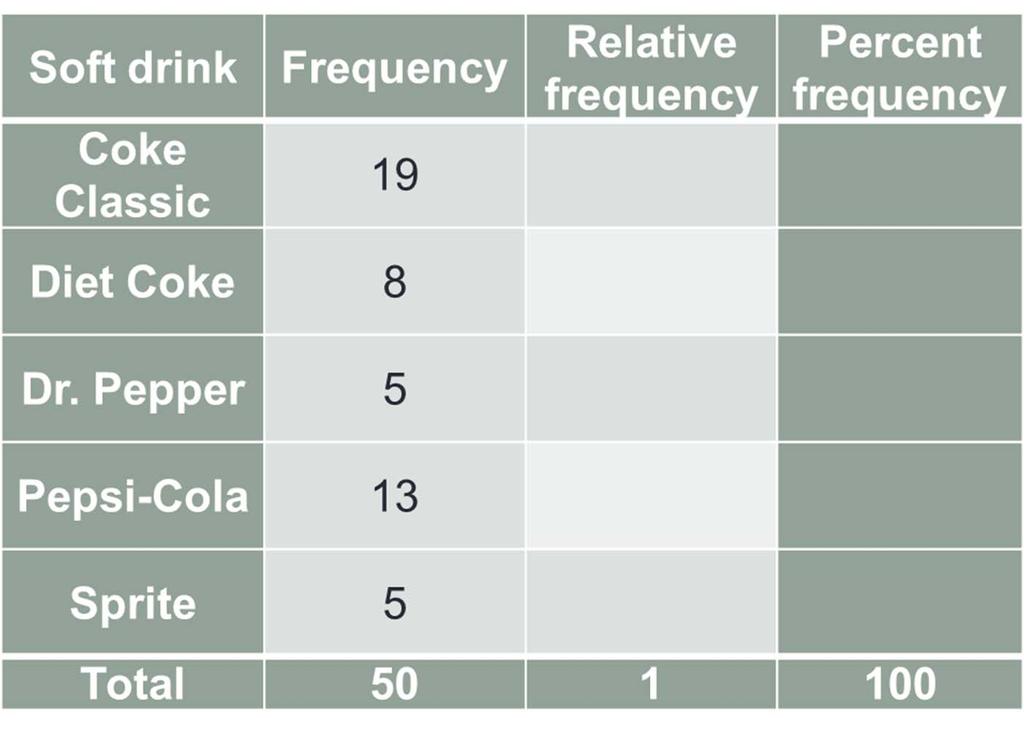
3 Frequency Distribution of soft drink purchases Soft Drink Count Frequency Coke Classic Diet Coke Dr. Pepper Pepsi-Cola Sprite Total

4 Frequency table
5 Other Measures
6
7 Frequency table Soft drink Coke Classic Frequency 19 Diet Coke 8 Dr. Pepper 5 Pepsi-Cola 13 Sprite 5 Relative frequency 19/50=0.38 8/50=0.16 5/50= /50=0.26 5/50=0.10 Percent frequency Total
8 Bar Graph of soft drink purchases Bar Graph of soft drink purchases Frequency Coke Classic Diet Coke Dr. Pepper Pepsi-Cola Sprite Soft Drink o x-axis (horizontal axis): The labels that are used for the classes (categories) of data. o y-axis (vertical axis): The frequency, relative frequency, or percent frequency.

9 The sector of the pie chart labelled Coke Classic consists of
10 Example The time in days required to complete year-end audits for a sample of 20 clients of Sanderson and Clifford, a small public accounting firm. Year-end audit times (in days) Take note that the sample size is 20 (n = 20).
11 Constructing a frequency distribution Number of classes: The number of classes is usually between 5 and 20 classes. For a larger number of data items, a larger number of classes is required. That is, for a large dataset (n 30): classes. For a smaller number of data items, as few as 5 or 6 classes may be used to summarize the data. That is, for a small dataset (n < 30): 5 or 6 classes. For our example, since n = 20 (< 30) we will use 5 classes. Take note: You could have worked with 6 classes.
12 Approximate class width: Approx. class width = Note: Always round up: 4.2~5
13 Frequency distribution for the audit time data: Audit Time (in days) Frequency Total 20
14 Class limits: The lower class limit identifies the smallest possible data value assigned to the class. The upper class limit identifies the largest possible data value assigned to the class. For example, for the 1 st class: Lower class limit = 10 and Upper class limit = 14.
15 Class midpoints: By adding the lower class limit and the upper class limit and dividing the total by 2, we obtain the class midpoints
16 Midpoints Audit Time (in days) Frequency Class Midpoint Total 20
17 Starting point of the 1 st class: Why does the 1 st class start at 10 when the smallest value in the data set is 12? The starting point of the 1 st class could be taken to be the smallest value in the data set or a value just before the smallest value. For this dataset, the starting value of the 1 st class could have been taken to be 10, 11 or 12. For example, if you started at 12, then the frequency distribution would look as follows:
18 Audit Time (in days) Frequency Total 20
19 Relative and percent frequency distributions for the audit time data: Audit Time (in days) Frequency Relative Frequency Percent Frequency Total
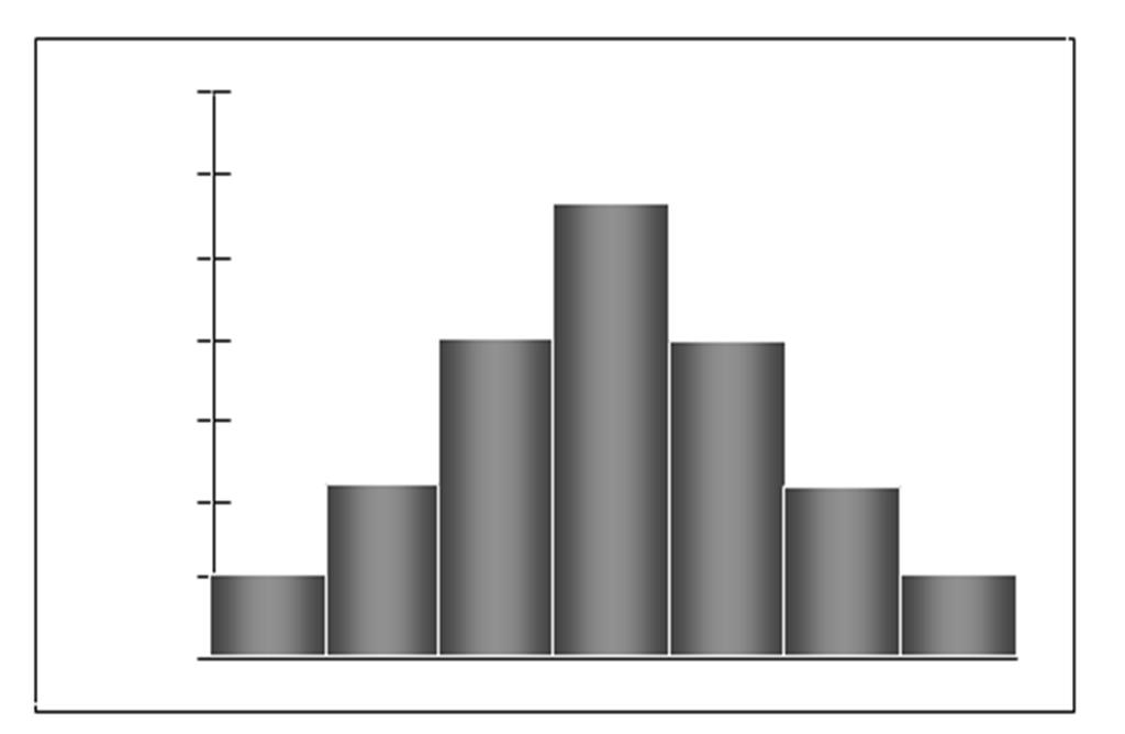
20 Histogram x-axis (horizontal axis): The variable of interest is placed here y-axis (vertical axis): Frequency, relative frequency, or percent frequency Histogram for the Audit Time Data Frequency Audit Time (days)
21 Symmetric

22 Moderately Skewed Left

23 Moderately Skewed Right
24 Recall that the frequency, relative frequency and percent frequency distributions were given by: Audit time (in days) Frequency Relative frequency Percent frequency Total
25 Table A: Cumulative distributions: Audit time (in days) Cumulative frequency Cumulative relative frequency Cumulative percent frequency
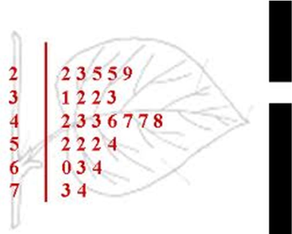
26 Audit time (in days) Cumulative frequency Cumulative relative frequency Cumulative percent frequency
27 Questions 1. What % of the audits has an audit-time of at most 24 days? 2. What proportion of the audits has an audit-time of more than 19 days? 3. How many audits have an audit-time of more than 24 days?
28 How many of the audit-times took more than 19 days AND were less than or equal to 29 days? Audit time (in days) Cumulative frequency Cumulative relative frequency Cumulative percent frequency

29 How many of the audit-times took more than 19 days AND were less than or equal to 29 days?
30 Audit time (in days) Cumulative percent frequency If this is the only information available, How many audits have a time of above 24 days?
31 Graph of the cumulative frequency distribution called the OGIVE Ogive for the audit-time data 20 Cumulative Frequency Audit 15Times (in 20 days)
32 Questions on Ogive How many audits took at most 22 days? What percentage of audits had an audit time of more than 22 days? How many audits had an audit time between 16 and 22 days? What is the median value? The upper 25% of values is above days.
33 The Stem-and-Leaf Display Construct a Stem-and-Leaf display [Leaf unit = 1] Take note: If the leaf unit is not given, then the leaf unit is equal to one.
34 Example Leaf unit = 10
35 Stem and Leaf Advantages of the Stem-and-Leaf display: Summarizes data quickly. Shows rank order of data. The user can see the shape of the data.
36 turuturuschoolroom2.blogspot.com
Section 1.5 Graphs and Describing Distributions
 Section 1.5 Graphs and Describing Distributions Data can be displayed using graphs. Some of the most common graphs used in statistics are: Bar graph Pie Chart Dot plot Histogram Stem and leaf plot Box
LESSON 2: FREQUENCY DISTRIBUTION
 LESSON : FREQUENCY DISTRIBUTION Outline Frequency distribution, histogram, frequency polygon Relative frequency histogram Cumulative relative frequency graph Stem-and-leaf plots Scatter diagram Pie charts,
Numerical: Data with quantity Discrete: whole number answers Example: How many siblings do you have?
 Types of data Numerical: Data with quantity Discrete: whole number answers Example: How many siblings do you have? Continuous: Answers can fall anywhere in between two whole numbers. Usually any type of
Elementary Statistics. Graphing Data
 Graphing Data What have we learned so far? 1 Randomly collect data. 2 Sort the data. 3 Compute the class width for specific number of classes. 4 Complete a frequency distribution table with the following
Statistics for Managers using Microsoft Excel 3 rd Edition
 Statistics for Managers using Microsoft Excel 3 rd Edition Chapter 2 Presenting Data in Tables and Charts 22 Prentice-Hall, Inc. Chap 2-1 Chapter Topics Organizing numerical data The ordered array and
Frequency Distribution and Graphs
 Chapter 2 Frequency Distribution and Graphs 2.1 Organizing Qualitative Data Denition 2.1.1 A categorical frequency distribution lists the number of occurrences for each category of data. Example 2.1.1
Chapter 2 Frequency Distributions and Graphs
 Chapter 2 Frequency Distributions and Graphs Outline 2-1 Organizing Data 2-2 Histograms, Frequency Polygons, and Ogives 2-3 Other Types of Graphs Objectives Organize data using a frequency distribution.
Chapter 3. Graphical Methods for Describing Data. Copyright 2005 Brooks/Cole, a division of Thomson Learning, Inc.
 Chapter 3 Graphical Methods for Describing Data 1 Frequency Distribution Example The data in the column labeled vision for the student data set introduced in the slides for chapter 1 is the answer to the
Chapter 2. Organizing Data. Slide 2-2. Copyright 2012, 2008, 2005 Pearson Education, Inc.
 Chapter 2 Organizing Data Slide 2-2 Section 2.1 Variables and Data Slide 2-3 Definition 2.1 Variables Variable: A characteristic that varies from one person or thing to another. Qualitative variable: A
Lecture Slides. Elementary Statistics Twelfth Edition. by Mario F. Triola. and the Triola Statistics Series. Section 2.2- #
 Lecture Slides Elementary Statistics Twelfth Edition and the Triola Statistics Series by Mario F. Triola Chapter 2 Summarizing and Graphing Data 2-1 Review and Preview 2-2 Frequency Distributions 2-3 Histograms
Chapter 2 Descriptive Statistics: Tabular and Graphical Methods
 Chapter Descriptive Statistics http://nscc-webctdev.northweststate.edu/script/sta_sp/scripts/student/serve_page... Page of 7 /7/9 Chapter Descriptive Statistics: Tabular and Graphical Methods Data can
Lecture 2: Chapter 2
 Lecture 2: Chapter 2 C C Moxley UAB Mathematics 3 June 15 2.2 Frequency Distributions Definition (Frequency Distribution) Frequency distributions shows how data are distributed among categories (classes)
Organizing Data 10/11/2011. Focus Points. Frequency Distributions, Histograms, and Related Topics. Section 2.1
 Organizing Data 2 Copyright Cengage Learning. All rights reserved. Section 2.1 Frequency Distributions, Histograms, and Related Topics Copyright Cengage Learning. All rights reserved. Focus Points Organize
NCSS Statistical Software
 Chapter 147 Introduction A mosaic plot is a graphical display of the cell frequencies of a contingency table in which the area of boxes of the plot are proportional to the cell frequencies of the contingency
Review. In an experiment, there is one variable that is of primary interest. There are several other factors, which may affect the measured result.
 Review Observational study vs experiment Experimental designs In an experiment, there is one variable that is of primary interest. There are several other factors, which may affect the measured result.
Outline. Drawing the Graph. 1 Homework Review. 2 Introduction. 3 Histograms. 4 Histograms on the TI Assignment
 Lecture 14 Section 4.4.4 on Hampden-Sydney College Fri, Sep 18, 2009 Outline 1 on 2 3 4 on 5 6 Even-numbered on Exercise 4.25, p. 249. The following is a list of homework scores for two students: Student
Chapter Displaying Graphical Data. Frequency Distribution Example. Graphical Methods for Describing Data. Vision Correction Frequency Relative
 Chapter 3 Graphical Methods for Describing 3.1 Displaying Graphical Distribution Example The data in the column labeled vision for the student data set introduced in the slides for chapter 1 is the answer
Business Statistics:
 Department of Quantitative Methods & Information Systems Business Statistics: Chapter 2 Graphs, Charts, and Tables Describing Your Data QMIS 120 Dr. Mohammad Zainal Chapter Goals After completing this
DESCRIBING DATA. Frequency Tables, Frequency Distributions, and Graphic Presentation
 DESCRIBING DATA Frequency Tables, Frequency Distributions, and Graphic Presentation Raw Data A raw data is the data obtained before it is being processed or arranged. 2 Example: Raw Score A raw score is
Describing Data Visually. Describing Data Visually. Describing Data Visually 9/28/12. Applied Statistics in Business & Economics, 4 th edition
 A PowerPoint Presentation Package to Accompany Applied Statistics in Business & Economics, 4 th edition David P. Doane and Lori E. Seward Prepared by Lloyd R. Jaisingh Describing Data Visually Chapter
Chpt 2. Frequency Distributions and Graphs. 2-3 Histograms, Frequency Polygons, Ogives / 35
 Chpt 2 Frequency Distributions and Graphs 2-3 Histograms, Frequency Polygons, Ogives 1 Chpt 2 Homework 2-3 Read pages 48-57 p57 Applying the Concepts p58 2-4, 10, 14 2 Chpt 2 Objective Represent Data Graphically
Displaying Distributions with Graphs
 Displaying Distributions with Graphs Recall that the distribution of a variable indicates two things: (1) What value(s) a variable can take, and (2) how often it takes those values. Example 1: Weights
Principles of Graphical Excellence Best Paper: ALAIR April 5 6, 2001 AIR: June 2-5, 2002, Toronto Focus-IR, February 21, 2003
 Anna T. Waggener, Ph.D. Institutional Assessment United States Army War College Principles of Graphical Excellence Best Paper: ALAIR April 5 6, 2001 AIR: June 2-5, 2002, Toronto Focus-IR, February 21,
Chapter 1. Picturing Distributions with Graphs
 Chapter 1. Picturing Distributions with Graphs 1 Chapter 1. Picturing Distributions with Graphs Definition. Individuals are the objects described by a set of data. Individuals may be people, but they may
Describing Data: Frequency Tables, Frequency Distributions, and Graphic Presentation. Chapter 2
 Describing Data: Frequency Tables, Frequency Distributions, and Graphic Presentation Chapter 2 Learning Objectives Organize qualitative data into a frequency table. Present a frequency table as a bar chart
Purpose. Charts and graphs. create a visual representation of the data. make the spreadsheet information easier to understand.
 Purpose Charts and graphs are used in business to communicate and clarify spreadsheet information. convert spreadsheet information into a format that can be quickly and easily analyzed. make the spreadsheet
Chapter 10. Definition: Categorical Variables. Graphs, Good and Bad. Distribution
 Chapter 10 Graphs, Good and Bad Chapter 10 3 Distribution Definition: Tells what values a variable takes and how often it takes these values Can be a table, graph, or function Categorical Variables Places
Mean for population data: x = the sum of all values. N = the population size n = the sample size, µ = the population mean. x = the sample mean
 MEASURE OF CENTRAL TENDENCY MEASURS OF CENTRAL TENDENCY Ungrouped Data Measurement Mean Mean for population data: Mean for sample data: x N x x n where: x = the sum of all values N = the population size
Descriptive Statistics II. Graphical summary of the distribution of a numerical variable. Boxplot
 MAT 2379 (Spring 2012) Descriptive Statistics II Graphical summary of the distribution of a numerical variable We will present two types of graphs that can be used to describe the distribution of a numerical
Notes: Displaying Quantitative Data
 Notes: Displaying Quantitative Data Stats: Modeling the World Chapter 4 A or is often used to display categorical data. These types of displays, however, are not appropriate for quantitative data. Quantitative
Chapter 4 Displaying and Describing Quantitative Data
 Chapter 4 Displaying and Describing Quantitative Data Overview Key Concepts Be able to identify an appropriate display for any quantitative variable. Be able to guess the shape of the distribution of a
Introduction. Descriptive Statistics. Problem Solving. Inferential Statistics. Chapter1 Slides. Maurice Geraghty
 Inferential Statistics and Probability a Holistic Approach Chapter 1 Displaying and Analyzing Data with Graphs This Course Material by Maurice Geraghty is licensed under a Creative Commons Attribution-ShareAlike
Notes 5C: Statistical Tables and Graphs
 Notes 5C: Statistical Tables and Graphs Frequency Tables A frequency table is an easy way to display raw data. A frequency table typically has between two to four columns: The first column lists all the
Chapter 4. September 08, appstats 4B.notebook. Displaying Quantitative Data. Aug 4 9:13 AM. Aug 4 9:13 AM. Aug 27 10:16 PM.
 Objectives: Students will: Chapter 4 1. Be able to identify an appropriate display for any quantitative variable: stem leaf plot, time plot, histogram and dotplot given a set of quantitative data. 2. Be
What Is a Histogram? A bar graph that shows the distribution of data A snapshot of data taken from a process HISTOGRAM VIEWGRAPH 1
 What Is a Histogram? 100 80 60 40 20 0 0 5 10 15 20 25 30 35 40 45 50 55 60 A bar graph that shows the distribution of data A snapshot of data taken from a process HISTOGRAM VIEWGRAPH 1 When Are Histograms
Chapter 2. The Excel functions, Excel Analysis ToolPak Add-ins or Excel PHStat2 Add-ins needed to create frequency distributions are:
 I. Organizing Data in Tables II. Describing Data by Graphs Chapter 2 I. Tables: 1. Frequency Distribution (Nominal or Ordinal) 2. Grouped Frequency Distribution (Interval or Ratio data) 3. Joint Frequency
Section 1: Data (Major Concept Review)
") Section 1: Data (Major Concept Review) Individuals = the objects described by a set of data variable = characteristic of an individual weight height age IQ hair color eye color major social security #
Section 1: Data (Major Concept Review) Individuals = the objects described by a set of data variable = characteristic of an individual weight height age IQ hair color eye color major social security #
Going back to the definition of Biostatistics. Organizing and Presenting Data. Learning Objectives. Nominal Data 10/10/2016. Tabulation and Graphs
 1/1/1 Organizing and Presenting Data Tabulation and Graphs Introduction to Biostatistics Haleema Masud Going back to the definition of Biostatistics The collection, organization, summarization, analysis,
Chapter 4. Displaying and Summarizing Quantitative Data. Copyright 2012, 2008, 2005 Pearson Education, Inc.
 Chapter 4 Displaying and Summarizing Quantitative Data Copyright 2012, 2008, 2005 Pearson Education, Inc. Dealing With a Lot of Numbers Summarizing the data will help us when we look at large sets of quantitative
Sections Descriptive Statistics for Numerical Variables
 Math 243 Sections 2.1.2-2.2.5 Descriptive Statistics for Numerical Variables A framework to describe quantitative data: Describe the Shape, Center and Spread, and Unusual Features Shape How is the data
How to define Graph in HDSME
 How to define Graph in HDSME HDSME provides several chart/graph options to let you analyze your business in a visual format (2D and 3D). A chart/graph can display a summary of sales, profit, or current
AP Statistics Composition Book Review Chapters 1 2
 AP Statistics Composition Book Review Chapters 1 2 Terms/vocabulary: Explain each term with in the STATISTICAL context. Bar Graph Bimodal Categorical Variable Density Curve Deviation Distribution Dotplot
Chapter 1. Statistics. Individuals and Variables. Basic Practice of Statistics - 3rd Edition. Chapter 1 1. Picturing Distributions with Graphs
 Chapter 1 Picturing Distributions with Graphs BPS - 3rd Ed. Chapter 1 1 Statistics Statistics is a science that involves the extraction of information from numerical data obtained during an experiment
1.1 Displaying Distributions with Graphs, Continued
 1.1 Displaying Distributions with Graphs, Continued Ulrich Hoensch Thursday, January 10, 2013 Histograms Constructing a frequency table involves breaking the range of values of a quantitative variable
PASS Sample Size Software
 Chapter 945 Introduction This section describes the options that are available for the appearance of a histogram. A set of all these options can be stored as a template file which can be retrieved later.
Describing Data. Presenting Categorical Data Graphically. Describing Data 143
 Describing Data 143 Describing Data Once we have collected data from surveys or experiments, we need to summarize and present the data in a way that will be meaningful to the reader. We will begin with
PSY 307 Statistics for the Behavioral Sciences. Chapter 2 Describing Data with Tables and Graphs
 PSY 307 Statistics for the Behavioral Sciences Chapter 2 Describing Data with Tables and Graphs Class Progress To-Date Math Readiness Descriptives Midterm next Monday Frequency Distributions One of the
MAT Mathematics in Today's World
 MAT 1000 Mathematics in Today's World Last Time 1. Three keys to summarize a collection of data: shape, center, spread. 2. The distribution of a data set: which values occur, and how often they occur 3.
Important Considerations For Graphical Representations Of Data
 This document will help you identify important considerations when using graphs (also called charts) to represent your data. First, it is crucial to understand how to create good graphs. Then, an overview
Learning Objectives. Describing Data: Displaying and Exploring Data. Dot Plot. Dot Plot 12/9/2015
 Describing Data: Displaying and Exploring Data Chapter 4 Learning Objectives Develop and interpret a dot plot. Develop and interpret a stem-and-leaf display. Compute and understand quartiles. Construct
Describing Data: Displaying and Exploring Data. Chapter 4
 Describing Data: Displaying and Exploring Data Chapter 4 Learning Objectives Develop and interpret a dot plot. Develop and interpret a stem-and-leaf display. Compute and understand quartiles. Construct
Variables. Lecture 13 Sections Wed, Sep 16, Hampden-Sydney College. Displaying Distributions - Quantitative.
 - - Lecture 13 Sections 4.4.1-4.4.3 Hampden-Sydney College Wed, Sep 16, 2009 Outline - 1 2 3 4 5 6 7 Even-numbered - Exercise 4.7, p. 226. According to the National Center for Health Statistics, in the
The numbers are...,..., ...,...,...,...,...,
 Stem and leaf diagrams 1. 2. 3. Stem Leaf Stem Leaf Stem Leaf 2 3 4 5 1 3 6 9 0 4 4 5 5 6 3 The numbers are 21, 23, 0 1 2 3 2 6 8 3 4 5 8 1 2 4 0 5 The numbers are...,..., 88 89 90 91 7 0 8 9 1 3 5 6 9
Name: Date: Class: Lesson 3: Graphing. a. Useful for. AMOUNT OF HEAT PRODUCED IN KJ. b. Difference between a line graph and a scatter plot:
 AMOUNT OF HEAT PRODUCED IN KJ NOTES Name: Date: Class: Lesson 3: Graphing Types of Graphs 1. Bar Graph a. Useful for. b. Helps us see quickly. Heat Produced Upon Mixture of Different Acids into Water 90
Interval of Head Circumferences (mm) XS 510 < 530 S 530 < 550 M 550 < 570 L 570 < 590 XL 590 < 610 XXL 610 < 630. Hat Sizes.
 XS 510 < 530 S 530 < 550 M 550 < 570 L 570 < 590 XL 590 < 610 XXL 610 < 630. Hat Sizes.") 6.6.4 Lesson Date Creating a Histogram Student Objectives I can construct a frequency histogram. I recognize that each interval must be the same size. Classwork Example 1: Frequency Table with Intervals
6.6.4 Lesson Date Creating a Histogram Student Objectives I can construct a frequency histogram. I recognize that each interval must be the same size. Classwork Example 1: Frequency Table with Intervals
Graphing Guidelines. Controlled variables refers to all the things that remain the same during the entire experiment.
 Graphing Graphing Guidelines Graphs must be neatly drawn using a straight edge and pencil. Use the x-axis for the manipulated variable and the y-axis for the responding variable. Manipulated Variable AKA
This page intentionally left blank
 Appendix E Labs This page intentionally left blank Dice Lab (Worksheet) Objectives: 1. Learn how to calculate basic probabilities of dice. 2. Understand how theoretical probabilities explain experimental
How to Make a Run Chart in Excel
 How to Make a Run Chart in Excel While there are some statistical programs that you can use to make a run chart, it is simple to make in Excel, using Excel s built-in chart functions. The following are
BE540 - Introduction to Biostatistics Computer Illustration. Topic 1 Summarizing Data Software: STATA. A Visit to Yellowstone National Park, USA
 BE540 - Introduction to Biostatistics Computer Illustration Topic 1 Summarizing Data Software: STATA A Visit to Yellowstone National Park, USA Source: Chatterjee, S; Handcock MS and Simonoff JS A Casebook
Seven Basic Quality Control Tools HISTOGRAM TOOL
 Frequency Frequency Seven Basic Quality Control Tools HISTOGRAM TOOL QUALITY TOOLS Histogram Description of Histogram: The frequency histogram (or distribution) is a statistical tool for presenting numerous
ESSENTIAL MATHEMATICS 1 WEEK 17 NOTES AND EXERCISES. Types of Graphs. Bar Graphs
 ESSENTIAL MATHEMATICS 1 WEEK 17 NOTES AND EXERCISES Types of Graphs Bar Graphs Bar graphs are used to present and compare data. There are two main types of bar graphs: horizontal and vertical. They are
Algebra I Notes Unit One: Real Number System
 Syllabus Objectives: 1.1 The student will organize statistical data through the use of matrices (with and without technology). 1.2 The student will perform addition, subtraction, and scalar multiplication
Why Should We Care? Everyone uses plotting But most people ignore or are unaware of simple principles Default plotting tools are not always the best
 Elementary Plots Why Should We Care? Everyone uses plotting But most people ignore or are unaware of simple principles Default plotting tools are not always the best More importantly, it is easy to lie
Why Should We Care? More importantly, it is easy to lie or deceive people with bad plots
 Elementary Plots Why Should We Care? Everyone uses plotting But most people ignore or are unaware of simple principles Default plotting tools (or default settings) are not always the best More importantly,
Mean and Median part 2
 The Third Annual GeoGebra Conference of Southern Connecticut August 25, 2015 Forest Fisher, Guttman Community College, NY http://fdfisher.com Mean and Median part 2 Group Members: List the names of your
3. Data and sampling. Plan for today
 3. Data and sampling Business Statistics Plan for today Reminders and introduction Data: qualitative and quantitative Quantitative data: discrete and continuous Qualitative data discussion Samples and
10 Wyner Statistics Fall 2013
 1 Wyner Statistics Fall 213 CHAPTER TWO: GRAPHS Summary Terms Objectives For research to be valuable, it must be shared. The fundamental aspect of a good graph is that it makes the results clear at a glance.
Univariate Descriptive Statistics
 Univariate Descriptive Statistics Displays: pie charts, bar graphs, box plots, histograms, density estimates, dot plots, stemleaf plots, tables, lists. Example: sea urchin sizes Boxplot Histogram Urchin
Chapter 1: Stats Starts Here Chapter 2: Data
 Chapter 1: Stats Starts Here Chapter 2: Data Statistics data, datum variation individual respondent subject participant experimental unit observation variable categorical quantitative Calculator Skills:
Business Statistics. Lecture 2: Descriptive Statistical Graphs and Plots
 Business Statistics Lecture 2: Descriptive Statistical Graphs and Plots 1 Goals for this Lecture Graphical descriptive statistics Histograms (and bar charts) Boxplots Scatterplots Time series plots Mosaic
Chapter 6: Descriptive Statistics
 Chapter 6: Descriptive Statistics Problem (01): Make a frequency distribution table for the following data using 5 classes. 5 10 7 19 25 12 15 7 6 8 17 17 22 21 7 7 24 5 6 5 Problem (02): Annual Salaries
Biggar High School Mathematics Department. S1 Block 1. Revision Booklet GOLD
 Biggar High School Mathematics Department S1 Block 1 Revision Booklet GOLD Contents MNU 3-01a MNU 3-03a MNU 3-03b Page Whole Number Calculations & Decimals 3 MTH 3-05b MTH 3-06a MTH 4-06a Multiples, Factors,
Office 2016 Excel Basics 24 Video/Class Project #36 Excel Basics 24: Visualize Quantitative Data with Excel Charts. No Chart Junk!!!
 Office 2016 Excel Basics 24 Video/Class Project #36 Excel Basics 24: Visualize Quantitative Data with Excel Charts. No Chart Junk!!! Goal in video # 24: Learn about how to Visualize Quantitative Data with
Female Height. Height (inches)
") Math 111 Normal distribution NAME: Consider the histogram detailing female height. The mean is 6 and the standard deviation is 2.. We will use it to introduce and practice the ideas of normal distributions.
Math 111 Normal distribution NAME: Consider the histogram detailing female height. The mean is 6 and the standard deviation is 2.. We will use it to introduce and practice the ideas of normal distributions.
Name. Introduction to Tables and Graphs
 Name Introduction to Tables and Graphs Graphing Resource - Student Guide (Source NASA Solar System Math Comparing Size and Distance) There are three types of graphs that scientists use. Graphs help them
Lecture 5 Understanding and Comparing Distributions
 Lecture 5 Understanding and Comparing Distributions 1 Recall the 5-summary from our Tim Horton s example: Calories of 30 donuts. min=180, max=400, median=250, Q1=210, Q3=280 Below is the boxplot for calories
11 Wyner Statistics Fall 2018
 11 Wyner Statistics Fall 218 CHAPTER TWO: GRAPHS Review September 19 Test September 28 For research to be valuable, it must be shared, and a graph can be an effective way to do so. The fundamental aspect
Information Graphics: Graphs, Schematic Diagrams, Symbols and Signs.
 Information Graphics: Graphs, Schematic Diagrams, Symbols and Signs. The final kind of graphic we need to learn about performs a unique function and therefore sits in a category by itself. It is called
CHAPTER 13A. Normal Distributions
 CHAPTER 13A Normal Distributions SO FAR We always want to plot our data. We make a graph, usually a histogram or a stemplot. We want to look for an overall pattern (shape, center, spread) and for any striking
Name: Date: Period: Histogram Worksheet
 Name: Date: Period: Histogram Worksheet 1 5. For the following five histograms, list at least 3 characteristics that describe each histogram (consider symmetric, skewed to left, skewed to right, unimodal,
Simple Graphical Techniques
 Simple Graphical Techniques Graphs are the pictorial representation of facts and figures, or data. The eye can detect patterns and trends from graphs far more easily than from a lot of numbers. Linear
TOPIC 4 GRAPHICAL PRESENTATION
 TOPIC 4 GRAPHICAL PRESENTATION Public agencies are very keen on amassing statistics they collect them, raise them to the nth power, take the cube root, and prepare wonderful diagrams. But what you must
Line Graphs. Name: The independent variable is plotted on the x-axis. This axis will be labeled Time (days), and
, and") Name: Graphing Review Graphs and charts are great because they communicate information visually. For this reason graphs are often used in newspapers, magazines, and businesses around the world. Sometimes,
Name: Graphing Review Graphs and charts are great because they communicate information visually. For this reason graphs are often used in newspapers, magazines, and businesses around the world. Sometimes,
TJP TOP TIPS FOR IGCSE STATS & PROBABILITY
 TJP TOP TIPS FOR IGCSE STATS & PROBABILITY Dr T J Price, 2011 First, some important words; know what they mean (get someone to test you): Mean the sum of the data values divided by the number of items.
Central Tendency Print Activity. Use the Explore It mode to answer the following questions:
 Name: Central Tendency Print Activity Use the Explore It mode to answer the following questions: 1 Use the diagram below to answer the following questions: a The graph represents the heights of a collection
SS Understand charts and graphs used in business.
 SS2 2.02 Understand charts and graphs used in business. Purpose of Charts and Graphs 1. Charts and graphs are used in business to communicate and clarify spreadsheet information. 2. Charts and graphs emphasize
Using Figures - The Basics
 Using Figures - The Basics by David Caprette, Rice University OVERVIEW To be useful, the results of a scientific investigation or technical project must be communicated to others in the form of an oral
PivotTables PivotCharts (Chapter 5)
") If a database contains a lot of information and the user would like to work with only a selection of the data in a table or as a chart, PivotTables and PivotCharts are a great solution. Data Mining: the
If a database contains a lot of information and the user would like to work with only a selection of the data in a table or as a chart, PivotTables and PivotCharts are a great solution. Data Mining: the
Statistics 101: Section L Laboratory 10
 Statistics 101: Section L Laboratory 10 This lab looks at the sampling distribution of the sample proportion pˆ and probabilities associated with sampling from a population with a categorical variable.
A C E. Answers Investigation 3. Applications. Sample 2: 11 moves. or 0.44; MAD Sample 2: 22. , or 2.44; MAD Sample 3: 0, or 0.
 Applications 1. a) The range is $1.75. b) Each server receives $15.65. c) Since Yanna s amount is higher than the mean, they will each receive more. If Yanna receives the mean ($15.65), then the remainder
Name Class Date. Introducing Probability Distributions
 Name Class Date Binomial Distributions Extension: Distributions Essential question: What is a probability distribution and how is it displayed? 8-6 CC.9 2.S.MD.5(+) ENGAGE Introducing Distributions Video
Mathematics Success Grade 6
 T428 Mathematics Success Grade 6 [OBJECTIVE] The students will plot ordered pairs containing rational values to identify vertical and horizontal lengths between two points in order to solve real-world
A Visual Display. A graph is a visual display of information or data. This is a graph that shows a girl walking her dog. Communicating with Graphs
 A Visual Display A graph is a visual display of information or data. This is a graph that shows a girl walking her dog. A Visual Display The horizontal axis, or the x-axis, measures time. Time is the independent
Statistics. Graphing Statistics & Data. What is Data?. Data is organized information. It can be numbers, words, measurements,
 Statistics Graphing Statistics & Data What is Data?. Data is organized information. It can be numbers, words, measurements, observations or even just descriptions of things. Qualitative vs Quantitative.
SAMPLE. This chapter deals with the construction and interpretation of box plots. At the end of this chapter you should be able to:
 find the upper and lower extremes, the median, and the upper and lower quartiles for sets of numerical data calculate the range and interquartile range compare the relative merits of range and interquartile
Applied Linear Algebra in Geoscience Using MATLAB
 Applied Linear Algebra in Geoscience Using MATLAB Plot (2D) plot(x,y, -mo, LineWidth,2, markersize,12, MarkerEdgeColor, g, markerfacecolor, y ) Plot (2D) Plot of a Function As an example, the plot command
AUTUMN 2016 GCSE 9-1 MOCK FOUNDATION PAPER 1 ALTERNATIVE VERSION
 AUTUMN 2016 GCSE 9-1 MOCK FOUNDATION PAPER 1 ALTERNATIVE VERSION This version was kindly put together by Graham Cumming at Edexcel and some of the questions have been adapted to strip out the sums as part
16 Histograms. Using Histograms to Reveal Distribution
 16 Histograms Using Histograms to Reveal Distribution The Histogram math function enhances understanding of the distribution of measured parameters (see the Disk Drive Analyzer Reference Manual for more
The Cartesian Coordinate System
 The Cartesian Coordinate System The xy-plane Although a familiarity with the xy-plane, or Cartesian coordinate system, is expected, this worksheet will provide a brief review. The Cartesian coordinate
Measuring Angles and Circle Graphs
 Name: Period: Date: 11 th Grade Mathematics PSSA Preparation Program o Mastered On: Measuring Angles and Circle Graphs Anchors Addressed M11.B.2.1.1 Measure and/or compare angles in degrees (up to 360