Chapter 2 Frequency Distributions and Graphs
|
|
|
- Rebecca Cox
- 5 years ago
- Views:
Transcription
1 Chapter 2 Frequency Distributions and Graphs
2 Outline 2-1 Organizing Data 2-2 Histograms, Frequency Polygons, and Ogives 2-3 Other Types of Graphs
3 Objectives Organize data using a frequency distribution. Represent data in frequency distributions graphically, using histograms, frequency polygons and ogives. Represent data using bar graphs, Pareto charts, time series graphs, pie graphs, and dotplots. Draw and interpret a stem and leaf plot.


4 A frequency distribution is the organization of raw data in table form, using classes and frequencies. Each raw data value is placed into a quantitative or qualitative category called a class. The frequency of a class is the number of data values contained in a specific class.
5 1. Categorical 2. Grouped 3. Ungrouped
6 Twenty-five army inductees were given a blood test to determine their blood type. The data set is A B B AB O O O B AB B B B O A O A O O O AB AB A O B A Construct a frequency distribution for the data.
7 Solution: Class A B O AB Total Frequency Percent 20% 28% 36% 16% 100%

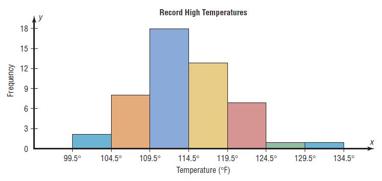
8
9 These data represent the record high temperatures in degrees Fahrenheit for each of the 50 states. Construct a grouped frequency distribution for the data, using 7 classes
10 Solution: R = H - L = = 34 Class width = R / number of classes = 34 / 7 = Class Limits Class Boundaries Total Frequency
11 A cumulative frequency distribution is a distribution that shows the number of data values less than or equal to a specific value (usually an upper boundary). Less than 99.5 Less than Less than Less than Less than Less than Less than Less than Cumulative Frequency
12 The data represent the number of miles per gallon that 30 selected four-wheel-drive sport utility vehicles obtained in city driving. Construct a frequency distribution, and analyze the distribution
13 Solution: R = H - L = = 7 Class Limits Class Boundaries Total Frequency
14 Cumulative frequency distribution Less than 99.5 Less than Less than Less than Less than Less than Less than Less than Cumulative Frequency
15 The histogram is a graph that displays the data by using contiguous vertical bars (unless the frequency of a class is 0) of various heights to represent the frequencies of the classes. Construct a histogram to represent the data shown for the record high temperatures for each of the 50 states (see Example 2-2).

16
17 The frequency polygon is a graph that displays the data by using lines that connect points plotted for the frequencies at the midpoints of the classes. The frequencies are represented by the heights to of the points. Using the frequency distribution given in Example 2-4, construct a frequency polygon.
18 Solution: Class Boundaries Midpoints Total Frequency
19
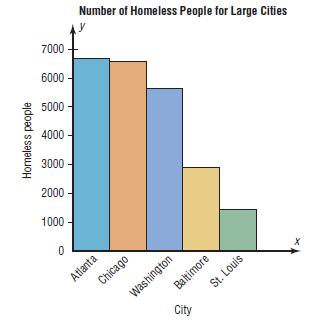
20 The ogive is a graph that displays the cumulative frequencies for the classes in a frequency distribution. Construct an ogive for the frequency distribution described in Example 2-4.
21 Solution: Less than 99.5 Less than Less than Less than Less than Less than Less than Less than Cumulative Frequency
22
23
24

25 A bar graph represents the data by using vertical or horizontal bars whose heights or lengths represent the frequencies of the data. The table shows the average money spent by first-year college students. Draw a horizontal and vertical bar graph for the data.
26 Solution: Electronics $728 Dorm Decor $344 Clothing $141 Shoes $72
27 A pareto chart is used to represent a frequency distribution for a categorical variable, and the frequencies are displayed by the heights of vertical bars, which are arranged in order from highest to lowest. The data shown here consist of the number of homeless people for a sample of selected cities. Draw and analyze a pareto chart for the data.
28 Solution:
29 The purpose of the pie graph is to show the relationship of the parts to the whole. A pie graph is a circle that is divided into sections or wedges according to the percentages in each category of the distribution. This frequency distribution shows the number of pounds each snack food eaten during the super bowl. Construct a pie graph for the data.
30 Solution: Degrees = f/n * 360 o Potato chips 11.2/30*360 o =134 o Tortilla Chips 8.2/30*360 o =98 o Pretzels 4.3/30*360 o =52 o Popcorn 3.8/30*360 o =46 o Snack nuts 2.5/30*360 o =30 o

31 % = f/n * 100 Potato chips 11.2/30*100=37.3% Tortilla Chips 8.2/30*100=27.3% Pretzels 4.3/30*100=14.3% Popcorn 3.8/30*100=12.7% Snack nuts 2.5/30*100=8.3%
32 A time series graph represents data that occur over a specific period of time. The data show the percentage of U.S. adults who smoke. Draw and analyze a time series graph for the data. Year Percent
33 Solution:
34 The stem and leaf plot is a method of organizing data and is a combination of sorting and graphing. A stem and leaf plot is a data plot that uses part of the data value as the stem and part of the data value as the leaf to form groups or classes. At an outpatient testing center, the number of cardiograms performed each day for 20 days is shown. Construct a stem and leaf plot for the data.
35 Solution:
36 Time Time Series Graph Qualitative Data Bar Graph Pareto Chart Pie Graph Quantitative Data Histogram Frequency Polygon Ogive
 the y")
37 1. Cut off (or truncate) the y axis.

38 2. Exaggerate a one-dimensional increase by showing it in two dimensions.

39 3. Omit labels or units on the axes of the graph. 4. All graphs should contain a source for the information presented.
Elementary Statistics. Graphing Data
 Graphing Data What have we learned so far? 1 Randomly collect data. 2 Sort the data. 3 Compute the class width for specific number of classes. 4 Complete a frequency distribution table with the following
Chpt 2. Frequency Distributions and Graphs. 2-3 Histograms, Frequency Polygons, Ogives / 35
 Chpt 2 Frequency Distributions and Graphs 2-3 Histograms, Frequency Polygons, Ogives 1 Chpt 2 Homework 2-3 Read pages 48-57 p57 Applying the Concepts p58 2-4, 10, 14 2 Chpt 2 Objective Represent Data Graphically
Statistics for Managers using Microsoft Excel 3 rd Edition
 Statistics for Managers using Microsoft Excel 3 rd Edition Chapter 2 Presenting Data in Tables and Charts 22 Prentice-Hall, Inc. Chap 2-1 Chapter Topics Organizing numerical data The ordered array and
Describing Data: Frequency Tables, Frequency Distributions, and Graphic Presentation. Chapter 2
 Describing Data: Frequency Tables, Frequency Distributions, and Graphic Presentation Chapter 2 Learning Objectives Organize qualitative data into a frequency table. Present a frequency table as a bar chart
Lecture 2: Chapter 2
 Lecture 2: Chapter 2 C C Moxley UAB Mathematics 3 June 15 2.2 Frequency Distributions Definition (Frequency Distribution) Frequency distributions shows how data are distributed among categories (classes)
DESCRIBING DATA. Frequency Tables, Frequency Distributions, and Graphic Presentation
 DESCRIBING DATA Frequency Tables, Frequency Distributions, and Graphic Presentation Raw Data A raw data is the data obtained before it is being processed or arranged. 2 Example: Raw Score A raw score is
Numerical: Data with quantity Discrete: whole number answers Example: How many siblings do you have?
 Types of data Numerical: Data with quantity Discrete: whole number answers Example: How many siblings do you have? Continuous: Answers can fall anywhere in between two whole numbers. Usually any type of
Review. In an experiment, there is one variable that is of primary interest. There are several other factors, which may affect the measured result.
 Review Observational study vs experiment Experimental designs In an experiment, there is one variable that is of primary interest. There are several other factors, which may affect the measured result.
Frequency Distribution and Graphs
 Chapter 2 Frequency Distribution and Graphs 2.1 Organizing Qualitative Data Denition 2.1.1 A categorical frequency distribution lists the number of occurrences for each category of data. Example 2.1.1
STK110. Chapter 2: Tabular and Graphical Methods Lecture 1 of 2. ritakeller.com. mathspig.wordpress.com
 STK110 Chapter 2: Tabular and Graphical Methods Lecture 1 of 2 ritakeller.com mathspig.wordpress.com Frequency distribution Example Data from a sample of 50 soft drink purchases Frequency Distribution
LESSON 2: FREQUENCY DISTRIBUTION
 LESSON : FREQUENCY DISTRIBUTION Outline Frequency distribution, histogram, frequency polygon Relative frequency histogram Cumulative relative frequency graph Stem-and-leaf plots Scatter diagram Pie charts,
Chapter 3. Graphical Methods for Describing Data. Copyright 2005 Brooks/Cole, a division of Thomson Learning, Inc.
 Chapter 3 Graphical Methods for Describing Data 1 Frequency Distribution Example The data in the column labeled vision for the student data set introduced in the slides for chapter 1 is the answer to the
Describing Data Visually. Describing Data Visually. Describing Data Visually 9/28/12. Applied Statistics in Business & Economics, 4 th edition
 A PowerPoint Presentation Package to Accompany Applied Statistics in Business & Economics, 4 th edition David P. Doane and Lori E. Seward Prepared by Lloyd R. Jaisingh Describing Data Visually Chapter
Section 1.5 Graphs and Describing Distributions
 Section 1.5 Graphs and Describing Distributions Data can be displayed using graphs. Some of the most common graphs used in statistics are: Bar graph Pie Chart Dot plot Histogram Stem and leaf plot Box
Principles of Graphical Excellence Best Paper: ALAIR April 5 6, 2001 AIR: June 2-5, 2002, Toronto Focus-IR, February 21, 2003
 Anna T. Waggener, Ph.D. Institutional Assessment United States Army War College Principles of Graphical Excellence Best Paper: ALAIR April 5 6, 2001 AIR: June 2-5, 2002, Toronto Focus-IR, February 21,
Outline. Drawing the Graph. 1 Homework Review. 2 Introduction. 3 Histograms. 4 Histograms on the TI Assignment
 Lecture 14 Section 4.4.4 on Hampden-Sydney College Fri, Sep 18, 2009 Outline 1 on 2 3 4 on 5 6 Even-numbered on Exercise 4.25, p. 249. The following is a list of homework scores for two students: Student
Chapter Displaying Graphical Data. Frequency Distribution Example. Graphical Methods for Describing Data. Vision Correction Frequency Relative
 Chapter 3 Graphical Methods for Describing 3.1 Displaying Graphical Distribution Example The data in the column labeled vision for the student data set introduced in the slides for chapter 1 is the answer
Notes 5C: Statistical Tables and Graphs
 Notes 5C: Statistical Tables and Graphs Frequency Tables A frequency table is an easy way to display raw data. A frequency table typically has between two to four columns: The first column lists all the
Business Statistics:
 Department of Quantitative Methods & Information Systems Business Statistics: Chapter 2 Graphs, Charts, and Tables Describing Your Data QMIS 120 Dr. Mohammad Zainal Chapter Goals After completing this
Chapter 2. Organizing Data. Slide 2-2. Copyright 2012, 2008, 2005 Pearson Education, Inc.
 Chapter 2 Organizing Data Slide 2-2 Section 2.1 Variables and Data Slide 2-3 Definition 2.1 Variables Variable: A characteristic that varies from one person or thing to another. Qualitative variable: A
PSY 307 Statistics for the Behavioral Sciences. Chapter 2 Describing Data with Tables and Graphs
 PSY 307 Statistics for the Behavioral Sciences Chapter 2 Describing Data with Tables and Graphs Class Progress To-Date Math Readiness Descriptives Midterm next Monday Frequency Distributions One of the
Chapter 4. September 08, appstats 4B.notebook. Displaying Quantitative Data. Aug 4 9:13 AM. Aug 4 9:13 AM. Aug 27 10:16 PM.
 Objectives: Students will: Chapter 4 1. Be able to identify an appropriate display for any quantitative variable: stem leaf plot, time plot, histogram and dotplot given a set of quantitative data. 2. Be
Chapter 10. Definition: Categorical Variables. Graphs, Good and Bad. Distribution
 Chapter 10 Graphs, Good and Bad Chapter 10 3 Distribution Definition: Tells what values a variable takes and how often it takes these values Can be a table, graph, or function Categorical Variables Places
Notes: Displaying Quantitative Data
 Notes: Displaying Quantitative Data Stats: Modeling the World Chapter 4 A or is often used to display categorical data. These types of displays, however, are not appropriate for quantitative data. Quantitative
Chapter 2 Descriptive Statistics: Tabular and Graphical Methods
 Chapter Descriptive Statistics http://nscc-webctdev.northweststate.edu/script/sta_sp/scripts/student/serve_page... Page of 7 /7/9 Chapter Descriptive Statistics: Tabular and Graphical Methods Data can
Chapter 2. The Excel functions, Excel Analysis ToolPak Add-ins or Excel PHStat2 Add-ins needed to create frequency distributions are:
 I. Organizing Data in Tables II. Describing Data by Graphs Chapter 2 I. Tables: 1. Frequency Distribution (Nominal or Ordinal) 2. Grouped Frequency Distribution (Interval or Ratio data) 3. Joint Frequency
Introduction. Descriptive Statistics. Problem Solving. Inferential Statistics. Chapter1 Slides. Maurice Geraghty
 Inferential Statistics and Probability a Holistic Approach Chapter 1 Displaying and Analyzing Data with Graphs This Course Material by Maurice Geraghty is licensed under a Creative Commons Attribution-ShareAlike
Chapter 4 Displaying and Describing Quantitative Data
 Chapter 4 Displaying and Describing Quantitative Data Overview Key Concepts Be able to identify an appropriate display for any quantitative variable. Be able to guess the shape of the distribution of a
Organizing Data 10/11/2011. Focus Points. Frequency Distributions, Histograms, and Related Topics. Section 2.1
 Organizing Data 2 Copyright Cengage Learning. All rights reserved. Section 2.1 Frequency Distributions, Histograms, and Related Topics Copyright Cengage Learning. All rights reserved. Focus Points Organize
Chapter 1. Picturing Distributions with Graphs
 Chapter 1. Picturing Distributions with Graphs 1 Chapter 1. Picturing Distributions with Graphs Definition. Individuals are the objects described by a set of data. Individuals may be people, but they may
Chapter 6: Descriptive Statistics
 Chapter 6: Descriptive Statistics Problem (01): Make a frequency distribution table for the following data using 5 classes. 5 10 7 19 25 12 15 7 6 8 17 17 22 21 7 7 24 5 6 5 Problem (02): Annual Salaries
Graphing Guidelines. Controlled variables refers to all the things that remain the same during the entire experiment.
 Graphing Graphing Guidelines Graphs must be neatly drawn using a straight edge and pencil. Use the x-axis for the manipulated variable and the y-axis for the responding variable. Manipulated Variable AKA
Going back to the definition of Biostatistics. Organizing and Presenting Data. Learning Objectives. Nominal Data 10/10/2016. Tabulation and Graphs
 1/1/1 Organizing and Presenting Data Tabulation and Graphs Introduction to Biostatistics Haleema Masud Going back to the definition of Biostatistics The collection, organization, summarization, analysis,
10 Wyner Statistics Fall 2013
 1 Wyner Statistics Fall 213 CHAPTER TWO: GRAPHS Summary Terms Objectives For research to be valuable, it must be shared. The fundamental aspect of a good graph is that it makes the results clear at a glance.
Displaying Distributions with Graphs
 Displaying Distributions with Graphs Recall that the distribution of a variable indicates two things: (1) What value(s) a variable can take, and (2) how often it takes those values. Example 1: Weights
Describing Data. Presenting Categorical Data Graphically. Describing Data 143
 Describing Data 143 Describing Data Once we have collected data from surveys or experiments, we need to summarize and present the data in a way that will be meaningful to the reader. We will begin with
11 Wyner Statistics Fall 2018
 11 Wyner Statistics Fall 218 CHAPTER TWO: GRAPHS Review September 19 Test September 28 For research to be valuable, it must be shared, and a graph can be an effective way to do so. The fundamental aspect
Chapter 4. Displaying and Summarizing Quantitative Data. Copyright 2012, 2008, 2005 Pearson Education, Inc.
 Chapter 4 Displaying and Summarizing Quantitative Data Copyright 2012, 2008, 2005 Pearson Education, Inc. Dealing With a Lot of Numbers Summarizing the data will help us when we look at large sets of quantitative
ESSENTIAL MATHEMATICS 1 WEEK 17 NOTES AND EXERCISES. Types of Graphs. Bar Graphs
 ESSENTIAL MATHEMATICS 1 WEEK 17 NOTES AND EXERCISES Types of Graphs Bar Graphs Bar graphs are used to present and compare data. There are two main types of bar graphs: horizontal and vertical. They are
3. Data and sampling. Plan for today
 3. Data and sampling Business Statistics Plan for today Reminders and introduction Data: qualitative and quantitative Quantitative data: discrete and continuous Qualitative data discussion Samples and
Step 1: Set up the variables AB Design. Use the top cells to label the variables that will be displayed on the X and Y axes of the graph
 Step 1: Set up the variables AB Design Use the top cells to label the variables that will be displayed on the X and Y axes of the graph Step 1: Set up the variables X axis for AB Design Enter X axis label
This Chapter s Topics
 This Chapter s Topics Today, we re going to talk about three things: Frequency distributions Graphs Charts Frequency distributions, graphs, and charts 1 Frequency distributions Frequency distributions
Office 2016 Excel Basics 24 Video/Class Project #36 Excel Basics 24: Visualize Quantitative Data with Excel Charts. No Chart Junk!!!
 Office 2016 Excel Basics 24 Video/Class Project #36 Excel Basics 24: Visualize Quantitative Data with Excel Charts. No Chart Junk!!! Goal in video # 24: Learn about how to Visualize Quantitative Data with
AP Statistics Composition Book Review Chapters 1 2
 AP Statistics Composition Book Review Chapters 1 2 Terms/vocabulary: Explain each term with in the STATISTICAL context. Bar Graph Bimodal Categorical Variable Density Curve Deviation Distribution Dotplot
Purpose. Charts and graphs. create a visual representation of the data. make the spreadsheet information easier to understand.
 Purpose Charts and graphs are used in business to communicate and clarify spreadsheet information. convert spreadsheet information into a format that can be quickly and easily analyzed. make the spreadsheet
SS Understand charts and graphs used in business.
 SS2 2.02 Understand charts and graphs used in business. Purpose of Charts and Graphs 1. Charts and graphs are used in business to communicate and clarify spreadsheet information. 2. Charts and graphs emphasize
Using Charts and Graphs to Display Data
 Page 1 of 7 Using Charts and Graphs to Display Data Introduction A Chart is defined as a sheet of information in the form of a table, graph, or diagram. A Graph is defined as a diagram that represents
1.1 Displaying Distributions with Graphs, Continued
 1.1 Displaying Distributions with Graphs, Continued Ulrich Hoensch Thursday, January 10, 2013 Histograms Constructing a frequency table involves breaking the range of values of a quantitative variable
GRAPHS & CHARTS. Prof. Rahul C. Basole CS/MGT 8803-DV > January 23, 2017 INFOVIS 8803DV > SPRING 17
 GRAPHS & CHARTS Prof. Rahul C. Basole CS/MGT 8803-DV > January 23, 2017 HW2: DataVis Examples Tumblr 47 students = 47 VIS of the Day submissions Random Order We will start next week Stay tuned Tufte Seminar
NCSS Statistical Software
 Chapter 147 Introduction A mosaic plot is a graphical display of the cell frequencies of a contingency table in which the area of boxes of the plot are proportional to the cell frequencies of the contingency
Stat 20: Intro to Probability and Statistics
 Stat 20: Intro to Probability and Statistics Lecture 4: Data Displays (cont.) Tessa L. Childers-Day UC Berkeley 26 June 2014 By the end of this lecture... You will be able to: Comprehend displays of quantitative
Chapter 1. Statistics. Individuals and Variables. Basic Practice of Statistics - 3rd Edition. Chapter 1 1. Picturing Distributions with Graphs
 Chapter 1 Picturing Distributions with Graphs BPS - 3rd Ed. Chapter 1 1 Statistics Statistics is a science that involves the extraction of information from numerical data obtained during an experiment
Section 1: Data (Major Concept Review)
") Section 1: Data (Major Concept Review) Individuals = the objects described by a set of data variable = characteristic of an individual weight height age IQ hair color eye color major social security #
Section 1: Data (Major Concept Review) Individuals = the objects described by a set of data variable = characteristic of an individual weight height age IQ hair color eye color major social security #
Important Considerations For Graphical Representations Of Data
 This document will help you identify important considerations when using graphs (also called charts) to represent your data. First, it is crucial to understand how to create good graphs. Then, an overview
HPS Scope Sequence Last Revised June SUBJECT: Math GRADE: 7. Michigan Standard (GLCE) Code & Language. What this Standard means:
 Code & Language. What this Standard means:") Number and Numeration MA.7.NS.1 (Apply and extend previous understandings of addition and subtraction to add and subtract rational numbers; represent addition and subtraction on a horizontal or vertical
Number and Numeration MA.7.NS.1 (Apply and extend previous understandings of addition and subtraction to add and subtract rational numbers; represent addition and subtraction on a horizontal or vertical
Sidcot intranet - Firefly. Useful links: Instant classroom. MyMaths. Objectives
 Useful links: Sidcot intranet - Firefly Instant classroom MyMaths Objectives Objectives To revise scatter graphs To use them to make estimations Scatter Graphs Revision powerpoint Now make some revision
PASS Sample Size Software
 Chapter 945 Introduction This section describes the options that are available for the appearance of a histogram. A set of all these options can be stored as a template file which can be retrieved later.
Mathology Ontario Grade 2 Correlations
 Mathology Ontario Grade 2 Correlations Curriculum Expectations Mathology Little Books & Teacher Guides Number Sense and Numeration Quality Relations: Read, represent, compare, and order whole numbers to
Statistics. Graphing Statistics & Data. What is Data?. Data is organized information. It can be numbers, words, measurements,
 Statistics Graphing Statistics & Data What is Data?. Data is organized information. It can be numbers, words, measurements, observations or even just descriptions of things. Qualitative vs Quantitative.
How to define Graph in HDSME
 How to define Graph in HDSME HDSME provides several chart/graph options to let you analyze your business in a visual format (2D and 3D). A chart/graph can display a summary of sales, profit, or current
UNCORRECTED PAGE PROOFS
 Topic 14 Representing and interpreting data 14.1 Overview Why learn this? Understanding data helps us to make sense of graphs, charts and advertising material. The media often present statistics such as
Variables. Lecture 13 Sections Wed, Sep 16, Hampden-Sydney College. Displaying Distributions - Quantitative.
 - - Lecture 13 Sections 4.4.1-4.4.3 Hampden-Sydney College Wed, Sep 16, 2009 Outline - 1 2 3 4 5 6 7 Even-numbered - Exercise 4.7, p. 226. According to the National Center for Health Statistics, in the
Data Analysis and Probability
 Data Analysis and Probability Vocabulary List Mean- the sum of a group of numbers divided by the number of addends Median- the middle value in a group of numbers arranged in order Mode- the number or item
The Cartesian Coordinate System
 The Cartesian Coordinate System The xy-plane Although a familiarity with the xy-plane, or Cartesian coordinate system, is expected, this worksheet will provide a brief review. The Cartesian coordinate
Learning Objectives. Describing Data: Displaying and Exploring Data. Dot Plot. Dot Plot 12/9/2015
 Describing Data: Displaying and Exploring Data Chapter 4 Learning Objectives Develop and interpret a dot plot. Develop and interpret a stem-and-leaf display. Compute and understand quartiles. Construct
Interval of Head Circumferences (mm) XS 510 < 530 S 530 < 550 M 550 < 570 L 570 < 590 XL 590 < 610 XXL 610 < 630. Hat Sizes.
 XS 510 < 530 S 530 < 550 M 550 < 570 L 570 < 590 XL 590 < 610 XXL 610 < 630. Hat Sizes.") 6.6.4 Lesson Date Creating a Histogram Student Objectives I can construct a frequency histogram. I recognize that each interval must be the same size. Classwork Example 1: Frequency Table with Intervals
6.6.4 Lesson Date Creating a Histogram Student Objectives I can construct a frequency histogram. I recognize that each interval must be the same size. Classwork Example 1: Frequency Table with Intervals
Describing Data: Displaying and Exploring Data. Chapter 4
 Describing Data: Displaying and Exploring Data Chapter 4 Learning Objectives Develop and interpret a dot plot. Develop and interpret a stem-and-leaf display. Compute and understand quartiles. Construct
PLC Papers Created For:
 PLC Papers Created For: Year 11 Topic Practice Paper: Histograms Histograms with unequal class widths 1 Grade 6 Objective: Construct and interpret a histogram with unequal class widths (for grouped discrete
AWM 11 UNIT 1 WORKING WITH GRAPHS
 AWM 11 UNIT 1 WORKING WITH GRAPHS Assignment Title Work to complete Complete 1 Introduction to Statistics Read the introduction no written assignment 2 Bar Graphs Bar Graphs 3 Double Bar Graphs Double
Chapter 1: Stats Starts Here Chapter 2: Data
 Chapter 1: Stats Starts Here Chapter 2: Data Statistics data, datum variation individual respondent subject participant experimental unit observation variable categorical quantitative Calculator Skills:
Simple Graphical Techniques
 Simple Graphical Techniques Graphs are the pictorial representation of facts and figures, or data. The eye can detect patterns and trends from graphs far more easily than from a lot of numbers. Linear
Spreadsheets 3: Charts and Graphs
 Spreadsheets 3: Charts and Graphs Name: Main: When you have finished this handout, you should have the following skills: Setting up data correctly Labeling axes, legend, scale, title Editing symbols, colors,
Statistics is the study of the collection, organization, analysis, interpretation and presentation of data.
 Statistics is the study of the collection, organization, analysis, interpretation and presentation of data. What is Data? Data is a collection of facts, such as values or measurements. It can be numbers,
Learning Log Title: CHAPTER 2: ARITHMETIC STRATEGIES AND AREA. Date: Lesson: Chapter 2: Arithmetic Strategies and Area
 Chapter 2: Arithmetic Strategies and Area CHAPTER 2: ARITHMETIC STRATEGIES AND AREA Date: Lesson: Learning Log Title: Date: Lesson: Learning Log Title: Chapter 2: Arithmetic Strategies and Area Date: Lesson:
Scientific Investigation Use and Interpret Graphs Promotion Benchmark 3 Lesson Review Student Copy
 Scientific Investigation Use and Interpret Graphs Promotion Benchmark 3 Lesson Review Student Copy Vocabulary Data Table A place to write down and keep track of data collected during an experiment. Line
Statistics 101 Reviewer for Final Examination
 Statistics 101 Reviewer for Final Examination Elementary Statistics S101-FE-003 TRUE or FALSE. Write True, if the statement is correct, and False, if otherwise. (20 pts.) 1. A sample is a subset of the
1-What type of graph is used to show trends? 2-What type of graph is used to compare information?
 AGENDA ABSENT BLOCK 9/3 & 9/4 week-4 TOPIC: the NATURE of SCIENCE OBJ : 9, 10, 11 DO NOW: 1-What type of graph is used to show trends? 2-What type of graph is used to compare information? Science of Life
Biggar High School Mathematics Department. S1 Block 1. Revision Booklet GOLD
 Biggar High School Mathematics Department S1 Block 1 Revision Booklet GOLD Contents MNU 3-01a MNU 3-03a MNU 3-03b Page Whole Number Calculations & Decimals 3 MTH 3-05b MTH 3-06a MTH 4-06a Multiples, Factors,
A Visual Display. A graph is a visual display of information or data. This is a graph that shows a girl walking her dog. Communicating with Graphs
 A Visual Display A graph is a visual display of information or data. This is a graph that shows a girl walking her dog. A Visual Display The horizontal axis, or the x-axis, measures time. Time is the independent
Data and its representation
 2 Data and its representation A microphone in the sidewalk would provide an eavesdropper with a cacophony of clocks, seemingly random like the noise from a Geiger counter. But the right kind of person
Why Should We Care? Everyone uses plotting But most people ignore or are unaware of simple principles Default plotting tools are not always the best
 Elementary Plots Why Should We Care? Everyone uses plotting But most people ignore or are unaware of simple principles Default plotting tools are not always the best More importantly, it is easy to lie
Correlation of Nelson Mathematics 2 to The Ontario Curriculum Grades 1-8 Mathematics Revised 2005
 Correlation of Nelson Mathematics 2 to The Ontario Curriculum Grades 1-8 Mathematics Revised 2005 Number Sense and Numeration: Grade 2 Section: Overall Expectations Nelson Mathematics 2 read, represent,
Unit 5: Graphs. Input. Output. Cartesian Coordinate System. Ordered Pair
 Section 5.1: The Cartesian plane Section 5.2: Working with Scale in the Cartesian Plane Section 5.3: Characteristics of Graphs Section 5.4: Interpreting Graphs Section 5.5: Constructing good graphs from
Coimisiún na Scrúduithe Stáit State Examinations Commission
 2009. M26 Coimisiún na Scrúduithe Stáit State Examinations Commission LEAVING CERTIFICATE EXAMINATION, 2009 MATHEMATICS FOUNDATION LEVEL PAPER 2 ( 300 marks ) MONDAY, 8 JUNE MORNING, 9:30 to 12:00 Attempt
Using Figures - The Basics
 Using Figures - The Basics by David Caprette, Rice University OVERVIEW To be useful, the results of a scientific investigation or technical project must be communicated to others in the form of an oral
Information Graphics: Graphs, Schematic Diagrams, Symbols and Signs.
 Information Graphics: Graphs, Schematic Diagrams, Symbols and Signs. The final kind of graphic we need to learn about performs a unique function and therefore sits in a category by itself. It is called
TEKSING TOWARD STAAR MATHEMATICS GRADE 6. Student Book
 TEKSING TOWARD STAAR MATHEMATICS GRADE 6 Student Book TEKSING TOWARD STAAR 2014 Six Weeks 1 Lesson 1 STAAR Category 1 Grade 6 Mathematics TEKS 6.2A/6.2B Problem-Solving Model Step Description of Step 1
Lab 4 Projectile Motion
 b Lab 4 Projectile Motion What You Need To Know: x x v v v o ox ox v v ox at 1 t at a x FIGURE 1 Linear Motion Equations The Physics So far in lab you ve dealt with an object moving horizontally or an
Line Graphs. Name: The independent variable is plotted on the x-axis. This axis will be labeled Time (days), and
, and") Name: Graphing Review Graphs and charts are great because they communicate information visually. For this reason graphs are often used in newspapers, magazines, and businesses around the world. Sometimes,
Name: Graphing Review Graphs and charts are great because they communicate information visually. For this reason graphs are often used in newspapers, magazines, and businesses around the world. Sometimes,
Univariate Descriptive Statistics
 Univariate Descriptive Statistics Displays: pie charts, bar graphs, box plots, histograms, density estimates, dot plots, stemleaf plots, tables, lists. Example: sea urchin sizes Boxplot Histogram Urchin
Circle Graphs Long-Term Memory Review Review 1
 Review 1 1. When is a circle graph the most appropriate representation? 2. An angle whose vertex is at the center of the circle is a angle. 3. The total measure of all central angles of a circle graph
GCSE MATHEMATICS 43601H. Higher Tier Unit 1 Statistics and Number. Morning. (JUN H01) WMP/Jun16/E4
 WMP/Jun16/E4") Please write clearly in block capitals. Centre number Candidate number Surname Forename(s) Candidate signature GCSE H MATHEMATICS Higher Tier Unit 1 Statistics and Number Thursday 26 May 2016 Materials
Please write clearly in block capitals. Centre number Candidate number Surname Forename(s) Candidate signature GCSE H MATHEMATICS Higher Tier Unit 1 Statistics and Number Thursday 26 May 2016 Materials
Unit 11: Linear Equations and Inequalities
 Section 11.1: General Form ax + by = c Section 11.2: Applications General Form Section 11.3: Linear Inequalities in Two Variables Section 11.4: Graphing Linear Inequalities in Two Variables KEY TERMS AND
Name Date. and y = 5.
 Name Date Chapter Fair Game Review Evaluate the epression when = and =.... 0 +. 8( ) Evaluate the epression when a = 9 and b =.. ab. a ( b + ) 7. b b 7 8. 7b + ( ab ) 9. You go to the movies with five
TOPIC 4 GRAPHICAL PRESENTATION
 TOPIC 4 GRAPHICAL PRESENTATION Public agencies are very keen on amassing statistics they collect them, raise them to the nth power, take the cube root, and prepare wonderful diagrams. But what you must
Name: Date: Class: Lesson 3: Graphing. a. Useful for. AMOUNT OF HEAT PRODUCED IN KJ. b. Difference between a line graph and a scatter plot:
 AMOUNT OF HEAT PRODUCED IN KJ NOTES Name: Date: Class: Lesson 3: Graphing Types of Graphs 1. Bar Graph a. Useful for. b. Helps us see quickly. Heat Produced Upon Mixture of Different Acids into Water 90
Using Graphing Skills
 Name Class Date Laboratory Skills 8 Using Graphing Skills Introduction Recorded data can be plotted on a graph. A graph is a pictorial representation of information recorded in a data table. It is used
Lecture Slides. Elementary Statistics Twelfth Edition. by Mario F. Triola. and the Triola Statistics Series. Section 2.2- #
 Lecture Slides Elementary Statistics Twelfth Edition and the Triola Statistics Series by Mario F. Triola Chapter 2 Summarizing and Graphing Data 2-1 Review and Preview 2-2 Frequency Distributions 2-3 Histograms
ELMS CRCT ACADEMY 6TH GRADE MATH ( )
") Name: Date: 1. Gabriel is 2 years older than his sister, Leeann. Which of the following graphs correctly represents the relationship between Gabriel's age and Leeann's age, in years? This online assessment
Name: Date: 1. Gabriel is 2 years older than his sister, Leeann. Which of the following graphs correctly represents the relationship between Gabriel's age and Leeann's age, in years? This online assessment
Data Presentation. Esra Akdeniz. February 12th, 2016
 Data Presentation Esra Akdeniz February 12th, 2016 HOW TO DO RESEARCH? Question. Literature research. Hypothesis. Collect data. Analyze data. Interpret and present results. HOW TO DO RESEARCH? Analyze