GRAPHS & CHARTS. Prof. Rahul C. Basole CS/MGT 8803-DV > January 23, 2017 INFOVIS 8803DV > SPRING 17
|
|
|
- Johnathan Todd
- 6 years ago
- Views:
Transcription
1 GRAPHS & CHARTS Prof. Rahul C. Basole CS/MGT 8803-DV > January 23, 2017

2 HW2: DataVis Examples
3 Tumblr 47 students = 47 VIS of the Day submissions Random Order We will start next week Stay tuned

4 Tufte Seminar in Atlanta
5 Agenda Learn different statistical data graphs Line graph, Bar Graph, Scatterplot, Trellis, Crosstab, Stacked bars, Dotplot, Radar graph, Box plot, Pareto chart, Bump chart, Histogram, Frequency plot, Strip plot, Steam-and-leaf plot, Heatmap Learn type of data and analytic goal each technique best applies to Develop skill at choosing graph(s) to display different types of data and data sets Learn approaches to address overplotting Understand concept of banking to 45 degree
6
7 Stephen Few: Suggested Design Process Determine your message and identify your data Determine if a table, or graph, or both is needed to communicate your message Determine the best means to encode the values Determine where to display each variable Determine the best design for the remaining objects Determine the range of the quantitative scale If a legend is required, determine where to place it Determine the best location for the quantitative scale Determine if grid lines are required Determine what descriptive text is needed Determine if particular data should be featured and how S Few Effectively Communicating Numbers
8 Points, Lines, Bars, Boxes Points Useful in scatterplots for 2-values Can replace bars when scale doesn t start at 0 Lines Connect values in a series Show changes, trends, patterns Not for a set of nominal or ordinal values Bars Emphasizes individual values Good for comparing individual values Boxes Shows a distribution of values

9 Overplotting Too many data points How to overcome? p. 118
10 Overplotting Solutions Reducing size of data objects Removing all fill color from data objects Changing the shape of data objects Jittering data objects Making data objects transparent Encoding the density of values Reducing the number of values Aggregating the data Filtering the data Breaking the data into a series of separate graphs Statistically sampling the data

11 Line Graphs When to use: When quantitative values change during a continuous period of time p. 151
12 Add Reference Lines p. 96
13 Crosstab Varies across more than one variable p. 102

14 Bar Graphs When to use: When you want to support the comparison of individual values p. 152

15 Trellis Display Typically varies on one variable p. 100
16 Vertical vs. Horizontal Bars Horizontal can be good if long labels or many items

17 p. 103

18 Consider this Stacked Bar Chart What issues do you see?
 Better? Why or Why Not?")
19 Stacked Bar Chart (cont.) Better? Why or Why Not?


20 Small Multiples (Two Variations)

21 Reference Lines in Bar Charts p. 97
22 Dot Plots When to use: When analyzing values that are spaced at irregular intervals of time p. 153
23 Radar Graphs When to use: When you want to represent data across the cyclical nature of time p. 154
")
24 Heatmaps When to use: When you want to display a large quantity of cyclical data (too much for radar) p. 157


25 Color Choice in Heatmaps Argues that black should not be used as a middle value because of its saliency (visual prominence) Some people are redgreen color blind too More on color later p

26 Box Plots When to use: You want to show how values are distributed across a range and how that distribution changes over time p. 157

27 Animated Scatterplots When to use: To compare how two quantitative variables change over time p. 159
28 Banking to 45 Same diagram, just drawn at different aspect ratios People interpret the diagrams better when lines are around 45, not too flat, not too steep p. 171

29 Question Which is increasing at a faster rate, hardware sales or software sales? Log scale shows this Both at same rate, 10% p. 172
30 Patterns Daily sales Average per day p. 176
31 Cycle Plot Combines visualizations from two prior graphs p. 177
32 Pareto Chart Shows individual contributors and increasing total 80/20 rule 80% of effect comes from 20% p. 194

33 Bump Chart Shows how ranking relationships change over time p. 201

34 Deviation Analysis Do you show the two values in question or the difference of the two? p. 203
35 Distribution Analysis Views Histogram Frequency polygon Strip plot Stem-and-leaf plot

36 Histogram p. 225

37 Frequency Plot p. 226
38 Strip Plot p. 227
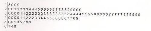
39 Stem-and-leaf Plot p. 228

40 Correlation Analysis Bleah. How can we clean this up? p. 276

41 Crosstab p. 277

42 Multiple Concurrent Views p. 107
43
44 Test Time!!! Stephen Few s Graph Design IQ Test
45 Tableau Tutorial: Part I
46 Project Elevator Pitch
47 HW3: Multivariate Data Visualization Download the.csv data file from T-Square File name: sp500.csv Data contains categorical and financial information of S&P500 companies Import data into Tableau Software Explore the data Prepare report: Generate any four (4) plots of interest Define what you encoded and why Describe your key findings Submit report on T-Square and bring two (2) hardcopies to class.
Review. In an experiment, there is one variable that is of primary interest. There are several other factors, which may affect the measured result.
 Review Observational study vs experiment Experimental designs In an experiment, there is one variable that is of primary interest. There are several other factors, which may affect the measured result.
Chapter 4. September 08, appstats 4B.notebook. Displaying Quantitative Data. Aug 4 9:13 AM. Aug 4 9:13 AM. Aug 27 10:16 PM.
 Objectives: Students will: Chapter 4 1. Be able to identify an appropriate display for any quantitative variable: stem leaf plot, time plot, histogram and dotplot given a set of quantitative data. 2. Be
Chapter 2 Frequency Distributions and Graphs
 Chapter 2 Frequency Distributions and Graphs Outline 2-1 Organizing Data 2-2 Histograms, Frequency Polygons, and Ogives 2-3 Other Types of Graphs Objectives Organize data using a frequency distribution.
Chapter 4 Displaying and Describing Quantitative Data
 Chapter 4 Displaying and Describing Quantitative Data Overview Key Concepts Be able to identify an appropriate display for any quantitative variable. Be able to guess the shape of the distribution of a
Stat 20: Intro to Probability and Statistics
 Stat 20: Intro to Probability and Statistics Lecture 4: Data Displays (cont.) Tessa L. Childers-Day UC Berkeley 26 June 2014 By the end of this lecture... You will be able to: Comprehend displays of quantitative
Chapter 10. Definition: Categorical Variables. Graphs, Good and Bad. Distribution
 Chapter 10 Graphs, Good and Bad Chapter 10 3 Distribution Definition: Tells what values a variable takes and how often it takes these values Can be a table, graph, or function Categorical Variables Places
Chapter 4. Displaying and Summarizing Quantitative Data. Copyright 2012, 2008, 2005 Pearson Education, Inc.
 Chapter 4 Displaying and Summarizing Quantitative Data Copyright 2012, 2008, 2005 Pearson Education, Inc. Dealing With a Lot of Numbers Summarizing the data will help us when we look at large sets of quantitative
Why Should We Care? More importantly, it is easy to lie or deceive people with bad plots
 Elementary Plots Why Should We Care? Everyone uses plotting But most people ignore or are unaware of simple principles Default plotting tools (or default settings) are not always the best More importantly,
Displaying Distributions with Graphs
 Displaying Distributions with Graphs Recall that the distribution of a variable indicates two things: (1) What value(s) a variable can take, and (2) how often it takes those values. Example 1: Weights
General tips for all graphs Choosing the right kind of graph scatter graph bar graph
 Excerpted and adapted from: McDonald, J.H. 2014. Handbook of Biological Statistics (3rd ed.). Sparky House Publishing, Baltimore, MD. (http://www.biostathandbook.com/graph.html) Guide to fairly good graphs
DESCRIBING DATA. Frequency Tables, Frequency Distributions, and Graphic Presentation
 DESCRIBING DATA Frequency Tables, Frequency Distributions, and Graphic Presentation Raw Data A raw data is the data obtained before it is being processed or arranged. 2 Example: Raw Score A raw score is
Office 2016 Excel Basics 24 Video/Class Project #36 Excel Basics 24: Visualize Quantitative Data with Excel Charts. No Chart Junk!!!
 Office 2016 Excel Basics 24 Video/Class Project #36 Excel Basics 24: Visualize Quantitative Data with Excel Charts. No Chart Junk!!! Goal in video # 24: Learn about how to Visualize Quantitative Data with
Describing Data Visually. Describing Data Visually. Describing Data Visually 9/28/12. Applied Statistics in Business & Economics, 4 th edition
 A PowerPoint Presentation Package to Accompany Applied Statistics in Business & Economics, 4 th edition David P. Doane and Lori E. Seward Prepared by Lloyd R. Jaisingh Describing Data Visually Chapter
Lecture 2: Chapter 2
 Lecture 2: Chapter 2 C C Moxley UAB Mathematics 3 June 15 2.2 Frequency Distributions Definition (Frequency Distribution) Frequency distributions shows how data are distributed among categories (classes)
15-388/688 - Practical Data Science: Visualization and Data Exploration. J. Zico Kolter Carnegie Mellon University Spring 2018
 15-388/688 - Practical Data Science: Visualization and Data Exploration J. Zico Kolter Carnegie Mellon University Spring 2018 1 Outline Basics of visualization Data types and visualization types Software
Why Should We Care? Everyone uses plotting But most people ignore or are unaware of simple principles Default plotting tools are not always the best
 Elementary Plots Why Should We Care? Everyone uses plotting But most people ignore or are unaware of simple principles Default plotting tools are not always the best More importantly, it is easy to lie
Chapter 2. Organizing Data. Slide 2-2. Copyright 2012, 2008, 2005 Pearson Education, Inc.
 Chapter 2 Organizing Data Slide 2-2 Section 2.1 Variables and Data Slide 2-3 Definition 2.1 Variables Variable: A characteristic that varies from one person or thing to another. Qualitative variable: A
Chapter 1. Picturing Distributions with Graphs
 Chapter 1. Picturing Distributions with Graphs 1 Chapter 1. Picturing Distributions with Graphs Definition. Individuals are the objects described by a set of data. Individuals may be people, but they may
Chpt 2. Frequency Distributions and Graphs. 2-3 Histograms, Frequency Polygons, Ogives / 35
 Chpt 2 Frequency Distributions and Graphs 2-3 Histograms, Frequency Polygons, Ogives 1 Chpt 2 Homework 2-3 Read pages 48-57 p57 Applying the Concepts p58 2-4, 10, 14 2 Chpt 2 Objective Represent Data Graphically
Learning Objectives. Describing Data: Displaying and Exploring Data. Dot Plot. Dot Plot 12/9/2015
 Describing Data: Displaying and Exploring Data Chapter 4 Learning Objectives Develop and interpret a dot plot. Develop and interpret a stem-and-leaf display. Compute and understand quartiles. Construct
Describing Data: Displaying and Exploring Data. Chapter 4
 Describing Data: Displaying and Exploring Data Chapter 4 Learning Objectives Develop and interpret a dot plot. Develop and interpret a stem-and-leaf display. Compute and understand quartiles. Construct
Numerical: Data with quantity Discrete: whole number answers Example: How many siblings do you have?
 Types of data Numerical: Data with quantity Discrete: whole number answers Example: How many siblings do you have? Continuous: Answers can fall anywhere in between two whole numbers. Usually any type of
Section 1.5 Graphs and Describing Distributions
 Section 1.5 Graphs and Describing Distributions Data can be displayed using graphs. Some of the most common graphs used in statistics are: Bar graph Pie Chart Dot plot Histogram Stem and leaf plot Box
Notes: Displaying Quantitative Data
 Notes: Displaying Quantitative Data Stats: Modeling the World Chapter 4 A or is often used to display categorical data. These types of displays, however, are not appropriate for quantitative data. Quantitative
Chapter 1: Stats Starts Here Chapter 2: Data
 Chapter 1: Stats Starts Here Chapter 2: Data Statistics data, datum variation individual respondent subject participant experimental unit observation variable categorical quantitative Calculator Skills:
TO PLOT OR NOT TO PLOT?
 Graphic Examples This document provides examples of a number of graphs that might be used in understanding or presenting data. Comments with each example are intended to help you understand why the data
Microsoft Excel: Data Analysis & Graphing. College of Engineering Engineering Education Innovation Center
 Microsoft Excel: Data Analysis & Graphing College of Engineering Engineering Education Innovation Center Objectives Use relative, absolute, and mixed cell referencing Identify the types of graphs and their
Chapter 1. Statistics. Individuals and Variables. Basic Practice of Statistics - 3rd Edition. Chapter 1 1. Picturing Distributions with Graphs
 Chapter 1 Picturing Distributions with Graphs BPS - 3rd Ed. Chapter 1 1 Statistics Statistics is a science that involves the extraction of information from numerical data obtained during an experiment
Univariate Descriptive Statistics
 Univariate Descriptive Statistics Displays: pie charts, bar graphs, box plots, histograms, density estimates, dot plots, stemleaf plots, tables, lists. Example: sea urchin sizes Boxplot Histogram Urchin
Business Statistics:
 Department of Quantitative Methods & Information Systems Business Statistics: Chapter 2 Graphs, Charts, and Tables Describing Your Data QMIS 120 Dr. Mohammad Zainal Chapter Goals After completing this
Business Statistics. Lecture 2: Descriptive Statistical Graphs and Plots
 Business Statistics Lecture 2: Descriptive Statistical Graphs and Plots 1 Goals for this Lecture Graphical descriptive statistics Histograms (and bar charts) Boxplots Scatterplots Time series plots Mosaic
Principles of Graphical Excellence Best Paper: ALAIR April 5 6, 2001 AIR: June 2-5, 2002, Toronto Focus-IR, February 21, 2003
 Anna T. Waggener, Ph.D. Institutional Assessment United States Army War College Principles of Graphical Excellence Best Paper: ALAIR April 5 6, 2001 AIR: June 2-5, 2002, Toronto Focus-IR, February 21,
Chapter 2. The Excel functions, Excel Analysis ToolPak Add-ins or Excel PHStat2 Add-ins needed to create frequency distributions are:
 I. Organizing Data in Tables II. Describing Data by Graphs Chapter 2 I. Tables: 1. Frequency Distribution (Nominal or Ordinal) 2. Grouped Frequency Distribution (Interval or Ratio data) 3. Joint Frequency
Elementary Statistics. Graphing Data
 Graphing Data What have we learned so far? 1 Randomly collect data. 2 Sort the data. 3 Compute the class width for specific number of classes. 4 Complete a frequency distribution table with the following
Notes 5C: Statistical Tables and Graphs
 Notes 5C: Statistical Tables and Graphs Frequency Tables A frequency table is an easy way to display raw data. A frequency table typically has between two to four columns: The first column lists all the
Chapter Displaying Graphical Data. Frequency Distribution Example. Graphical Methods for Describing Data. Vision Correction Frequency Relative
 Chapter 3 Graphical Methods for Describing 3.1 Displaying Graphical Distribution Example The data in the column labeled vision for the student data set introduced in the slides for chapter 1 is the answer
Addendum COLOR PALETTES
 Addendum Followup Material from Best Practices in Graphical Data Presentation Workshop 2010 Library Assessment Conference Baltimore, MD, October 25-27, 2010 COLOR PALETTES Two slides from the workshop
Sections Descriptive Statistics for Numerical Variables
 Math 243 Sections 2.1.2-2.2.5 Descriptive Statistics for Numerical Variables A framework to describe quantitative data: Describe the Shape, Center and Spread, and Unusual Features Shape How is the data
Introduction. Descriptive Statistics. Problem Solving. Inferential Statistics. Chapter1 Slides. Maurice Geraghty
 Inferential Statistics and Probability a Holistic Approach Chapter 1 Displaying and Analyzing Data with Graphs This Course Material by Maurice Geraghty is licensed under a Creative Commons Attribution-ShareAlike
Engineering Fundamentals and Problem Solving, 6e
 Engineering Fundamentals and Problem Solving, 6e Chapter 5 Representation of Technical Information Chapter Objectives 1. Recognize the importance of collecting, recording, plotting, and interpreting technical
PASS Sample Size Software
 Chapter 945 Introduction This section describes the options that are available for the appearance of a histogram. A set of all these options can be stored as a template file which can be retrieved later.
11 Wyner Statistics Fall 2018
 11 Wyner Statistics Fall 218 CHAPTER TWO: GRAPHS Review September 19 Test September 28 For research to be valuable, it must be shared, and a graph can be an effective way to do so. The fundamental aspect
Going back to the definition of Biostatistics. Organizing and Presenting Data. Learning Objectives. Nominal Data 10/10/2016. Tabulation and Graphs
 1/1/1 Organizing and Presenting Data Tabulation and Graphs Introduction to Biostatistics Haleema Masud Going back to the definition of Biostatistics The collection, organization, summarization, analysis,
Line Graphs. Name: The independent variable is plotted on the x-axis. This axis will be labeled Time (days), and
, and") Name: Graphing Review Graphs and charts are great because they communicate information visually. For this reason graphs are often used in newspapers, magazines, and businesses around the world. Sometimes,
Name: Graphing Review Graphs and charts are great because they communicate information visually. For this reason graphs are often used in newspapers, magazines, and businesses around the world. Sometimes,
Statistics for Managers using Microsoft Excel 3 rd Edition
 Statistics for Managers using Microsoft Excel 3 rd Edition Chapter 2 Presenting Data in Tables and Charts 22 Prentice-Hall, Inc. Chap 2-1 Chapter Topics Organizing numerical data The ordered array and
Constructing Line Graphs Appendix B AP Biology Investigative Lab Essentials
 Constructing Line Graphs Appendix B AP Biology Investigative Lab Essentials Directions: Reading, constructing and interpreting graphs are essential skills for any Biology/Science student. We will spend
Appendix III Graphs in the Introductory Physics Laboratory
 Appendix III Graphs in the Introductory Physics Laboratory 1. Introduction One of the purposes of the introductory physics laboratory is to train the student in the presentation and analysis of experimental
Purpose. Charts and graphs. create a visual representation of the data. make the spreadsheet information easier to understand.
 Purpose Charts and graphs are used in business to communicate and clarify spreadsheet information. convert spreadsheet information into a format that can be quickly and easily analyzed. make the spreadsheet
Page 21 GRAPHING OBJECTIVES:
 Page 21 GRAPHING OBJECTIVES: 1. To learn how to present data in graphical form manually (paper-and-pencil) and using computer software. 2. To learn how to interpret graphical data by, a. determining the
LESSON 2: FREQUENCY DISTRIBUTION
 LESSON : FREQUENCY DISTRIBUTION Outline Frequency distribution, histogram, frequency polygon Relative frequency histogram Cumulative relative frequency graph Stem-and-leaf plots Scatter diagram Pie charts,
FlashChart. Symbols and Chart Settings. Main menu navigation. Data compression and time period of the chart. Chart types.
 FlashChart Symbols and Chart Settings With FlashChart you can display several symbols (for example indices, securities or currency pairs) in an interactive chart. You can also add indicators and draw on
Frequency Distribution and Graphs
 Chapter 2 Frequency Distribution and Graphs 2.1 Organizing Qualitative Data Denition 2.1.1 A categorical frequency distribution lists the number of occurrences for each category of data. Example 2.1.1
Year 10 Practical Assessment Skills Lesson 1 Results tables and Graph Skills
 Year 10 Practical Assessment Skills Lesson 1 Results tables and Graph Skills Aim: to be able to present results and draw appropriate types of graphs Must: identify mistakes in data recording Should: be
This Chapter s Topics
 This Chapter s Topics Today, we re going to talk about three things: Frequency distributions Graphs Charts Frequency distributions, graphs, and charts 1 Frequency distributions Frequency distributions
Learning Log Title: CHAPTER 2: ARITHMETIC STRATEGIES AND AREA. Date: Lesson: Chapter 2: Arithmetic Strategies and Area
 Chapter 2: Arithmetic Strategies and Area CHAPTER 2: ARITHMETIC STRATEGIES AND AREA Date: Lesson: Learning Log Title: Date: Lesson: Learning Log Title: Chapter 2: Arithmetic Strategies and Area Date: Lesson:
Statistics 101 Reviewer for Final Examination
 Statistics 101 Reviewer for Final Examination Elementary Statistics S101-FE-003 TRUE or FALSE. Write True, if the statement is correct, and False, if otherwise. (20 pts.) 1. A sample is a subset of the
Outline. Drawing the Graph. 1 Homework Review. 2 Introduction. 3 Histograms. 4 Histograms on the TI Assignment
 Lecture 14 Section 4.4.4 on Hampden-Sydney College Fri, Sep 18, 2009 Outline 1 on 2 3 4 on 5 6 Even-numbered on Exercise 4.25, p. 249. The following is a list of homework scores for two students: Student
1.1 Displaying Distributions with Graphs, Continued
 1.1 Displaying Distributions with Graphs, Continued Ulrich Hoensch Thursday, January 10, 2013 Histograms Constructing a frequency table involves breaking the range of values of a quantitative variable
Using Figures - The Basics
 Using Figures - The Basics by David Caprette, Rice University OVERVIEW To be useful, the results of a scientific investigation or technical project must be communicated to others in the form of an oral
Data and its representation
 2 Data and its representation A microphone in the sidewalk would provide an eavesdropper with a cacophony of clocks, seemingly random like the noise from a Geiger counter. But the right kind of person
Chapter 3. Graphical Methods for Describing Data. Copyright 2005 Brooks/Cole, a division of Thomson Learning, Inc.
 Chapter 3 Graphical Methods for Describing Data 1 Frequency Distribution Example The data in the column labeled vision for the student data set introduced in the slides for chapter 1 is the answer to the
4 Exploration. 4.1 Data exploration using R tools
 4 Exploration The statistical background of all methods discussed in this chapter can be found Analysing Ecological Data by Zuur, Ieno and Smith (2007). Here, we only discuss how to apply the methods in
1-What type of graph is used to show trends? 2-What type of graph is used to compare information?
 AGENDA ABSENT BLOCK 9/3 & 9/4 week-4 TOPIC: the NATURE of SCIENCE OBJ : 9, 10, 11 DO NOW: 1-What type of graph is used to show trends? 2-What type of graph is used to compare information? Science of Life
Section 1: Data (Major Concept Review)
") Section 1: Data (Major Concept Review) Individuals = the objects described by a set of data variable = characteristic of an individual weight height age IQ hair color eye color major social security #
Section 1: Data (Major Concept Review) Individuals = the objects described by a set of data variable = characteristic of an individual weight height age IQ hair color eye color major social security #
TeleTrader FlashChart
 TeleTrader FlashChart Symbols and Chart Settings With TeleTrader FlashChart you can display several symbols (for example indices, securities or currency pairs) in an interactive chart. You can also add
Statistics. Graphing Statistics & Data. What is Data?. Data is organized information. It can be numbers, words, measurements,
 Statistics Graphing Statistics & Data What is Data?. Data is organized information. It can be numbers, words, measurements, observations or even just descriptions of things. Qualitative vs Quantitative.
You must have: Pen, HB pencil, eraser, calculator, ruler, protractor.
 Write your name here Surname Other names Pearson Edexcel Award Statistical Methods Level 2 Calculator allowed Centre Number Candidate Number Wednesday 14 May 2014 Morning Time: 1 hour 30 minutes You must
Using Charts and Graphs to Display Data
 Page 1 of 7 Using Charts and Graphs to Display Data Introduction A Chart is defined as a sheet of information in the form of a table, graph, or diagram. A Graph is defined as a diagram that represents
Sidcot intranet - Firefly. Useful links: Instant classroom. MyMaths. Objectives
 Useful links: Sidcot intranet - Firefly Instant classroom MyMaths Objectives Objectives To revise scatter graphs To use them to make estimations Scatter Graphs Revision powerpoint Now make some revision
SS Understand charts and graphs used in business.
 SS2 2.02 Understand charts and graphs used in business. Purpose of Charts and Graphs 1. Charts and graphs are used in business to communicate and clarify spreadsheet information. 2. Charts and graphs emphasize
Scientific Investigation Use and Interpret Graphs Promotion Benchmark 3 Lesson Review Student Copy
 Scientific Investigation Use and Interpret Graphs Promotion Benchmark 3 Lesson Review Student Copy Vocabulary Data Table A place to write down and keep track of data collected during an experiment. Line
Excel Manual X Axis Scales 2010 Graph Two X-
 Excel Manual X Axis Scales 2010 Graph Two X-axis same for both X, and Y axes, and I can see the X and Y data maximum almost the same, but the graphy on Thanks a lot for any help in advance. Peter T, Jan
Geometry Activity. Then enter the following numbers in L 1 and L 2 respectively. L 1 L
 Geometry Activity Introduction: In geometry we can reflect, rotate, translate, and dilate a figure. In this activity lists and statistical plots on the TI-83 Plus Silver Edition will be used to illustrate
ESSENTIAL MATHEMATICS 1 WEEK 17 NOTES AND EXERCISES. Types of Graphs. Bar Graphs
 ESSENTIAL MATHEMATICS 1 WEEK 17 NOTES AND EXERCISES Types of Graphs Bar Graphs Bar graphs are used to present and compare data. There are two main types of bar graphs: horizontal and vertical. They are
STK 573 Metode Grafik untuk Analisis dan Penyajian Data
 STK 573 Metode Grafik untuk Analisis dan Penyajian Data Pertemuan 5 Sajian Peubah Diskret Tunggal Tim Dosen: Prof. Dr. Khairil Anwar Notodiputro Dr. Ir. Aji Hamim Wigena Dr. Agus M Soleh Pendahuluan Chart:
BE540 - Introduction to Biostatistics Computer Illustration. Topic 1 Summarizing Data Software: STATA. A Visit to Yellowstone National Park, USA
 BE540 - Introduction to Biostatistics Computer Illustration Topic 1 Summarizing Data Software: STATA A Visit to Yellowstone National Park, USA Source: Chatterjee, S; Handcock MS and Simonoff JS A Casebook
Graphing Techniques. Figure 1. c 2011 Advanced Instructional Systems, Inc. and the University of North Carolina 1
 Graphing Techniques The construction of graphs is a very important technique in experimental physics. Graphs provide a compact and efficient way of displaying the functional relationship between two experimental
Gain From Using One of Process Control's Emerging Tools: Power Spectrum
 Gain From Using One of Process Control's Emerging Tools: Power Spectrum By Michel Ruel (TOP Control) and John Gerry (ExperTune Inc.) Process plants are starting to get big benefits from a widely available
Tables and Figures. Germination rates were significantly higher after 24 h in running water than in controls (Fig. 4).
.") Tables and Figures Text: contrary to what you may have heard, not all analyses or results warrant a Table or Figure. Some simple results are best stated in a single sentence, with data summarized parenthetically:
Tables and Figures Text: contrary to what you may have heard, not all analyses or results warrant a Table or Figure. Some simple results are best stated in a single sentence, with data summarized parenthetically:
Name: Date: Class: Lesson 3: Graphing. a. Useful for. AMOUNT OF HEAT PRODUCED IN KJ. b. Difference between a line graph and a scatter plot:
 AMOUNT OF HEAT PRODUCED IN KJ NOTES Name: Date: Class: Lesson 3: Graphing Types of Graphs 1. Bar Graph a. Useful for. b. Helps us see quickly. Heat Produced Upon Mixture of Different Acids into Water 90
Important Considerations For Graphical Representations Of Data
 This document will help you identify important considerations when using graphs (also called charts) to represent your data. First, it is crucial to understand how to create good graphs. Then, an overview
GCSE MATHEMATICS 43601H. Higher Tier Unit 1 Statistics and Number. Morning. (JUN H01) WMP/Jun16/E4
 WMP/Jun16/E4") Please write clearly in block capitals. Centre number Candidate number Surname Forename(s) Candidate signature GCSE H MATHEMATICS Higher Tier Unit 1 Statistics and Number Thursday 26 May 2016 Materials
Please write clearly in block capitals. Centre number Candidate number Surname Forename(s) Candidate signature GCSE H MATHEMATICS Higher Tier Unit 1 Statistics and Number Thursday 26 May 2016 Materials
Infographics at CDC for a nonscientific audience
 Infographics at CDC for a nonscientific audience A Standards Guide for creating successful infographics Centers for Disease Control and Prevention Office of the Associate Director for Communication 03/14/2012;
Graphing Guidelines. Controlled variables refers to all the things that remain the same during the entire experiment.
 Graphing Graphing Guidelines Graphs must be neatly drawn using a straight edge and pencil. Use the x-axis for the manipulated variable and the y-axis for the responding variable. Manipulated Variable AKA
Mathematics Essential General Course Year 12. Selected Unit 3 syllabus content for the. Externally set task 2017
 Mathematics Essential General Course Year 12 Selected Unit 3 syllabus content for the Externally set task 2017 This document is an extract from the Mathematics Essentials General Course Year 12 syllabus,
CS 147: Computer Systems Performance Analysis
 CS 147: Computer Systems Performance Analysis Mistakes in Graphical Presentation CS 147: Computer Systems Performance Analysis Mistakes in Graphical Presentation 1 / 45 Overview Excess Information Multiple
Chapter 2 Descriptive Statistics: Tabular and Graphical Methods
 Chapter Descriptive Statistics http://nscc-webctdev.northweststate.edu/script/sta_sp/scripts/student/serve_page... Page of 7 /7/9 Chapter Descriptive Statistics: Tabular and Graphical Methods Data can
AP Statistics Composition Book Review Chapters 1 2
 AP Statistics Composition Book Review Chapters 1 2 Terms/vocabulary: Explain each term with in the STATISTICAL context. Bar Graph Bimodal Categorical Variable Density Curve Deviation Distribution Dotplot
Tutorial 1: Install Forecaster HD (Win XP, Vista, 7, 8)
") Tutorial 1: Install Forecaster HD (Win XP, Vista, 7, 8) Download Forecaster HD (FHD) from Community s website http://www.communitypro.com/productlist/135-forecaster-ceiling-system-software Open Setup.exe
Tutorial 1: Install Forecaster HD (Win XP, Vista, 7, 8) Download Forecaster HD (FHD) from Community s website http://www.communitypro.com/productlist/135-forecaster-ceiling-system-software Open Setup.exe
Appendix C: Graphing. How do I plot data and uncertainties? Another technique that makes data analysis easier is to record all your data in a table.
 Appendix C: Graphing One of the most powerful tools used for data presentation and analysis is the graph. Used properly, graphs are an important guide to understanding the results of an experiment. They
Bar Charts with SGPLOT
 Bar Charts with SGPLOT Bar Charts using SGPLOT Among the many plot types available in SGPLOT are several that construct bar charts. and VBAR Horizontal and Vertical Bar Charts, respectively Compatible,
CPM Educational Program
 CC COURSE 3 ETOOLS Table of Contents General etools... 4 Algebra Tiles (CPM)... 5 Pattern Tile & Dot Tool (CPM)... 8 Base Ten Blocks (CPM)...10 Area and Perimeter (CPM)...12 Desmos Graphing Calculator...15
Data Presentation. Esra Akdeniz. February 12th, 2016
 Data Presentation Esra Akdeniz February 12th, 2016 HOW TO DO RESEARCH? Question. Literature research. Hypothesis. Collect data. Analyze data. Interpret and present results. HOW TO DO RESEARCH? Analyze
Exploring rate of change in motion problems Block 4 Student Activity Sheet
 1. Sketch the graph of each elevator ride described. [EX3, page2] a. The elevator starts on floor 4 and rises at a rate of 1 floor per second. b. The elevator starts on floor -3 rises at a rate of 2 floors
Foundations for Functions
 Activity: Spaghetti Regression Activity 1 TEKS: Overview: Background: A.2. Foundations for functions. The student uses the properties and attributes of functions. The student is expected to: (D) collect
Plotting Points & The Cartesian Plane. Scatter Plots WS 4.2. Line of Best Fit WS 4.3. Curve of Best Fit WS 4.4. Graphing Linear Relations WS 4.
 UNIT 4 - GRAPHING RELATIONS Date Lesson Topic HW Nov. 3 4.1 Plotting Points & The Cartesian Plane WS 4.1 Nov. 6 4.1 Plotting Points & The Cartesian Plane WS 4.1-II Nov. 7 4.2 Scatter Plots WS 4.2 Nov.
6.1 Slope of a Line Name: Date: Goal: Determine the slope of a line segment and a line.
 6.1 Slope of a Line Name: Date: Goal: Determine the slope of a line segment and a line. Toolkit: - Rate of change - Simplifying fractions Main Ideas: Definitions Rise: the vertical distance between two
STK110. Chapter 2: Tabular and Graphical Methods Lecture 1 of 2. ritakeller.com. mathspig.wordpress.com
 STK110 Chapter 2: Tabular and Graphical Methods Lecture 1 of 2 ritakeller.com mathspig.wordpress.com Frequency distribution Example Data from a sample of 50 soft drink purchases Frequency Distribution
Graphs. This tutorial will cover the curves of graphs that you are likely to encounter in physics and chemistry.
 Graphs Graphs are made by graphing one variable which is allowed to change value and a second variable that changes in response to the first. The variable that is allowed to change is called the independent
Mathematics Expectations Page 1 Grade 04
 Mathematics Expectations Page 1 Problem Solving Mathematical Process Expectations 4m1 develop, select, and apply problem-solving strategies as they pose and solve problems and conduct investigations, to