History of Control Charts
|
|
|
- Theodore Floyd
- 5 years ago
- Views:
Transcription


1
2 History of Control Charts 1920 s Walter Shewhart of Bell Labs working to improve reliability of telephone transmission systems W. Edward Demmings, U.S. Dept. of Agriculture and later U.S Census Bureau, promotes Shewart s work for next 50 years, becoming adopted widely in US WWII and post-war Japan industry for process control Handbook for Analytical Quality Control in Water and Wastewater Laboratories, USEPA, EPA-600/
3 What is a Control Chart? A control chart is a graph used to evaluate how a process changes over time. Some quality metric(s), representative of the process (e.g. product weight, measured value of a known standard, percent recovery), is selected for evaluation. There are many types of control charts. Charts may be uni- or multivariate. Univariate Shewhart-type (Levey-Jennings) control charts are commonly used in laboratories. Control charts typically plot an average of the metric, upper and lower warning limits (UWL, LWL) and/or control limits (UCL, LCL) for a predetermined number of events (n). Warning and control limits may be based on fixed values, or may be calculated based on arithmetic or statistical functions of the data.
4 % Recovery Fixed Limits Control Chart 140 % Recovery PO4-P % Recovery Mean LWL = 85% UWL = 115% 20 0 Run Date
5 % Recovery Fixed Limits Control Chart 140 % Recovery PO4-P % Recovery Mean LWL = 85% UWL = 115% 20 0 Run date
6 CaCO3 (mg/l) 95% and 99% Probability Limits (Means) Control Chart 650 SM 2340 C-1997 Hardness Standard (mg/l) Standard (mg/l) Mean LWL (mean-2sd) UWL (mean+2sd) LCL (mean-3sd) UCL (mean+3sd) 300 Run Date
7 RPD One Sided Precision Control Chart 45 RPD Duplicates SM NH3-D RPD Mean UWL UCL 5 0 Run Date
8 KCl (ppm) Cusum Control Chart P. promelas Chronic SRT (Growth) EPA Method SRT IC25 Mean IC25 Lower Limit Upper Limit SRT Test Number
9
10 KCl (ppm) Same Data in a Traditional Control Chart P. promelas Chronic SRT (Growth) EPA Method SRT IC25 Mean IC25 Lower Limit Upper Limit SRT Test Number
11 Control Chart Interpretation 1 in 20 points should exceed 95% warning limits and 1 in 100 should exceed 99% control limits. These are not necessarily out of limits but may be Type 1 statistical errors. Specific guidelines regarding interpretation may be included in the test method. A control chart evaluates changes in your system. It does not evaluate the validity of data per se. A highly proficient lab may have much narrower control limits than a lab of lesser proficiency. Compare lab precision with method-specific intra-laboratory precision data, if available
12 Lab A Lab B
13 Control Chart Interpretation
14 Control Chart Interpretation WECO (Western Electric Company) Rules for Identifying Out-of- Control Data Points Any point above or below 3 SD 2 out of last 3 above or below 2 SD 4 out of last 5 above or below 1 SD 8 consecutive points on one side of the control line (e.g. mean) Trend Rules 6 in a row trending up or down 14 in a row alternating up and down
15 Control Chart Interpretation Standard Methods (1020 B.13.c) Any point above or below 3 SD: Repeat analysis; if repeat exceeds 3 SD discontinue analyses and correct problem. 2 out of last 3 above or below 2 SD: Analyze another sample; if exceeds 2 SD evaluate bias and correct problem. 4 out of last 5 above or below 1 SD, or are in decreasing or increasing order: Analyze another sample; if exceeds 1 SD or in same order, discontinue analyses and correct problem. 7 consecutive points on one side of the control line (e.g. mean): Discontinue analyses and correct problem. After correcting problem: Reanalyze samples analyzed between last in-control measurement and the out-of-control measurement.
16 Control Chart Construction Essentials Generally there are no rigid requirements on control chart construction (See EPA, Standard Methods, ASTM guidance). Methods often define WLs, CLs and n. The typical control chart based on the mean and standard deviation assumes the data are normally distributed. The charts are not robust to non-normal data and interpretations may be skewed. (Check for normality: Histograms, normal probability plots, Chi-square goodness of fit. Alternatives: Transform data, use non-normal control chart methods). Always use the sample standard deviation (stdev.s), not the population standard deviation (stdev), unless your data is from the complete population. A minimum number (e.g. 20) of data points are needed for a meaningful estimate of the mean and standard deviation. The method or regulation may require that only the most recent n (e.g. 20 or 30) data points be used. The measurement being evaluated is not included in calculation of WLs and CLs. It is only included in the next iteration of the chart.


17 Data Set Size and Normal Distribution
18 Basic Steps for Constructing Your Control Chart Select the metric you will be evaluating. Determine basis and values of your control and/or warning limits (fixed, arithmetic, statistical). Determine appropriate time period or number of data points to incorporate into your chart. Determine a priori how you will evaluate data outside limits. Collect data and construct control chart. Evaluate data.

19 Now Let s Make a Control Chart!
20 Set up your spread sheet
21 Insert formula for average
22 Insert formula for sample standard deviation
23 Type in $K$1 which will transcribe the value from the formula cell

24 Drag cursor to autofill the mean value
25
26 Insert formula for lower warning limit

27 Drag and fill cells

28 Insert formula for upper warning limit
29 Drag and fill
30 Insert formula for lower control limit

31 Drag and fill

32 Insert formula for upper control limit
33 Drag and fill

34 Use cursor to highlight date and measurement columns; include headers

35 Insert tab>line or Area Chart>Line

36 Still need to add mean and limits
37 Place cursor on chart and right-click mouse; select data

38 Click Add button

39 Series name box will be blank with blinking line. 1. Place cursor over Mean column label and left click to fill series name. 2. Back space over the ={1}

40 Highlight the values for the mean in C2:C34 to fill in series values and then click Ok

41 Click Add again to add the LWL

42 Continue as with the Mean values.

43 Until LWL, UWL, LCL and UCL are added to the chart.

44 Now we have a basic control chart. But it needs fixing up. First let s make it bigger by dragging a corner.
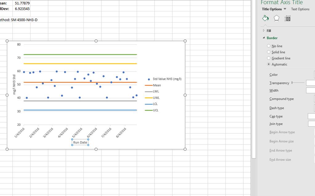
45 Add a legend.
46 Rather have data points than a line for values? Right-click the line>format Data Series.

47 Click paint bucket.

48 Under Line option select No line

49 Under Marker select automatic. Change color, size if desired.

50 Often we need to change the range of the y-axis for better presentation. Left click the y-axis to change range, units, etc.

51 The x-axis intersecting at y=20 looks better. Show cusum spread sheet formuals??
52 What do the units on the y-axis mean? We need axis titles.
53 Just type into the Axis Title boxes beside the y-axis and below the x-axis
54

55 Let s add a title.

56
57

58 Our new point 9/3/16 is compared with the mean and limits. Depending on the method/guidance: 1. Add the new data point and calculate new cumulative values. 2. Add the new data point and calculate new values but eliminating the nth previous point from analysis (e.g. only last 20 or 30)

59 CuSum Control Chart formulas individual mean value

60 CuSum Control Chart formulas individual LWL value

61 CuSum Control Chart formulas individual UWL value

62 CuSum Control Chart formulas next individual mean value Copy/Paste formulas from line above, range auto adjusts

63 CuSum Control Chart formulas next individual LWL value
64 CuSum Control Chart formulas next individual UWL value

65 Right click control chart to edit series values; change to include most recent n values
66 Charting Your Data is a Great Tool Other QC metrics (CV (%RSD), % valid measures, etc.) By Instrument By Technician By Day of the Week (Should you buy a car made on Monday or Friday?)
67 Standard Practice for Use of Control Charts in Statistical Process Control Resources APHA/AWWA/WEF Standard Methods for the Examination of Water and Wastewater. 22nd Edition. American Public Health Assoc., Washington, DC (Section 1020 B.13) ASTM Standard Practice for Use of Control Charts in Statistical Process Control, ASTM E , ASTM International, West Conshohocken, PA, 2016 USEPA Handbook for Analytical Quality Control in Water and Wastewater Laboratories, USEPA, EPA-600/
68 Questions or further information: Pete De Lisle Coastal Bioanalysts, Inc Enterprise Court Gloucester, VA (Fax) 68
How to Make a Run Chart in Excel
 How to Make a Run Chart in Excel While there are some statistical programs that you can use to make a run chart, it is simple to make in Excel, using Excel s built-in chart functions. The following are
Excel Lab 2: Plots of Data Sets
 Excel Lab 2: Plots of Data Sets Excel makes it very easy for the scientist to visualize a data set. In this assignment, we learn how to produce various plots of data sets. Open a new Excel workbook, and
Excel Tool: Plots of Data Sets
 Excel Tool: Plots of Data Sets Excel makes it very easy for the scientist to visualize a data set. In this assignment, we learn how to produce various plots of data sets. Open a new Excel workbook, and
CHM 152 Lab 1: Plotting with Excel updated: May 2011
 CHM 152 Lab 1: Plotting with Excel updated: May 2011 Introduction In this course, many of our labs will involve plotting data. While many students are nerds already quite proficient at using Excel to plot
CHM 109 Excel Refresher Exercise adapted from Dr. C. Bender s exercise
 CHM 109 Excel Refresher Exercise adapted from Dr. C. Bender s exercise (1 point) (Also see appendix II: Summary for making spreadsheets and graphs with Excel.) You will use spreadsheets to analyze data
NCSS Statistical Software
 Chapter 147 Introduction A mosaic plot is a graphical display of the cell frequencies of a contingency table in which the area of boxes of the plot are proportional to the cell frequencies of the contingency
Advanced Engineering Statistics. Jay Liu Dept. Chemical Engineering PKNU
 Advanced Engineering Statistics Jay Liu Dept. Chemical Engineering PKNU Statistical Process Control (A.K.A Process Monitoring) What we will cover Reading: Textbook Ch.? ~? 2012-06-27 Adv. Eng. Stat., Jay
Sensors and Scatterplots Activity Excel Worksheet
 Name: Date: Sensors and Scatterplots Activity Excel Worksheet Directions Using our class datasheets, we will analyze additional scatterplots, using Microsoft Excel to make those plots. To get started,
Assignment 5 due Monday, May 7
 due Monday, May 7 Simulations and the Law of Large Numbers Overview In both parts of the assignment, you will be calculating a theoretical probability for a certain procedure. In other words, this uses
A graph is an effective way to show a trend in data or relating two variables in an experiment.
 Chem 111-Packet GRAPHING A graph is an effective way to show a trend in data or relating two variables in an experiment. Consider the following data for exercises #1 and 2 given below. Temperature, ºC
Physics 253 Fundamental Physics Mechanic, September 9, Lab #2 Plotting with Excel: The Air Slide
 1 NORTHERN ILLINOIS UNIVERSITY PHYSICS DEPARTMENT Physics 253 Fundamental Physics Mechanic, September 9, 2010 Lab #2 Plotting with Excel: The Air Slide Lab Write-up Due: Thurs., September 16, 2010 Place
Assessing Measurement System Variation
 Example 1 Fuel Injector Nozzle Diameters Problem A manufacturer of fuel injector nozzles has installed a new digital measuring system. Investigators want to determine how well the new system measures the
I STATISTICAL TOOLS IN SIX SIGMA DMAIC PROCESS WITH MINITAB APPLICATIONS
 Six Sigma Quality Concepts & Cases- Volume I STATISTICAL TOOLS IN SIX SIGMA DMAIC PROCESS WITH MINITAB APPLICATIONS Chapter 7 Measurement System Analysis Gage Repeatability & Reproducibility (Gage R&R)
Assessing Measurement System Variation
 Assessing Measurement System Variation Example 1: Fuel Injector Nozzle Diameters Problem A manufacturer of fuel injector nozzles installs a new digital measuring system. Investigators want to determine
Detection of Non-Random Patterns in Shewhart Control Charts: Methods and Applications
 Detection of Non-Random Patterns in Shewhart Control Charts: Methods and Applications A. Rakitzis and S. Bersimis Abstract- The main purpose of this article is the development and the study of runs rules
This tutorial will lead you through step-by-step to make the plot below using Excel.
 GES 131 Making Plots with Excel 1 / 6 This tutorial will lead you through step-by-step to make the plot below using Excel. Number of Non-Student Tickets vs. Student Tickets Y, Number of Non-Student Tickets
Create a Flowchart in Word
 Create a Flowchart in Word A flowchart is a diagram of steps, movements or actions involved in a system or activity. Flowcharts use conventional geometric symbols and arrows to define relationships and
I STATISTICAL TOOLS IN SIX SIGMA DMAIC PROCESS WITH MINITAB APPLICATIONS
 Six Sigma Quality Concepts & Cases- Volume I STATISTICAL TOOLS IN SIX SIGMA DMAIC PROCESS WITH MINITAB APPLICATIONS Chapter 7 Measurement System Analysis Gage Repeatability & Reproducibility (Gage R&R)
Laboratory 2: Graphing
 Purpose It is often said that a picture is worth 1,000 words, or for scientists we might rephrase it to say that a graph is worth 1,000 words. Graphs are most often used to express data in a clear, concise
Microsoft Excel: Data Analysis & Graphing. College of Engineering Engineering Education Innovation Center
 Microsoft Excel: Data Analysis & Graphing College of Engineering Engineering Education Innovation Center Objectives Use relative, absolute, and mixed cell referencing Identify the types of graphs and their
Chapter 10. Definition: Categorical Variables. Graphs, Good and Bad. Distribution
 Chapter 10 Graphs, Good and Bad Chapter 10 3 Distribution Definition: Tells what values a variable takes and how often it takes these values Can be a table, graph, or function Categorical Variables Places
Univariate Descriptive Statistics
 Univariate Descriptive Statistics Displays: pie charts, bar graphs, box plots, histograms, density estimates, dot plots, stemleaf plots, tables, lists. Example: sea urchin sizes Boxplot Histogram Urchin
Spreadsheets 3: Charts and Graphs
 Spreadsheets 3: Charts and Graphs Name: Main: When you have finished this handout, you should have the following skills: Setting up data correctly Labeling axes, legend, scale, title Editing symbols, colors,
PivotTables PivotCharts (Chapter 5)
") If a database contains a lot of information and the user would like to work with only a selection of the data in a table or as a chart, PivotTables and PivotCharts are a great solution. Data Mining: the
If a database contains a lot of information and the user would like to work with only a selection of the data in a table or as a chart, PivotTables and PivotCharts are a great solution. Data Mining: the
Plotting scientific data in MS Excel 2003/2004
 Plotting scientific data in MS Excel 2003/2004 The screen grab above shows MS Excel with all the toolbars switched on - remember that some options only become visible when others are activated. We only
Statistics 101: Section L Laboratory 10
 Statistics 101: Section L Laboratory 10 This lab looks at the sampling distribution of the sample proportion pˆ and probabilities associated with sampling from a population with a categorical variable.
1.1 Displaying Distributions with Graphs, Continued
 1.1 Displaying Distributions with Graphs, Continued Ulrich Hoensch Thursday, January 10, 2013 Histograms Constructing a frequency table involves breaking the range of values of a quantitative variable
Office 2016 Excel Basics 24 Video/Class Project #36 Excel Basics 24: Visualize Quantitative Data with Excel Charts. No Chart Junk!!!
 Office 2016 Excel Basics 24 Video/Class Project #36 Excel Basics 24: Visualize Quantitative Data with Excel Charts. No Chart Junk!!! Goal in video # 24: Learn about how to Visualize Quantitative Data with
Chapter 1. Picturing Distributions with Graphs
 Chapter 1. Picturing Distributions with Graphs 1 Chapter 1. Picturing Distributions with Graphs Definition. Individuals are the objects described by a set of data. Individuals may be people, but they may
Lab 15: EXL3 Microsoft Excel s AutoFill Tool, Multiple Worksheets, Charts and Conditional Formatting
 Lab 15: EXL3 Microsoft Excel s AutoFill Tool, Multiple Worksheets, Charts and Conditional Formatting Learn how to work with multiple worksheets, use the AutoFill tool, charts, and apply conditional formatting
Experiment 2: Electronic Enhancement of S/N and Boxcar Filtering
 Experiment 2: Electronic Enhancement of S/N and Boxcar Filtering Synopsis: A simple waveform generator will apply a triangular voltage ramp through an R/C circuit. A storage digital oscilloscope, or an
PASS Sample Size Software
 Chapter 945 Introduction This section describes the options that are available for the appearance of a histogram. A set of all these options can be stored as a template file which can be retrieved later.
Step 1: Set up the variables AB Design. Use the top cells to label the variables that will be displayed on the X and Y axes of the graph
 Step 1: Set up the variables AB Design Use the top cells to label the variables that will be displayed on the X and Y axes of the graph Step 1: Set up the variables X axis for AB Design Enter X axis label
EE EXPERIMENT 3 RESISTIVE NETWORKS AND COMPUTATIONAL ANALYSIS INTRODUCTION
 EE 2101 - EXPERIMENT 3 RESISTIVE NETWORKS AND COMPUTATIONAL ANALYSIS INTRODUCTION The resistors used in this laboratory are carbon composition resistors, consisting of graphite or some other type of carbon
Section 3 Correlation and Regression - Worksheet
 The data are from the paper: Exploring Relationships in Body Dimensions Grete Heinz and Louis J. Peterson San José State University Roger W. Johnson and Carter J. Kerk South Dakota School of Mines and
Microsoft Excel Math Formula Guide
 Microsoft Excel is a spreadsheet software that is used to organize and calculate data. This handout will focus on how to use built-in Excel functions to solve basic mathematical calculations. Basics of
Microsoft Excel Lab Two (Completed 03/02/18) Transcript by Rev.com. Page 1 of 6
 Transcript by Rev.com. Page 1 of 6") [00:00:31] Speaker 1: Hello everyone and welcome to excel lab two. To get started with this lab you will need two files. You will need excel lab two instructions file also, you will need excel lab two
[00:00:31] Speaker 1: Hello everyone and welcome to excel lab two. To get started with this lab you will need two files. You will need excel lab two instructions file also, you will need excel lab two
Chapter 2. The Excel functions, Excel Analysis ToolPak Add-ins or Excel PHStat2 Add-ins needed to create frequency distributions are:
 I. Organizing Data in Tables II. Describing Data by Graphs Chapter 2 I. Tables: 1. Frequency Distribution (Nominal or Ordinal) 2. Grouped Frequency Distribution (Interval or Ratio data) 3. Joint Frequency
Quick Guide. NucleoCounter NC-3000
 Quick Guide NucleoCounter NC-3000 Table of contents Setting up the FlexiCyte Protocol 2 Editing Image Capture and Analysis Parameters 3 Optimizing Exposure Time 4 Compensation for Spectral Overlap 6 Creating
Chapter 2 Descriptive Statistics: Tabular and Graphical Methods
 Chapter Descriptive Statistics http://nscc-webctdev.northweststate.edu/script/sta_sp/scripts/student/serve_page... Page of 7 /7/9 Chapter Descriptive Statistics: Tabular and Graphical Methods Data can
Example: Your Name (instead of contestant number) / Job 1
 / Job 1") BPA PROJECT Advanced Spreadsheet Applications ASA Description: Finished Product: This project is based on the Advanced Spreadsheet Applications event; it consists of creating a spreadsheet with multiple
BPA PROJECT Advanced Spreadsheet Applications ASA Description: Finished Product: This project is based on the Advanced Spreadsheet Applications event; it consists of creating a spreadsheet with multiple
Summary... 1 Sample Data... 2 Data Input... 3 C Chart... 4 C Chart Report... 6 Analysis Summary... 7 Analysis Options... 8 Save Results...
 C Chart Summary... 1 Sample Data... 2 Data Input... 3 C Chart... 4 C Chart Report... 6 Analysis Summary... 7 Analysis Options... 8 Save Results... 9 Summary The C Chart procedure creates a control chart
FlashChart. Symbols and Chart Settings. Main menu navigation. Data compression and time period of the chart. Chart types.
 FlashChart Symbols and Chart Settings With FlashChart you can display several symbols (for example indices, securities or currency pairs) in an interactive chart. You can also add indicators and draw on
Directions for running IC samples on the Shimadzu TOC analyzer. (5/18/2015 DER)
") Directions for running IC samples on the Shimadzu TOC analyzer. (5/18/2015 DER) Turn on the TOC analyzer by pressing the on switch located in the lower left corner of the panel on the front of the instrument.
Directions for running IC samples on the Shimadzu TOC analyzer. (5/18/2015 DER) Turn on the TOC analyzer by pressing the on switch located in the lower left corner of the panel on the front of the instrument.
ISO MAINTENANCE STANDARDS
 ATTACHMENT 1 CHANGES TO: ISO MAINTENANCE STANDARDS Section 1 Page C-3 Section 4.3 Pages C-17, C22-27, & C-30 Section 5.2.1b) Page C-33 Section 10 Page C-43 ISO Maintenance Standards REVISION 1 9/7/00 ISO
USE OF BASIC ELECTRONIC MEASURING INSTRUMENTS Part II, & ANALYSIS OF MEASUREMENT ERROR 1
 EE 241 Experiment #3: USE OF BASIC ELECTRONIC MEASURING INSTRUMENTS Part II, & ANALYSIS OF MEASUREMENT ERROR 1 PURPOSE: To become familiar with additional the instruments in the laboratory. To become aware
CREATING (AB) SINGLE- SUBJECT DESIGN GRAPHS IN MICROSOFT EXCEL Lets try to graph this data
 SINGLE- SUBJECT DESIGN GRAPHS IN MICROSOFT EXCEL Lets try to graph this data") CREATING (AB) SINGLE- SUBJECT DESIGN GRAPHS IN MICROSOFT EXCEL 2003 Lets try to graph this data Date Baseline Data Date NCR (intervention) 11/10 11/11 11/12 11/13 2 3 3 1 11/15 11/16 11/17 11/18 3 3 2
CREATING (AB) SINGLE- SUBJECT DESIGN GRAPHS IN MICROSOFT EXCEL 2003 Lets try to graph this data Date Baseline Data Date NCR (intervention) 11/10 11/11 11/12 11/13 2 3 3 1 11/15 11/16 11/17 11/18 3 3 2
Data Analysis Part 1: Excel, Log-log, & Semi-log plots
 Data Analysis Part 1: Excel, Log-log, & Semi-log plots Why Excel is useful Excel is a powerful tool used across engineering fields. Organizing data Multiple types: date, text, numbers, currency, etc Sorting
Correlation and Regression
 Correlation and Regression Shepard and Feng (1972) presented participants with an unfolded cube and asked them to mentally refold the cube with the shaded square on the bottom to determine if the two arrows
Graphing Guidelines. Controlled variables refers to all the things that remain the same during the entire experiment.
 Graphing Graphing Guidelines Graphs must be neatly drawn using a straight edge and pencil. Use the x-axis for the manipulated variable and the y-axis for the responding variable. Manipulated Variable AKA
Appendix 3 - Using A Spreadsheet for Data Analysis
 105 Linear Regression - an Overview Appendix 3 - Using A Spreadsheet for Data Analysis Scientists often choose to seek linear relationships, because they are easiest to understand and to analyze. But,
Environmental Stochasticity: Roc Flu Macro
 POPULATION MODELS Environmental Stochasticity: Roc Flu Macro Terri Donovan recorded: January, 2010 All right - let's take a look at how you would use a spreadsheet to go ahead and do many, many, many simulations
Comparing Across Categories Part of a Series of Tutorials on using Google Sheets to work with data for making charts in Venngage
 Comparing Across Categories Part of a Series of Tutorials on using Google Sheets to work with data for making charts in Venngage These materials are based upon work supported by the National Science Foundation
TeleTrader FlashChart
 TeleTrader FlashChart Symbols and Chart Settings With TeleTrader FlashChart you can display several symbols (for example indices, securities or currency pairs) in an interactive chart. You can also add
EXERCISE 1: CREATE LINE SPARKLINES
 EXERCISE 1: CREATE LINE SPARKLINES In this exercise you ll create line sparklines. Then you ll convert the line type to the column type. Part 1: Create the sparklines Before you start, notice that the
Fundamentals of Statistical Monitoring: The Good, Bad, & Ugly in Biosurveillance
 Fundamentals of Statistical Monitoring: The Good, Bad, & Ugly in Biosurveillance Galit Shmuéli Dept of Decision & Info Technologies Robert H Smith School of Business University of Maryland, College Park
Purpose. Charts and graphs. create a visual representation of the data. make the spreadsheet information easier to understand.
 Purpose Charts and graphs are used in business to communicate and clarify spreadsheet information. convert spreadsheet information into a format that can be quickly and easily analyzed. make the spreadsheet
Excel 2003: Discos. 1. Open Excel. 2. Create Choose a new worksheet and save the file to your area calling it: Disco.xls
 Excel 2003: Discos 1. Open Excel 2. Create Choose a new worksheet and save the file to your area calling it: Disco.xls 3. Enter the following data into your spreadsheet: 4. Make the headings bold. Centre
EKA Laboratory Muon Lifetime Experiment Instructions. October 2006
 EKA Laboratory Muon Lifetime Experiment Instructions October 2006 0 Lab setup and singles rate. When high-energy cosmic rays encounter the earth's atmosphere, they decay into a shower of elementary particles.
DESCRIBING DATA. Frequency Tables, Frequency Distributions, and Graphic Presentation
 DESCRIBING DATA Frequency Tables, Frequency Distributions, and Graphic Presentation Raw Data A raw data is the data obtained before it is being processed or arranged. 2 Example: Raw Score A raw score is
Experiment P55: Light Intensity vs. Position (Light Sensor, Motion Sensor)
") PASCO scientific Vol. 2 Physics Lab Manual: P55-1 Experiment P55: (Light Sensor, Motion Sensor) Concept Time SW Interface Macintosh file Windows file illuminance 30 m 500/700 P55 Light vs. Position P55_LTVM.SWS
PASCO scientific Vol. 2 Physics Lab Manual: P55-1 Experiment P55: (Light Sensor, Motion Sensor) Concept Time SW Interface Macintosh file Windows file illuminance 30 m 500/700 P55 Light vs. Position P55_LTVM.SWS
Capability Control Chart for Variables
 Capability Control Chart for Variables Revised: 10/10/2017 Summary... 1 Data Input... 3 Analysis Options... 4 Analysis Summary... 5 Control Chart... 6 Chart Report... 8 Runs Tests... 9 OC Curve... 11 ARL
Enhancement of Multispectral Images and Vegetation Indices
 Enhancement of Multispectral Images and Vegetation Indices ERDAS Imagine 2016 Description: We will use ERDAS Imagine with multispectral images to learn how an image can be enhanced for better interpretation.
Female Height. Height (inches)
") Math 111 Normal distribution NAME: Consider the histogram detailing female height. The mean is 6 and the standard deviation is 2.. We will use it to introduce and practice the ideas of normal distributions.
Math 111 Normal distribution NAME: Consider the histogram detailing female height. The mean is 6 and the standard deviation is 2.. We will use it to introduce and practice the ideas of normal distributions.
CPM Educational Program
 CC COURSE 1 ETOOLS Table of Contents General etools... 4 Algebra Tiles (CPM)... 5 Pattern Tile & Dot Tool (CPM)... 8 Area and Perimeter (CPM)...10 +/- Tiles & Number Lines (CPM)...13 Base Ten Blocks (CPM)...15
MATHEMATICAL FUNCTIONS AND GRAPHS
 1 MATHEMATICAL FUNCTIONS AND GRAPHS Objectives Learn how to enter formulae and create and edit graphs. Familiarize yourself with three classes of functions: linear, exponential, and power. Explore effects
Tables and Figures. Germination rates were significantly higher after 24 h in running water than in controls (Fig. 4).
.") Tables and Figures Text: contrary to what you may have heard, not all analyses or results warrant a Table or Figure. Some simple results are best stated in a single sentence, with data summarized parenthetically:
Tables and Figures Text: contrary to what you may have heard, not all analyses or results warrant a Table or Figure. Some simple results are best stated in a single sentence, with data summarized parenthetically:
ECG Analysis using the Offline Averaging Mode
 BIOPAC Systems, Inc. 42 Aero Camino Goleta, Ca 93117 Ph (805)685-0066 Fax (805)685-0067 www.biopac.com info@biopac.com ECG Analysis using the Offline Averaging Mode For years, cardiologists examined paper
FACULTY OF ENGINEERING LAB SHEET ENT 3036 SEMICONDUCTOR DEVICES TRIMESTER
 FACULTY OF ENGINEERING LAB SHEET ENT 3036 SEMICONDUCTOR DEVICES TRIMESTER 3 2017-2018 SD1 I-V MEASUREMENT OF MOS CAPACITOR *Note: On-the-spot evaluation may be carried out during or at the end of the experiment.
Activity P52: LRC Circuit (Voltage Sensor)
") Activity P52: LRC Circuit (Voltage Sensor) Concept DataStudio ScienceWorkshop (Mac) ScienceWorkshop (Win) AC circuits P52 LRC Circuit.DS (See end of activity) (See end of activity) Equipment Needed Qty
Activity P52: LRC Circuit (Voltage Sensor) Concept DataStudio ScienceWorkshop (Mac) ScienceWorkshop (Win) AC circuits P52 LRC Circuit.DS (See end of activity) (See end of activity) Equipment Needed Qty
This lab is to be completed using University computer labs in your own time.
 College of Natural Resources Department of Forest Resources Forest Measurements and Inventory Laboratory 3 Part 1: Introduction to Excel The objectives of this laboratory exercise are to: Become familiar
2.2 More on Normal Distributions and Standard Normal Calculations
 The distribution of heights of adult American men is approximately normal with mean 69 inches and standard deviation 2.5 inches. Use the 68-95-99.7 rule to answer the following questions: What percent
Why Should We Care? Everyone uses plotting But most people ignore or are unaware of simple principles Default plotting tools are not always the best
 Elementary Plots Why Should We Care? Everyone uses plotting But most people ignore or are unaware of simple principles Default plotting tools are not always the best More importantly, it is easy to lie
Building a Chart Using Trick or Treat Data a step by step guide By Jeffrey A. Shaffer
 Building a Chart Using Trick or Treat Data a step by step guide By Jeffrey A. Shaffer Each year my home is bombarded on Halloween with an incredible amount of Trick or Treaters. So what else would an analytics
Homework Assignment (20 points): MORPHOMETRICS (Bivariate and Multivariate Analyses)
: MORPHOMETRICS (Bivariate and Multivariate Analyses)") Fossils and Evolution Due: Tuesday, Jan. 31 Spring 2012 Homework Assignment (20 points): MORPHOMETRICS (Bivariate and Multivariate Analyses) Introduction Morphometrics is the use of measurements to assess
Fossils and Evolution Due: Tuesday, Jan. 31 Spring 2012 Homework Assignment (20 points): MORPHOMETRICS (Bivariate and Multivariate Analyses) Introduction Morphometrics is the use of measurements to assess
TOPIC 4 GRAPHICAL PRESENTATION
 TOPIC 4 GRAPHICAL PRESENTATION Public agencies are very keen on amassing statistics they collect them, raise them to the nth power, take the cube root, and prepare wonderful diagrams. But what you must
Chapter 1. Statistics. Individuals and Variables. Basic Practice of Statistics - 3rd Edition. Chapter 1 1. Picturing Distributions with Graphs
 Chapter 1 Picturing Distributions with Graphs BPS - 3rd Ed. Chapter 1 1 Statistics Statistics is a science that involves the extraction of information from numerical data obtained during an experiment
Why Should We Care? More importantly, it is easy to lie or deceive people with bad plots
 Elementary Plots Why Should We Care? Everyone uses plotting But most people ignore or are unaware of simple principles Default plotting tools (or default settings) are not always the best More importantly,
Creating Nice 2D-Diagrams
 UseCase.0046 Creating Nice 2D-Diagrams Keywords: 2D view, z=f(x,y), axis, axes, bitmap, mesh, contour, plot, font size, color lookup table, presentation Description This use case demonstrates how to configure
Lab 6 Profiles of DEMs and change detection by using the DEMs
 Lab 6 Profiles of DEMs and change detection by using the DEMs Introduction This lab will introduce you to change detection by subtraction between two images. You will subtract two Digital Elevation Model
Outline Process Control. Variation: Common and Special Causes. What is quality? Common and Special Causes (cont d)
") . Process Control Outline. Optimization. Statistical Process Control 3. In-Process Control What is quality? Variation: Common and Special Causes Pieces vary from each other: But they form a pattern that,
. Process Control Outline. Optimization. Statistical Process Control 3. In-Process Control What is quality? Variation: Common and Special Causes Pieces vary from each other: But they form a pattern that,
Honors Chemistry Summer Assignment
 Honors Chemistry Summer Assignment Page 1 Honors Chemistry Summer Assignment 2014-2015 Materials needed for class: Scientific or Graphing Calculator Mrs. Dorman ldorman@ringgold.org Notebook with folder
Use sparklines to show data trends
 Use sparklines to show data trends New in Microsoft Excel 2010, a sparkline is a tiny chart in a worksheet cell that provides a visual representation of data. Use sparklines to show trends in a series
Statistics for Quality Assurance of Ambient Air Monitoring Data
 Statistics for Quality Assurance of Ambient Air Monitoring Data Lesson 8: Precision and Bias QA Handbook Vol. II, Sections 10 & 17 and Appendices D & I 1 What We Will Cover In Lesson #8 Precision and Bias
LAB 8: Activity P52: LRC Circuit
 LAB 8: Activity P52: LRC Circuit Equipment: Voltage Sensor 1 Multimeter 1 Patch Cords 2 AC/DC Electronics Lab (100 μf capacitor; 10 Ω resistor; Inductor Coil; Iron core; 5 inch wire lead) The purpose of
Data Analysis in MATLAB Lab 1: The speed limit of the nervous system (comparative conduction velocity)
") Data Analysis in MATLAB Lab 1: The speed limit of the nervous system (comparative conduction velocity) Importing Data into MATLAB Change your Current Folder to the folder where your data is located. Import
Data Analysis in MATLAB Lab 1: The speed limit of the nervous system (comparative conduction velocity) Importing Data into MATLAB Change your Current Folder to the folder where your data is located. Import
BANTAM INSTRUMENTS SOFTWARE USER S MANUAL MIL-STD-461E PRE-COMPLIANCE MEASUREMENT SYSTEM MODEL EMC-461. Model EMC-461 Software User s Manual
 BANTAM INSTRUMENTS MIL-STD-461E PRE-COMPLIANCE MEASUREMENT SYSTEM MODEL EMC-461 SOFTWARE USER S MANUAL MIL-STD-461E PRE-COMPLIANCE MEASUREMENT SYSTEM MODEL EMC-461 Software User s Manual BANTAM INSTRUMENTS
This week we will work with your Landsat images and classify them using supervised classification.
 GEPL 4500/5500 Lab 4: Supervised Classification: Part I: Selecting Training Sets Due: 4/6/04 This week we will work with your Landsat images and classify them using supervised classification. There are
Working with Formulas and Functions
 Working with Formulas and Functions Objectives Create a complex formula Insert a function Type a function Copy and move cell entries Understand relative and absolute cell references Objectives Copy formulas
Shimadzu RF-5301 Fluorimeter operation guide for students
 Department of Chemistry Teaching Laboratories Shimadzu RF-5301 Fluorimeter operation guide for students General directions Detailed instructions for use of the fluorimeter may be given in the lab script,
Spreadsheets 2: Calculate!
 Spreadsheets 2: Calculate! Name: Main: Spreadsheets are convenient for organizing text information in charts and rows. However, they can also act like a calculator to perform all sorts of mathematical
Chapter 5 Exercise Solutions
 -bar R Chapter Eercise Solutions Notes:. Several eercises in this chapter differ from those in the th edition. An * indicates that the description has changed. A second eercise number in parentheses indicates
TAP 6 Demo Quick Tour
 TAP 6 Demo Quick Tour Sales Contact: Curt Alway P.O. Box 7205 Charlottesville, VA 22906 Voice: 303-344-5486, Ext 1 Fax: 303-265-9399 Email: sales@softwright.com Technical Contact: Todd Summers, Ph.D. P.O.
Using the SDT in Access ARSI Training
 Using the SDT in Access ARSI Training Andrea Peach, Georgetown College During our training, we used Access to create queries for accessing the Student Data Tool. This tutorial will remind you how we: 1.
EECS 312: Digital Integrated Circuits Lab Project 1 Introduction to Schematic Capture and Analog Circuit Simulation
 EECS 312: Digital Integrated Circuits Lab Project 1 Introduction to Schematic Capture and Analog Circuit Simulation Teacher: Robert Dick GSI: Shengshuo Lu Assigned: 5 September 2013 Due: 17 September 2013
Excel Module 2: Working with Formulas and Functions
 1. An Excel complex formula uses more than one arithmetic operator. a. True b. False True QUESTION TYPE: True / False LEARNING OBJECTIVES: ENHE.REDI.16.018 - Create a complex formula by pointing 2. According
Try what you learned (and some new things too)
") Training Try what you learned (and some new things too) PART ONE: DO SOME MATH Exercise 1: Type some simple formulas to add, subtract, multiply, and divide. 1. Click in cell A1. First you ll add two numbers.
Training Try what you learned (and some new things too) PART ONE: DO SOME MATH Exercise 1: Type some simple formulas to add, subtract, multiply, and divide. 1. Click in cell A1. First you ll add two numbers.
Office 2016 Excel Basics 16 Video/Class Project #28 Excel Basics 16: Mixed Cell References in Formulas & Functions to Save Time
 Office 2016 Excel Basics 16 Video/Class Project #28 Excel Basics 16: Mixed Cell References in Formulas & Functions to Save Time Goal in video # 16: Learn how to use Mixed Cell References in Excel Formulas.
To describe the centre and spread of a univariate data set by way of a 5-figure summary and visually by a box & whisker plot.
 Five Figure Summary Teacher Notes & Answers 7 8 9 10 11 12 TI-Nspire Investigation Student 60 min Aim To describe the centre and spread of a univariate data set by way of a 5-figure summary and visually
Graphing with Excel. Data Table
 Graphing with Excel Copyright L. S. Quimby There are many spreadsheet programs and graphing programs that you can use to produce very nice graphs for your laboratory reports and homework papers, but Excel