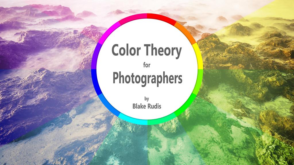
Color Theory for Photographers. Copyright 2016 Blake Rudis. Published by: Blake Rudis
|
|
|
- Rosalind McBride
- 5 years ago
- Views:
Transcription
1
2 Color Theory for Photographers Copyright 2016 Blake Rudis Published by: Blake Rudis Written, Photographed, Designed, and Illustrated by: Blake Rudis This book is designed to provide information for photographers about Color Theory as it pertains to photography. Every effort has been made to make this book as complete and accurate as possible at the time it was written. All rights reserved. This book or parts thereof may not be reproduced in any form, stored in any retrieval system, or transmitted in any form by any means electronic, mechanical, photocopy, recording, or otherwise without prior written permission of the publisher, except as provided by United States of America copyright law. For permission requests, write to the author via The information, views, and opinions contained within this book are that of the author, Blake Rudis. Blake cannot be held legally liable for any damages you may incur from the information provided herein. ISBN-10: ISBN-13:
3 Table of Contents 1. My Experience with Color Theory 5 2. Color Theory Explained 9 3. The Color Wheel and Digital Photography How Colors Interact How Color Can Manipulate Mood Color Theory & Photoshop Color Theory & ON1 Photo Conclusion 53 Downloadable Bonus Content. 55 Continue Your Color Theory Education. 56 About the Author. 57
4

5 My Color Theory journey began with Bob Ross when I was around five years old. You may chuckle at that, but it is true. I would follow along with Bob, who, like a magician, could create an artistic masterpiece in the span of an hour. I was young, and it was challenging to follow along at times, but I possessed something critical back then, the passion and yearning to create. Throughout my life, I have experimented with just about every art form. My childhood crayons and watercolors evolved into acrylic and oil paints in my teenage years. In college, I studied Printmaking and sculpture. Following college, I went back to painting as sculpting materials and printing presses were far out of my budget. Somewhere in my adolescence, my mother handed me my first camera, a Canon AE-1 SLR film camera. I loved it, but I cherished it like a precious relic as the film and processing far exceeded my allowance. I enjoyed photography, but I found it difficult to incorporate it into my many artistic processes. I would use an old Fujifilm digital camera to document my sculptures and paintings, but I would rarely consider those pictures art, more like documents. I discredited my photos because my post processing skills were not at the same level as my painting abilities. At the time, I had no idea that they could both work together. 5

6 As I recall my years as an artist, it does appear to be scattered all over the place like a jack of all trades rather than a master of one. However, I learned a great deal along the way and am a better photographer for it. Reflecting on it now, it is much easier to tie together just how valuable these lessons have been. I started getting into painting when I was around 12 years old, but it wasn t until much later in life that I would understand the colors I was mixing on the canvas. After graduating from the University of Delaware in 2006, I made a pact with myself. No matter what, you will never stop creating. It was this pact that led me on a very long journey with Color Theory. I realized that I had created a plethora of paintings over the years that lacked any solid foundation of Color Theory. Indeed, I had taken courses where Color Theory was explained in detail, but I took them for granted. I found that to be the dull scientific side to an otherwise fun hobby. For all of these reasons, I decided to take on Color Theory like a bull by the horns. Between 2006 and 2007 I conducted and finished over 145 paintings that were strictly for the benefit of furthering my knowledge of color and Color Theory. These paintings were abstract in nature; some only resembled design. Others lacked a term for what they resembled as they were not good enough for the public eye! 6


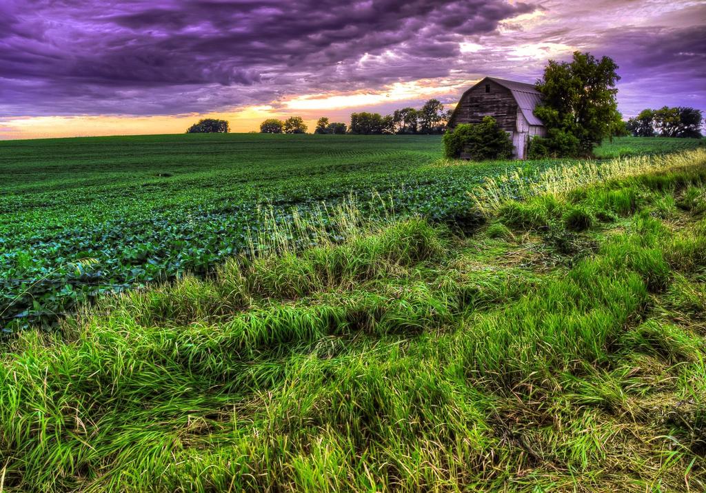
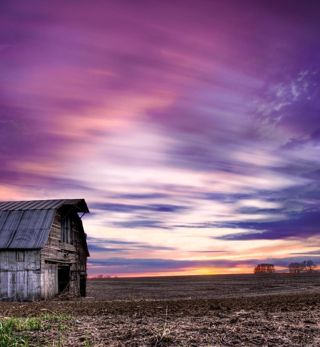
7 I am more grateful than ever for those 145 experimental Color Theory paintings. I knew then that I was making a conscious effort to further my knowledge of color, but I was unaware of the subconscious effect it was having on how I experienced color as a photographer. Photographers often view Color Theory as a painter s skill and overlook how powerful it can be when applied to photography. By the time you finish this book, you should have a better understanding of Color Theory, how to manipulate the mood of your viewer with your color decisions, and what tools you can use in your post processing endeavors to get the most out of your color images. With that said, you will not become an expert overnight. Some artists have spent their entire lives dedicated to Color Theory. Consider this book a manuscript to get you started. A diptych titled Marching to the Beat of My Own Drum. During the extensive color theory studies, these were two abstract paintings that emerged using complementary colors for harmony and lighter hues of color to draw attention to the focal point. My Experience With Color Theory 7
8 8


9 The term Color Theory has been around for centuries, but it is difficult to explain as it means something different to every artist. In its simplest terms, it is how we interact with color in our daily lives. What makes this simple concept so complicated is that everyone experiences color differently. For us artists, we spend quite a bit more time with color than the average human. We use color to explore the world making relationships between colors. We analyze how our color decisions will impact our viewer. We also create works of art with various color palettes to provoke moods and feelings within ourselves and others. Using a scientific method, like Color Theory, we can begin to dissect color and learn how to use if effectively. There is no right or wrong way to study color, and everyone will come to differences of opinion on what is harmonious or offensive. This makes the topic of Color Theory subjective in nature, but there is a critical tool we can use to study it, the Color Wheel. 9
10 10

11 The Traditional Color Wheel To understand Color Theory from a photographer s perspective we must first look at Color Theory and how it relates to a painter. On many occasions, we will refer to painting when discussing digital color concepts. Therefore, I find it more than suiting to cover Color Theory for painters before moving forward. I am more than positive that you have had a lesson in Color Theory at some point in your life, but you may not have been aware of it. You may have seen a Color Wheel like this. You may have even created one in your time. This is the Traditional Color Wheel. It is also referred to as the Painter s Color Wheel and the Old Color Wheel. It is broken down into three categories of Color. Primary Secondary Tertiary The traditional Color Wheel with Red, Yellow and Blue as the Primary Colors. This is the most basic Color Wheel and one you may have seen in your lifetime. The Color Wheel and Digital Photography 11


12 3 Categories of Color From the Traditional Color Wheel Primary Red Yellow Blue Primary colors are colors that possess the purest of pigments from which all other colors are created. With only these three Primary Colors you can make any color combination on the wheel. Secondary Orange Green Violet Secondary Colors are created when you combine two Primary Colors. Red + Yellow = Orange Yellow + Blue = Green Blue + Red = Violet Tertiary Red Orange Yellow Orange Yellow Green Blue Green Blue Violet Red Violet Tertiary Colors are created when you combine Primary Colors with the Secondary Color adjacent to it. Red + Orange = Red Orange Yellow + Orange = Yellow Orange Yellow + Green = Yellow Green Blue + Green = Blue Green Blue + Violet = Blue Violet Red + Violet = Red Violet The Color Wheel and Digital Photography 12


13 The Digital Color Models Just before you get too comfortable with the Traditional Color Wheel, I am going to throw you for a whirl. The Traditional Color Wheel works well for painting, but it has some limiting factors in the digital spectrum in regards to printing ink and light transmission. There are 2 digital color wheel models that render more accurate colors, the subtractive and additive models. The Subtractive Color Model starts with Cyan, Magenta, and Yellow as the primary colors. You may recognize these colors as the pigments in present day printers. When equal parts of each color are mixed they yield true black. To make up the Digital Color Wheel, we must also take into consideration the colors that make up our monitors or the transmission of light. These colors are Red, Green, and Blue. These are also referred to as Additive Colors. When equal parts of each are combined, the result is pure white light. Subtractive Color Model Additive Color Model The Color Wheel and Digital Photography 13


14 The Digital Color Wheel The Digital Color Wheel is a combination of the Additive Color Model and the Subtractive Color Model. With this Color Wheel, accurate hues can be rendered for any color as well as combinations to make pure Black and Pure White. Rather than 3 Primary Colors in the Traditional Color Wheel, we end up with 6 Primary Colors in the Digital Color Wheel that are mapped out on the wheel to the right. Colors in the digital space are created from 256 values. 0 is black, 255 is white, and a color receives its hue based on the point values given to Red, Green, and Blue as seen in the chart below. Any color with a value of 255 will render the most saturated form of that color all point values lower are called hues. Chapter 3 The Color Wheel and Digital Photography 14


15 Color Properties Three distinct properties define color in the digital spectrum. These properties are Saturation, Hue, and Lightness or Luminance. Saturation Hue Lightness (Luminance) The purity of a color is referred to as Saturation. A fully saturated color is its purest form. Very rarely does a color appear fully saturated in nature. Fully Saturated Every Primary Color, or Root Color, can have variations by adding small amounts of other colors. These differences are referred to as Hues. Saturation Reduced by 50% The amount of white or black present in a color is known as Luminance and sometimes Lightness. A painter would refer to these as tines and shades. A tint of a color is achieved by adding white, on the contrary adding black would yield a shade. Saturation is the amount of pigment present in a given color. This can also be referred to as pure color. A hue can be defined as a variation of a root color. Blue is the main root color but Ultramarine is a hue of Blue. Often hues are achieved by mixing unequal parts of two root colors. Lightness, or Luminance, refers to the amount of white or black present in a given color. Using just the Luminance of one color you can create Monochromatic photos. Chapter 3 The Color Wheel and Digital Photography 15


16 Color Relationships Complementary Colors Split Complements Analogous Colors The colors on the wheel have far more relationships than their secondary and tertiary mixtures and properties. Several color relationships are useful in creating harmony and balance in paintings, designs, and photographs. Here are just a few important ones to remember as you are creating your images. With practice, you will begin to see these relationships in the environments you photograph. In your post processing workflow, you can amplify these relationships with various tools. On the following pages, you will see these relationships put into practice. Complementary Colors are any colors that are directly across from one another on the Color Wheel. A Split Complementary Color palette is formed when you select a color and its complement along with the two adjacent Secondary colors. Analogous Colors are any grouping of 3 Colors in close proximity to one another on the Color Wheel. The Color Wheel and Digital Photography 16
17 17

18 18


19 19


20 20
21 21
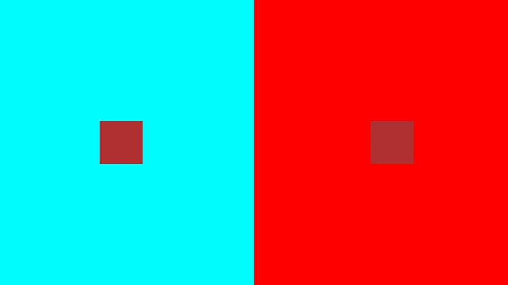
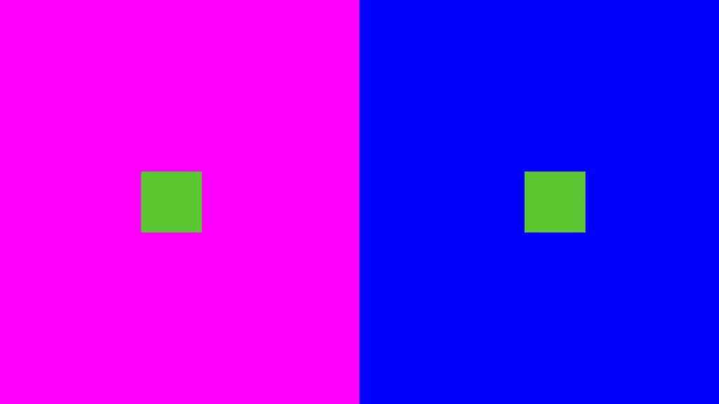
22 Color Interaction There is much more to color interaction than mixing to achieve various hues. Sometimes Colors don t have to be mixed to interact with the viewer s mind. Just placing one color in proximity to another can change its appearance altogether. In the pages to follow, you will see full-size spreads that show how one color can be altered by the presence of another. For these experiments, the small block in the middle will be our controlled element. The larger blocks that fill the left and right side of the page will be our variables. Watch how the block in the middle changes its appearance based on the colors that surround it. Controlled Element Throughout the next few pages, these elements will be the same color. They will be placed on the variables. Take note of how the intensity changes. Variable Elements In our experiments to come, you will see these larger color swatches changing. Pay particular attention to how these colors will affect the intensity, saturation and hue of the Controlled Elements. 22
23
24
25
26

27 Color Interaction The purpose of this exercise was to show you how colors will interact next to and surrounded by one another. During our post processing efforts, it is often tempting to increase the saturation of a color to make it more prominent. Lesser is it known that by reducing the saturation of the surrounding colors one may be able to bring out the target color more effectively without over saturating it. The example used to create these color swatches is available in the Downloadable Bonus Content section of this book. Example 1 - Tone Intensity In this example, you can see how the gray swatch almost appears white on the large black sample. Example 2 - Color Intensity Here we have the Complementary colors cyan and red with a maroon swatch on top. On cyan, the maroon appears far more saturated and intense. On top of red, it seems less saturated and lighter. Example 3 - Color Harmony In this example, the complements are magenta and green. However, the other large swatch is blue. This shows us how green and magenta are more harmonious than blue and green. The surrounding complement, magenta, makes the green appear less saturated. Example 4 - Color & Tone Intensity Here the complements blue and yellow have had their saturation drastically reduced, and a light gray of equal tonal value has been applied on top. Notice how the colors interact with the intensity of the tone. 27
28 28


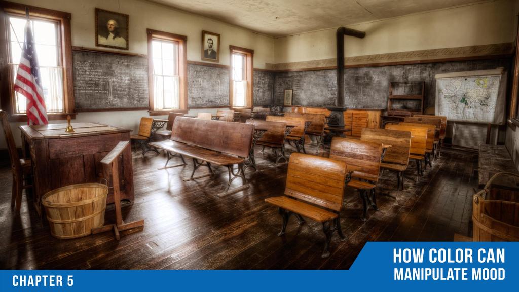
29 Creating Mood with Color Understanding color is important for many reasons. While it is important to know the technical aspects of Color as discussed in Chapters 3 and 4. It is imperative to know that Color can drastically change our viewer s mood. Every color on the color wheel will make the audience feel something different and invoke certain emotions based on their reaction to the color. Understanding this concept will allow you to manipulate the viewer s mood without having to explain the feeling of the scene. The chart to the right shows a range of colors and how each may have a positive or adverse effect dependent upon the color intensity or the context of the color. 29

30 Feeling Vintage or Aged 30
31 Feeling Cold, Scared 31
32 Feeling Anxious, Lonely 32
33 33


34 Color Theory & Photoshop Curves Adjustment Layer Hue Saturation Adjustment Layer Many tools in Photoshop can manipulate color using the Color Theory Principles. Listed here are several useful ways to modify color in Photoshop. However, these are not the only ways to adjust your colors in Photoshop. These tools can be broken down into two categories, Technical, and Artistic. Technical tools are used to increase or reduce saturation and lightness or maintain color accuracy. Artistic tools are used to create mood, draw out emotion, and color grade the photo. Typically, these techniques are used last in the final stage of the post processing workflow. Keep in mind that many of these tools may be utilized for both applications. Selective Color Adjustment Layer Gradient Map Adjustment Layer The Adjustment Layers can be found on the bottom portion of the Layers Palette, the icon looks like a half circle. There are other methods of selecting the Adjustment Layers, but this is the most workflow efficient method. 34


35 Curves Adjustment Layer We typically think of the Curves Adjustment Layer as a tone modifier more than a color modifier. That is because the Curve is often used in the default RGB mode which controls all three color channels at once. The real potential of curves comes out when you use it with the individual color channels. To do this, change the RGB drop down from RGB to the channel you desire. The Tone Curve The Tone Curve can be used to make an image lighter or darker in particular areas of the photo. It can be broken down into three primary sections, Darks, Mids, and Lights. RED Channel GREEN Channel BLUE Channel R is for Red/Cyan G is for Green/Magenta B is for Blue/Yellow Notice how the Channel curve corresponds to its complement depending on the direction that you move it. Using the curve in this manner provides expert control when modifying the colors in your photo. 35

36 Curves Adjustment Layer In the example below, you can see how the Curves RGB, Red, Green, and Blue have been used to color correct the photo and add a more vibrant mood to the overall image. These curves may be used to add artistic effects or for technical adjustments like color correction. 36


37 Hue Saturation Adjustment Layer The Hue Saturation Adjustment Layer boasts many more possibilities for your images than its name implies. Looking back to Chapter 3, we covered the color properties, Hue, Saturation, and Lightness. The Hue/Saturation Adjustment gives you full control over the color properties of the image as a whole (Master) and the individual colors within the picture. With the ability to modify the Hue, Saturation, and Luminance of a given color, the post processing possibilities are nearly endless. Hue: Replaces the selected color with the appropriate color on the color wheel. Moving the slider to the right will replace the color clockwise around the color wheel. Moving the slider to the left will replace the color counter-clockwise around the wheel. Saturation: Increases or decreases the purity of the selected color. Lightness: Adds white or black to the chosen color to increase or decrease the tonal intensity of the selected color. Colorize: Adds a wash of color to the entire image globally. Excellent for Color Grading. With Master selected, any modifications you make to Hue, Saturation, or Lightness will affect all of the colors in the image globally. This can be effective if you just want to boost the overall Saturation a little bit. However, modifying the Hue and Lightness on the Master can yield less than desirable results. It is far more efficient to adjust the individual colors within the adjustment layer to protect other colors while only modifying the color that needs change. Here you can selectively modify the hue of the chosen color, increase its purity with saturation, or increase the tonal depth of the color with the lightness slider. Selecting Colorize will add a Monochromatic effect to the photo respective to the HUE selected. This can be the most useful tool for making Monochromatic images or adding a subtle hint of color. I recommend using it in conjunction with the Color Blend Mode in the Layers palette to preserve the tones in the photo. Adjust the Opacity to taste. A lower Opacity will apply a color tint to the picture. 37


38 Hue Saturation Adjustment Layer Here you can see that the Saturation and the Hue of the color Yellow have been increased to draw attention to them while preserving the integrity of the surrounding colors. In the example below, the Colorize Setting has been checked and a bold Orange Hue was selected. This modification resulted in a Monochromatic image. The same Colorize settings exist in the Hue/Saturation Adjustment layer below. However, the Blend Mode Color has been selected in the Layers Palette with an Opacity of 30%. This adds a subtle, but effective tint of color to the photo. 38


39 Selective Color Adjustment Layer The Selective Color Adjustment Layer is another powerful Color Theory modifier in Photoshop. Similar to the Hue/Saturation Adjustment, it allows you to modify individual colors by mixing them with the other colors around the wheel. It can be used for both technical and artistic adjustments. While the Hue/Saturation and the Selective Color Adjustments may seem similar, they are very different. The Hue/Saturation Adjustment layer allows you to change the entire hue of the color selected which will effectively replace the color with the chosen color on the color wheel. With Selective Color you have the ability to modify the hue of a color by adding varying amounts of other colors. This is similar to a painter's palette where the color red from the tube may need a bit of yellow to increase its intensity, but a slight amount of black to tone it down. Here you are not only modifying the hue, but you are also adding very specific amounts of color to the desired color to achieve the hue you want. In the Selective Color Adjustment Layer, you can select from the primary colors on the Digital Color Wheel and modify them with subtle traces of color. You can add a little bit of more Red to the color Red to increase its intensity or add Cyan to reduce its strength. The sliders on the Selective Color Adjustment are sneaky. There are hidden colors that only someone with Color Theory knowledge, like yourself, would know existed. Each slider controls not only its labeled color but its complement as well. For example, if you were to move the Cyan slider to the right you would be increasing the amount of Cyan in the selected color or tone. If you were to move it to the left, you would be reducing the amount of Cyan by adding its complement, Red. 39


, increased")
40 Selective Color Adjustment Layer The Selective Color Adjustment is used here to enrich the Yellow and Blue in the image. Yellow: Added Cyan, Magenta, Yellow and Black Blue: Added Cyan and Magenta. Reduced yellow (added Blue), increased Black for richer tone. 40


41 Gradient Map Adjustment Layer The Gradient Map Adjustment Layer may be the most underutilized tool for Color Theory manipulation. The Gradient Map assesses the tones in your image and replaces them with the colors you define. Using this in conjunction with Blending Modes, you have complete control over the color in your pictures. When you create a Gradient Map Adjustment Layer, it will select the colors for the Gradient Map based on the primary and secondary colors selected in your palette. The Gradient Map you see here will replace all dark tones in your photograph with Dark Brown and all Light tones with Light Brown. You may select from any gradient in the Presets or plot custom color points on the toggle slider. The image below is the result of the selected gradient. If the default Black and White are selected, it will yield a high contrast black and white image. Replacing black and white with color will apply the selected colors to your tones. However, you have full control over the colors applied to your photograph in the settings of the Adjustment Layer. 41


42 Gradient Map Adjustment Layer Here a Pthalo Blue and Cream Gradient Map has been applied to the image. The Blending Mode was set to normal, so all dark tones are being replaced with a Pthalo Blue, and light tones have been replaced with a Cream hue. The same gradient was applied to this portion of the photo, but the Opacity in the Layers Palette was set to 50%. This allows 50% of the underlying tone and color to show through the selected gradient. Here the Gradient remains the same, but the Opacity is set to 50% with the blend mode set to Overlay. With Overlay selected the Gradient mixes and blends with the Color Tones of the original to achieve an almost cross-processed look. 42
43 43


44 Color Theory & ON1 Photo 10 Color Enhancer Filter Photo Filter ON1 Photo 10 contains a multitude of tools to adjust your photos with the Color Theory principles in mind. ON1 Photo 10 works as a standalone program and a plugin to your filters in Photoshop making it a useful and efficient tool for photo post processing. ON1 Photo 10 is a suite of programs that are designed to aid in specific tasks. The entire suite covers the gamut of post processing needs from basic adjustments in ON1 Enhance to creating intricate masks in ON1 Layers. Another program included in the suite is ON1 Effects 10. Split Tone Filter Black & White Filter ON1 Effects 10 is a driving force for image post processing. It can be used for minimal edits or for compelling artistic effects. Listed here are just a few of the filters you will find in Effects that are ideal for adjusting the Color Theory principles we have discussed thus far. With Effects 10 you can create works of art with filters that can be applied individually or as a group for limitless possibilities. The selected few listed above are excellent for Color Theory adjustments. 44


45 Color Enhancer Filter The Color Enhancer filter in Effects 10 is similar to the Hue/Saturation Adjustment Layer in Photoshop with some added benefits. Not only does it allow you to modify the Hue, Saturation, and Lightness in the overall image or individual colors, it also allows for global Temperature, Tint, and Vibrance adjustments. In my workflow I target three specific areas on every photo in this order: 1. Tone 2. Color 3. Artistic Effects The Color Enhancer Filter effectively addresses the second target area in my workflow. The Color Enhancer Filter is broken down into several useful parts. The top portion will access blend modes and the overall Opacity of the filter. The middle section contains the necessary adjustments for color, both globally and selectively. The lower part, Purity, protects the Highlights and Shadows from color adjustments. Here you can see the full range of colors that you have access to for local color adjustments. Global changes affect the entire image as a whole, and local adjustments target specific areas. Here you can target specific colors and adjust their intensity and hue. There are several useful protection measures built into every filter. Here you can adjust the filter effect by protecting Highlights, Shadows, and Skin Tones. 45


46 Color Enhancer Filter Here the Color Enhancer Filter was used to adjust the green color cast in the original photograph using various tools. The Temperature and Tint adjustments were used to enhance the photo globally. Then the Selective Color Adjustments were used to make locally targeted changes for a more accurate color rendering. Here the filter is being used for technical, rather than artistic, purposes. 46


47 Photo Filter The Photo Filter in Effects 10 is much more versatile than the name implies. What makes it unique is its ability to replicate real photo filters, just like the ones you would screw onto your lens. You can choose from a solid color which can add a subtle wash of color over the entire photo or aid in making monochromatic images by reducing the underlying layers saturation. Using these filters, you have quite a bit of control over tone, color, and depth in your photos. For instance, you can apply a Graduated filter and set it to blue to increase color intensity, or you can tame bright blue skies by adding a yellow or orange filter with low strength. Each photo filter has different adjustments that are prompted when you select them. These adjustments can be used for technical corrections as well as artistic effects. Don t let the basic adjustments fool you. With a bit of creativity, these filters can bee used for a variety of artistic effects. 47


48 Photo Filter In this example, a Blue Graduated Filter was selected and applied only to the sky. Using the skin protection, the building, and the foreground grass were not affected by the filter. However, the blue color chosen added depth to the sky by increasing the saturation of the pockets of blue sky. Below, a Solid Color was chosen to add a subtle wash of color over the entire photo. The effect is less about being technically correct and more about adding an artistic element to create mood by adding a dramatic cream color. Here the Bi-Color Filter is selected giving the image a dual color cast dictated by their individual strengths. This effect, like the previous, may not be technically correct, but it adds an artistic element to the photo. The result appears to be a day-to-night effect. 48


49 Split Tone Filter The Split Tone Filter in ON1 Effects 10 allows you to replace the Highlights and Shadows in your photo with any color you choose. It is useful for creating artistic effects, especially when adhering to the color theory principles. We discussed how complementary colors worked in harmony in Chapter 3. With this filter, you can apply them effectively. By replacing the Highlights and Shadows with complementary colors, you can create harmonious effects that are either blatantly obvious with stark color casts, or subliminal with subtle undertones. With the Split Tone Filter, you can apply various colors to the highlights and shadows in your photos. The degree of color applied can be adjusted with the Amount Slider. The Blend Mode selected will make a difference in the outcome of your color choices. When set to Normal, the colors will be applied to the Highlights and Shadows with the selected intensity. With the Color Blend Mode, the underlying tones of the image will show through the selected colors. I find the Color Blend Mode with low amounts to be the most useful selection for subliminal color tones. 49

50 Split Tone Filter In this example, the Amounts for each color are set to 100 with the Color Blend Mode selected to preserve the underlying tones. At 100% the colors apply a very strong cast over the image making it appear like an analogous color image. The same colors and blend mode are selected for the example below. However, the Amounts have been significantly reduced. Notice how this applies a subtle wash of harmonious color over the entire image. 50


51 Black & White Filter After manipulating the Tone and Split Toner settings, use the Opacity to reduce the effect and allow the underlying colors to show through. The Black and White Filter in ON1 Effects is extremely versatile. It can be used to make beautiful Black and White images. If you think outside the box a bit, you can use it to manipulate the principles of Color Theory. By default, the filter will be set to a Black and White effect upon selection. If you scroll down to the Toner section you will see something that is very similar to the Split Toning Filter. The only difference is the inability to select multiple blend modes. The Preserve Whites & Blacks option is effectively the Color Blend Mode. What makes the B&W Filter significantly different than Split Tone Filter is the ability to modify the tones in the image along with the split tone color. Using the tone section you can create various monochromatic images. The tone section of the Black & White Filter makes it a compelling candidate for monochromatic image manipulation. Here you can modify the tones that will show through the selected Toner settings below. There are various Toner presets built into Effects. You may create your custom presets similar to the Split Tone Filter we discussed in the previous section. Used in combination with the Toner settings, you can create some powerful effects with one filter. 51

52 Black & White Filter In the following examples, the Toner remained constant, a pale yellow for the Highlights and dark blue for the shadows. Throughout the adjustments, the variable elements were the tone settings. Notice how the monochromatic image drastically changes with the various tone selections 52

53 53


54 Conclusion We have covered many important aspects of Color Theory. You have seen the evolution of the Color Wheel, the Color Models, the various color properties, and their special relationships. You now know that color can play an integral role in the viewers mood. You have also seen how different colors interact when placed adjacent to one another. You now possess the knowledge to tackle color theory relationships in Photoshop and ON1 Effects 10, but your journey does not stop here! Color Theory is a rather comprehensive topic that is difficult to cover in its entirety in one book. Several hundred artists before you have spent their entire lives studying color theory. You must now embark on your journey with these concepts in mind and develop your own relationships and theories. Throughout your adventure, you will encounter ebbs and flows. I implore you not to get discouraged in your color theory journey. Everyone sees and interacts with color differently. Make notes, both mental and written, print out the color wheel and reference it often, and never underestimate the influence color has on your viewer. 54


55 Bonus Content The example PSD file used in Chapter 4. This is a Photoshop File that can be modified for your color interaction experiments. Just double click the Solid Color Fill layers and set them the to colors you want to test. A.PNG Color Wheel that can be printed and placed near your workstation or put on your images as you work to see how your effects are affecting the colors on the Digital Color Wheel. Eleven ON1 Effects 10 Presets ready to be imported into your version of ON1 Effects. Many of the examples shown in this book are available as presets. 55

56 Continue Your Color Theory Education You can continue your path of Color Theory education with me. I have developed a system for manipulating color in Photoshop known as the Color Zone System. Included in this course is over 3 hours of education, an efficient system you can implement today, and all the follow along resources required. With the Color Zone System, you gain complete control over the colors in your photographs. The system seamlessly weaves its way into your workflow with the versatility of an Action that does all of the hard work for you. There are 12 colors in the Color Zone System and each color can be independently modified to ensure you do not affect the image globally when you want a color specific adjustment. This type of control lends you endless possibilities. You essentially become a painter of color on your photographs. enter the code ON1theory for $30 off 56

57 About the Author Blake Rudis is a self-published author and the host of f64 Academy. While his focus has been strong in HDR photography for the past five years or so, he is most passionate about post-processing images in Photoshop and mentoring others. Blake takes great pride in his Fine Art background. From Acrylic and Oil Painting to Printmaking and Sculpture he has had his hands in just about every art form. This has been paramount in shaping his ideologies on photography and post-processing. For Blake, it is not about the act of photography, but the artistic process as a whole. 57
COLOR AS A DESIGN ELEMENT
 COLOR COLOR AS A DESIGN ELEMENT Color is one of the most important elements of design. It can evoke action and emotion. It can attract or detract attention. I. COLOR SETS COLOR HARMONY Color Harmony occurs
The Color Wheel is a visual representation of color theory. It is the color spectrum wrapped onto a circle.
 The Color Wheel is a visual representation of color theory. It is the color spectrum wrapped onto a circle. It creates an orderly progression of color that helps us understand color balance and harmony.
Color Theory and Mixing
 MODULE 4 Color Theory and Mixing? What is explored in this module? In this module, we ll look at basic color theory and mixing colors. You ll find that color theory and mixing is not a perfect science.
color basics theory & application Fall 2013 Ahmed Ansari Communication Design Fundamentals
 color basics theory & application Fall 2013 Ahmed Ansari Communication Design Fundamentals Presentation 7 Tom Fraser + Adam Banks Designer's Color Manual Johannes Itten The Art of Color Ellen Lupton &
A Basic Guide to Photoshop Adjustment Layers
 A Basic Guide to Photoshop Adjustment Layers Photoshop has a Panel named Adjustments, based on the Adjustment Layers of previous versions. These adjustments can be used for non-destructive editing, can
Choose Paint Colors and Schemes
 Choose Paint Colors and Schemes When you re decorating your home, choosing the right paint colors is the most important decision you ll make. As fun as choosing colors can be, this part of the planning
Black and White Photoshop Conversion Techniques
 Black and White Photoshop Conversion Techniques Andrew Gibson on Jan 27th 2011 Final Product What You'll Be Creating A quick glance through any photography or fashion magazine, or at the photos on social
Translating the Actual into a Digital Photographic Language Working in Grayscale
 Translating the Actual into a Digital Photographic Language Working in Grayscale Overview Photographs are informed by considered and intentional choices. These choices are suggested by a need or desire
Above and Beyond. designed by Stephanie Cooper 1
 Above and Beyond designed by Stephanie Cooper 1 Color Workshop Spring 2011 Above and Beyond designed by Stephanie Cooper 2 3 Introduction to Cyan A clear, cyan-colored sky is symbolic. Cyan greets us first
A Basic Guide to Photoshop CS Adjustment Layers
 A Basic Guide to Photoshop CS Adjustment Layers Alvaro Guzman Photoshop CS4 has a new Panel named Adjustments, based on the Adjustment Layers of previous versions. These adjustments can be used for non-destructive
Value. Value-It is the lightness or darkness of an object, regardless of color. Value is relative to the background color and other items on the page.
 Value Value-It is the lightness or darkness of an object, regardless of color. Value is relative to the background color and other items on the page. Value is created by a light source that shines on an
Color Theory. Additive Color
 Color Theory A primary color is a color that cannot be made from a combination of any other colors. A secondary color is a color created from a combination of two primary colors. Tertiary color is a combination
Tablet overrides: overrides current settings for opacity and size based on pen pressure.
 Photoshop 1 Painting Eye Dropper Tool Samples a color from an image source and makes it the foreground color. Brush Tool Paints brush strokes with anti-aliased (smooth) edges. Brush Presets Quickly access
Diploma in Photoshop
 Diploma in Photoshop Adjustment Layers An adjustment layer applies colour and tonal adjustments to your image without permanently changing pixel values. The colour and tonal adjustments are stored in the
In order to manage and correct color photos, you need to understand a few
 In This Chapter 1 Understanding Color Getting the essentials of managing color Speaking the language of color Mixing three hues into millions of colors Choosing the right color mode for your image Switching
What s New in Capture NX
 What s New in Capture NX Thank you for downloading the latest version of Capture NX, with support for Picture Controls and other new features. Please note the following changes to the manual. En Camera
Understanding Color Theory Excerpt from Fundamental Photoshop by Adele Droblas Greenberg and Seth Greenberg
 Understanding Color Theory Excerpt from Fundamental Photoshop by Adele Droblas Greenberg and Seth Greenberg Color evokes a mood; it creates contrast and enhances the beauty in an image. It can make a dull
Using Adobe Photoshop
 Using Adobe Photoshop 4 Colour is important in most art forms. For example, a painter needs to know how to select and mix colours to produce the right tones in a picture. A Photographer needs to understand
Elements Of Art Study Guide
 Elements Of Art Study Guide General Elements of Art- tools artists use to create artwork; Line, shape, color, texture, value, space, form Composition- the arrangement of elements of art to create a balanced
Color and More. Color basics
 Color and More In this lesson, you'll evaluate an image in terms of its overall tonal range (lightness, darkness, and contrast), its overall balance of color, and its overall appearance for areas that
Notes on colour mixing
 INFORMATION SHEET These notes, with the diagrams in colour, can be found on the internet at: http://www.andrewnewland.com/homepage/teaching Notes on colour mixing Andrew Newland T E A C H I N G A R T &
Painting Special Effects on Photographs
 TUTORIAL 7 Painting Special Effects on Photographs In this tutorial you will learn how to transform a photo into a striking color composition with paintbrushes, masks, blending modes, color, and paper
Color Balancing Techniques
 Written by Jonathan Sachs Copyright 1996-2007 Digital Light & Color Introduction Color balancing refers to the process of removing an overall color bias from an image. For example, if an image appears
Color is a property of light.
 Color Theory I Color is a property of light. -Objects have no color of their own, they just reflect a particular wavelength from the color spectrum. (For example a blue object absorbs all of the wavelengths,
Hot or Cold? Warm Colors: Yellow, Orange, Red (excitement) Cool Colors: Green, Blue, Violet (calmness)
 Cool Colors: Green, Blue, Violet (calmness)") Art Basics The Color Wheel Primary Colors: a group of colors from which all other colors can be obtained by mixing. Ex: Yellow, Red, and Blue Secondary Colors: a color resulting from the mixing of two
Art Basics The Color Wheel Primary Colors: a group of colors from which all other colors can be obtained by mixing. Ex: Yellow, Red, and Blue Secondary Colors: a color resulting from the mixing of two
Line. The path created by a point moving through space. i n. Horizontal Line. Thin Line. Thick Line
 Line The path created by a point moving through space. V er Horizontal Line Diagonal Line Zig-Zag Line Wavy Line t i c a l L i n e Spiral Line Thin Line Thick Line Line can help create the illusion of
The basic tenets of DESIGN can be grouped into three categories: The Practice, The Principles, The Elements
 Vocabulary The basic tenets of DESIGN can be grouped into three categories: The Practice, The Principles, The Elements 1. The Practice: Concept + Composition are ingredients that a designer uses to communicate
Choosing your colour. A personal choice for sure, but
 Choosing your colour. A personal choice for sure, but MAKING CHOICES THAT WORK FOR YOU: So how do YOU go about choosing colours for new work? The project pattern or your stash on hand? By what is available
1. Brightness/Contrast
 1. Brightness/Contrast Brightness/Contrast makes adjustments to the tonal range of your image. The brightness slider is for adjusting the highlights in your image and the Contrast slider is for adjusting
Black and White using Photoshop
 Topics to be covered: Methods for B&W conversion Improving the image Toning Printer color management Black and White using Photoshop Various ways to get to B&W Adobe Raw Converter (ACR) in from Bridge
> color scheme painting
 > color scheme painting > objective(s): Students will create a highly accurate brush overlay painting of a closely cropped image of their eye using only colors within a specific selected color scheme,
Part I: Color Foundations The Basic Principles of COLOUR theory
 Part I: Color Foundations The Basic Principles of COLOUR theory Colour Systems Available colour systems are dependent on the medium with which a designer is working. When painting, an artist has a variety
COLORIZING IMAGES WITH GRADIENT MAPS
 COLORIZING IMAGES WITH GRADIENT MAPS In this Photoshop tutorial, we ll learn how to add complex colorizing effects to images using custom gradients! Specifically, we ll look at the Gradient Map image adjustment
Chapter 4. Incorporating Color Techniques
 Chapter 4 Incorporating Color Techniques Color Modes Photoshop displays and prints images using specific color modes A mode is the amount of color data that can be stored in a given file format 2 Color
Art Vocabulary Assessment
 Art Vocabulary Assessment Name: Date: Abstract Artwork in which the subject matter is stated in a brief, simplified manner; little or no attempt is made to represent images realistically, and objects are
Digital Design and Communication Teaching (DiDACT) University of Sheffield Department of Landscape. Adobe Photoshop CS5 INTRODUCTION WORKSHOPS
 University of Sheffield Department of Landscape. Adobe Photoshop CS5 INTRODUCTION WORKSHOPS") Adobe INTRODUCTION WORKSHOPS WORKSHOP 1 - what is Photoshop + what does it do? Outcomes: What is Photoshop? Opening, importing and creating images. Basic knowledge of Photoshop tools. Examples of work.
Adobe INTRODUCTION WORKSHOPS WORKSHOP 1 - what is Photoshop + what does it do? Outcomes: What is Photoshop? Opening, importing and creating images. Basic knowledge of Photoshop tools. Examples of work.
Correction Techniques
 10 Advanced Color Correction Techniques Learning Objectives After completing this chapter, you will be able to: Explain how a computer monitor displays color. Describe how color is created in the printing
Part 2: Spot Color Lessons
 Why White? The importance of white in color printing is often overlooked. The foundation of color printing is based on applying Cyan, Magenta, Yellow and Black (CMYK) onto white paper. The paper s white
XXXX - ILLUSTRATING FROM SKETCHES IN PHOTOSHOP 1 N/08/08
 INTRODUCTION TO GRAPHICS Illustrating from sketches in Photoshop Information Sheet No. XXXX Creating illustrations from existing photography is an excellent method to create bold and sharp works of art
CUT the wheel vertically IN HALF: WARM (right) AND COOL COLORS (left)
 AND COOL COLORS (left)") COLOR CHEAT SHEET! Simons Arts123 The following information has been collected from a number of websites. See: http://www.youtube.com/watch?v=059-0wrjpau Karen Kavet http://www.color-wheel-pro.com/color-schemes.html
COLOR CHEAT SHEET! Simons Arts123 The following information has been collected from a number of websites. See: http://www.youtube.com/watch?v=059-0wrjpau Karen Kavet http://www.color-wheel-pro.com/color-schemes.html
HISTOGRAMS. These notes are a basic introduction to using histograms to guide image capture and image processing.
 HISTOGRAMS Roy Killen, APSEM, EFIAP, GMPSA These notes are a basic introduction to using histograms to guide image capture and image processing. What are histograms? Histograms are graphs that show what
Master digital black and white conversion with our Photoshop plug-in. Black & White Studio plug-in - Tutorial
 Master digital black and white conversion with our Photoshop plug-in This Photoshop plug-in turns Photoshop into a digital darkroom for black and white. Use the light sensitivity of films (Tri-X, etc)
Hue is what makes a color identifiable and different from any other color, e.g. orange, red-orange, red.
 Hue Hue is what makes a color identifiable and different from any other color, e.g. orange, red-orange, red. Hues are determined (and can be measured) by a color's wavelength. There are millions of hues
Tutorial Another Rainy Day
 For this tutorial I wanted to take people through the process that I go through when painting buildings. In this tutorial I will be showing you how to paint A Rainy Day in four easy to follow steps...
Wright Field Scale Modelers. Color Mixing: Everything you thought you knew about color is wrong.
 Wright Field Scale Modelers Color Mixing: Everything you thought you knew about color is wrong. Sources http://www.huevaluechroma.com/ Written by a color scientist, Dr. Briggs. It is a bit technical. Principles
Deposit Central School District Curriculum Map
 GRADE LEVEL: 5-6 What are the most effective ways to use the elements of art and principals of design in art? In what ways can I incorporate the elements of art and principles of design together in art?
UBT128X Colour theory
 UBT128X Colour theory Unit reference number: L/507/5481 Level: 3 Guided Learning (GL) hours: 25 Overview This unit is about exploring the concepts and theories of colour. Learners will develop the knowledge
Luminosity Masks Program Notes Gateway Camera Club January 2017
 Luminosity Masks Program Notes Gateway Camera Club January 2017 What are Luminosity Masks : Luminosity Masks are a way of making advanced selections in Photoshop Selections are based on Luminosity - how
Hue Value Intensity tint shade Tones
 COLOR Color Color is the element of art that is derived from reflective light. You see color because light waves are reflected from objects to your eyes. White light from the sun is actually a combination
B&W Photos from Colour:
 Quick and Dirty Methods for PS, PS Elements and Canon Software 8/1/2007 New Westminster Photography Club Derek Carlin New Westminster Photography Club Page 1 Introduction This is a very brief article on
Color Correction and Enhancement
 10 Approach to Color Correction 151 Color Correction and Enhancement The primary purpose of Photoshop is to act as a digital darkroom where images can be corrected, enhanced, and refined. How do you know
CS 547 Digital Imaging Lecture 2
 CS 547 Digital Imaging Lecture 2 Basic Photo Corrections & Retouching and Repairing Selection Tools Rectangular marquee tool Use to select rectangular images Elliptical Marque Tool Use to select elliptical
GRAPHICS TECHNOLOGY II
 GRAPHICS TECHNOLOGY II COLORS ARE PART OF OUR LIFE From the clothes we wear, to the things around us, the food we eat, the things we use- everything. Colors are said to activate the right brain for emotions.
How to use advanced color techniques
 How to use advanced color techniques In Adobe Photoshop, you can adjust an image s colors in a variety of ways. Using the techniques described in this guide, you can take the raw material of your image
The Elements of Art: Photography Edition. Directions: Copy the notes in red. The notes in blue are art terms for the back of your handout.
 The Elements of Art: Photography Edition Directions: Copy the notes in red. The notes in blue are art terms for the back of your handout. The elements of art a set of 7 techniques which describe the characteristics
Pacific New Media David Ulrich
 Pacific New Media David Ulrich pacimage@maui.net www.creativeguide.com 808.721.2862 Digital Imaging Workflow in Adobe Photoshop All color and tonal correction editing should be done in a non-destructive
Color Reproduction. Chapter 6
 Chapter 6 Color Reproduction Take a digital camera and click a picture of a scene. This is the color reproduction of the original scene. The success of a color reproduction lies in how close the reproduced
How to use advanced color techniques
 Adobe Photoshop CS5 Extended Project 6 guide How to use advanced color techniques In Adobe Photoshop CS5, you can adjust an image s colors in a variety of ways. Using the techniques described in this guide,
The Elements and Principles of Art
 The Elements and Principles of Art The elements and principles can be applied to discuss any of the visual arts including: painting, photography, set design, graphic design, sculpture, and architecture.
How to use advanced color techniques
 Adobe Photoshop CC Guide How to use advanced color techniques In Adobe Photoshop, you can adjust an image s colors in a variety of ways. Using the techniques described in this guide, you can take the raw
Adobe Photoshop Chapter 5 Study Questions /50 Total Points
 Name: Class: Date: Adobe Photoshop Chapter 5 Study Questions /50 Total Points True/False Indicate whether the statement is true or false. 1. Bitmapped images are resolution-independent, maintaining their
Adding Dimension to Your Monochrome Images
 Adding Dimension to Your Monochrome Images Printing Duotones, Tritones, and Quadtones 2004, Glenn E. Mitchell II, Ph.D. of The Light s Right Studio, http://www.thelightsrightstudio.com Computer programs,
Master digital black and white conversion with our Photoshop plug-in. Black & White Studio plug-in - Tutorial
 Master digital black and white conversion with our Photoshop plug-in This Photoshop plug-in turns Photoshop into a digital darkroom for black and white. Use the light sensitivity of films (Tri-X, etc)
Tiered Assignments th Grade Art I
 Value & Color Tiered Assignments 9-12 th Grade Art I Color is one of the most powerful elements the artist uses for expression, prompting aesthetic responses, creating contrast, value, mood, and expressive
Spears Art Studio High School and Adult Beginners Painting with Oil and/oracrylic. Can You Answer? Brushy Creek
 Spears Art Studio High School and Adult Beginners Painting with Oil and/oracrylic Can You Answer? Brushy Creek Brushy Creek reference photo and painting D. S. Spears oil on canvas image size: 40"x30" Spears
COLOR THEORY. The Color Wheel
 COLOR THEORY COLOR THEORY Color theory encompasses a multitude of definitions, concepts and design applications. All the information would fill several encyclopedias. As an introduction, here are a few
ADJUSTMENT LAYERS TUTORIAL
 ADJUSTMENT LAYERS TUTORIAL I briefly showed layers in the original layers tutorial but there is a lot more to layers than discussed there. First let us recap the premise behind layers. Layers are like
The Magazine for Photographers August 2016
 The Magazine for Photographers The Magazine for Photographers CONTENTS AUGUST 4 Color Tinting in Photoshop 17 Circular Polarizer Tips 29 Step by Step: Mirror Image 37 Export Settings 54 (Not So) Smart
> andy warhol > objective(s): > curricular focus: > specifications: > instruction: > procedure: > requirements:
: > curricular focus: > specifications: > instruction: > procedure: > requirements:") > andy warhol > objective(s): Students will select a portrait image, crop it tightly and eliminate the background, then uniquely color several times in the style of Andy Warhol. > curricular focus: This
> andy warhol > objective(s): Students will select a portrait image, crop it tightly and eliminate the background, then uniquely color several times in the style of Andy Warhol. > curricular focus: This
Red. By Jessica Lia BREAKFAST STOCK CLUB PREMIUM CHALLENGE #85
 S E Q U O I A C L U B BREAKFAST STOCK CLUB PREMIUM CHALLENGE #85 Red By Jessica Lia As a stock photographer, it s a ritual for me to shoot something for Christmas and Valentine s Day every year because
This tutorial will show you how to use artistic grunge overlays to transform your photos into works of art.
 ARTISTIC GRUNGE OVERLAYS For all photo editing software that supports PNG files If you have any questions, please feel free to contact me at kim@photosbykimhill.com. This tutorial will show you how to
Painting Mid-Term Study Guide
 Painting Mid-Term Study Guide The exam is broken into 3 specific areas with a collection of questions that involves the following areas: ELEMENTS AND PRINCINPLES, PAINTING TECHNIQUES, and MATERIALS. These
Color is derived from Reflected Light.
 How We See Color Color is derived from Reflected Light. White light from the sun is actually a combination of all colors. When light passes through a prism, a wedge-shaped glass, the beam of light bends
Selective Editing in Camera Raw 5
 Selective Editing in Camera Raw 5 The editing tools that you saw in the last chapter are global editing tools. That is, they affect all parts of the image. So, when you choose to, for example, brighten
Colors in Images & Video
 LECTURE 8 Colors in Images & Video CS 5513 Multimedia Systems Spring 2009 Imran Ihsan Principal Design Consultant OPUSVII www.opuseven.com Faculty of Engineering & Applied Sciences 1. Light and Spectra
LECTURE 07 COLORS IN IMAGES & VIDEO
 MULTIMEDIA TECHNOLOGIES LECTURE 07 COLORS IN IMAGES & VIDEO IMRAN IHSAN ASSISTANT PROFESSOR LIGHT AND SPECTRA Visible light is an electromagnetic wave in the 400nm 700 nm range. The eye is basically similar
Principles of Architectural Design Lec. 2.
 Principles of Architectural Design Lec. 2. The Complementary Elements of design. The complementary elements characterize the natural elements, creating means of comparison for the primary elements used
Properties of Color. Value: Tint: Shade: Tone: Intensity:
 Seeing Color Color and light are inseparable, without light there would be no color When light passes through a prism a spectrum of colors becomes visible Defining Color Hue The name of a color, such
Elements of Art. Define: Line. Shape. Value. Texture. Color. Form. Space
 Elements of Art Line Shape Value Texture Color Form Space Directions: When we talk about the parts that make up a picture or work of art, we refer to them as elements. In the space below, draw a picture
Convert RAW Files to Black-and-White Images
 Convert RAW Files to Black-and-White Images Contributor: Seán Duggan n Specialty: Fine Art Primary Tools Used: Saturation slider and Calibration tab Camera Raw offers a great deal of control for crafting
Adobe Photoshop. Levels
 How to correct color Once you ve opened an image in Photoshop, you may want to adjust color quality or light levels, convert it to black and white, or correct color or lens distortions. This can improve
DEFINING THE FOCAL POINT
 Sunrise 124 10 DEFINING THE FOCAL POINT These projects demonstrate the thought process behind the composition design of two paintings that have strong focal points. You ll begin each painting using your
Colorizing A Photo With Multiple Colors In Photoshop
 Colorizing A Photo With Multiple Colors In Photoshop Written by Steve Patterson. In this Photoshop Effects tutorial, we re going to learn how to colorize a photo using multiple colors. It s an effect I
CColor Theory in Design
 CColor Theory in Design The Color Wheel The Color Wheel A color circle, based on red, yellow and blue, is traditional in the field of art. Sir Isaac Newton developed the first circular diagram of colors
Primary Hue Color Wheels
 Primary Hue Color Wheels You can make your own basic six color wheels using different combinations of your primary colors, and then mixing the secondaries from your choices. This will give you a quick
DESIGN CHALLENGE 6 Color Project Due: 11/20/17. Size : minimum dimension of 12 X 14. Project Objectives
 DESIGN CHALLENGE 6 Color Project Due: 11/20/17 Size : minimum dimension of 12 X 14 Project Objectives Develop visual understanding of the differences between subject matter and form.intentionally translate
check it out online at
 check it out online at www.belyea.com/svc/all_about_color.pdf Who am I? I got the blues Experience and Emotions through color PASSION JOY Depression HARMONY CREATIVITY PEACE MOURNING It s a bird, it s
the RAW FILE CONVERTER EX powered by SILKYPIX
 How to use the RAW FILE CONVERTER EX powered by SILKYPIX The X-Pro1 comes with RAW FILE CONVERTER EX powered by SILKYPIX software for processing RAW images. This software lets users make precise adjustments
The Color Wheel. The color wheel shows relationships between the colors.
 Color Wheel The Color Wheel The color wheel shows relationships between the colors. Artists often use the color wheel to help understand how colors relate to one another. The Color Wheel Let s learn about
Assessment Project Requirements 10 x ppi
 Color Replacement Color Wheel The color wheel provides independent artists, designers, illustrators and any other professionals that depend on color a foundation for choosing and creating colorful designs.
ARTS D Design. Project 1: Art Elements. Reading Guide: form. elements of art. line. shape. value. texture. color. principles of organization
 ARTS 101 2-D Design Project 1: Art Elements Reading Guide: form elements of art line shape value texture color principles of organization harmony variety balance proportion dominance movement economy unity
Contents: Bibliography:
 ( 2 ) Contents: Sizing an Image...4 RAW File Conversion...4 Selection Tools...5 Colour Range...5 Quick Mask...6 Extract Tool...7 Adding a Layer Style...7 Adjustment Layer...8 Adding a gradient to an Adjustment
LIGHTIG FOR INTERIORS
 LIGHTIG FOR INTERIORS COLORS LIGHTING Interior Design Department Third grade/ Fall semester Siba nazem Kady COLORS THEORIES OF COLOR DESIGN Review The Hue REVIEW HUE,VALUE, AND SATURATION - Gradation of
Essential Skills - 3 Key Blend Modes. Ken Fisher
 Ken Fisher One of the best ways to understand blending modes is to experiment with them. Get two layers together and play around. The results sometimes will leave you cold, the effects wont inspire you.
Contents. Teachers Notes 4 Handy Hints 5 Colour 7 Techniques Explained 8 How To Use This Book 9
 Contents Teachers Notes 4 Handy Hints 5 Colour 7 Techniques Explained 8 How To Use This Book 9 Beach Umbrella 10-12 Chameleon 13-15 Banana Sundae 16-18 Life Cycle 19-21 Don t Bully Me 22-23 Balloon Faces
PHOTOSHOP DESIGN EFFECTS FOR INTERMEDIATE TO ADVANCED USERS
 PHOTOSHOP DESIGN EFFECTS FOR INTERMEDIATE TO ADVANCED USERS Copyright 2012, National Seminars Training Introduction This class is all about design effects in Adobe Photoshop. For example, let s say that
Chapter Objectives. Color Management. Color Management. Chapter Objectives 1/27/12. Beyond Design
 1/27/12 Copyright 2009 Fairchild Books All rights reserved. No part of this presentation covered by the copyright hereon may be reproduced or used in any form or by any means graphic, electronic, or mechanical,
PUBLIC BETA: LUMINAR FOR WINDOWS Facts, Features & Tools
 PUBLIC BETA: LUMINAR FOR WINDOWS Facts, Features & Tools Key Facts Release date: Public Beta for Windows: July 13, 2017 Full featured version for Windows: late 2017 Product name: Public Beta of Luminar
COLORIZE A PHOTO WITH MULTIPLE COLORS
 COLORIZE A PHOTO WITH MULTIPLE COLORS In this Photoshop photo effects tutorial, we re going to learn how to colorize a photo using multiple colors. It s an effect I ve seen used quite a bit in ads for
The Unsharp Mask. A region in which there are pixels of one color on one side and another color on another side is an edge.
 GIMP More Improvements The Unsharp Mask Unless you have a really expensive digital camera (thousands of dollars) or have your camera set to sharpen the image automatically, you will find that images from