Describing Data: Displaying and Exploring Data. Chapter 4
|
|
|
- Julius Mitchell
- 5 years ago
- Views:
Transcription

1 Describing Data: Displaying and Exploring Data Chapter 4
2 Learning Objectives Develop and interpret a dot plot. Develop and interpret a stem-and-leaf display. Compute and understand quartiles. Construct and interpret box plots. Draw and interpret a scatter diagram. Construct and interpret a contingency table.
3 Dot Plot A dot plot groups the data as little as possible and the identity of an individual observation is not lost. To develop a dot plot, each observation is simply displayed as a dot along a horizontal number line indicating the possible values of the data. If there are identical observations or the observations are too close to be shown individually, the dots are piled on top of each other.

4 Dot Plot Example 1: Recall Whitner Autoplex from chapter 2, Develop a dot plot for the selling prices.


5 Dot Plot Example: Reported below are the number of vehicles sold in the last 24 months at Smith Ford Mercury Jeep, Inc., in Kane, Pennsylvania, and Brophy Honda Volkswagen in Greenville, Ohio. Construct dot plots and report summary statistics for the two small-town Auto USA lots.
6 Stem-and-Leaf In Chapter 2, we showed how to organize data into a frequency distribution. The major advantage to organizing the data into a frequency distribution is that we get a quick visual picture of the shape of the distribution. One technique that is used to display quantitative information in a condensed form is the stem-and-leaf display.
7 Stem-and-Leaf Stem-and-leaf display is a statistical technique to present a set of data. Each numerical value is divided into two parts. The leading digit(s) becomes the stem and the trailing digit the leaf. The stems are located along the vertical axis, and the leaf values are stacked against each other along the horizontal axis. Advantage of the stem-and-leaf display over a frequency distribution - the identity of each observation is not lost.
8 Stem-and-Leaf Suppose we have seven observations 96, 94, 93, 94, 95, 96, and 97. The stem value is the leading digit or digits, in this case 9. The leaves are the trailing digits. The stem is placed to the left of a vertical line and the leaf values to the right. The values in the 90 up to 100 class would appear as Then, we sort the values within each stem from smallest to largest. Thus, the second row of the stem-and-leaf display would appear as follows:

9 Stem-and-Leaf Example: Listed in Table 4 1 is the number of 30-second radio advertising spots purchased by each of the 45 members of the Greater Buffalo Automobile Dealers Association last year. Organize the data into a stem-and-leaf display. Around what values do the number of advertising spots tend to cluster? What is the fewest number of spots purchased by a dealer? The largest number purchased?
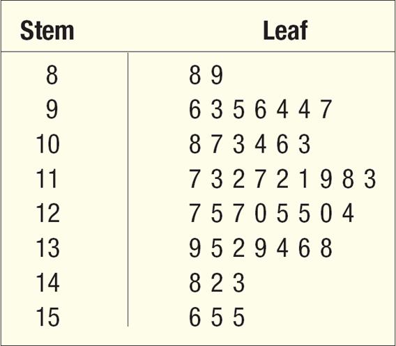
10 Stem-and-Leaf
11 The Quartiles Quartiles are the three points that divide a set of observations into four equal parts. The first quartile is the value below which 25% of the observations occur and usually labeled as Q 1. ( the 25 th percentile) The second quartile Q 2 is the Median. ( the 50 th percentile) The third quartile is the value below which 75% of the observations occur and usually labeled as Q 3. ( the 75 th percentile)
12 The Quartiles The location of Q 1 is L 25 The location of Q 2 is L 25 The location of Q 3 is L 25
13 The Quartiles Example: Listed below are the commissions earned last month by a sample of 15 brokers at Salomon Smith Barney s Oakland, California, office. Salomon Smith Barney is an investment company with offices located throughout the United States. $2,038 $1,758 $1,721 $1,637 $2,097 $2,047 $2,205 $1,787 $2,287 $1,940 $2,311 $2,054 $2,406 $1,471 $1,460 Locate the median, the first quartile, and the third quartile for the commissions earned.
14 The Quartiles Step 1: Organize the data from lowest to largest value $1,460 $1,471 $1,637 $1,721 $1,758 $1,787 $1,940 $2,038 $2,047 $2,054 $2,097 $2,205 $2,287 $2,311 $2,406
15 The Quartiles Step 2: Compute the first and third quartiles. Locate L 25 and L 75 using: L25 (15 1) 4 L75 (15 1) Therefore, the first and third quartiles are the 4th and 12th observation in the array, respectively L L $1,721 $2,205
16 The Box Plot A box plot is a graphical display, based on the quartiles, that help us picture a set of data. To construct a box plot, we need only five statistics: the minimum value, Q 1 (the first quartile), the median, Q 3 (the third quartile) and the maximum value.

17 The Box Plot

18 The Box Plot
19 The Scatter Diagram A scatter diagram is graphical technique to show the relationship between variables. To draw a scatter diagram we need two variables. We scale one variable along the horizontal axis (X-axis) of a graph and the other variable along the vertical axis (Y-axis).

20 The Scatter Diagram
21 The Contingency table A scatter diagram requires that both of the variables be at least interval scale. What if we wish to study the relationship between two variables when one or both are nominal or ordinal scale? In this case we tally the results in a contingency table. A contingency table is a table used to classify observations according to two identifiable characteristics.

22 The Contingency table Example: A manufacturer of preassembled windows produced 50 windows yesterday. This morning the quality assurance inspector reviewed each window for all quality aspects. Each was classified as acceptable or unacceptable and by the shift on which it was produced. Thus we reported two variables on a single item. The two variables are shift and quality. The results are reported in the following table.
Learning Objectives. Describing Data: Displaying and Exploring Data. Dot Plot. Dot Plot 12/9/2015
 Describing Data: Displaying and Exploring Data Chapter 4 Learning Objectives Develop and interpret a dot plot. Develop and interpret a stem-and-leaf display. Compute and understand quartiles. Construct
DESCRIBING DATA. Frequency Tables, Frequency Distributions, and Graphic Presentation
 DESCRIBING DATA Frequency Tables, Frequency Distributions, and Graphic Presentation Raw Data A raw data is the data obtained before it is being processed or arranged. 2 Example: Raw Score A raw score is
Business Statistics:
 Department of Quantitative Methods & Information Systems Business Statistics: Chapter 2 Graphs, Charts, and Tables Describing Your Data QMIS 120 Dr. Mohammad Zainal Chapter Goals After completing this
Describing Data: Frequency Tables, Frequency Distributions, and Graphic Presentation. Chapter 2
 Describing Data: Frequency Tables, Frequency Distributions, and Graphic Presentation Chapter 2 Learning Objectives Organize qualitative data into a frequency table. Present a frequency table as a bar chart
LESSON 2: FREQUENCY DISTRIBUTION
 LESSON : FREQUENCY DISTRIBUTION Outline Frequency distribution, histogram, frequency polygon Relative frequency histogram Cumulative relative frequency graph Stem-and-leaf plots Scatter diagram Pie charts,
Review. In an experiment, there is one variable that is of primary interest. There are several other factors, which may affect the measured result.
 Review Observational study vs experiment Experimental designs In an experiment, there is one variable that is of primary interest. There are several other factors, which may affect the measured result.
Chapter 2. Organizing Data. Slide 2-2. Copyright 2012, 2008, 2005 Pearson Education, Inc.
 Chapter 2 Organizing Data Slide 2-2 Section 2.1 Variables and Data Slide 2-3 Definition 2.1 Variables Variable: A characteristic that varies from one person or thing to another. Qualitative variable: A
Chapter 4. Displaying and Summarizing Quantitative Data. Copyright 2012, 2008, 2005 Pearson Education, Inc.
 Chapter 4 Displaying and Summarizing Quantitative Data Copyright 2012, 2008, 2005 Pearson Education, Inc. Dealing With a Lot of Numbers Summarizing the data will help us when we look at large sets of quantitative
Numerical: Data with quantity Discrete: whole number answers Example: How many siblings do you have?
 Types of data Numerical: Data with quantity Discrete: whole number answers Example: How many siblings do you have? Continuous: Answers can fall anywhere in between two whole numbers. Usually any type of
Going back to the definition of Biostatistics. Organizing and Presenting Data. Learning Objectives. Nominal Data 10/10/2016. Tabulation and Graphs
 1/1/1 Organizing and Presenting Data Tabulation and Graphs Introduction to Biostatistics Haleema Masud Going back to the definition of Biostatistics The collection, organization, summarization, analysis,
Sections Descriptive Statistics for Numerical Variables
 Math 243 Sections 2.1.2-2.2.5 Descriptive Statistics for Numerical Variables A framework to describe quantitative data: Describe the Shape, Center and Spread, and Unusual Features Shape How is the data
Section 1.5 Graphs and Describing Distributions
 Section 1.5 Graphs and Describing Distributions Data can be displayed using graphs. Some of the most common graphs used in statistics are: Bar graph Pie Chart Dot plot Histogram Stem and leaf plot Box
Statistics for Managers using Microsoft Excel 3 rd Edition
 Statistics for Managers using Microsoft Excel 3 rd Edition Chapter 2 Presenting Data in Tables and Charts 22 Prentice-Hall, Inc. Chap 2-1 Chapter Topics Organizing numerical data The ordered array and
Chapter 2. The Excel functions, Excel Analysis ToolPak Add-ins or Excel PHStat2 Add-ins needed to create frequency distributions are:
 I. Organizing Data in Tables II. Describing Data by Graphs Chapter 2 I. Tables: 1. Frequency Distribution (Nominal or Ordinal) 2. Grouped Frequency Distribution (Interval or Ratio data) 3. Joint Frequency
Describing Data Visually. Describing Data Visually. Describing Data Visually 9/28/12. Applied Statistics in Business & Economics, 4 th edition
 A PowerPoint Presentation Package to Accompany Applied Statistics in Business & Economics, 4 th edition David P. Doane and Lori E. Seward Prepared by Lloyd R. Jaisingh Describing Data Visually Chapter
Chapter 3. Graphical Methods for Describing Data. Copyright 2005 Brooks/Cole, a division of Thomson Learning, Inc.
 Chapter 3 Graphical Methods for Describing Data 1 Frequency Distribution Example The data in the column labeled vision for the student data set introduced in the slides for chapter 1 is the answer to the
Notes 5C: Statistical Tables and Graphs
 Notes 5C: Statistical Tables and Graphs Frequency Tables A frequency table is an easy way to display raw data. A frequency table typically has between two to four columns: The first column lists all the
STK110. Chapter 2: Tabular and Graphical Methods Lecture 1 of 2. ritakeller.com. mathspig.wordpress.com
 STK110 Chapter 2: Tabular and Graphical Methods Lecture 1 of 2 ritakeller.com mathspig.wordpress.com Frequency distribution Example Data from a sample of 50 soft drink purchases Frequency Distribution
Chapter Displaying Graphical Data. Frequency Distribution Example. Graphical Methods for Describing Data. Vision Correction Frequency Relative
 Chapter 3 Graphical Methods for Describing 3.1 Displaying Graphical Distribution Example The data in the column labeled vision for the student data set introduced in the slides for chapter 1 is the answer
Chpt 2. Frequency Distributions and Graphs. 2-3 Histograms, Frequency Polygons, Ogives / 35
 Chpt 2 Frequency Distributions and Graphs 2-3 Histograms, Frequency Polygons, Ogives 1 Chpt 2 Homework 2-3 Read pages 48-57 p57 Applying the Concepts p58 2-4, 10, 14 2 Chpt 2 Objective Represent Data Graphically
Displaying Distributions with Graphs
 Displaying Distributions with Graphs Recall that the distribution of a variable indicates two things: (1) What value(s) a variable can take, and (2) how often it takes those values. Example 1: Weights
Chapter 4 Displaying and Describing Quantitative Data
 Chapter 4 Displaying and Describing Quantitative Data Overview Key Concepts Be able to identify an appropriate display for any quantitative variable. Be able to guess the shape of the distribution of a
Frequency Distribution and Graphs
 Chapter 2 Frequency Distribution and Graphs 2.1 Organizing Qualitative Data Denition 2.1.1 A categorical frequency distribution lists the number of occurrences for each category of data. Example 2.1.1
Univariate Descriptive Statistics
 Univariate Descriptive Statistics Displays: pie charts, bar graphs, box plots, histograms, density estimates, dot plots, stemleaf plots, tables, lists. Example: sea urchin sizes Boxplot Histogram Urchin
Variables. Lecture 13 Sections Wed, Sep 16, Hampden-Sydney College. Displaying Distributions - Quantitative.
 - - Lecture 13 Sections 4.4.1-4.4.3 Hampden-Sydney College Wed, Sep 16, 2009 Outline - 1 2 3 4 5 6 7 Even-numbered - Exercise 4.7, p. 226. According to the National Center for Health Statistics, in the
Chapter 10. Definition: Categorical Variables. Graphs, Good and Bad. Distribution
 Chapter 10 Graphs, Good and Bad Chapter 10 3 Distribution Definition: Tells what values a variable takes and how often it takes these values Can be a table, graph, or function Categorical Variables Places
How to Make a Run Chart in Excel
 How to Make a Run Chart in Excel While there are some statistical programs that you can use to make a run chart, it is simple to make in Excel, using Excel s built-in chart functions. The following are
Algebra I Notes Unit One: Real Number System
 Syllabus Objectives: 1.1 The student will organize statistical data through the use of matrices (with and without technology). 1.2 The student will perform addition, subtraction, and scalar multiplication
Chapter 2 Frequency Distributions and Graphs
 Chapter 2 Frequency Distributions and Graphs Outline 2-1 Organizing Data 2-2 Histograms, Frequency Polygons, and Ogives 2-3 Other Types of Graphs Objectives Organize data using a frequency distribution.
Appendix C: Graphing. How do I plot data and uncertainties? Another technique that makes data analysis easier is to record all your data in a table.
 Appendix C: Graphing One of the most powerful tools used for data presentation and analysis is the graph. Used properly, graphs are an important guide to understanding the results of an experiment. They
Chapter 2 Descriptive Statistics: Tabular and Graphical Methods
 Chapter Descriptive Statistics http://nscc-webctdev.northweststate.edu/script/sta_sp/scripts/student/serve_page... Page of 7 /7/9 Chapter Descriptive Statistics: Tabular and Graphical Methods Data can
Interval of Head Circumferences (mm) XS 510 < 530 S 530 < 550 M 550 < 570 L 570 < 590 XL 590 < 610 XXL 610 < 630. Hat Sizes.
 XS 510 < 530 S 530 < 550 M 550 < 570 L 570 < 590 XL 590 < 610 XXL 610 < 630. Hat Sizes.") 6.6.4 Lesson Date Creating a Histogram Student Objectives I can construct a frequency histogram. I recognize that each interval must be the same size. Classwork Example 1: Frequency Table with Intervals
6.6.4 Lesson Date Creating a Histogram Student Objectives I can construct a frequency histogram. I recognize that each interval must be the same size. Classwork Example 1: Frequency Table with Intervals
Descriptive Statistics II. Graphical summary of the distribution of a numerical variable. Boxplot
 MAT 2379 (Spring 2012) Descriptive Statistics II Graphical summary of the distribution of a numerical variable We will present two types of graphs that can be used to describe the distribution of a numerical
UNCORRECTED PAGE PROOFS
 Topic 14 Representing and interpreting data 14.1 Overview Why learn this? Understanding data helps us to make sense of graphs, charts and advertising material. The media often present statistics such as
BE540 - Introduction to Biostatistics Computer Illustration. Topic 1 Summarizing Data Software: STATA. A Visit to Yellowstone National Park, USA
 BE540 - Introduction to Biostatistics Computer Illustration Topic 1 Summarizing Data Software: STATA A Visit to Yellowstone National Park, USA Source: Chatterjee, S; Handcock MS and Simonoff JS A Casebook
Chapter 1: Stats Starts Here Chapter 2: Data
 Chapter 1: Stats Starts Here Chapter 2: Data Statistics data, datum variation individual respondent subject participant experimental unit observation variable categorical quantitative Calculator Skills:
NCSS Statistical Software
 Chapter 147 Introduction A mosaic plot is a graphical display of the cell frequencies of a contingency table in which the area of boxes of the plot are proportional to the cell frequencies of the contingency
IE 361 Module 36. Process Capability Analysis Part 1 (Normal Plotting) Reading: Section 4.1 Statistical Methods for Quality Assurance
 Reading: Section 4.1 Statistical Methods for Quality Assurance") IE 361 Module 36 Process Capability Analysis Part 1 (Normal Plotting) Reading: Section 4.1 Statistical Methods for Quality Assurance ISU and Analytics Iowa LLC (ISU and Analytics Iowa LLC) IE 361 Module
IE 361 Module 36 Process Capability Analysis Part 1 (Normal Plotting) Reading: Section 4.1 Statistical Methods for Quality Assurance ISU and Analytics Iowa LLC (ISU and Analytics Iowa LLC) IE 361 Module
GRAPHS & CHARTS. Prof. Rahul C. Basole CS/MGT 8803-DV > January 23, 2017 INFOVIS 8803DV > SPRING 17
 GRAPHS & CHARTS Prof. Rahul C. Basole CS/MGT 8803-DV > January 23, 2017 HW2: DataVis Examples Tumblr 47 students = 47 VIS of the Day submissions Random Order We will start next week Stay tuned Tufte Seminar
SAMPLE. This chapter deals with the construction and interpretation of box plots. At the end of this chapter you should be able to:
 find the upper and lower extremes, the median, and the upper and lower quartiles for sets of numerical data calculate the range and interquartile range compare the relative merits of range and interquartile
Purpose. Charts and graphs. create a visual representation of the data. make the spreadsheet information easier to understand.
 Purpose Charts and graphs are used in business to communicate and clarify spreadsheet information. convert spreadsheet information into a format that can be quickly and easily analyzed. make the spreadsheet
Organizing Data 10/11/2011. Focus Points. Frequency Distributions, Histograms, and Related Topics. Section 2.1
 Organizing Data 2 Copyright Cengage Learning. All rights reserved. Section 2.1 Frequency Distributions, Histograms, and Related Topics Copyright Cengage Learning. All rights reserved. Focus Points Organize
Why Should We Care? Everyone uses plotting But most people ignore or are unaware of simple principles Default plotting tools are not always the best
 Elementary Plots Why Should We Care? Everyone uses plotting But most people ignore or are unaware of simple principles Default plotting tools are not always the best More importantly, it is easy to lie
Mathematics (Project Maths)
") 2010. M128 S Coimisiún na Scrúduithe Stáit State Examinations Commission Leaving Certificate Examination Sample Paper Mathematics (Project Maths) Paper 2 Ordinary Level Time: 2 hours, 30 minutes 300 marks
2010. M128 S Coimisiún na Scrúduithe Stáit State Examinations Commission Leaving Certificate Examination Sample Paper Mathematics (Project Maths) Paper 2 Ordinary Level Time: 2 hours, 30 minutes 300 marks
Biggar High School Mathematics Department. S1 Block 1. Revision Booklet GOLD
 Biggar High School Mathematics Department S1 Block 1 Revision Booklet GOLD Contents MNU 3-01a MNU 3-03a MNU 3-03b Page Whole Number Calculations & Decimals 3 MTH 3-05b MTH 3-06a MTH 4-06a Multiples, Factors,
Why Should We Care? More importantly, it is easy to lie or deceive people with bad plots
 Elementary Plots Why Should We Care? Everyone uses plotting But most people ignore or are unaware of simple principles Default plotting tools (or default settings) are not always the best More importantly,
Office 2016 Excel Basics 24 Video/Class Project #36 Excel Basics 24: Visualize Quantitative Data with Excel Charts. No Chart Junk!!!
 Office 2016 Excel Basics 24 Video/Class Project #36 Excel Basics 24: Visualize Quantitative Data with Excel Charts. No Chart Junk!!! Goal in video # 24: Learn about how to Visualize Quantitative Data with
Grade 6 Math Circles Winter 2013 Mean, Median, Mode
 1 University of Waterloo Faculty of Mathematics Grade 6 Math Circles Winter 2013 Mean, Median, Mode Mean, Median and Mode The word average is a broad term. There are in fact three kinds of averages: mean,
What Is a Histogram? A bar graph that shows the distribution of data A snapshot of data taken from a process HISTOGRAM VIEWGRAPH 1
 What Is a Histogram? 100 80 60 40 20 0 0 5 10 15 20 25 30 35 40 45 50 55 60 A bar graph that shows the distribution of data A snapshot of data taken from a process HISTOGRAM VIEWGRAPH 1 When Are Histograms
Unit 3 - Data STUDY GUIDE - WORKSHEET #11
 Class: Date: Unit 3 - Data STUDY GUIDE - WORKSHEET #11 1. (1 point) 8.5, 7.9, 8.4, 7.7, 8.5, 7.9, 8.9, 8.2 a. mean: 8.25 median: 8.1 mode: 8.5 range: 1.2 b. mean: 8.25 median: 8.1 modes: 7.9, 8.5 range:
(Notice that the mean doesn t have to be a whole number and isn t normally part of the original set of data.)
") One-Variable Statistics Descriptive statistics that analyze one characteristic of one sample Where s the middle? How spread out is it? Where do different pieces of data compare? To find 1-variable statistics
One-Variable Statistics Descriptive statistics that analyze one characteristic of one sample Where s the middle? How spread out is it? Where do different pieces of data compare? To find 1-variable statistics
Unit 8, Activity 1, Vocabulary Self-Awareness Chart
 Unit 8, Activity 1, Vocabulary Self-Awareness Chart Vocabulary Self-Awareness Chart WORD +? EXAMPLE DEFINITION Central Tendency Mean Median Mode Range Quartile Interquartile Range Standard deviation Stem
Engineering Fundamentals and Problem Solving, 6e
 Engineering Fundamentals and Problem Solving, 6e Chapter 5 Representation of Technical Information Chapter Objectives 1. Recognize the importance of collecting, recording, plotting, and interpreting technical
EE EXPERIMENT 3 RESISTIVE NETWORKS AND COMPUTATIONAL ANALYSIS INTRODUCTION
 EE 2101 - EXPERIMENT 3 RESISTIVE NETWORKS AND COMPUTATIONAL ANALYSIS INTRODUCTION The resistors used in this laboratory are carbon composition resistors, consisting of graphite or some other type of carbon
Algebra I. Measures of Central Tendency: Mean, Median, Mode & Additional Measures of Data. Slide 1 / 141 Slide 2 / 141. Slide 4 / 141.
 Slide 1 / 141 Slide 2 / 141 lgebra I ata & Statistical nalysis 2015-11-25 www.njctl.org Slide 3 / 141 Slide 4 / 141 Table of ontents lick on the topic to go to that section Measures of entral Tendency
Chapter 4. September 08, appstats 4B.notebook. Displaying Quantitative Data. Aug 4 9:13 AM. Aug 4 9:13 AM. Aug 27 10:16 PM.
 Objectives: Students will: Chapter 4 1. Be able to identify an appropriate display for any quantitative variable: stem leaf plot, time plot, histogram and dotplot given a set of quantitative data. 2. Be
Meaningful Ways to Develop Math Facts
 NCTM 206 San Francisco, California Meaningful Ways to Develop Math Facts -5 Sandra Niemiera Elizabeth Cape mathtrailblazer@uic.edu 2 4 5 6 7 Game Analysis Tool of Game Math Involved in the Game This game
Chapter 1. Picturing Distributions with Graphs
 Chapter 1. Picturing Distributions with Graphs 1 Chapter 1. Picturing Distributions with Graphs Definition. Individuals are the objects described by a set of data. Individuals may be people, but they may
MULTIPLE CHOICE. Choose the one alternative that best completes the statement or answers the question.
 Practice for Final Exam Name Identify the following variable as either qualitative or quantitative and explain why. 1) The number of people on a jury A) Qualitative because it is not a measurement or a
0, 0, 0, 0, 0, 0, 0, 1, 1, 1, 1, 2, 2, 2, 2, 2, 2, 2, 3, 3, 3, 3, 4, 5, 8
 Name Date One Variable Statistics Dot Plots Independent Practice 1. The number of boots that 25 students had in their homes in Florida were recorded below: 0, 0, 0, 0, 0, 0, 0, 1, 1, 1, 1, 2, 2, 2, 2,
Lesson 10. Unit 2. Reading Maps. Graphing Points on the Coordinate Plane
 Lesson Graphing Points on the Coordinate Plane Reading Maps In the middle ages a system was developed to find the location of specific places on the Earth s surface. The system is a grid that covers the
Unit 5: Graphs. Input. Output. Cartesian Coordinate System. Ordered Pair
 Section 5.1: The Cartesian plane Section 5.2: Working with Scale in the Cartesian Plane Section 5.3: Characteristics of Graphs Section 5.4: Interpreting Graphs Section 5.5: Constructing good graphs from
Lesson 10 Practice Problems
 Name: Date: Lesson 10 Skills Practice 1. Determine the slope of the line between each of the following pairs of points. Show all steps, and reduce your answer to lowest terms. a. (4, 5) and ( 2, 3) b.
Statistics. Graphing Statistics & Data. What is Data?. Data is organized information. It can be numbers, words, measurements,
 Statistics Graphing Statistics & Data What is Data?. Data is organized information. It can be numbers, words, measurements, observations or even just descriptions of things. Qualitative vs Quantitative.
3. Data and sampling. Plan for today
 3. Data and sampling Business Statistics Plan for today Reminders and introduction Data: qualitative and quantitative Quantitative data: discrete and continuous Qualitative data discussion Samples and
Business Statistics. Lecture 2: Descriptive Statistical Graphs and Plots
 Business Statistics Lecture 2: Descriptive Statistical Graphs and Plots 1 Goals for this Lecture Graphical descriptive statistics Histograms (and bar charts) Boxplots Scatterplots Time series plots Mosaic
Name: Date: Period: Histogram Worksheet
 Name: Date: Period: Histogram Worksheet 1 5. For the following five histograms, list at least 3 characteristics that describe each histogram (consider symmetric, skewed to left, skewed to right, unimodal,
Session 5 Variation About the Mean
 Session 5 Variation About the Mean Key Terms for This Session Previously Introduced line plot median variation New in This Session allocation deviation from the mean fair allocation (equal-shares allocation)
Central Tendency Print Activity. Use the Explore It mode to answer the following questions:
 Name: Central Tendency Print Activity Use the Explore It mode to answer the following questions: 1 Use the diagram below to answer the following questions: a The graph represents the heights of a collection
You must have: Pen, HB pencil, eraser, calculator, ruler, protractor.
 Write your name here Surname Other names Pearson Edexcel Award Statistical Methods Level 2 Calculator allowed Centre Number Candidate Number Wednesday 14 May 2014 Morning Time: 1 hour 30 minutes You must
Introduction. Descriptive Statistics. Problem Solving. Inferential Statistics. Chapter1 Slides. Maurice Geraghty
 Inferential Statistics and Probability a Holistic Approach Chapter 1 Displaying and Analyzing Data with Graphs This Course Material by Maurice Geraghty is licensed under a Creative Commons Attribution-ShareAlike
Left skewed because it is stretched to the left side. Lesson 5: Box Plots. Lesson 5
 Opening Exercise Consider the following scenario. A television game show, Fact or Fiction, was cancelled after nine shows. Many people watched the nine shows and were rather upset when it was taken off
A graph is an effective way to show a trend in data or relating two variables in an experiment.
 Chem 111-Packet GRAPHING A graph is an effective way to show a trend in data or relating two variables in an experiment. Consider the following data for exercises #1 and 2 given below. Temperature, ºC
MA Lesson 16 Sections 2.3 and 2.4
 MA 1500 Lesson 16 Sections.3 and.4 I Piecewise Functions & Evaluating such Functions A cab driver charges $4 a ride for a ride less than 5 miles. He charges $4 plus $0.50 a mile for a ride greater than
Stat 20: Intro to Probability and Statistics
 Stat 20: Intro to Probability and Statistics Lecture 4: Data Displays (cont.) Tessa L. Childers-Day UC Berkeley 26 June 2014 By the end of this lecture... You will be able to: Comprehend displays of quantitative
NUMERICAL DATA and OUTLIERS
 ESSENTIAL MATHEMATICS 2 WEEK 2 NOTES AND EXERCISES NUMERICAL DATA and OUTLIERS Example Peter asked eight friends about the amount of pocket money they received each week. The results were: $20 $32 $32
Plotting Points & The Cartesian Plane. Scatter Plots WS 4.2. Line of Best Fit WS 4.3. Curve of Best Fit WS 4.4. Graphing Linear Relations WS 4.
 UNIT 4 - GRAPHING RELATIONS Date Lesson Topic HW Nov. 3 4.1 Plotting Points & The Cartesian Plane WS 4.1 Nov. 6 4.1 Plotting Points & The Cartesian Plane WS 4.1-II Nov. 7 4.2 Scatter Plots WS 4.2 Nov.
select the 4 times tables and then all the number tiles used would be 4 x something
 Notes for the User: This resource contains the instructions for 6 multiplication games as well as the resources to make the games. These games are appropriate for students in Grade 3 and up who are working
Algebra 2 P49 Pre 10 1 Measures of Central Tendency Box and Whisker Plots Variation and Outliers
 Algebra 2 P49 Pre 10 1 Measures of Central Tendency Box and Whisker Plots Variation and Outliers 10 1 Sample Spaces and Probability Mean Average = 40/8 = 5 Measures of Central Tendency 2,3,3,4,5,6,8,9
Learning Log Title: CHAPTER 2: ARITHMETIC STRATEGIES AND AREA. Date: Lesson: Chapter 2: Arithmetic Strategies and Area
 Chapter 2: Arithmetic Strategies and Area CHAPTER 2: ARITHMETIC STRATEGIES AND AREA Date: Lesson: Learning Log Title: Date: Lesson: Learning Log Title: Chapter 2: Arithmetic Strategies and Area Date: Lesson:
Chapter 2. Describing Distributions with Numbers. BPS - 5th Ed. Chapter 2 1
 Chapter 2 Describing Distributions with Numbers BPS - 5th Ed. Chapter 2 1 Numerical Summaries Center of the data mean median Variation range quartiles (interquartile range) variance standard deviation
AUTUMN 2016 GCSE 9-1 MOCK FOUNDATION PAPER 1 ALTERNATIVE VERSION
 AUTUMN 2016 GCSE 9-1 MOCK FOUNDATION PAPER 1 ALTERNATIVE VERSION This version was kindly put together by Graham Cumming at Edexcel and some of the questions have been adapted to strip out the sums as part
To describe the centre and spread of a univariate data set by way of a 5-figure summary and visually by a box & whisker plot.
 Five Figure Summary Teacher Notes & Answers 7 8 9 10 11 12 TI-Nspire Investigation Student 60 min Aim To describe the centre and spread of a univariate data set by way of a 5-figure summary and visually
Line Graphs. Name: The independent variable is plotted on the x-axis. This axis will be labeled Time (days), and
, and") Name: Graphing Review Graphs and charts are great because they communicate information visually. For this reason graphs are often used in newspapers, magazines, and businesses around the world. Sometimes,
Name: Graphing Review Graphs and charts are great because they communicate information visually. For this reason graphs are often used in newspapers, magazines, and businesses around the world. Sometimes,
Sample Lesson Plan for Standard 5.MD.B.2: Creating Line Plots. An Introduction to Line Plots Using Whole Numbers
 Sample Lesson Plan for Standard 5.MD.B.2: Creating Line Plots An Introduction to Line Plots Using Whole Numbers Grade Level Expectations For this standard, fifth grade students are expected to create line
IE 361 Module 17. Process Capability Analysis: Part 1. Reading: Sections 5.1, 5.2 Statistical Quality Assurance Methods for Engineers
 IE 361 Module 17 Process Capability Analysis: Part 1 Reading: Sections 5.1, 5.2 Statistical Quality Assurance Methods for Engineers Prof. Steve Vardeman and Prof. Max Morris Iowa State University Vardeman
A Visual Display. A graph is a visual display of information or data. This is a graph that shows a girl walking her dog. Communicating with Graphs
 A Visual Display A graph is a visual display of information or data. This is a graph that shows a girl walking her dog. A Visual Display The horizontal axis, or the x-axis, measures time. Time is the independent
Elementary Statistics. Graphing Data
 Graphing Data What have we learned so far? 1 Randomly collect data. 2 Sort the data. 3 Compute the class width for specific number of classes. 4 Complete a frequency distribution table with the following
TEKSING TOWARD STAAR MATHEMATICS GRADE 6. Student Book
 TEKSING TOWARD STAAR MATHEMATICS GRADE 6 Student Book TEKSING TOWARD STAAR 2014 Six Weeks 1 Lesson 1 STAAR Category 1 Grade 6 Mathematics TEKS 6.2A/6.2B Problem-Solving Model Step Description of Step 1
Statistical Measures
 Statistical Measures Pre-Algebra section 10.1 Statistics is an area of math that deals with gathering information (called data). It is often used to make predictions. Important terms: Population A population
PASS Sample Size Software
 Chapter 945 Introduction This section describes the options that are available for the appearance of a histogram. A set of all these options can be stored as a template file which can be retrieved later.
5.1N Key Features of Rational Functions
 5.1N Key Features of Rational Functions A. Vocabulary Review Domain: Range: x-intercept: y-intercept: Increasing: Decreasing: Constant: Positive: Negative: Maximum: Minimum: Symmetry: End Behavior/Limits:
Outline. Drawing the Graph. 1 Homework Review. 2 Introduction. 3 Histograms. 4 Histograms on the TI Assignment
 Lecture 14 Section 4.4.4 on Hampden-Sydney College Fri, Sep 18, 2009 Outline 1 on 2 3 4 on 5 6 Even-numbered on Exercise 4.25, p. 249. The following is a list of homework scores for two students: Student
CS 445 HW#2 Solutions
 1. Text problem 3.1 CS 445 HW#2 Solutions (a) General form: problem figure,. For the condition shown in the Solving for K yields Then, (b) General form: the problem figure, as in (a) so For the condition
TJP TOP TIPS FOR IGCSE STATS & PROBABILITY
 TJP TOP TIPS FOR IGCSE STATS & PROBABILITY Dr T J Price, 2011 First, some important words; know what they mean (get someone to test you): Mean the sum of the data values divided by the number of items.
Mathematics. Pre-Leaving Certificate Examination, Paper 2 Ordinary Level Time: 2 hours, 30 minutes. 300 marks L.19 NAME SCHOOL TEACHER
 L.19 NAME SCHOOL TEACHER Pre-Leaving Certificate Examination, 2016 Name/vers Printed: Checked: To: Updated: Name/vers Complete ( Paper 2 Ordinary Level Time: 2 hours, 30 minutes 300 marks School stamp
Algebra 1B. Chapter 6: Linear Equations & Their Graphs Sections 6-1 through 6-7 & 7-5. COLYER Fall Name: Period:
 Chapter 6: Linear Equations & Their Graphs Sections 6-1 through 6-7 & 7-5 COLYER Fall 2016 Name: Period: What s the Big Idea? Analyzing Linear Equations & Inequalities What can I expect to understand when
6.1 - Introduction to Periodic Functions
 6.1 - Introduction to Periodic Functions Periodic Functions: Period, Midline, and Amplitude In general: A function f is periodic if its values repeat at regular intervals. Graphically, this means that
Data and its representation
 2 Data and its representation A microphone in the sidewalk would provide an eavesdropper with a cacophony of clocks, seemingly random like the noise from a Geiger counter. But the right kind of person
Find the following for the Weight of Football Players. Sample standard deviation n=
 Find the following for the Weight of Football Players x Sample standard deviation n= Fun Coming Up! 3-3 Measures of Position Z-score Percentile Quartile Outlier Bluman, Chapter 3 3 Measures of Position: