DESIGN GUIDELINES VILLAGEOF KEREMEOS CONTENTS:
|
|
|
- Derrick Harrington
- 6 years ago
- Views:
Transcription
1 VILLAGEOF KEREMEOS DESIGN GUIDELINES CONTENTS: Introduction 2 Colour in the Downtown...p.3 Basic Colour Theory 4 Colour Schemes 5-6 Historic Colour Schemes 7 Contemporary Colour Schemes 8 Colour Palettes...p.9 Materials 10 Villageof Keremeos - Business Improvement Area - ColourDesignGuidelinē Page 1

2 INTRODUCTION Colour is one of the most powerful design elements which can be used to create an image of unity and quality within the downtown business area. The Village of Keremeos Colour Design Guidelines have been created to aid in developing a broader view of the marketing image of the community, and in choosing and evaluating successful colour schemes for use within the Designated Commercial Area. These Guidelines have been formulated to explain the basic theory of colour and how to jointly use colour effectively within a downtown area. Some specific recommendations are presented, but due to the extremely subjective nature of colour preference, as well as the variety of possible acceptable colour options, the paint colour samples and visual examples provided in this document should be considered as suggestions only. Final approval of proposed colour schemes will be made through the design review process. VillageofKeremeos - Business ImprovementArea - ColourDesignGuideline - Page 2

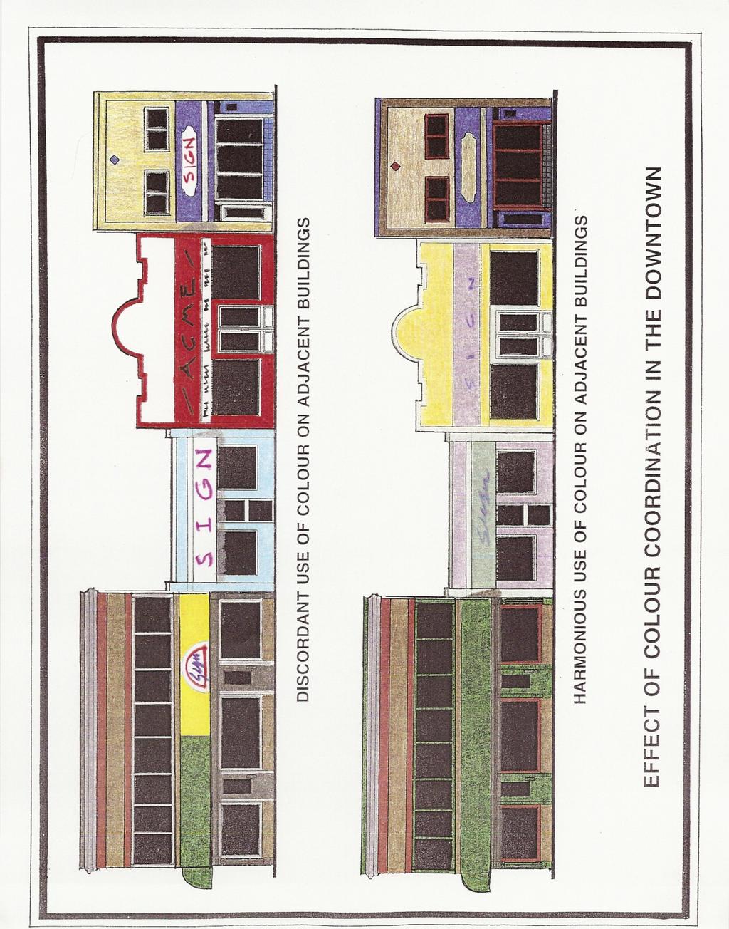
3 COORDINATED COLOUR IN THE DOWNTOWN The use and control of colour in the downtown commercial core is a matter of great concern to the success of the marketing image enhancement process. Tastefully selected colour schemes which have been thoughtfully coordinated with the overall appearance of the Keremeos business area in mind can do much to create the quality image which is desired by the business community. Conversely, the thoughtless use of garish colour can readily cheapen the look of the business core. One key to success in downtown facade improvements is to view the downtown as an INTEGRATED VISUAL MARKETING UNIT, not as a series of unconnected individual buildings & businesses. Such a cooperative approach to the use of colour in the business place benefits the entire community. GENERAL PRINCIPLES In trying to create a downtown marketing image of quality the following general colour recommendations should be followed: - Use WARM, subdued background SHADES which blend harmoniously as a whole throughout the commercial core. - Use brighter accent colours discretely to create subtle areas of focus, not to out-shout neighboring businesses. - Utilize multi co oured paint schemes to create visual interest and to highlight architectural features. - Develop regular maintenance programs to maintain quality of facade finishes. VillageofKeremeos - Business ImprovementArea - ColourDesignGuidelinē Page 3
4
, and orange, green, and purple are called secondary hues.")
5 BAsIcCOLOUR THEORY PROPERTIES OF COLOUR Colour properties of interest to those selecting paint schemes for a building facade include; 'Hue', 'Va ue' and Intensity. HUE" refers to the name of a colour - for example red, yellow,and blue are called the primary hues (or Colours), and orange, green, and purple are called secondary hues. VALUE" refers to a colours brightness, as in dark' green or 'light' green; and, INTENS TY (or 'chroma') indicates clarity or the extent to which the hue is free of white or black. The terms Tint and Shade" are important to understand in the concept of colour VALUE and INTENSITY. TINT is a gradated lightening of colour made by adding white to it to lessen the vividness of the hue. SHADE refers to the degree to which a pure colour is darkened by the addition of black. TEMPERATURE The projected temperature of a colour is similarly of interest. Colours are said to be 'COOL' when blue forms a part of its make up; 'WARM' colours have red in their composition. The cooler colours scuh as blues, greens and violets seem to recede, whereas the warmer colours such as reds, oranges, yellows appear to advance. IMPORTANCE OF SHADED COLOURS: An examination of the recommended colour palettes, and the colours shown in the concept sketches, will demonstrate the importance of using 'shades' and shaded tints as the basis for a successful town widecolour program. The combination of subdued tints and the grayed back nature of 'shades' allows a wide variety of colours to be used together without causing visual clashes to occur between the individual colours of a building's own paint scheme, or with the paint schemes of adjacent buildings. Generally, shaded tints work the best for the body of the building, reserving the stronger, more vibrant colours, for small accent areas. VillageofKeremeos - Business Improvement Area - ColourDesignGuideline - Page 4
6 WNWWUR? 7/A\LH 3%% YELLOW TWELVE- HUE COLOUR WHEEL PMMARY COLOURS SECONDARY COLOURS RED GREEN YELLOW PURPLE BLUE ORANGE

7 HUE HNT SHADE WHITE ADDED BLACK ADDED

8 COOL COLOURS

9 WARM COLOURS
 the monochromatic scheme; 2) monochromatic plus accent; and, 3) the complementary scheme.")
10 for COLOUR SCHEMES TYPES OF COLOUR SCHEME ood colour schemes tor buildings are generally made up of only a few colours which G have been taste-fully selected, mixed, and blended. THREE COLOUR SCHEMES are discussed and illustrated below: 1) the monochromatic scheme; 2) monochromatic plus accent; and, 3) the complementary scheme. The colour samples on the following pages should be recognized as a recommendation for basic colour direction, not as the only allowable colours or colour schemes for the downtown. 1) MONOCHROMATIC: Monochromatic colour schemes are developed by using several values (relative degree of light or dark) of the same colour. A typical scheme would include a minimum of three values, for instance, dark, medium, and light. Not all colours can be used successfully in a mono chromatic scheme instance, the lighter colours of yellow and orange may not show a tonal range sufficient for emphasis. 2) MONOCHROMATIC PLUS ACCENT: This scheme uses a base of monochromatic colours, but adds a contrasting, complementary, colour for accent. Earth and gray tones make good monochromatic bases, with shaded primary colours for accents 3) COMPLEMENTARY: Complementary colour schemes are formed by selecting colours which sit opposite each other on the colour wheel (refer to attached colour wheel). Examples of complementary colours include: red & green, blue-violet & ye low orange, and violet & yellow. Complementary schemes work best when the contrasting colours are muted tints and /or shades of a pure colour. Villageof Keremeos - Business Improvement Area - ColourDesignGuideline - Page 5

11 MONOCHROMATIC VARIOUS SHADES OF THE SAME COLOUR TYPES OF COLOUR SCHEME

12 MONOCHROMATIC WITH ACCENT TYPES OF COLOUR SCHEME

13 COMPLEMENTARY COLOURS OPPOSITE ON THE COLOUR WHEEL TYPES OF COLOUR SCHEME

14 Official COLOUR SCHEMES CONTINUED: SELECTION OF COLOURS: Colour schemes for buildings within Keremeos s designated commercial area should recognize the principles and objectives of the Downtown Keremeos Marketing Theme" which have been outlined within the Keremeos BIA Building Facade Design Guidelines, and the Village of Keremeos Community Plan documents. In this regard, colours and paint schemes which are inspired by traditional influences, or the warm colours of the surrounding natural environment should be utilized. LOCATING COLOURS ON THE BUILDING FACADE: The placement of individual colours on the building face should be planned using a thoughtful criteria. In this regard, the following general guidelines should be considered. ACCENT THE ARCHITECTURALELEMENTS OF THE BUILDING. The building facade often has vertical or horizontal design features which make appropriate locations for colour transitions. Typical architectural elements would include column pilasters. cornices, window lintels and sills, and any type of raised relief from the base building face. These types of details should be painted to include the side/edges of the raised element as well as the frontal face plane. This lends a sense of mass to the detailing. - ACCENT DOOR AND WINDOW ELEMENTS Applying accent colours to window and door sash, casings, and trims helps to provide colourful interest to the building face. Choose colours for this purpose which contrast with both the background base colour of the building and the colour of the glass in the windows and doors, or window decoration; e.g. interior drapery or blind treatments which project an exterior colour. Materials chosen for colouring windows or doors should be compatible with the material sub strate and projected usage patterns for the feature. VillageofKeremeos - BusinessImprovement Area - ColourDesignGuideline - Page 6

15 HISTORIC COLOUR SCHEMES: Colour schemes for historic, and infill, buildings within the designated heritage business core should recognize the precedent of the types of colours and paint schemes which were typically used on structures during the turn of the century time period. Being aware of the rules of proper historic colour selection, also allows for certain conscious decisions to vary from the strict historic tradition, in order to create modern interpretations of heritage paint schemes for effect. The following general information is presented to aid in colour design decisions regarding heritage" paint schemes. HISTORIC COLOURS: The palette of colours and types of paint available during the Late Victorian period was very limited by modern standards. The Colours tended to be derived from natural organic sources, which limited their brilliance, but they were used in intense concentrations creating strong, contrasting effects. Colours which were favoured included: - REDS - terra cotta tones, tuscan dark reds, & small amounts of fire engine red - YELLOW OCHRE - DARK MOSSY GREENS & SAGE GREENS 0 BLUES dark navy & powdery delft blue grays - - EARTH TONES - creams, tans, beige s - WHITE & GRAYS COLOUR SCHEMES: Ifa purist approach is taken to colour selection on an historic building, the original paint colours may sometimes be ascertained by taking paint scrapings from the building face and examining them under a microscope to - check the appearance of the successive paint layers then matching the historic co our(s) to a modern equivalent. Late Victorian paint schemes were generally comprised of two or three colours; a base background colour with one or more accent colours applied to the trims of the structure. The painted lady" technique of extensively highlighting the intricate detailing of the Victorian ornament with numerous colours is a relatively recent innovation from the 1970's California resurgence of interest in Victorian architecture. This technique offers dramatic and playful possibilities, but should be recognized for what it is, and used with discretion. VillageofKeremeos - Business Improvement Area - ColourDesignGuideline - Page 7

16 CONTEMPORARY COLOUR SCHEMES Colours which are chosen for newer (non heritage) buildings within the commercial areas should generally be based on the palette" of the surrounding natural environment. Utilizing the intrinsic Colours of natural materials, e.g. stone, brick, and wood, as base tones", the same shaded palette which is appropriate for the heritage area, should be consulted for a selection of appropriate accent colours and tones. Colours selected from the Earth Tone" and/or Gray" palettes, or the light and mid range shades of the colour palettes, generally will provide acceptable base colour choices. The stronger (darker) colours, or more brilliant contemporary colours, should be reserved for trims and smaller accent areas. VillageofKeremeos - Business Improvement Area - ColourDesignGuideline - Page 8

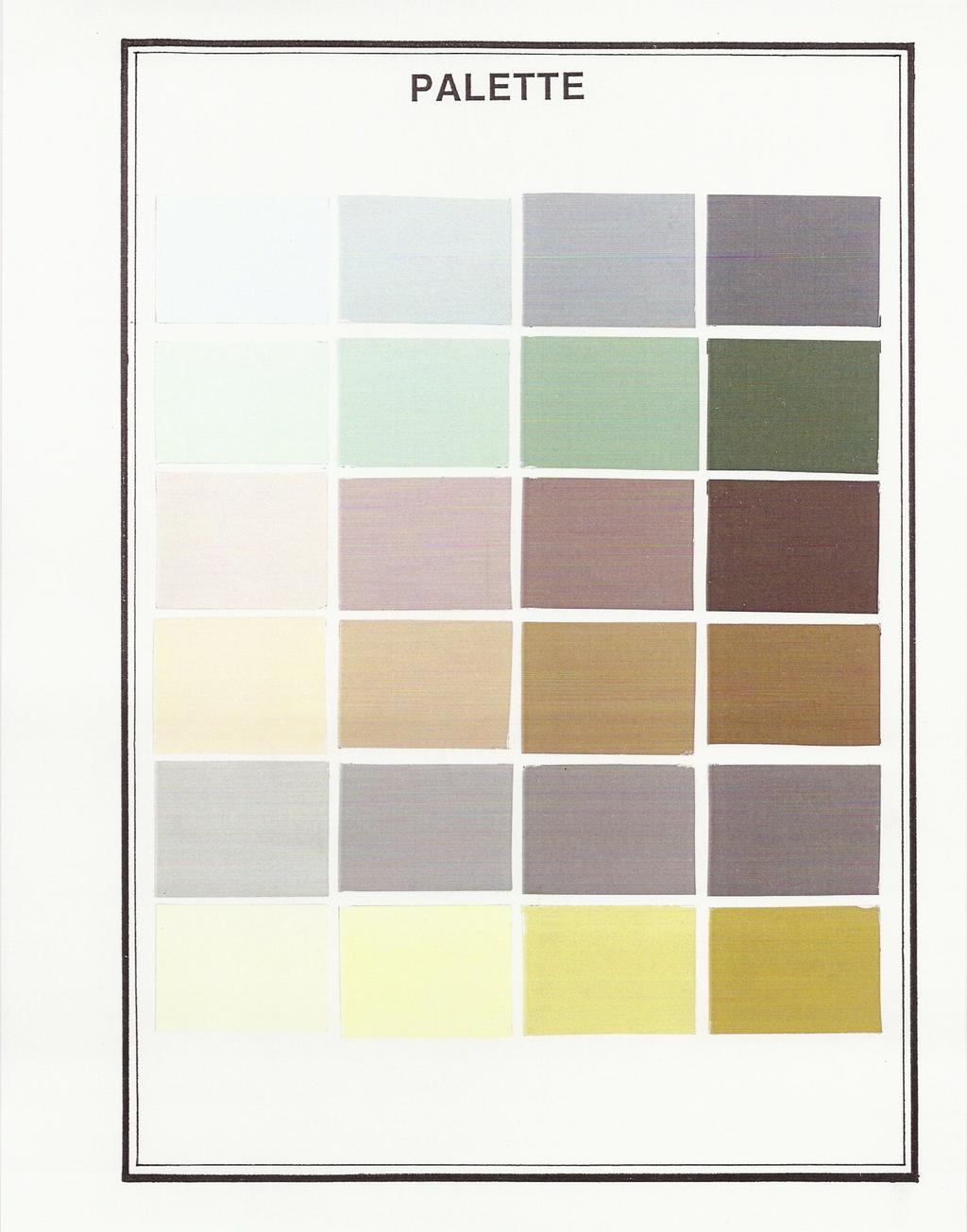
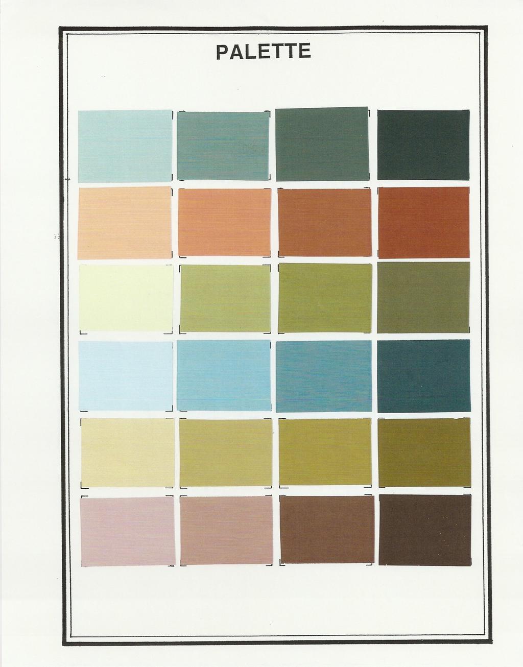
17 COLOUR PALETTES Sample colours are presented in the sheets entitled "palette." It should be noted that the colour chips included on the sample palettes are not intended to represent the ONLY colours allowed. Rather they are to give an indication of the general tone which is being recommended. Colours shown on the palettes are acceptable for both historic and contemporary building paint schemes. Site specific examples of how the colour recommendations might be used for buildings located within the designated Keremeos Commercial Area may be seen in the attached, coloured, building renderings. RECOMMENDATIONS ENCOURAGED - Colour schemes which respect the appearance of adjacent buildings and the colour palette for the business community - subdued background shades with small areas of bright accent colour - Contrasting paint schemes which accent the decorative features of the building facade - Multi hued and mu ti co oured schemes - Shaded and tinted colours - Use of warm tones as background wall colours DISCOURAGED - Single colour paint schemes - Large areas of bright, pure colours Extremely dark or light colours ( i.e. large areas of pure white, black, chocolate brown, or charcoal gray ) - Colour schemes which seek to grab attention by clashing with the colours of adjacent buildings. VillageofKeremeos - Business Improvement Area - ColourDesignGuideline - Page 9
18
19

20
DESIGNING FLOWER BEDS with
 DESIGNING FLOWER BEDS with Good flower bed designs incorporate many different features Relative surface feel or look On plants, texture comes from Leaves Twigs Bark Texture also comes from Rocks Pavement
Color Theory and Mixing
 MODULE 4 Color Theory and Mixing? What is explored in this module? In this module, we ll look at basic color theory and mixing colors. You ll find that color theory and mixing is not a perfect science.
Designing Flower Beds with Colors
 Utah State University DigitalCommons@USU All Archived Publications Archived USU Extension Publications 1-1-2005 Designing Flower Beds with Colors Larry A. Sagers Follow this and additional works at: http://digitalcommons.usu.edu/extension_histall
Example: Leaf. Cut out the shape using scissors, and carefully use the template to place your sampling outlines evenly around the drawing paper.
 Colored Pencil Samplings Because of the technical skills required to successfully manipulate colored pencils, you must first practice some of the basic techniques involved with drawing colored pencil compositions.
Choose Paint Colors and Schemes
 Choose Paint Colors and Schemes When you re decorating your home, choosing the right paint colors is the most important decision you ll make. As fun as choosing colors can be, this part of the planning
The Color Wheel is a visual representation of color theory. It is the color spectrum wrapped onto a circle.
 The Color Wheel is a visual representation of color theory. It is the color spectrum wrapped onto a circle. It creates an orderly progression of color that helps us understand color balance and harmony.
Hue is what makes a color identifiable and different from any other color, e.g. orange, red-orange, red.
 Hue Hue is what makes a color identifiable and different from any other color, e.g. orange, red-orange, red. Hues are determined (and can be measured) by a color's wavelength. There are millions of hues
Color Schemes.
 Color Schemes http://www.hgtv.com/video/warm-orangelivingdining-room-video/index.html COLOR (Schemes)HARMONIES A color (scheme) harmony is a pleasing combination of colors based on their respective positions
Art 2D Mid-Term Review 2018
 Art 2D Mid-Term Review 2018 Definition: What is a Line? Definition: Line is the most basic design tool. A line has length, width, tone, and texture. It may divide space, define a form, describe contour,
Value. Value-It is the lightness or darkness of an object, regardless of color. Value is relative to the background color and other items on the page.
 Value Value-It is the lightness or darkness of an object, regardless of color. Value is relative to the background color and other items on the page. Value is created by a light source that shines on an
THE MEANING OF COLOR VISUAL COMMUNICATION III 3D DESIGN PRINCIPLES
 COLOR THE MEANING OF COLOR Color in design is very subjective. What evokes one reaction in one person may evoke a very different reaction in someone else. Sometimes this is due to personal preference,
Elements and Principles
 Elements and Principles of Art The building blocks and how we use them Your recipe for creating art! Lets learn the ingredients! ART INGREDIENTS! Elements of Art: The basic building blocks/ foundation
Video 2: Landscape Structure and Atmospheric Perspective
 Video 2: Landscape Structure and Atmospheric Perspective When working with pastels, landscape drawing can be approached using a specific order. Because pastels can be layered on the surface, it makes sense
LIGHTIG FOR INTERIORS
 LIGHTIG FOR INTERIORS COLORS LIGHTING Interior Design Department Third grade/ Fall semester Siba nazem Kady COLORS THEORIES OF COLOR DESIGN Review The Hue REVIEW HUE,VALUE, AND SATURATION - Gradation of
COLOR AS A DESIGN ELEMENT
 COLOR COLOR AS A DESIGN ELEMENT Color is one of the most important elements of design. It can evoke action and emotion. It can attract or detract attention. I. COLOR SETS COLOR HARMONY Color Harmony occurs
With colours you can set a mood, attract attention, or make a statement. You can use colour to energise, or to cool down. By selecting the right
 COLOUR With colours you can set a mood, attract attention, or make a statement. You can use colour to energise, or to cool down. By selecting the right colour scheme, you can create an ambiance of elegance,
Line. The path created by a point moving through space. i n. Horizontal Line. Thin Line. Thick Line
 Line The path created by a point moving through space. V er Horizontal Line Diagonal Line Zig-Zag Line Wavy Line t i c a l L i n e Spiral Line Thin Line Thick Line Line can help create the illusion of
The Color Wheel is a visual representation of the spectrum of color. It consists of warm and cool hues (Hue is the word used to describe a pure
 Mini Color Review The Color Wheel is a visual representation of the spectrum of color. It consists of twelve warm and cool hues (Hue is the word used to describe a pure color) and visually describes the
Color is derived from Reflected Light.
 How We See Color Color is derived from Reflected Light. White light from the sun is actually a combination of all colors. When light passes through a prism, a wedge-shaped glass, the beam of light bends
CUT the wheel vertically IN HALF: WARM (right) AND COOL COLORS (left)
 AND COOL COLORS (left)") COLOR CHEAT SHEET! Simons Arts123 The following information has been collected from a number of websites. See: http://www.youtube.com/watch?v=059-0wrjpau Karen Kavet http://www.color-wheel-pro.com/color-schemes.html
COLOR CHEAT SHEET! Simons Arts123 The following information has been collected from a number of websites. See: http://www.youtube.com/watch?v=059-0wrjpau Karen Kavet http://www.color-wheel-pro.com/color-schemes.html
Properties of Color. Value: Tint: Shade: Tone: Intensity:
 Seeing Color Color and light are inseparable, without light there would be no color When light passes through a prism a spectrum of colors becomes visible Defining Color Hue The name of a color, such
Interior Design I PRECISION EXAMS DESCRIPTION. EXAM INFORMATION Items
 PRECISION EXAMS Interior Design I EXAM INFORMATION Items 64 Points 72 Prerequisites NONE Grade Level 9-12 Course Length ONE SEMESTER DESCRIPTION This course enables students to explore their creativity
Principles of Design
 Principles of Design Balance A. Stability of an arrangement 1. Arrangement appears secure and stable 2. Balance must be both visual and actual Balance a. visual balance refers to the way an arrangement
Notes on colour mixing
 INFORMATION SHEET These notes, with the diagrams in colour, can be found on the internet at: http://www.andrewnewland.com/homepage/teaching Notes on colour mixing Andrew Newland T E A C H I N G A R T &
Art & Design visual elements
 Make your own colour scheme Which 20 colours suit you best? Choose 20 of your favourite colours out of the different stacks on the tables. Make sure to group harmonious colours together. Discuss the place
Color is a property of light.
 Color Theory I Color is a property of light. -Objects have no color of their own, they just reflect a particular wavelength from the color spectrum. (For example a blue object absorbs all of the wavelengths,
LIGHTIG FOR INTERIORS
 LIGHTIG FOR INTERIORS COLORS- Lecture 4 LIGHTING Interior Design Department Third grade/ Fall semester Siba nazem Kady COLORS 1. COLOR 2. FORM AND COLOR 1. COLOR COLORS Color Interaction Color never appears
Review Questions for Design Final Exam Correct answers are highlighted in RED
 Review Questions for Design Final Exam Correct answers are highlighted in RED 1. What type of art is this image? a. Abstract b. Non-Objective c. Realistic 2. What type of art is this image? a. Abstract
The Color Wheel. The color wheel shows relationships between the colors.
 Color Wheel The Color Wheel The color wheel shows relationships between the colors. Artists often use the color wheel to help understand how colors relate to one another. The Color Wheel Let s learn about
Name: Period: THE ELEMENTS OF ART
 Name: Period: THE ELEMENTS OF ART Name: Period: An element of art that is used to define shape, contours, and outlines, also to suggest mass and volume. It may be a continuous mark made on a surface with
What influences colour and what does colour influence?
 1 What influences colour and what does colour influence? COLOUR has associations of feelings eg.red: Anger, Passion, power, love etc Green: Freshness, re-birth, life, growth Blue: Tranquility, sadness,
Color Wheel. Warm Colors. Cool Colors
 Color Wheel Warm Colors Cool Colors How we see color: the light source gives a full spectrum of wavelengths (All 6 colors). The cup absorbs every wave length of color except Blue. Blue is reflected back
Tone The gradual change of tone across this surface indicates that it is curved rather than flat. 1. Light (see note)
") Colour Theory: Illustration, Colour, Layout and Desk Top Publishing Illustration terms Look at this at example of a computer rendering. Notice some of the key features of the illustration that make it
Colour Theory: Illustration, Colour, Layout and Desk Top Publishing Illustration terms Look at this at example of a computer rendering. Notice some of the key features of the illustration that make it
practical beauty t h i z e w i n a t u r e r m o n h a
 A R T S & C R A F T S practical beauty h a r m o n i z e w i t h n a t u r e CRAFTSMAN STYLE E X T E R I O R P R E S E R V A T I O N P A L E T T E A R T S & C R A F T S { 1900 s} IT WAS PURELY USEFUL,
DRAFT V. SITE ELEMENTS SIGNS
 1. SIGNS Intent Signs are an important streetscape design element that affect not only the visual character of the Historic District but also the vitality of its businesses. Signage provides business identification,
Art Vocabulary Assessment
 Art Vocabulary Assessment Name: Date: Abstract Artwork in which the subject matter is stated in a brief, simplified manner; little or no attempt is made to represent images realistically, and objects are
Elements of Design. Line Texture Color Shape & Form Pattern. TOOLS The elements of design are the tools we use to create a style or design.
 Elements of design Elements of Design Line Texture Color Shape & Form Pattern TOOLS The elements of design are the tools we use to create a style or design. Line in Fashion Lines can deflect your gaze
Colour Theory Explained
 Colour Theory Explained And Why all artists need to understand it. The beginnings of how we now understand colour Sir Isaac Newton discovered the spectrum in the 1660 s The colour (similar to how we see
What is Color? The element of art derived from reflected light. Light reflects off objects, sending colors back to our eyes.
 Chapter 7: COLOR What is Color? The element of art derived from reflected light. Light reflects off objects, sending colors back to our eyes. I. Color Spectrum Color Spectrum: The bands of color created
GRAPHICS TECHNOLOGY II
 GRAPHICS TECHNOLOGY II COLORS ARE PART OF OUR LIFE From the clothes we wear, to the things around us, the food we eat, the things we use- everything. Colors are said to activate the right brain for emotions.
Fashion Merchandising: Strand 7. Elements and Principles of Design
 Fashion Merchandising: Strand 7 Elements and Principles of Design Standards Students will recognize the use of the principles and elements of design. Standard 1: Reassess elements of design. Standard 2:
The Elements and Principles of Art
 The Elements and Principles of Art The elements and principles can be applied to discuss any of the visual arts including: painting, photography, set design, graphic design, sculpture, and architecture.
The Elements of Art: Photography Edition. Directions: Copy the notes in red. The notes in blue are art terms for the back of your handout.
 The Elements of Art: Photography Edition Directions: Copy the notes in red. The notes in blue are art terms for the back of your handout. The elements of art a set of 7 techniques which describe the characteristics
COLOR PLANNING FOR INTERIORS JOSHIMA V.M., UON.
 COLOR PLANNING FOR INTERIORS JOSHIMA V.M., UON. COLOR CONCEPTS & SYSTEMS 1. Additive mixing 2. Subtractive mixing 3. Munsell color system 4. Pantone System 5. Artist s circle 6. Traditional color schemes
Color Theory. Additive Color
 Color Theory A primary color is a color that cannot be made from a combination of any other colors. A secondary color is a color created from a combination of two primary colors. Tertiary color is a combination
Line Line Characteristic of Line are: Width Length Direction Focus Feeling Types of Line: Outlines Contour Lines Gesture Lines Sketch Lines
 Line Line: An element of art that is used to define shape, contours, and outlines, also to suggest mass and volume. It may be a continuous mark made on a surface with a pointed tool or implied by the edges
Elements Of Art Study Guide
 Elements Of Art Study Guide General Elements of Art- tools artists use to create artwork; Line, shape, color, texture, value, space, form Composition- the arrangement of elements of art to create a balanced
The art of colour Date: Venerdì, febbraio 12:17:49 CET Topic: Educational Lighting Site
 The art of colour Date: Venerdì, febbraio 15 @ 12:17:49 CET Topic: Educational Lighting Site Primary colours Newton's disc Complementary colours Secondary colours Tertiary colours Warm and cold colours
Color in Landscaping. By C. Kohn Agricultural Sciences Waterford WI
 Color in Landscaping By C. Kohn Agricultural Sciences Waterford WI Color Color is the difference in the visual appearance of objects due to how they reflect light into a person s eyes. Different objects
C40M75Y80 M10Y35 C40Y70K10 C100Y50 Earthy doesn't mean lifeless. These shades of brown and tan are enlivened with a bright teal accent.
 Brown, tan, beige Meaning Brown is a natural, down-to-earth neutral color. It is found in earth, wood, and stone. While brown conveys a wholesome earthiness. It is a warm color that can stimulate the appetite.
Elements of Art. Define: Line. Shape. Value. Texture. Color. Form. Space
 Elements of Art Line Shape Value Texture Color Form Space Directions: When we talk about the parts that make up a picture or work of art, we refer to them as elements. In the space below, draw a picture
DESIGN CHALLENGE 6 Color Project Due: 11/20/17. Size : minimum dimension of 12 X 14. Project Objectives
 DESIGN CHALLENGE 6 Color Project Due: 11/20/17 Size : minimum dimension of 12 X 14 Project Objectives Develop visual understanding of the differences between subject matter and form.intentionally translate
By: Zaiba Mustafa. Copyright
 By: Zaiba Mustafa Copyright 2009 www.digiartport.net Line: An element of art that is used to define shape, contours, and outlines, also to suggest mass and volume. It may be a continuous mark made on a
outline: a line that surrounds and defines the edge of a shape; does not apply line variation and shows little depth.
 Elements of Art (The elements of art should be considered as the basic building blocks in a piece of art. Line, texture, value, space, color, shape and form/volume are the seven elements of design from
elements of design worksheet
 elements of design worksheet Line Line: An element of art that is used to define shape, contours, and outlines, also to suggest mass and volume. It may be a continuous mark made on a surface with a pointed
COLOR PALETTE GUIDELINES FOR NON-RESIDENTIAL PROPERTIES
 COLOR PALETTE GUIDELINES FOR NON-RESIDENTIAL PROPERTIES COLOR PALETTE GUIDELINES FOR NON-RESIDENTIAL PROPERTIES Step 1: Choose a base color. Begin by identifying any significant architectural features
outline: a line that surrounds and defines the edge of a shape; does not apply line variation and shows little depth.
 Elements of Art The elements of art should be considered as the basic building blocks in a piece of art. Line, texture, value, space, color, shape and form/volume are the seven elements of design from
Elements of Art Principles of Organization
 Elements of Art Principles of Organization Robert Spahr Associate Professor Department of Cinema & Photography rspahr@siu.edu http://www.robertspahr.com Pieter Claesz. (Dutch, about 1597 1660), Still
Multiple Choice Identify the choice that best completes the statement or answers the question.
 2 Multiple Choice Identify the choice that best completes the statement or answers the question. 1. Horizontal lines mostly suggest. a. action b. rest c. adventure d. confusion 2. Diagonal lines imply.
COLOR CO C L O O L R O
 COLOR COLOR Y O G R B V informal definitions HUE a particular gradation of color. It is another word for color. PRIMARY & secondary RED BLUE PURPLE GREEN YELLOW ORANGE Primary: Red, Yellow, Blue. All Colors
ONE K CREATIVE. tools for social impact storytelling: color
 tools for social impact storytelling: color THe basics of color application EACH COLOR EVOKES A DIFFERENT EMOTION IN HUMANS; MAKE SURE YOU ARE AWARE OF THE EMOTIONAL RESPONSES TO COLOR, AS WELL AS WHEN
The Elements of Art line color value texture shape form space
 The Elements of Art line color value texture shape form space Line Rembrandt van Rijn Man in a furlined coat 1655. Museum of Art, Toledo Lines are marks drawn on a surface. Line can have many qualities
Trunk Full of Flowers by Kingslan & Gibilisco Studio
 Trunk Full of Flowers by Kingslan & Gibilisco Studio Conversion Chart Book Code Archival Winsor & Newton Genesis W Soft Titanium White Titanium White White Y Cadmium Yellow Mid Cadmium Yellow Pale Bismuth
Elements of Art. Robert Spahr Associate Professor Department of Cinema & Photography
 Elements of Art Robert Spahr Associate Professor Department of Cinema & Photography rspahr@siu.edu http://www.robertspahr.com Pieter Claesz. (Dutch, about 1597 1660), Still Life with Stoneware Jug, Wine
Horace A picture is worth a thousand words. Napoleon Bonaparte A work of art is the unique result of a unique
 A man paints with his brains and not with his hands. Michelangelo A painting that is well composed is half finished. A picture is a poem without words. Pierre Bonnard Horace A picture is worth a thousand
THE GARDENER S COLOR WHEEL. A Guide to Planning Color in the Garden
 THE GARDENER S COLOR WHEEL A Guide to Planning Color in the Garden 1 Introducing The Gardener s Color Wheel As a passionate gardener and former set designer, I ve found the color wheel a wonderfully helpful,
ARTS D Design. Project 1: Art Elements. Reading Guide: form. elements of art. line. shape. value. texture. color. principles of organization
 ARTS 101 2-D Design Project 1: Art Elements Reading Guide: form elements of art line shape value texture color principles of organization harmony variety balance proportion dominance movement economy unity
Color Pencil Techniques and Toned Drawing Practice Exercises
 Color Pencil Techniques and Toned Drawing Practice Exercises Objectives: Learn to create values in black, white, and grayscale Practice color pencil techniques Learn ways of mixing color Become familiar
NEWTONIAN COLOR THEORY
 THEORY 2D Design Color Crash Course NEWTONIAN THEORY Color in a picture is like enthusiasm in life. -incent an Gogh In 1666 Sir Isaac Newton (1642-1726) passed a beam of light through a prism and proved
Complementary colours
 Complementary colours red and green Yellow and purple Blue and orange Any two colours which are directly opposite each other. These opposing colours create maximum contrast and maximum stability Artist:
Part I: Color Foundations The Basic Principles of COLOUR theory
 Part I: Color Foundations The Basic Principles of COLOUR theory Colour Systems Available colour systems are dependent on the medium with which a designer is working. When painting, an artist has a variety
Color Wheel Magic. by Margie Deeb. PART 3: Color Scheme #1 Monochromatic Using Contrast to Make Stronger Palettes
 Color Wheel Magic PART 1: Properties of Color by Margie Deeb 101 PART 2: Properties of Color Color Wheel Layout PART 3: Color Scheme #1 Monochromatic Using Contrast to Make Stronger Palettes PART 4: Color
Choosing your colour. A personal choice for sure, but
 Choosing your colour. A personal choice for sure, but MAKING CHOICES THAT WORK FOR YOU: So how do YOU go about choosing colours for new work? The project pattern or your stash on hand? By what is available
Art Glossary Studio Art Course
 Art Glossary Studio Art Course Abstract: not realistic, though often based on an actual subject. Accent: a distinctive feature, such as a color or shape, added to bring interest to a composition. Advertisement:
the RAW FILE CONVERTER EX powered by SILKYPIX
 How to use the RAW FILE CONVERTER EX powered by SILKYPIX The X-Pro1 comes with RAW FILE CONVERTER EX powered by SILKYPIX software for processing RAW images. This software lets users make precise adjustments
Compelling Color Combinations in Desert Gardens. Angelica Elliott, Program Development Manager
 Compelling Color Combinations in Desert Gardens Angelica Elliott, Program Development Manager Learning Objectives Apply color into their gardens to create pleasing color combinations and color harmony.
Introduction to Color Theory
 Systems & Biomedical Engineering Department SBE 306B: Computer Systems III (Computer Graphics) Dr. Ayman Eldeib Spring 2018 Introduction to With colors you can set a mood, attract attention, or make a
THE SCIENCE OF COLOUR
 THE SCIENCE OF COLOUR Colour can be described as a light wavelength coming from a light source striking the surface of an object which in turns reflects the incoming light from were it is received by the
Hue Value Intensity tint shade Tones
 COLOR Color Color is the element of art that is derived from reflective light. You see color because light waves are reflected from objects to your eyes. White light from the sun is actually a combination
UBT128X Colour theory
 UBT128X Colour theory Unit reference number: L/507/5481 Level: 3 Guided Learning (GL) hours: 25 Overview This unit is about exploring the concepts and theories of colour. Learners will develop the knowledge
LEVEL: 2 CREDITS: 5.00 GRADE: PREREQUISITE: None
 DESIGN #588 LEVEL: 2 CREDITS: 5.00 GRADE: 10-11 PREREQUISITE: None This course will familiarize the beginning art student with the elements and principles of design. Students will learn how to construct
Coloured pencils are easy to work with step-by-step to avoid making mistakes. It is easy to correct mistakes once happen using an eraser.
 Coloured pencil technique What makes this medium so special and supersedes pencil in drawing? Human beings eye adores both colour and light. Coloured pencils are portable and a good medium to start with
the messenger of experience! form! and color! product design!
 the messenger of experience! form! and color! 2.744 product design! the messenger of experience! color! 2.744 product design! but first! a mini quiz!! list 4 steps/levels in a systematic form-giving process!
Painting. Lesson One: Choosing Your Colors Facilitator Guide
 Lesson One: Facilitator Guide Building Basics was paid for under an EL Civics grant from the U. S. Department of Education administered by the Virginia Department of Education. It was paid for under the
ART CRITICISM: elements//principles
 ART CRITICISM: elements//principles ELEMENTS OF DESIGN LINE SHAPE FORM SPACE TEXTURE COLOR PRINCIPLES OF DESIGN RHYTHM MOVEMENT BALANCE EMPHASIS VARIETY UNITY PROPORTION ELEMENTS building blocks of art
COLOR THEORY. The Color Wheel
 COLOR THEORY COLOR THEORY Color theory encompasses a multitude of definitions, concepts and design applications. All the information would fill several encyclopedias. As an introduction, here are a few
This chapter will cover the following topics: Colour terminology. The colour spectrum. The colour wheel. Organisation of colour.
 What would the world be like without colour? Colour brings vitality to everything it touches, be it the clothes we wear or the homes we live in and as a painter and decorator, you need to understand colour,
SISTA 230. Color Theory
 SISTA 230 Color Theory CSS Colors CSS color:red; CSS background-color:blue; 17 valid color keywords CSS Color Keywords aqua black blue fuchsia gray green lime maroon navy olive orange purple red silver
Arts & The Beauty of Behr Process Corporation
 Arts & Crafts Style The Beauty of Craftsmanship Distinguished by its exquisite woodwork, its linear paneled stained glass and its fanciful tile mosaics, the Arts and Crafts-styled home represents the quintessence
Fundamentals of color. Color temperature
 Fundamentals of color Color temperature color temperature, such as 3400 K for halogen lamps, 4200 K for certain fluorescent tubes (Temperature is measured in Kelvin, which is a scale that has its zero
Elements of Art -&- Principles of Design
 Elements of Art -&- Principles of Design Elements of Art Line Shape Form Space Texture Value Color Line A line is a basic element of art, referring to a continuous mark, made on a surface, by a moving
Floral Design Basics: Principles & Elements
 Floral esign asics: Principles & lements lements basic visual qualities of a design; includes line, form, space, texture, pattern, color, size and fragrance ine Form visual path the eye is drawn or attracted
Deposit Central School District Curriculum Map
 GRADE LEVEL: 5-6 What are the most effective ways to use the elements of art and principals of design in art? In what ways can I incorporate the elements of art and principles of design together in art?
Answer the questions below.
 Color Theory Answer the questions below. The two images to the right were created by the same artist. How is the color in these two paintings different? How does the color tone of these paintings effect
9/1/2015 Elements and Principles of Design. Color and value
 Color and value Colors are light waves reflected and absorbed by objects. Hues are the names of colors. Primary hues are red, yellow and blue. Secondary hues are green, orange, and violet. Tertiary hues
The Principles and Elements of Design. These are the building blocks of all good floral design
 The Principles and Elements of Design These are the building blocks of all good floral design ELEMENTS OF DESIGN The Elements of Design are those you can see and touch LINE FORM COLOUR TEXTURE SPACE LINE
ART 2 Summer Homework:
 ART 2 Summer Homework: Dear Art 2 Students who have taken Art 1 for high school credit in middle school. In order to ease the transition to high school and make sure you are prepared to be in an upper
color basics theory & application Fall 2013 Ahmed Ansari Communication Design Fundamentals
 color basics theory & application Fall 2013 Ahmed Ansari Communication Design Fundamentals Presentation 7 Tom Fraser + Adam Banks Designer's Color Manual Johannes Itten The Art of Color Ellen Lupton &
Writing about Art: Asking Questions
 WRITING ACROSS THE CURRICULUM Writing about Art: Asking Questions Any work of art provokes a response in the viewer. Your task as writer is to define and discuss the choices and techniques the artist has
Elements of Art. Line Shape Form Space Value Color Texture
 Elements of Art Line Shape Form Space Value Color Texture Line Line is the path of a moving point through space. Mark on a surface usually created by a pencil, pen, crayon, marker or paintbrush. Thick