STK 573 Metode Grafik untuk Analisis dan Penyajian Data
|
|
|
- Magnus Dennis
- 6 years ago
- Views:
Transcription
1 STK 573 Metode Grafik untuk Analisis dan Penyajian Data Pertemuan 5 Sajian Peubah Diskret Tunggal Tim Dosen: Prof. Dr. Khairil Anwar Notodiputro Dr. Ir. Aji Hamim Wigena Dr. Agus M Soleh
2 Pendahuluan Chart: present summary data used as an eye-catching alternative to statistical tables depicting the distribution of a single discrete variable scales of measurement: Nominal, Ordinal, Interval, Ratio
3 Discret of Variables can be put into a one-to-one correspondence with the natural numbers primary purpose: Descriptive for graphical displays that depict distributions of the population of values for a single variable.
4 Purposes to orient the viewers to the topic or population under study; to stress an issue central to the study to provide an overview of the population to expose a commonly held misconception about the population to justify concentration on a subpopulation to allow viewers to formulate questions that the researcher will address
5 three basic charts for plotting the distribution of a single discrete variable: The Dot Chart The Bar Chart The Pie Chart Advanced The Stacked Bar Chart The Pictograph Variations on the Dot and Bar Charts
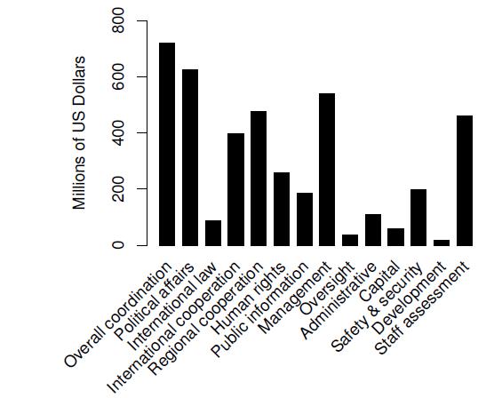
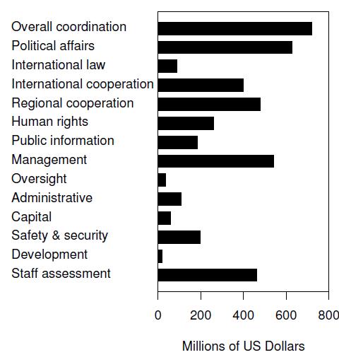
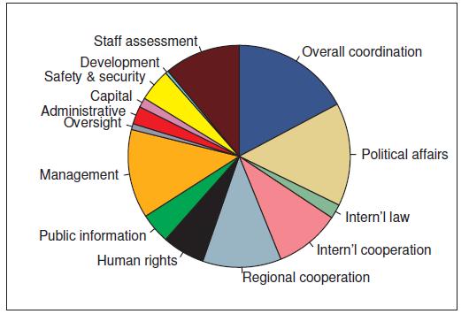
6 Example of Data Appropriations in Resolution 62/327 of the United Nations General Assembly
7 To attempt to extract more information than this by just reading the table would appear to be a questionable effort consider several different graphical means of depicting the data
8 The Dot Chart Plotting standart: The categories, or values, are listed in a vertical column with labels to the left A horizontal dotted line is adjacent to the category with the value indicated by a large dot The horizontal and vertical axes are framed in a rectangular box with the category labels and the horizontal coordinates, with tick marks, displayed outside the framing box
9 The Dot Chart Plotting standart (continued ): There are no tick marks for the vertical categories, presumably because this is not required due to the horizontal lines for the categories within the box There are no tick marks for the vertical categories, presumably because this is not required due to the horizontal lines for the categories within the box
10
11 The Bar Chart most frequently used graphical display for summarizing data with respect to a single discrete variable Depicts the distribution of a categorical variable with the lengths of bars scaled accordingly problem with the label orientation
12
13 A frame can be useful by providing visual cues for locating the end of the bars in a Cartesian coordinate plane the more difficult it is to discern the length of the bar
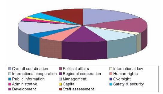
14 The Pie Chart conveyed visually by the different sizes of the slices for each category The slices in a pie chart are adjacent, so it is essential that the slices are differentiated from each other different color for each slice
15 Avoid: putting a region in yellow adjacent to a regionin blue putting a region in red adjacent to a region in green The use of grayscale is one way around the problem of color blindness among viewers
16
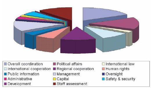
17
18 Hatching or cross-hatching, or both, can unintentionally add the illusion of motion in a graphic due to the Moir e effect Hatching is the use of close parallel lines to give the effect of shading Cross-hatching uses intersecting sets of parallel lines to the same effect
19 how many categories are too many for a pie chart? One rule of thumb is that the upper limit for the number of categories is six
20 A question worth considering is how do viewers extract information from a pie chart. Do viewers rely on comparison of areas, arc length, chord length, or central angles of the wedges? Do all viewers uniformly use just one of these comparisons?
21 Recommendation: Do not draft pseudo three-dimensional pie charts because of the perceptual difficulties in assessing or comparing the sizes of pie segments. The relevant axioms are those of Apprehension, Clarity, Efficiency, and Truthfulness. Do not use a pie chart if the number of categories exceeds six because of perceptual difficulty related to the axioms of Apprehension, Clarity, and Efficiency
22 Recommendation: Do not use hatching or cross-hatching as either will likely result in the perception of a Moir e effect in the graphic by viewers. The Moir e effect interferes with Apprehension, Clarity, and fficiency Do not choose graytone shading or colors that could lead to difficulty in identifying distinct pie segments. To do so would lead to a conflict with the axioms of Apprehension, Clarity, and Efficiency
23 Recommendation: Do not use a legend with a color key to identify categories with segments because this will require the viewer to take more time to study the graph. This would violate the Efficiency and Necessity axioms and interfere with Apprehension Do not place labels adjacent to pie segments in such a manner that the identification of the referenced pie segment is ambiguous. This would lead to a conflict with Apprehension, Clarity, and Efficiency
24 Recommendation: Do not use pullouts in pie charts, or so-called exploded wedges if using pseudo threedimensional pie charts. To do so interferes with the process of comparing wedge sizes and leads to conflicts with Apprehension and Efficiency


25 The Stacked Bar Chart Advanced
26 The Pictograph
27 Variations on the Dot and Bar Charts
28 Selesai
Using Figures - The Basics
 Using Figures - The Basics by David Caprette, Rice University OVERVIEW To be useful, the results of a scientific investigation or technical project must be communicated to others in the form of an oral
Important Considerations For Graphical Representations Of Data
 This document will help you identify important considerations when using graphs (also called charts) to represent your data. First, it is crucial to understand how to create good graphs. Then, an overview
Using Charts and Graphs to Display Data
 Page 1 of 7 Using Charts and Graphs to Display Data Introduction A Chart is defined as a sheet of information in the form of a table, graph, or diagram. A Graph is defined as a diagram that represents
Purpose. Charts and graphs. create a visual representation of the data. make the spreadsheet information easier to understand.
 Purpose Charts and graphs are used in business to communicate and clarify spreadsheet information. convert spreadsheet information into a format that can be quickly and easily analyzed. make the spreadsheet
How to define Graph in HDSME
 How to define Graph in HDSME HDSME provides several chart/graph options to let you analyze your business in a visual format (2D and 3D). A chart/graph can display a summary of sales, profit, or current
SS Understand charts and graphs used in business.
 SS2 2.02 Understand charts and graphs used in business. Purpose of Charts and Graphs 1. Charts and graphs are used in business to communicate and clarify spreadsheet information. 2. Charts and graphs emphasize
DESCRIBING DATA. Frequency Tables, Frequency Distributions, and Graphic Presentation
 DESCRIBING DATA Frequency Tables, Frequency Distributions, and Graphic Presentation Raw Data A raw data is the data obtained before it is being processed or arranged. 2 Example: Raw Score A raw score is
ESSENTIAL MATHEMATICS 1 WEEK 17 NOTES AND EXERCISES. Types of Graphs. Bar Graphs
 ESSENTIAL MATHEMATICS 1 WEEK 17 NOTES AND EXERCISES Types of Graphs Bar Graphs Bar graphs are used to present and compare data. There are two main types of bar graphs: horizontal and vertical. They are
Cognition and Perception
 Cognition and Perception 2/10/10 4:25 PM Scribe: Katy Ionis Today s Topics Visual processing in the brain Visual illusions Graphical perceptions vs. graphical cognition Preattentive features for design
Why Should We Care? More importantly, it is easy to lie or deceive people with bad plots
 Elementary Plots Why Should We Care? Everyone uses plotting But most people ignore or are unaware of simple principles Default plotting tools (or default settings) are not always the best More importantly,
Statistics. Graphing Statistics & Data. What is Data?. Data is organized information. It can be numbers, words, measurements,
 Statistics Graphing Statistics & Data What is Data?. Data is organized information. It can be numbers, words, measurements, observations or even just descriptions of things. Qualitative vs Quantitative.
constant EXAMPLE #4:
 Linear Equations in One Variable (1.1) Adding in an equation (Objective #1) An equation is a statement involving an equal sign or an expression that is equal to another expression. Add a constant value
Infographics at CDC for a nonscientific audience
 Infographics at CDC for a nonscientific audience A Standards Guide for creating successful infographics Centers for Disease Control and Prevention Office of the Associate Director for Communication 03/14/2012;
Why Should We Care? Everyone uses plotting But most people ignore or are unaware of simple principles Default plotting tools are not always the best
 Elementary Plots Why Should We Care? Everyone uses plotting But most people ignore or are unaware of simple principles Default plotting tools are not always the best More importantly, it is easy to lie
Graphing Guidelines. Controlled variables refers to all the things that remain the same during the entire experiment.
 Graphing Graphing Guidelines Graphs must be neatly drawn using a straight edge and pencil. Use the x-axis for the manipulated variable and the y-axis for the responding variable. Manipulated Variable AKA
Office 2016 Excel Basics 24 Video/Class Project #36 Excel Basics 24: Visualize Quantitative Data with Excel Charts. No Chart Junk!!!
 Office 2016 Excel Basics 24 Video/Class Project #36 Excel Basics 24: Visualize Quantitative Data with Excel Charts. No Chart Junk!!! Goal in video # 24: Learn about how to Visualize Quantitative Data with
Line Graphs. Name: The independent variable is plotted on the x-axis. This axis will be labeled Time (days), and
, and") Name: Graphing Review Graphs and charts are great because they communicate information visually. For this reason graphs are often used in newspapers, magazines, and businesses around the world. Sometimes,
Name: Graphing Review Graphs and charts are great because they communicate information visually. For this reason graphs are often used in newspapers, magazines, and businesses around the world. Sometimes,
Chapter 3. Graphical Methods for Describing Data. Copyright 2005 Brooks/Cole, a division of Thomson Learning, Inc.
 Chapter 3 Graphical Methods for Describing Data 1 Frequency Distribution Example The data in the column labeled vision for the student data set introduced in the slides for chapter 1 is the answer to the
ENGINEERING GRAPHICS ESSENTIALS
 ENGINEERING GRAPHICS ESSENTIALS Text and Digital Learning KIRSTIE PLANTENBERG FIFTH EDITION SDC P U B L I C AT I O N S Better Textbooks. Lower Prices. www.sdcpublications.com ACCESS CODE UNIQUE CODE INSIDE
General tips for all graphs Choosing the right kind of graph scatter graph bar graph
 Excerpted and adapted from: McDonald, J.H. 2014. Handbook of Biological Statistics (3rd ed.). Sparky House Publishing, Baltimore, MD. (http://www.biostathandbook.com/graph.html) Guide to fairly good graphs
Describing Data Visually. Describing Data Visually. Describing Data Visually 9/28/12. Applied Statistics in Business & Economics, 4 th edition
 A PowerPoint Presentation Package to Accompany Applied Statistics in Business & Economics, 4 th edition David P. Doane and Lori E. Seward Prepared by Lloyd R. Jaisingh Describing Data Visually Chapter
James A. Sannerud, Compumetrics, Inc.
 IS A PICTURE REALLY WORTH A THOUSAND WORDS? James A. Sannerud, Compumetrics, Inc. ABSTRACT The abundance of computer hardware and the power of statistical software have simplified the time consuming process
Chapter 2. The Excel functions, Excel Analysis ToolPak Add-ins or Excel PHStat2 Add-ins needed to create frequency distributions are:
 I. Organizing Data in Tables II. Describing Data by Graphs Chapter 2 I. Tables: 1. Frequency Distribution (Nominal or Ordinal) 2. Grouped Frequency Distribution (Interval or Ratio data) 3. Joint Frequency
Notes 5C: Statistical Tables and Graphs
 Notes 5C: Statistical Tables and Graphs Frequency Tables A frequency table is an easy way to display raw data. A frequency table typically has between two to four columns: The first column lists all the
COPYRIGHTED MATERIAL. Overview
 In normal experience, our eyes are constantly in motion, roving over and around objects and through ever-changing environments. Through this constant scanning, we build up experience data, which is manipulated
COPYRIGHTED MATERIAL OVERVIEW 1
 OVERVIEW 1 In normal experience, our eyes are constantly in motion, roving over and around objects and through ever-changing environments. Through this constant scanning, we build up experiential data,
Mathology Ontario Grade 2 Correlations
 Mathology Ontario Grade 2 Correlations Curriculum Expectations Mathology Little Books & Teacher Guides Number Sense and Numeration Quality Relations: Read, represent, compare, and order whole numbers to
Chapter Five: Graphics
 Chapter Five: Graphics Is a picture really worth a thousand words? It depends. What about a graphic such as this (Figure 1)? Figure 1: Pie chart showing percentages of majors declared by freshmen I can
Microsoft Excel: Data Analysis & Graphing. College of Engineering Engineering Education Innovation Center
 Microsoft Excel: Data Analysis & Graphing College of Engineering Engineering Education Innovation Center Objectives Use relative, absolute, and mixed cell referencing Identify the types of graphs and their
10 Wyner Statistics Fall 2013
 1 Wyner Statistics Fall 213 CHAPTER TWO: GRAPHS Summary Terms Objectives For research to be valuable, it must be shared. The fundamental aspect of a good graph is that it makes the results clear at a glance.
Unit 5: Graphs. Input. Output. Cartesian Coordinate System. Ordered Pair
 Section 5.1: The Cartesian plane Section 5.2: Working with Scale in the Cartesian Plane Section 5.3: Characteristics of Graphs Section 5.4: Interpreting Graphs Section 5.5: Constructing good graphs from
Appendix III Graphs in the Introductory Physics Laboratory
 Appendix III Graphs in the Introductory Physics Laboratory 1. Introduction One of the purposes of the introductory physics laboratory is to train the student in the presentation and analysis of experimental
Chapter Displaying Graphical Data. Frequency Distribution Example. Graphical Methods for Describing Data. Vision Correction Frequency Relative
 Chapter 3 Graphical Methods for Describing 3.1 Displaying Graphical Distribution Example The data in the column labeled vision for the student data set introduced in the slides for chapter 1 is the answer
This Chapter s Topics
 This Chapter s Topics Today, we re going to talk about three things: Frequency distributions Graphs Charts Frequency distributions, graphs, and charts 1 Frequency distributions Frequency distributions
AWM 11 UNIT 1 WORKING WITH GRAPHS
 AWM 11 UNIT 1 WORKING WITH GRAPHS Assignment Title Work to complete Complete 1 Introduction to Statistics Read the introduction no written assignment 2 Bar Graphs Bar Graphs 3 Double Bar Graphs Double
Addendum COLOR PALETTES
 Addendum Followup Material from Best Practices in Graphical Data Presentation Workshop 2010 Library Assessment Conference Baltimore, MD, October 25-27, 2010 COLOR PALETTES Two slides from the workshop
Univariate Descriptive Statistics
 Univariate Descriptive Statistics Displays: pie charts, bar graphs, box plots, histograms, density estimates, dot plots, stemleaf plots, tables, lists. Example: sea urchin sizes Boxplot Histogram Urchin
Excel Manual X Axis Scale Start At Graph
 Excel Manual X Axis Scale Start At 0 2010 Graph But when I plot them by XY chart in Excel (2003), it looks like a rectangle, even if I havesame for both X, and Y axes, and I can see the X and Y data maximum
Section 1.5 Graphs and Describing Distributions
 Section 1.5 Graphs and Describing Distributions Data can be displayed using graphs. Some of the most common graphs used in statistics are: Bar graph Pie Chart Dot plot Histogram Stem and leaf plot Box
10 GRAPHING LINEAR EQUATIONS
 0 GRAPHING LINEAR EQUATIONS We now expand our discussion of the single-variable equation to the linear equation in two variables, x and y. Some examples of linear equations are x+ y = 0, y = 3 x, x= 4,
Excel Manual X Axis Label Below Chart 2010 >>>CLICK HERE<<<
 Excel Manual X Axis Label Below Chart 2010 When the X-axis is crowded with labels one way to solve the problem is to split the labels for to use two rows of labels enter the two rows of X-axis labels as
Introduction. Descriptive Statistics. Problem Solving. Inferential Statistics. Chapter1 Slides. Maurice Geraghty
 Inferential Statistics and Probability a Holistic Approach Chapter 1 Displaying and Analyzing Data with Graphs This Course Material by Maurice Geraghty is licensed under a Creative Commons Attribution-ShareAlike
NCSS Statistical Software
 Chapter 147 Introduction A mosaic plot is a graphical display of the cell frequencies of a contingency table in which the area of boxes of the plot are proportional to the cell frequencies of the contingency
11 Wyner Statistics Fall 2018
 11 Wyner Statistics Fall 218 CHAPTER TWO: GRAPHS Review September 19 Test September 28 For research to be valuable, it must be shared, and a graph can be an effective way to do so. The fundamental aspect
Objective: Investigate patterns in vertical and horizontal lines, and. interpret points on the plane as distances from the axes.
 NYS COMMON CORE MATHEMATICS CURRICULUM Lesson 6 5 6 Lesson 6 Objective: Investigate patterns in vertical and horizontal lines, and Suggested Lesson Structure Fluency Practice Application Problem Concept
Tables: Tables present numbers for comparison with other numbers. Data presented in tables should NEVER be duplicated in figures, and vice versa
 Tables and Figures Both tables and figures are used to: support conclusions illustrate concepts Tables: Tables present numbers for comparison with other numbers Figures: Reveal trends or delineate selected
Multiple Category Scope and Sequence: Scope and Sequence Report For Course Standards and Objectives, Content, Skills, Vocabulary
 Multiple Category Scope and Sequence: Scope and Sequence Report For Course Standards and Objectives, Content, Skills, Vocabulary Wednesday, August 20, 2014, 3:14PM District Intermediate Introduction to
Lesson 10. Unit 2. Reading Maps. Graphing Points on the Coordinate Plane
 Lesson Graphing Points on the Coordinate Plane Reading Maps In the middle ages a system was developed to find the location of specific places on the Earth s surface. The system is a grid that covers the
GRAPHS & CHARTS. Prof. Rahul C. Basole CS/MGT 8803-DV > January 23, 2017 INFOVIS 8803DV > SPRING 17
 GRAPHS & CHARTS Prof. Rahul C. Basole CS/MGT 8803-DV > January 23, 2017 HW2: DataVis Examples Tumblr 47 students = 47 VIS of the Day submissions Random Order We will start next week Stay tuned Tufte Seminar
II. Basic Concepts in Display Systems
 Special Topics in Display Technology 1 st semester, 2016 II. Basic Concepts in Display Systems * Reference book: [Display Interfaces] (R. L. Myers, Wiley) 1. Display any system through which ( people through
Scientific Investigation Use and Interpret Graphs Promotion Benchmark 3 Lesson Review Student Copy
 Scientific Investigation Use and Interpret Graphs Promotion Benchmark 3 Lesson Review Student Copy Vocabulary Data Table A place to write down and keep track of data collected during an experiment. Line
Introduction to Graphs
 Introduction to Graphs INTRODUCTION TO GRAPHS 231 CHAPTER 15 15.1 Introduction Have you seen graphs in the newspapers, television, magazines, books etc.? The purpose of the graph is to show numerical facts
Algebra. Teacher s Guide
 Algebra Teacher s Guide WALCH PUBLISHING Table of Contents To the Teacher.......................................................... vi Classroom Management..................................................
Chapter 2. Organizing Data. Slide 2-2. Copyright 2012, 2008, 2005 Pearson Education, Inc.
 Chapter 2 Organizing Data Slide 2-2 Section 2.1 Variables and Data Slide 2-3 Definition 2.1 Variables Variable: A characteristic that varies from one person or thing to another. Qualitative variable: A
A Visual Display. A graph is a visual display of information or data. This is a graph that shows a girl walking her dog. Communicating with Graphs
 A Visual Display A graph is a visual display of information or data. This is a graph that shows a girl walking her dog. A Visual Display The horizontal axis, or the x-axis, measures time. Time is the independent
Chapter 2 Frequency Distributions and Graphs
 Chapter 2 Frequency Distributions and Graphs Outline 2-1 Organizing Data 2-2 Histograms, Frequency Polygons, and Ogives 2-3 Other Types of Graphs Objectives Organize data using a frequency distribution.
IED Detailed Outline. Unit 1 Design Process Time Days: 16 days. An engineering design process involves a characteristic set of practices and steps.
 IED Detailed Outline Unit 1 Design Process Time Days: 16 days Understandings An engineering design process involves a characteristic set of practices and steps. Research derived from a variety of sources
Numerical: Data with quantity Discrete: whole number answers Example: How many siblings do you have?
 Types of data Numerical: Data with quantity Discrete: whole number answers Example: How many siblings do you have? Continuous: Answers can fall anywhere in between two whole numbers. Usually any type of
Elementary Statistics. Graphing Data
 Graphing Data What have we learned so far? 1 Randomly collect data. 2 Sort the data. 3 Compute the class width for specific number of classes. 4 Complete a frequency distribution table with the following
Excel Lab 2: Plots of Data Sets
 Excel Lab 2: Plots of Data Sets Excel makes it very easy for the scientist to visualize a data set. In this assignment, we learn how to produce various plots of data sets. Open a new Excel workbook, and
Graphing Techniques. Figure 1. c 2011 Advanced Instructional Systems, Inc. and the University of North Carolina 1
 Graphing Techniques The construction of graphs is a very important technique in experimental physics. Graphs provide a compact and efficient way of displaying the functional relationship between two experimental
CHAPTER 1 Exploring Data
 CHAPTER 1 Exploring Data 1.1 Analyzing Categorical Data The Practice of Statistics, 5th Edition Starnes, Tabor, Yates, Moore Bedford Freeman Worth Publishers Analyzing Categorical Data Learning Objectives
Chapter 2: Functions and Graphs Lesson Index & Summary
 Section 1: Relations and Graphs Cartesian coordinates Screen 2 Coordinate plane Screen 2 Domain of relation Screen 3 Graph of a relation Screen 3 Linear equation Screen 6 Ordered pairs Screen 1 Origin
Tables and Figures. Germination rates were significantly higher after 24 h in running water than in controls (Fig. 4).
.") Tables and Figures Text: contrary to what you may have heard, not all analyses or results warrant a Table or Figure. Some simple results are best stated in a single sentence, with data summarized parenthetically:
Tables and Figures Text: contrary to what you may have heard, not all analyses or results warrant a Table or Figure. Some simple results are best stated in a single sentence, with data summarized parenthetically:
Dimensioning. Dimensions: Are required on detail drawings. Provide the shape, size and location description: ASME Dimensioning Standards
 Dimensioning Dimensions: Are required on detail drawings. Provide the shape, size and location description: - Size dimensions - Location dimensions - Notes Local notes (specific notes) General notes ASME
Information Graphics: Graphs, Schematic Diagrams, Symbols and Signs.
 Information Graphics: Graphs, Schematic Diagrams, Symbols and Signs. The final kind of graphic we need to learn about performs a unique function and therefore sits in a category by itself. It is called
the same information given in two different 1. Dimensions should NOT be duplicated, or Dimension Guidelines Incorrect ways.
 Dimension Guidelines 1. Dimensions should NOT be duplicated, or the same information given in two different ways. Incorrect 1. Dimensions should NOT be duplicated, or the same information given in two
Geometric Dimensioning and Tolerancing
 Geometric dimensioning and tolerancing (GDT) is Geometric Dimensioning and Tolerancing o a method of defining parts based on how they function, using standard ASME/ANSI symbols; o a system of specifying
Chapter 9 Linear equations/graphing. 1) Be able to graph points on coordinate plane 2) Determine the quadrant for a point on coordinate plane
 Be able to graph points on coordinate plane 2) Determine the quadrant for a point on coordinate plane") Chapter 9 Linear equations/graphing 1) Be able to graph points on coordinate plane 2) Determine the quadrant for a point on coordinate plane Rectangular Coordinate System Quadrant II (-,+) y-axis Quadrant
Chapter 9 Linear equations/graphing 1) Be able to graph points on coordinate plane 2) Determine the quadrant for a point on coordinate plane Rectangular Coordinate System Quadrant II (-,+) y-axis Quadrant
CS 147: Computer Systems Performance Analysis
 CS 147: Computer Systems Performance Analysis Mistakes in Graphical Presentation CS 147: Computer Systems Performance Analysis Mistakes in Graphical Presentation 1 / 45 Overview Excess Information Multiple
DICOM Correction Proposal
 Tracking Information - Administration Use Only DICOM Correction Proposal Correction Proposal Number Status CP-1713 Letter Ballot Date of Last Update 2018/01/23 Person Assigned Submitter Name David Clunie
Laboratory 2: Graphing
 Purpose It is often said that a picture is worth 1,000 words, or for scientists we might rephrase it to say that a graph is worth 1,000 words. Graphs are most often used to express data in a clear, concise
Engineering Working Drawings Basics
 Engineering Working Drawings Basics Engineering graphics is an effective way of communicating technical ideas and it is an essential tool in engineering design where most of the design process is graphically
Mathematics Success Grade 6
 T428 Mathematics Success Grade 6 [OBJECTIVE] The students will plot ordered pairs containing rational values to identify vertical and horizontal lengths between two points in order to solve real-world
Learning Log Title: CHAPTER 2: ARITHMETIC STRATEGIES AND AREA. Date: Lesson: Chapter 2: Arithmetic Strategies and Area
 Chapter 2: Arithmetic Strategies and Area CHAPTER 2: ARITHMETIC STRATEGIES AND AREA Date: Lesson: Learning Log Title: Date: Lesson: Learning Log Title: Chapter 2: Arithmetic Strategies and Area Date: Lesson:
Ms. Cavo Graphic Art & Design Illustrator CS3 Notes
 Ms. Cavo Graphic Art & Design Illustrator CS3 Notes 1. Selection tool - Lets you select objects and groups by clicking or dragging over them. You can also select groups within groups and objects within
A Gentle Introduction to SAS/Graph Software
 A Gentle Introduction to SAS/Graph Software Ben Cochran, The Bedford Group, Raleigh, NC Abstract: The power and flexibility of SAS/GRAPH software enables the user to produce high quality graphs, charts,
Statistics for Managers using Microsoft Excel 3 rd Edition
 Statistics for Managers using Microsoft Excel 3 rd Edition Chapter 2 Presenting Data in Tables and Charts 22 Prentice-Hall, Inc. Chap 2-1 Chapter Topics Organizing numerical data The ordered array and
Syllabus Snapshot. Exam Body: An Roinn Oideachais agus Scileanna. Level: Junior Certificate Subject: Technical Graphics.
 Syllabus Snapshot by Amazing Brains Exam Body: An Roinn Oideachais agus Scileanna Level: Junior Certificate Subject: Technical Graphics 3. COURSE CONTENT PREAMBLE The course content is arranged under the
Frequency Distribution and Graphs
 Chapter 2 Frequency Distribution and Graphs 2.1 Organizing Qualitative Data Denition 2.1.1 A categorical frequency distribution lists the number of occurrences for each category of data. Example 2.1.1
Horizon - The horizontal line that contains the vanishing point(s) in a perspective drawing.
 in a perspective drawing.") Representing Solids Perspective Drawing A drawing where non-vertical parallel lines appear to meet at a point called a vanishing point. Example: If you look straight down a highway, it appears that the
Representing Solids Perspective Drawing A drawing where non-vertical parallel lines appear to meet at a point called a vanishing point. Example: If you look straight down a highway, it appears that the
PASS Sample Size Software
 Chapter 945 Introduction This section describes the options that are available for the appearance of a histogram. A set of all these options can be stored as a template file which can be retrieved later.
Going back to the definition of Biostatistics. Organizing and Presenting Data. Learning Objectives. Nominal Data 10/10/2016. Tabulation and Graphs
 1/1/1 Organizing and Presenting Data Tabulation and Graphs Introduction to Biostatistics Haleema Masud Going back to the definition of Biostatistics The collection, organization, summarization, analysis,
PORTAGE COUNTY WATER RESOURCES DRAFTING STANDARDS. Date: January 26, 2001
 PORTAGE COUNTY WATER RESOURCES DRAFTING STANDARDS Date: January 26, 2001 Portage County Water Resources Drafting Standards. AutoCad 2000/Land Development Desktop R2 Friday, January 26, 2001 Preface: Part
3. Data and sampling. Plan for today
 3. Data and sampling Business Statistics Plan for today Reminders and introduction Data: qualitative and quantitative Quantitative data: discrete and continuous Qualitative data discussion Samples and
Engineering Fundamentals and Problem Solving, 6e
 Engineering Fundamentals and Problem Solving, 6e Chapter 5 Representation of Technical Information Chapter Objectives 1. Recognize the importance of collecting, recording, plotting, and interpreting technical
Section 2.3 Task List
 Summer 2017 Math 108 Section 2.3 67 Section 2.3 Task List Work through each of the following tasks, carefully filling in the following pages in your notebook. Section 2.3 Function Notation and Applications
STK110. Chapter 2: Tabular and Graphical Methods Lecture 1 of 2. ritakeller.com. mathspig.wordpress.com
 STK110 Chapter 2: Tabular and Graphical Methods Lecture 1 of 2 ritakeller.com mathspig.wordpress.com Frequency distribution Example Data from a sample of 50 soft drink purchases Frequency Distribution
Image and video processing
 Image and video processing Processing Colour Images Dr. Yi-Zhe Song The agenda Introduction to colour image processing Pseudo colour image processing Full-colour image processing basics Transforming colours
A graph is an effective way to show a trend in data or relating two variables in an experiment.
 Chem 111-Packet GRAPHING A graph is an effective way to show a trend in data or relating two variables in an experiment. Consider the following data for exercises #1 and 2 given below. Temperature, ºC
Problem Solving with the Coordinate Plane
 Grade 5 Module 6 Problem Solving with the Coordinate Plane OVERVIEW In this 40-day module, students develop a coordinate system for the first quadrant of the coordinate plane and use it to solve problems.
TOPIC 4 GRAPHICAL PRESENTATION
 TOPIC 4 GRAPHICAL PRESENTATION Public agencies are very keen on amassing statistics they collect them, raise them to the nth power, take the cube root, and prepare wonderful diagrams. But what you must
Chpt 2. Frequency Distributions and Graphs. 2-3 Histograms, Frequency Polygons, Ogives / 35
 Chpt 2 Frequency Distributions and Graphs 2-3 Histograms, Frequency Polygons, Ogives 1 Chpt 2 Homework 2-3 Read pages 48-57 p57 Applying the Concepts p58 2-4, 10, 14 2 Chpt 2 Objective Represent Data Graphically
The curse of three dimensions: Why your brain is lying to you
 The curse of three dimensions: Why your brain is lying to you Susan VanderPlas srvanderplas@gmail.com Iowa State University Heike Hofmann hofmann@iastate.edu Iowa State University Di Cook dicook@iastate.edu
Chapter 10. Definition: Categorical Variables. Graphs, Good and Bad. Distribution
 Chapter 10 Graphs, Good and Bad Chapter 10 3 Distribution Definition: Tells what values a variable takes and how often it takes these values Can be a table, graph, or function Categorical Variables Places
TenMarks Curriculum Alignment Guide: EngageNY/Eureka Math, Grade 7
 EngageNY Module 1: Ratios and Proportional Relationships Topic A: Proportional Relationships Lesson 1 Lesson 2 Lesson 3 Understand equivalent ratios, rate, and unit rate related to a Understand proportional
Step 1: Set up the variables AB Design. Use the top cells to label the variables that will be displayed on the X and Y axes of the graph
 Step 1: Set up the variables AB Design Use the top cells to label the variables that will be displayed on the X and Y axes of the graph Step 1: Set up the variables X axis for AB Design Enter X axis label
Trade of Sheet Metalwork. Module 7: Introduction to CNC Sheet Metal Manufacturing Unit 4: CNC Drawings & Documentation Phase 2
 Trade of Sheet Metalwork Module 7: Introduction to CNC Sheet Metal Manufacturing Unit 4: CNC Drawings & Documentation Phase 2 Table of Contents List of Figures... 5 List of Tables... 5 Document Release
Analytic Geometry/ Trigonometry
 Analytic Geometry/ Trigonometry Course Numbers 1206330, 1211300 Lake County School Curriculum Map Released 2010-2011 Page 1 of 33 PREFACE Teams of Lake County teachers created the curriculum maps in order
Resting pulse After exercise Resting pulse After exercise. Trial Trial Trial Trial. Subject Subject
 EXERCISE 2.3 Data Presentation Objectives After completing this exercise, you should be able to 1. Explain the difference between discrete and continuous variables and give examples. 2. Use one given data